Software
Houzz Logo Print
mayngt

Repaint kitchen walls or cabinets???

5 years ago
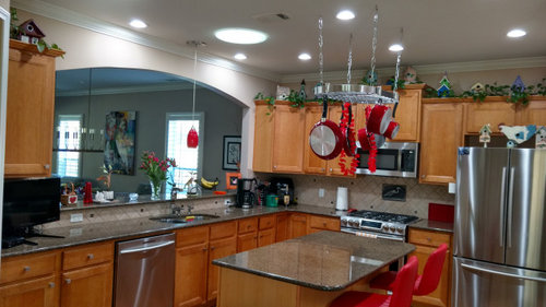
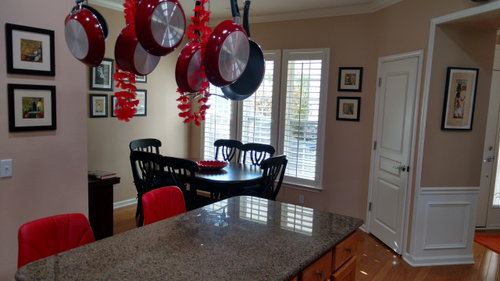
I have honey oak cabinets, tropical brown granite and oak floors. Kitchen is bright in the morning from morning sun but gets darker as day goes oon. There is a small skylight and seven LED ceiling cans. Thinking of painting the ceiling and trim bright white in lieu of off whie and walls a very pale beige


(tan tint) in lieu of existing pink tint. New paint Light reflective value 75. Will using satin finish on walls instead of flat on walls help? Should we forget aboiut walls and paint the cabinets to brighten up the entire space?

Comments (12)

  • 5 years ago

    The budget for painting walls and trim vs painting cabinets is not in the same category.


    Roughly $5k for cabinets vs a few hundred for paint.


    Decisions on how much to invest have to be weighed against necessity, how long you plan on being in the home, your financial stability, neighborhood home values, home buyer expectations and the joy factor.


    Your walls are definitely pink beige, but your backsplash is also pink beige and it looks as though the counter is brown with pink beige.


    Pink beige is challenging to work around. The easy choice is white walls and trim, but without light to reflect off of the white it will go dingy.


    Your white trim looks pretty white against the color you have now. Instead of using a pink beige you could go with something in the same LRV range to give contrast to the white, but make use a blue/green undertone.


    Painting the trim and doors a brighter white will provide greater contrast.


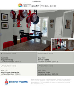
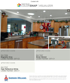
    I used the SW color visualizer to give you some examples with colors I would use, but you may need to play with them in your lighting to get it right - the visualizers are good for picking hue/chroma, but the LRV is always way off.


    If this were my home the colors I would try first would be SW High Reflective White for doors and trim, magnetic gray for walls and silver strand for ceilings.


    The blue/gray/greens will play off your pink beige, your wood and your red accents beautifully.


  • 5 years ago

    I understand the desire to have light and bright, but sometimes we have to work with what we have. Paint isn't magic and doesn't create light.


    I had a home is Southern California that had tons of light. At one time I had everything white on white, changed things up to colors when I tired of it.


    I bought a home in Central Pa that has a lot of large windows, but we have a lot of cloudy days and some of the rooms don't have huge windows. The previous owners painted all the bedrooms and office white. It looks tired and dull and dead. I tried many of the colors I used in Southern CA and they look gray and lifeless. I have upped the chroma and lowered the LRV to get the fresh, clean look that I want.


  • 5 years ago

    I am always a fan of bright white trim and ceilings. I happen to like color on the walls but the pink does not work with your cabinets and granite. If your cabinet finish is in good shape, I wouldn't paint them. They seem really nice and are not as bad as the dreaded orange oak that you sometimes see. You could stick with a neutral beige on the walls or go with a bit more color in the green or blue family if you want to try something different.

    I understand everyone has their own design style and you're the one who lives there, but I think the decor on top of the cabinets closes the room in a lot. Your eye is drawn up there and not in a good way. I'd clear the tops of the cabinets, take down the pot rack and approach with a fresh slate. Maybe the cute birdhouses could find a place on a shelf in the dining or living room?

  • 5 years ago
    last modified: 5 years ago

    I would remove the potrack, it just looks cluttery to me. Have pendent lights installed there. I would also paint the ceiling a bright white, because, I like white ceilings in a kitchen. Trim, can also be bright white. Walls something that doesnt show pink. Maybe try a light color, rather than the dreary beige and tans. Maybe a light blue, or a light blue green, would add a bit more to the room. I would also change out the red chair/stools by the island, for another color, also that red pendent. I would not paint your cabinets. They are very nice like they are. I am one that does like stuff on top of cabinets, so I would leave that, but, maybe remove all that greenery, which does seem to add a bit more cluttery feeling.

  • 5 years ago

    The ideal kitchen today seems to be white on white with stainless steel appliances and nothing displayed on the counter tops.


    I love the style and personality of your kitchen.

    I love the pot rack with your pristine red cookware and the bird houses and the red chairs.


    It makes me feel like I know something about who you are and that I am not visiting Pleasantville;


    I was not expecting the consistency in the art work, with all the matching frames and mats, but I can't see the artwork in the pictures to see how they relate. May be perfect when you are in the home and able to see each piece of art.


    Remember the primary purpose of your home beyond providing shelter is to bring joy to your life. Enjoying your home and having a home where others enjoy visiting is way more important than having the pristine, white on white minimalist design of the day kitchen.


  • PRO
    5 years ago
    last modified: 5 years ago

    Wood work is a nice white. Yes, paint the ceiling in the same white, but a flat finish.

    With fleeting morning light, you want green, not white or light anything. It will just turn to blah!

    Green, specifically B.M. Spring Meadow, will keep the room alive and fresh all day. At dark, when lights go on it will still show beautifully.

    Here is a good example of your cabinet color (in the woven window treatment) white trim and the green on the walls.


    I do agree with red not being the best accent color and I would remove the faux greenery on the cabinet tops.


    White frames, less art, one lovely piece in dining area, again in a white frame. I suggest this one as it has a touch of your cabinets in the mix.


  • 5 years ago

    I like your kitchen. Good layout, love the big pass-through. I completely agree with JudyG on those green accents. Go bright but go earthy. I think the red accents are driving the cabs to look more orange — and they really aren’t. I think the pot rack and the stuff on top of the cabs makes it look more cluttered — and it really isn’t. (Plus it’s so hard to dust!) I would probably replace the backsplash, and chose something reflective rather than natural stone.

    If new countertops were in the budget (not much more than painting the cabinets) I’d consider it, maybe, after all else was done, because your counters do swallow some light. Certainly I’d never paint those cabinets, but I would put bolder hardware on them. Pulls wherever you can, and coordinating knobs where you cannot swap them. I’d remove or paint anything remotely pink or red that is near those cabs to keep them from leaning orange.

    It is a lovely space with loads of potential. Hope to see the after pics.

  • 5 years ago
    last modified: 5 years ago

    Painting will help, but you also need under cabinet lighting and if your LED's are not 3000 - 5000k, they need to be changed.

    Here are the different options you can shop for, starting with the most kitchen-friendly:

    • Daylight (5000K): With a white, almost bluish light, daylight bulbs are meant to "resemble noon on a cloudless day" (I'm thinking this is what my fluorescents must be). Rather than using them everywhere in a kitchen, spring for them as accents where you do food prep or read recipes, for example. (Reading, Jori tells me, has actually been proven to be easier under daylight bulbs than any other.) Style-wise, they'll make cool-colored decorations pop but will muddy any orangey decor.
    • Cool White (4100K): A great workhorse bulb for your kitchen and bathrooms (or for any room where the decor is blue or green rather than reddish in color), cool whites are crisp without feeling overly so.

    Also - Add pendants above your island. I like red too, and it can be striking in smaller does in your kitchen.

    Best Wishes!


    https://food52.com/blog/16899-the-best-light-bulbs-for-maximum-visibility-in-your-kitchen

  • 5 years ago

    @Gene

    shiripp is absolutely right, but I would be really surprised if those were not daylight bulbs next to the small skylight since they are not more yellow than the skylight light.


    In fact, I would like to ask if you could confirm the information about your lights and ask your permission to use the photo to show how a daylight bulb compares to daylight (if in fact you have daylight bulbs).


    So often people are told that daylight bulbs are blue and that they should buy 4000 k or soft white vs a 5000k daylight bulb.


    I think your picture is a great representation that daylight bulbs and daylight are both the same and using daylight bulbs will provide you with light that simulates daylight.


  • 5 years ago

    Jennifer...Daylight bulbs installed...we use them thruout the dining, living, kitchen and family rooms. Absolutely terrific with wall washers on dimmers for art work. Please use the pic for your discussions. Gene

  • 5 years ago

    Thank you!