Software
Houzz Logo Print
shaoyi_hu

Balboa mist too pink, classic gray too light

5 years ago
Hello, Team


I am selecting my paint color, I have narrowed down to three colors:


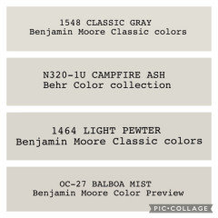
BM Balboa mist, Behr Silver Drop, BM classic gray,


I initially thought Balboa mist will be a perfect color, but... It's too purple-pink


The balboa mist is pretty changing based on different color's flooring, lightening, blabla..


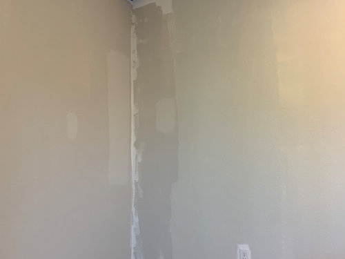
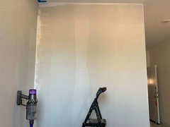
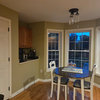
Left -> Right: Balboa mist, Silver Drop, BM classic gray darken 25%


With lights on


I have to say Balboa mist is sometimes perfect, sometimes too warm, too pink, sometimes even purpel,

Silver Drop is very clean, well, it reads some green undertone, but it feels a little boring, a little cold

classic gray is good with a warm undertone, but it's too light even after I dark it by 25%


So my question is:


Is there a warm gray color darker than Classic Gray but lighter than Balboa mist, which reads a little brown but not taking advantage of the gray .... So struggling choosing color and it takes more time select than I expected

Comments (27)

  • 5 years ago

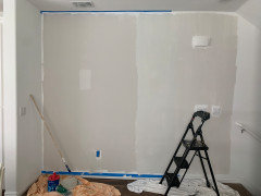
    one more photo: at times balboa mist will look beautiful with good sunlight, it shows as pink but romantic and very impressive, but not all the time, not all the places


  • 5 years ago

    I'd bring a few pieces of furniture into the area, maybe some textiles you'll be using? Let it go overnight and pop in periodically throughout the 24 hours and see what you like, or don't. sometimes it's easier to eliminate than to choose.

  • 5 years ago


    shaoyi hu thanked Marylee H
  • 5 years ago
    last modified: 5 years ago

    I have Balboa Mist in my bedrooms and it looks soooo beige to me. I really don't like it as much as I did in my old apartment where it looked like a true grey (less natural light). I have Metro Grey in my living room and I absolutely love it. We get lots of light, but even at night its a very true grey without being to dark or to blue. Everyone compliments me on it.

    shaoyi hu thanked cate erickson
  • 5 years ago

    Balboa Mist looked purple in my house. I hope my samples help. Light Pewter is a darker Classic Beige.


  • 5 years ago

    Take a look at BM Collingwood Gray. I tried about a dozen grays in a room with a large window and found it to be the most consistent. It looks more greige in a lot of photos, but on the wall I definitely see warm gray.

    If you have a lot of natural light in the room, all 4 walls are not going to look the same at all times of the day and night - or even across the seasons as the sun's angle changes. By all means, evaluate at different times, but make your decision based on the time of day you spend the most time looking at the room. And if you're going to have lights on most of the time, make those bulb selections first. I picked a blue for a bathroom based on the old existing light, but once I upgraded the fixture to LED had to start over, it made such a difference.

    shaoyi hu thanked L.D. Johnson
  • 5 years ago

    i struggled with balboa mist at first. It is in my dining and kitchen. It looked very purple like Barney purple at first. But....once I got it painted and bought things back in I am loving it. i almost repainted and had a week where I was really struggling. I don’t really see any purple anymore and love how it changes.

    shaoyi hu thanked B G
  • 5 years ago

    Thanks Everyone, I have got a sample of Classic Gray 50% percentage now, and also light pewter and will try how it looks like and share.

    I also see other people suggest many other colors, all thanks!

    @B G Nice to know that, would you mind share some photos if you do not mind

  • 5 years ago

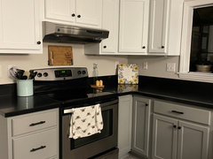
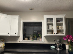
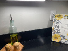
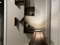
    Not the best lighting. I’ll get a some in daylight tomorrow.


  • 5 years ago


  • 5 years ago


  • 5 years ago


  • 5 years ago

    I did have to repaint my trim to be more white for it to really pop and look less purple.

    shaoyi hu thanked B G
  • 5 years ago

    wow,thanks,B G,it does not read purple

  • 5 years ago

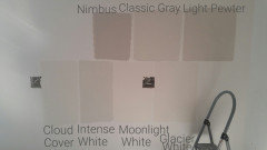
    I would like to share another photo, since I know people might be interested in knowing how each color looks like.


    From left -> right: Balboa mist, Light Pewter, Silver Drop, Classic Gray + 50%, Classic Gray + 25%

    I think a little bit and this is what my decision might be:

    1. Balboa mist is pink on my first floor (though good on second floor)

    2. Light Pewter is a beautiful color, more towards Gray than classic gray and with a little Green Undertone, to some light, it's blue and yellow, this for me looks like more a traditional light version of gray owl

    3. Silver Drop too light after standing near Light Pewter

    4. Classic Gray + 50 % is in good depth, but, it start showing up green undertone in additional to brown, but actually it's still pretty good, you may see that it looks pretty similar to classic gray + 25%

    5. Classic Gray +25% looks almost similar to classic gray, but add a little depth


    I feel like Classic Gray + 25% is still light, but the best one among all of them. I will try to paint as this, will update. Feel free to ask/discuss any questions


  • 5 years ago

    Yes, very nice! Classic Gray is a great color.

  • 5 years ago

    I agree! I painted my entire living area and hallways Classic Gray. Great choice.

  • 5 years ago

    What about cloud cover? I’m interested in that paint. Thoughts feedback?
    Thanks
    Shannon

  • 5 years ago

    Cloud cover looked green in my space. I have large maple and cedar trees around my house and large windows so that may have played a part.

  • 5 years ago

    Thanks Cherie, I will pass on this colour if that’s the case. I have lots of north light, that can make some light colours turn ICY blue. That what happened to BM paper white for me

  • 4 years ago

    Shaoyi- did yiu end up using classic gray plus 25%? i am thinking about dou g the same and curious if you see any purple?

  • 4 years ago

    We chose two Benjamin Moore’s paint colors & love one but not the other. We painted all interior walls BW classic gray & love the sophisticated calming color with no shifting undertones.

    Then we painted BM Balboa Mist on the cabinets & thought we would like it since we love Classic Gray.

    At first Balboa Mist paint appeared to be a simple beige. We were disappointed to not see a warm gray. Then it SHIFTED colors throughout the day from pink beige to a muddy peachy pink to a murky flesh color similar to a dirty peach crayon. Occasionally it has flashed a pretty purplish gray but just briefly at certain cabinets in the room. Balboa Mist may appear to be a warm purple undertone gray but its color is too influenced by its surroundings. Its dominant pinkish/peachish beige undertones show up to distort a potentially pretty warm gray.

  • 4 years ago


    Benjamin Moore’s paint colors.

    🫣🫤🙄😤Balboa Mist cabinet color- Comments so far…., ”Oh!😬 you painted your cabinets 🎀Pink!?”

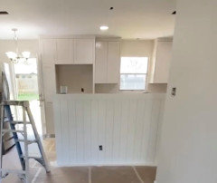
    😊Chantilly Lace paint on half wall- a clean fresh look. No undertones.

    😊Classic Gray on right side wall- a neutral soft warm gray. No undertones anywhere.

  • PRO
    4 years ago

    At first Balboa Mist paint appeared to be a simple beige.


    I agree with you, under a balanced light source Balboa Mist does look "just beige".


    And it shows up that way for a lot of people in a lot of spaces.


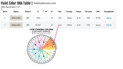
    Factually, Balboa Mist belongs to the Yellow Hue Family over near the Yellow-Red Hue Family. Right where you'd expect to find a 'warm just beige-beige'.


    Factual color notations, like Yellow Hue Family, demands specifying a light source first and foremost,


    Which is very different from subjectively judging color under random, unspecified light sources and then categorizing it into unyielding, static silos of "undertones". For example, Balboa mist has purple undertones.


    Specifying a light source is also why factual color notations can easily explain why a color looks the way it looks under different lighting and "undertones" can't.


    And because we have framework of factual notations, we can observe what actually happens with color -- and track it.


    That's the whole point of having data.


    So, what we know is low chroma colors like Balboa Mist from this hue family neighborhood can shift. It's all about the quality of light first, context second.


    Pink/peachy/fleshy with Balboa Mist comes from overtones because it is so close to the Yellow-Red hue family.


    A Purple/Purple-Blue version of Balboa Mist is due to the quality of light and context.


  • 4 years ago
    last modified: 4 years ago

    Please explain how quality lighting is achieved. What kind of light source will Balboa Mist need to look warm grayish purple.

  • PRO
    4 years ago

    Please explain how quality lighting is achieved


    Unfortunately, have to deal with the hand you're dealt when it comes to how much and the quality of natural light you have in a room.


    Adding windows and doors (called fenestration) to improve the amount and balance of light usually isn't realistic.


    Neither is changing light bulbs.


    Because even if you were to leave the lights on all day (and who does that?) the affect is comparable to spitting into the ocean and expecting it to rise.


    Window treatments that open to expose as much of the window as possible helps the most when trying to bring some balance to the quality of inherent light.


    By balance I mean a quality of light that shines a mix - or balance - of wavelengths across the whole visible spectrum. Not just warm like incandescent light bulbs and not just cool like many daylight light bulbs.


    What kind of light source will Balboa Mist need to look warm grayish purple.


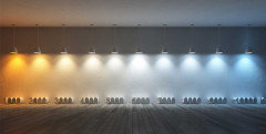
    A natural or artificial light source that is 'cooler' and shines more wavelengths from the blue end of the spectrum can make Balboa Mist show up purple.


    Again, during the day the color and kelvins of a light bulb mean nothing.


    At night, it's going to change how the color looks - and the atmosphere.


    So, it's really important that you like the vibe you get in the room from a light bulb. That's just as important as how changing the light changes a paint color.


Sponsored
AIS Renovations
Average rating: 4.5 out of 5 stars15 Reviews
Custom Craftsmanship & Construction Solutions in Franklin County, Ohio