Software
Houzz Logo Print
webuser_889213608

Mat ideas for artwork

5 years ago

Hi there,


I'm looking for advice on mat colour suggestions for a piece of artwork I'm purchasing. I'm considering white/off-white because that seems like a safe bet, but I'm not sure it necessarily works in this instance. Thanks in advance!


Comments (24)

  • 5 years ago
    last modified: 5 years ago

    if you're taking it to be framed, they'll show you tons of color options in person.


    I'd do that and see what looks good to you.

    white could work depending on the frame, but honestly it washes out the coloring. if the print is going on a dark teal or blue wall, go w/white. if it's going on a white wall, I'd prob choose a color mat.


    but a dark teal could also look nice. No off-white.

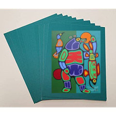
    go to the frame place and try out diff colors, like i've done here

    this red and black frame could work. Maybe the dark orange, or a lighter blue


    Maybe no mat. just place it in a black frame. or black mat/frame


    Andrew thanked Beth H. :
  • 5 years ago

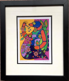
    Hard to know without knowing the colors in the room and if there are some you'd want to emphasize, but I'd go with a double mat...the inner, narrow in black and the outer, the deep purple from the image.


  • 5 years ago

    Do you already know what frame is going to be used?

  • 5 years ago

    I might try the the same neon green as the bear’s nose or the fish in hand to make it easier to grasp see that the picture is about a bear, and not an abstract design.

  • 5 years ago

    I would suggest the same as Annie did. The dark purple is found in both the bird and the bear and while not in the fish, the fish cuts across the arm of the bear where it is found. The purple ties the animals together.

    Choosing a colour such as the red for the mat then draws the eye to the middle of the bear and so missing the rest of the picture which you don't want.

  • 5 years ago

    I would probably do as Olychick suggested.

  • 5 years ago
    last modified: 5 years ago

    I feel like the all-white is too stark. This person (Etsy) did cream, black, white. But I think just cream and black would be perfect.


    I hope you’re happy — I do NOT need any more art, but now I want these!


    Update us!

  • 5 years ago

    Go to a professional framer. (Not a craft store that sells matting). I am not great at this activity and had a terrific framing place I relied on for decades. I have never felt the urge to reframe any work they did for me. Professionals will show you options right there, with single or double matting and tons of frame choices. Your eye will tell you what you love.

  • 5 years ago

    Black frame only might be nice or maybe black frame with white or ivory. I agree that colored mat is a distraction.

  • 5 years ago

    I would do a very narrow inner mat in a color you want to emphasize like the red or purple and then a split outer mat, half blue and half green. If you get a skilled mat cutter it will look amazing bc it will extend the picture. Also need very closely matching mat colors.

  • 5 years ago

    Just popping in to say I'm jealous Andrew! Fab artwork!!

  • 5 years ago

    Jinx wins w the prize - tiny black with white, and black frame. Perfect.

  • 5 years ago
    last modified: 5 years ago

    Definitely not a colorful mat. Stick with white or cream matting for a classic gallery look.

  • 5 years ago
    last modified: 5 years ago

    We framed our Norval Morriseau with a double mat, which I think adds depth and draws the eye further in to emphasize the art. A white mat is fresh and won‘t take away from the crisp colors in your art.


  • 5 years ago

    Thanks everyone for the suggestions! While I do like some of the more vibrant mat colours suggested above, I am weary of picking something that overpowers the artwork. Unfortunately, we're still under a stay-at-home order up here in Toronto so I'll be purchasing online and won't have the chance to see any options s in person; I'd prefer to play it safe with a white or off white option. There also seems to be some general consensus that this would be the way to go anyways


    I must admit, trying to make all of these decisions online is making me a little nervous and now I'm even considering skipping the print/mat route, and go with a stretched canvas option instead. Does anyone have any thoughts on that option? I recognize there are some tradeoffs here.


    Also, its great the see the community show some love for Woodland artists!

  • 5 years ago

    Black mat, burnished gold frame. When I had this picture framed, the framer suggested the black mat. I could not imagine it, but the framer was very enthusiastic about using the black mat. I made a deal with him. If I didn’t like it, he would replace it for cost. Now I cannot imagine it otherwise.


    I liked the black mat so much, I had another piece also matted in black.


    I like the way black provides a counterpoint to the vivid colors.

  • 5 years ago

    even in toronto they won't let you out to the store??


    I like the black mat with a nice frame. a lot depends on where this is going, what the wall looks like, the frame, the surrounding decor.

    Pick whatever you like. you can always redo it later.

  • 5 years ago

    A high quality frame shop will give you ideas. Don’t go in with a preconceived idea, framing is too expensive done properly. Frame the art for itself.

  • 5 years ago

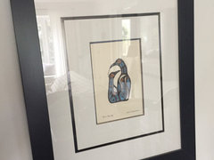
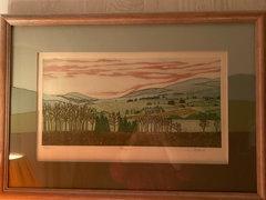
    This is an example of the mats’ continuing lines within the print


  • 5 years ago
    last modified: 5 years ago

    The hope is Ontario’s lock down will be over by the end of the month. Hope so! I would definitely wait to meet in person for a consultation, if there is no urgency. Michael‘s is decently priced, has good choices and eventually you can make an appointment. Also keep an eye out for their sales (check if framing is included).

    They may even come up with ideas you hadn’t considered, per their example below.


  • 5 years ago
    last modified: 5 years ago

    Do you have any way of experimenting at home with backgrounds for the art piece? Print it out from your computer and then put it on top of towels, shirts, sofa, baking pans, etc — everything different color you can find around the house — and see what you think?

    Important too is where you intend to place this work. Are you placing it near curtains, lamp shades, sofa/pillows or other artworks that have strong colors of their own?

    My best to everyone in Ontario. Stopping circulation to suppress contagion is definitely worth it.

  • 5 years ago

    I would wait. “Do it once; do it right” when it comes to framing. This is so hard to do via the internet.

  • 5 years ago

    Strictly personal (aren’t we all??).....but I HATE the white idea, think it totally fights with/detracts from the art. I agree the 'wait' option is best and then go to a true framing place where the person doing the framing has the 'eye' and experience to help you make a decision.