Software
Houzz Logo Print
dianne_luke

Name that undertone(s)!!

5 years ago
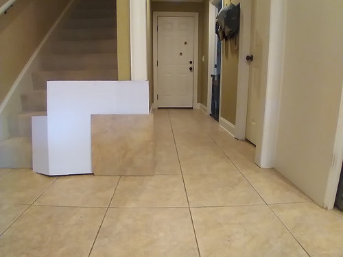

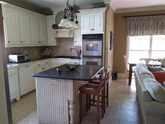
I am gathering information to make good decisions with paint, countertops and backsplash in my kitchen. Current wall color is SW Baguette and trim is SW Muslin. Going round and round with myself about the undertone(s) in my floors, please give me your input! If you need different/better pictures, I am happy to oblige.

Comments (15)

  • 5 years ago

    not sure what you are needing? your floor is yellow, gold,. are you wanting help for things to go with that?

    Dianne Luke thanked Jennifer Havin
  • 5 years ago

    Thanks for your response. I was trying to confirm what I thought I was seeing in the floor. I have looked at it so much that I was starting to confuse myself. I think that I see pink in my backsplash and orange and gold in my countertops and when I put floor tile next to it, I wasn't sure what I saw. I am keeping the floor and the yellowish cream trim. Planning on installing cream/off white subway backsplash and yet, undetermined quartz countertop where there is currently granite tile. Looking for a new paint color that will freshen up the space and a new light fixture over the island. Thanks again for your help. Any other input you have is greatly appreciated.

    .


  • 5 years ago

    I think your best bet with paint is a blue. It’ll match the style and color of the kitchen...
    I like the island countertop btw. Don’t think I’d replace it ( not sure if that was the plan or not)
    I’ll look for some lights. I think you need some French country style lighting...

    ...
    Backsplash shouldn’t be entertained until the rest of the kitchen is complete. You will do so much better that way...
    That being said, I don’t think I’d do white... very hard to match to cream... I would look at some blue options...or maybe an earthy tones organic feeling textured tile...

    Dianne Luke thanked HU-187528210
  • 5 years ago

    Thanks! Yes, I like the island countertop. It's definitely staying. Husband would be a firm "no" on white, he prefers "a color". THanks again for your help.

  • 5 years ago

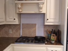
    Here's the problem with asking this kind of advice on the internet: We only see what the pictures show us, and between the different lighting, the vagaries of photography, and differences in monitors, we all see something different. I clipped the tile out of two of your images and put them side by side. You wouldn't know they were the same tile.


    I tend to think that the photo by the stairs is a truer rendering of the color (gold), and that the photo with the tile propped on the range (looking darker and oranger) had lower light levels. But I could be wrong.


    I suggest using one of the paint manufacturers' imaging tools to explore colors. They are great for capturing the nuances between similar paint colors, but they can help you assess whether blue is a good direction, or whether you like darks, mid-tone, or light colors.


    Dianne Luke thanked cawaps
  • PRO
    5 years ago

    @Dianne Luke it will be very difficult to be accurate with these images online, so I would suggest looking at the paint formula. Let whatever paint you have chosen guide the rest of your decisions. This may mean making adjustments to your wall or trim paint color so that they align. Decide on one undertone you want to go with for all of your materials. If you are sticking with your current paint colors, look at those formulas. A lot of red and yellow? You have an orange undertone. Red and blue? A purple one. Red alone? Its red. Blue and yellow? Its green. And on and on.


    Take a big swath of the predominant paint sample with you when you pick out other components. Bring samples back to your space and look at them together in different times of the day. Understand what the direction of your exposures will do to the lighting-- north facing will seem purple and shadowy for example. There are a lot of blogs online that go into this in detail, so do a search.

    Dianne Luke thanked Greta Interiors
  • 5 years ago

    You may find this objective approach to colour pretty refreshing!


    https://thelandofcolor.com/bringing-perspective-color-undertone/

    Dianne Luke thanked Marylee H
  • 5 years ago

    Your island countertop is a very good color to go with for the rest of your counters. I would see, if that could be matched. Do not pick a backsplash until you have everything else done. White is not what you need there, but, you wont know what goes well, until you finish everything else.

    Dianne Luke thanked cat_ky
  • 5 years ago

    It looks like you have a spare floor tile - take it outdoors in indirect light, place it on the white background, and you should able to easily see the dominant undertone. Indoors, the paint on the walls, the lighting (both natural coming in and artificial), and all other colors in the space counter, backsplash, accessories) will reflect on, and alter your perception of, the floor's color.

  • 5 years ago

    As long as you mention specific paint names, I have used same paint fan to pinpoint basic color [but for paint] for tile, etc...

  • PRO
    5 years ago

    I was trying to confirm what I thought I was seeing in the floor. I have looked at it so much that I was starting to confuse myself. I think that I see pink in my backsplash and orange and gold in my countertops and when I put floor tile next to it, I wasn't sure what I saw.


    A Color Muse and The Color Strategist Color Wheel would help you - a lot. Here's a PDF of the color wheel.


    And this video explains more. Jump to the 8 minute mark for how to use the Color Muse with the color wheel to find hue family for whatever you want.


    Dianne Luke thanked Lori A. Sawaya
  • 5 years ago

    I addition to Lori's link, check out https://mariakillam.com/ - she has many blogs about decorating around the color of tiles in your home.

    Dianne Luke thanked Sammie J
  • 5 years ago

    Dianne -

    Are you saying that the tile that propped up next to the stairway is the same time that is propped up behind the stove? If so, I don't think I've ever seen such a dramatic example of the difference lighting can have on color. I mean, they look totally different. Cawaps clip pretty much sums it up. There is not much hope of us helping when we're unable to see the color accurately. I'd recommend a local consultation with someone who can see your space IRL. One of the best investments we made was on color consultation and in the grand scheme it's not that expensive (our painting company provided it free for a job over XX dollars). With you also having countertops on the line, you want to be sure you get it right.

    Dianne Luke thanked crcollins1_gw
  • 5 years ago

    Yes- they are the same. The difference is pretty dramatic. I am headed towards color consult. Thanks for your input!