

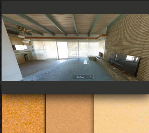
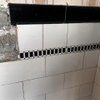
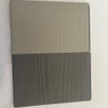
thoughts on color for cork floor
5 years ago
Sort by:Oldest
Comments (9)

Related Stories
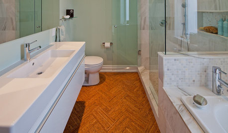
FLOORSWill Cork Float for Your Bathroom Floor?
Get the facts on advantages, disadvantages, costs and installation to see if a cork bathroom floor is right for you
Full Story
REMODELING GUIDESCork Flooring 101: Warm Up to a Natural Wonder
Comfortable, sustainable and easy on the eye, cork has a lot going for it. Use our guide to get familiar with this natural flooring material
Full Story
REMODELING GUIDESYour Floor: An Introduction to Solid-Plank Wood Floors
Get the Pros and Cons of Oak, Ash, Pine, Maple and Solid Bamboo
Full Story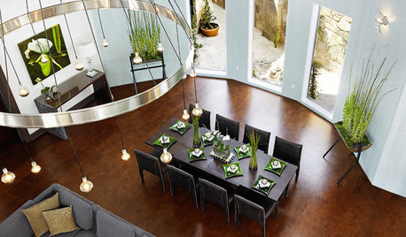
DECORATING GUIDESDiscover the Unstoppable Advantages of Cork for the Home
Look beyond wine stoppers to see cork's ecofriendliness, durability, fire resistance and antimicrobial nature for all kinds of home products
Full Story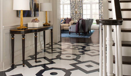
FLOORS6 Alternative Flooring Ideas to Kick Up Your Style
Rubber, cork, concrete and other materials are worthy options in lieu of hardwood or tile
Full Story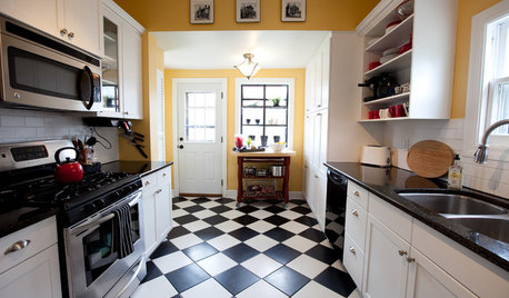
KITCHEN DESIGNKitchen Flooring 101: Find Your Material Match
From cork to concrete, our guide will help you pick the perfect surface for your kitchen floor
Full Story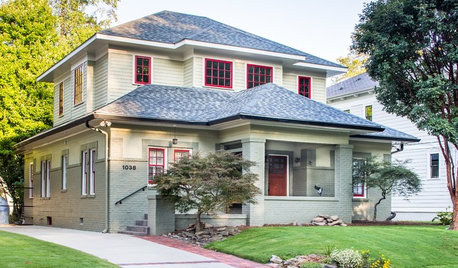
CRAFTSMAN DESIGNHouzz Tour: Thoughtful Renovation Suits Home's Craftsman Neighborhood
A reconfigured floor plan opens up the downstairs in this Atlanta house, while a new second story adds a private oasis
Full Story
STUDIOS AND WORKSHOPSPick the Best Flooring for Your Creative Space
We give you the lowdown on carpet, concrete, cork and more flooring options so you can focus on your art or craft
Full Story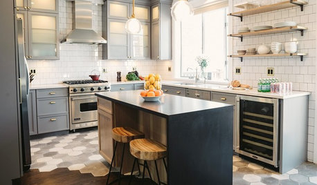
MOST POPULAR10 Tile Layouts You Haven’t Thought Of
Consider fish scales, hopscotch and other patterns for an atypical arrangement on your next project
Full Story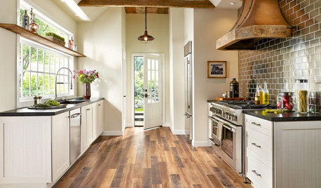
MOST POPULARPros and Cons of 5 Popular Kitchen Flooring Materials
Which kitchen flooring is right for you? An expert gives us the rundown
Full Story

Patricia Colwell Consulting
PamelaOriginal Author
Related Professionals
Guymon Home Remodeling · Charlottesville Home Builders · Panama City Kitchen & Bathroom Designers · Frisco Flooring Contractors · Stamford Flooring Contractors · Eureka Flooring Contractors · Quincy Tile and Stone Contractors · Wilmington Tile and Stone Contractors · North Platte Tile and Stone Contractors · Lewiston Kitchen Remodelers · Laredo Interior Designers & Decorators · Bemidji Interior Designers & Decorators · Keene Interior Designers & Decorators · Orlando Architects & Building Designers · Shreveport Architects & Building DesignersPamelaOriginal Author
PamelaOriginal Author
apple_pie_order
Jennifer Havin
PamelaOriginal Author
PamelaOriginal Author
PamelaOriginal Author