Software
Houzz Logo Print
hzdeleted_1220889

This Stately Veranda Makes a Statement!

13 years ago
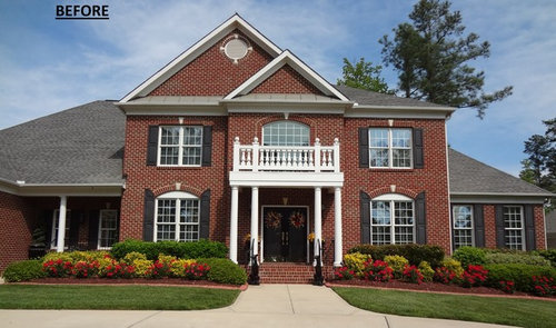
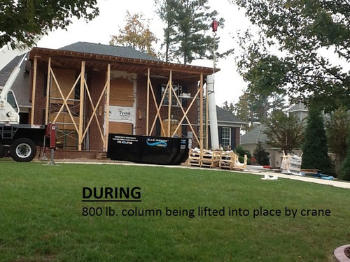
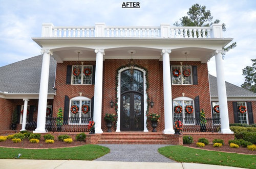
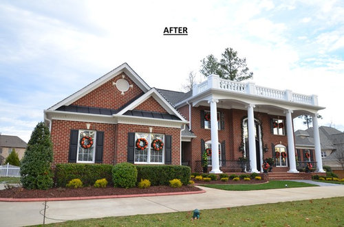
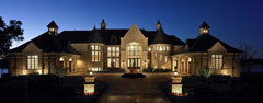
The homeowner said they wanted their home to "make a statement when someone entered the neighborhood". And that, it does! With the addition of four 20' high columns that weigh about 800 pounds each, beautiful outdoor chandeliers and custom wrought iron railings, we were able to give them the effect they were looking for. An exquisite glass and iron door adds beauty and style to the entire façade. Topped off with Venetian Scamozzi Capitals, this home is one of our favorite and most memorable projects.

Comments (27)

  • PRO
    13 years ago
    That is certainly a 'grand' entrance.
  • 13 years ago
    wasn't crazy about the house at the start and frankly I think the addition made it far worse
  • 13 years ago
    If your clients are happy, I guess this should be considered a success of sorts. Architecturally, I find this poorly designed. The new front door itself is beautiful, although too tall, but the veranda is overscaled. It's so important to get scale and tone right. The gabled wing to the right would have coordinated reasonably well with the original main house, but is a mismatch to the new main house facade.

    The statement being made here seems to be, "We don't know much about good design but we wanted people to know (think?) we have lots of money."
  • 13 years ago
    OMG ;(
  • PRO
    13 years ago
    Soberg said it best....
  • 13 years ago
    Huge waste of their money. The new additions do not go with the style of the house at all. Perhaps if they changed the rest of the roofline as well but as it sits now it just looks so thrown together.
  • 13 years ago
    LOL! Looks like a funeral parlor. I am always puzzled why money is spent on sillyness like this, as opposed to upgrading quality of materials. For example this house has alot a roof visible... upgrading to a slate roof would have been a much better move.
  • 13 years ago
    a funeral parlor or a bank. I don't understand the big columns or the veranda. all that money for what? it's put together by a committee.
  • 13 years ago
    Yikes, I thought the before picture was the awful one, just realized it could get worse when I clicked on the after. It's soooooooooooooo much. Oh well, I hope they like it, mini Tara ;)
  • 13 years ago
    Just awful! Way out of proportion and just gaudy. Sorry.
  • PRO
    13 years ago
    The plantation idea is really over, has been for some time. As a country, we've moved on.
  • PRO
    13 years ago
    last modified: 13 years ago
    The one thing that was bad before, the fake shutters, are still there!!!!
    It's too bad there weren't C,C, & Rs preventing this from happening.
  • 13 years ago
    I would like to know what thi$ little $tatement $et them back?
  • 13 years ago
    I wonder what the neighbors think.
  • 13 years ago
    vbnvbnvbn
  • 13 years ago
    Being that this is in NC, I believe that the changes are appropriate and quite nice. The overall appearance of the home is pretty fancy, "brand new" but fancy. However, I believe real shutters would have brought things a little bit more together. I'm surprised they didn't notice them and switch 'em out!
  • PRO
    13 years ago
    This is not my style by any stretch of the imagination...but you CAN do things like this the right way where there is balance and proportion.....
  • 13 years ago
    Not my taste in the least but if you're clients are happy you've achieved your main goal. I can appreciate the work it took though I don't know much about architecture and exterior design. I just know what I like and Im happily learning more. thanks for sharing.
  • PRO
    13 years ago
    One flamingo in the lawn is whimsy. 100 in the lawn is a statement. 20 in the lawn is bad taste that got carried away. Point being, if you're going to go against the grain you have to go big or go home. If you don't take it far enough it's a fail.

    That said -dang, you went big. It's not for me, but you and your client have some cojones for going there. Now it just needs landscaping that fits with the new style :)
  • 13 years ago
    Rev. Gardens, well said. I think landscaping might be the only save for this building. Cover it up with ivy and plant large trees around it. Hide it somehow!!!! Maybe they could take off the monstrosity that is the big veranda thing (on both sides) and the pillars too. make it a home, not an institution and an eyesore.
  • PRO
    13 years ago
    Hide it? No no no. You misunderstand. The point behind my flamingo analogy is you gotta OWN it. This house is a bombastic Wagnerian opera but the landscaping is Kenny G. Turn that knob to 11!
  • 13 years ago
    last modified: 13 years ago
    Now THIS would have made a statement to the hood;) rest the arrow on photo for full effect
    kevin akey · More Info
  • PRO
    13 years ago
    When I grow up I want to live in a castle...and I want a look out tower where my long flowing hair can fall down...wait that is a children's story....or a combination of two...LOL I think people should have whatever they want...hopefully they are happy with this. All of the Christmas decorations seem to indicate they are. I bet the neighbors still came to their Christmas party. ;)
  • 13 years ago
    How could they miss it? ;)
  • 13 years ago
    It looked better before the make over !!
  • 13 years ago
    I bet they don't have a Christmas party.
Sponsored
Wannemacher Interiors
Average rating: 5 out of 5 stars26 Reviews
Customized Award-Winning Interior Design Solutions in Franklin Cnty OH