Software
Houzz Logo Print
annie_b_

How to make the kitchen color scheme more succinct?

5 years ago
last modified: 5 years ago
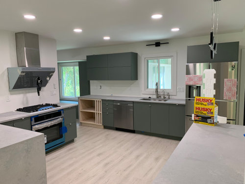
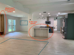
Hi so I am trying to figure out what color to paint the kitchen island because the painter messed up on staining it (either try to stain it darker on top of the current stain (Simply) white, or paint it black.

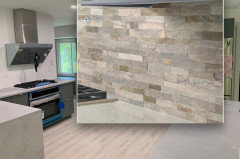
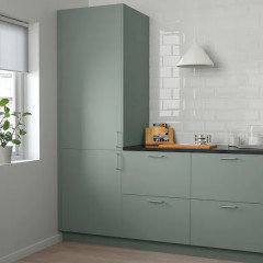
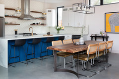
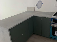
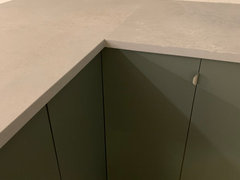
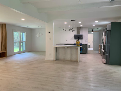
The other dilemma is the blue-gray countertops (Cesarstone airy concrete), the floors & white walls, don’t seem to clash well together. We havent picked a kitchen backsplash yet so theres room for adjustment. But i feel like the countertops & cabinet make the floor look yellow (and colors just don’t pair well), and the white walls just don’t look good with the countertop & green-gray cabinets. i considered possibly painting the kitchen wall a light gray to transition the countertop a bit more, but the problem is the walls in both sides are continuous into the dining room & living room and I wan to keep those clean and white. To the left of the kitchen is the dining area (where hanging pebble lights are). perpendicular to the right of the kitchen is the living room with concrete fireplace.

Since I cant change the countertop or the floors, any suggestions on how to coordinate the kitchen colors better?


Comments (23)

  • PRO
    5 years ago
    last modified: 5 years ago
    First, make certain you have correct lighting COOL. 400O K , THAT'S THE FIRST STEP. After that?

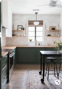
    A stone tile backsplash that brings all the tones together


    https://www.bedrosians.com/en/product/detail/glacier-white-ledger/?itemNo=SLTGLCWHTSF&gclid=CjwKCAjww-CGBhALEiwAQzWxOqCf7vp2U0gek9aua2JgWJyespL22eZQq9GUO5gUORvpl_aYuIwAwhoCf9AQAvD_BwE

    There is NO good answer after that. No answer you even want to hear. Change the tops. .......to a clean white, and paint the island deep gray as cabinets.

    The deep tone of cabinets is not causing the "yellow" issue. It's the tops.

    Failing that ? Try painting walls to a match of tops......and yup........all the way to the dining. Sorry, and WAH.

  • 5 years ago

    Hi Annie, i think i would keep the walls white, paint the incorrectly stained cabinets the same color as the rest of the cabinets. And then choose a back splash tile that helps to marry the counter tops with the white walls 👍🏻

  • 5 years ago

    Everything will look ”succinct” if you do the island the same shade as the cabinets, then pick great bar stools.

  • 5 years ago

    if you can mimic the existing cabinets with a paint shade thats what I'd do. Hard t tell what your cabinets are.......dark bottle green or more gray? anyway......the island is small enough...I dont see it as a statement. I'd want it to line up with the other great cabinets. sometimes a shade or two lighter or darker than those cabinets makes for a wee bit of interest and will set it off just enough...and leave room for bar stools to be a focus as someone mentionned. When you get to backsplash you can marry the shadings of counter with floor etc........you're doing neutrals in that sense and there are ways to do that for all of this to end up beautifully together. . there is nothing to be concerned about here. I think it all looks great .

  • 5 years ago

    Your cupboards and floor go well together. The countertop is the cool tone that jars a bit. I love Jans suggestion for the backsplash- blend it all together. Are your white walls a warmer white? All the angst that goes into these decisions!!! But when you are in there, busy with life, they don't matter and we live with what we have chosen!

  • 5 years ago
    last modified: 5 years ago
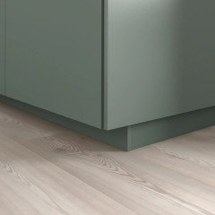
    The cabinets are ikea Bodarp Green-gray. our lighting is 3800-4000. the walls are SW Snowbound white, which is a neutral gray-white.

    For the island, i know prople have suggested green/same color as cabinets but we don’t prefer That. we want to keep it a neutral color for minimal look such as white, gray or black. ideally it was suppose to be wood but the painter stained the pine too light and stained it wrong

    the stone backsplash makes sense, but its very opposite of our style. we are going for a clean, minimal, scandinavian japan look. I’ll consider maybe a gray stone-ish backsplsh though. ANY specific tile suggestions are welcome.

  • 5 years ago
    last modified: 5 years ago
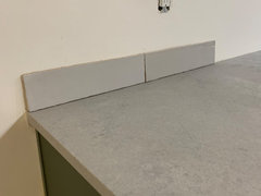
    Jan’s idea of a multi toned BS is a good one. But, her example is too rustic.

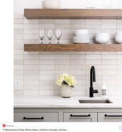
    Look at Bedrosian Chloe, in white. There are other similar tiles out there as well.

    I think the floor is fine. For me, the only time it really matters is when you are mixing wood tone cabinets with wood flooring.

    If you don't want the island the same, than of your ideas, I like black.

    You might consider a different wall color, but maybe start a new thread. I would also wait until you select a BS.

  • 5 years ago


  • 5 years ago

    Adding a carpet would bring some warmth and/or texture into the room, depending on what material you used. Maybe jute or sisal?
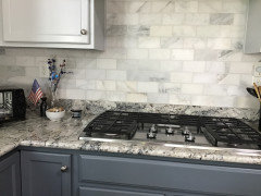
    In my kitchen i used honed marble subway tiles for backsplash and very pleased. They have just a hint of gray.

  • PRO
    5 years ago

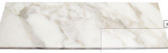
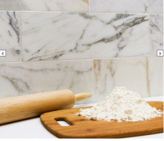
    Pine is too soft to stain really well. Match the cabinets and paint it_ don't add to the confusion Think tile is your best bet....trips to a dedicated tile store and sample boards dragged back. Start at Calacatta gold marble.........honed would be nice. Test box before any order.


  • 5 years ago

    I had honed marble too, loved it!!!

  • 5 years ago

    i'm very happy with mine; got it at Home Depot

  • PRO
    5 years ago
    last modified: 5 years ago
    Your eye is fighting to get some of the warm floor tone up onto the splash, and acknowledge the cooler tone in the tops. .........insisting on a very simple/plain gray? Way difficult : ) with green gray of cabinets and blue tone in tops. Needs the sand in the mix. Or glass mix of cool and warm grays, leaving the floor out in left field a bit.

    There's so much remodel going on? Selling whatever you can of existing tops and a switch to black or white? May be the shortest route to a kitchen you love in full. Freeing.

    I vote black / sell he mistake tops.

    The island isn't large enough, or special enough to demand another color other than the cabinet match. jmho.

    Ultimately? You are after SIMPLE .....: )


    https://www.ikea.com/ca/en/p/bodarp-door-gray-green-00435601/

    and great with the floor tone


  • PRO
    5 years ago

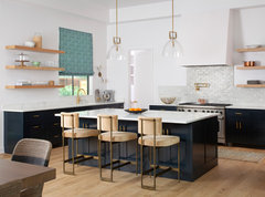
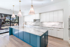
    We might just recommend checking your lighting and making sure your lights are cool and not in yellow hues. Once that is done you might try adding a nice rug to bring in some color and texture. Here are just a few of our kitchen designs that might help you.

    Rollingwood New Build · More Info


    Northwest Hills New Build · More Info


    Julius Street New Build · More Info


    Westminster Glen · More Info


  • 5 years ago

    Is this how the island was supposed to be stained? If it is not impossible to be removed and reworked in a shop, it still might be able to be modified in place. I would test whether you can sand it back to raw wood - or clad it in new wood and stain it to match that feature on the left side of the room. Maybe if it is not full of drawers and just a console like we see in the photo, it might not be a bad idea to just have it remade from sctatch. In order to viusally ballance what you have and make it look more cohesive, add that green prominently is at least two other spots (maybe a picture on the wall and in an area rug?). Add that warmer wood across the room too (perhaps in some shelving on the kitchen walls) for a little bit more balance. I dont think the problem is the white on the walls, I think what you may be having trouble with is too much monochrome and not enough contrast. The walls are fine, and they're fine with the countertops. Right now the kitchen is very visually heavy on that side of the room and it just needs the balance I mentioned.If you cannot get the island the color you want, paint it to match the cabinets or go really bold with a whole new color like a blush or marigold, but you dont need more white. Good luck.


  • 5 years ago
    last modified: 5 years ago
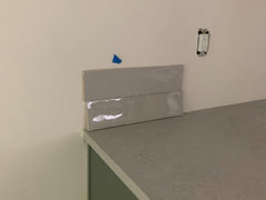
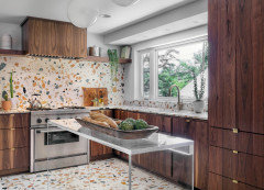
    @Therese N love that middle white one! beautifully subtle! too bad that one is out of stock at tilebar 😭

    the island was stained Miniwax simply white- however it didnt turn out the color I expected , but i also think the painter stained it wrong…. and by the time he finished it was too late. so debating whether to keep it that way or paint it a different color, however I really really wanted it a nautral wood color. the pine is a cheap quality as well.. so that might have been the problem as well. I dont think we will paint it a color (green/blue/ etc) since we don’t like a lot of color (the kitchen cabinet is the most colorful we’re going to get and even that turned out more colorful than we expected). also since the wood is not good quality if we paint it a color you will see the wood defects/unevenness even more.

    and to others, our lights are already as bright as possible (we also have both options of lighting available- in 4000’s and 3800’s separately so lighting is not the issue). Also FYI the range is sealed, its not actually blue. Its a silver.

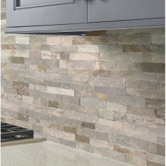
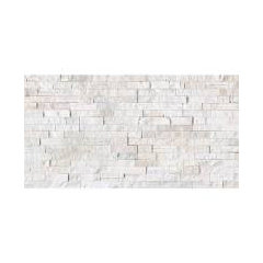
    we will most likely pick a backsplash either same color aa countertop or something white or gray to reflect the color more and run it up to ceiling or to the vent hood at least. Here are options we are looking at

    1)


    this tile is literally exact same color as the countertop. Kind of a blue-gray color. this would be a safe choice? we would do a straight pattern, not subway

    2)


    Warm-grey tile- matches floor to bring in the warmth. however I really don’t like beige and it looks a bit beige to me


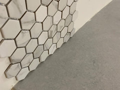
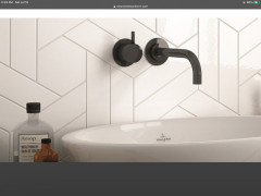
    Mosaic hexagon white and gray marble. However this might be too much texture/shape because we have a lot of vertical slat lines throughout the main house already (and its open concept so you see everything). however we have hexagon tile in our upstairs bathroom & we have marble backsplash for downstairs guest bath so the pattern would match

    Photos were mostly taken at night so lighting wasnt the best

    may look for some other options on tilebar..

  • 5 years ago

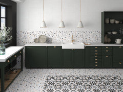
    Don’t give up on that white terrazzo. You might find it somewhere else or similar tile. I don’t think I’d do that grey tile. It matches great, but you may want to stay on track with something that combines your white & greys. To avoid clashing all the texture, I’d stay away from long narrow tiles and use a different shape like hex or triangle, but do it in a larger size. Scale is the key to mixing patterns. I’ll check with my fav. local shop to see what they have in stock. Where are you located?

  • 5 years ago

    https://www.ceramictileworksmn.com/scale/

    https://tile.expert/en-us/tile/ape/trendy/i/ape-trendy-2

    So that white terrazzo will be back in stock really soon - I’d encourage you to see if you could reserve some or get notification. Otherwise, I’d still strongly encourage you to get a tiny bit more adventurous and consider something like this that ties your space together a bit more. The last photo shows another pattern available with those solid tiles in the first link.

  • 5 years ago

    @Therese N okay thanks! I'm still hesitant if I want white because currently look at white walls i dont feel like it matches the floors well, so I thought adding some subtle color like the blue gray would look a little better, but still thinking on it. Im located in Atlanta, GA. So i went to floor & decor and plan to go to tileshop tomorrow (although i dont think tileshop will have much more variety of the style im looking for but we will see )

  • 5 years ago

    Oh, I forgot to mention… another way to tie colors together like this is grout. If you got a white tile you could use matching grey grout to highlight the pattern

  • 5 years ago
    last modified: 5 years ago
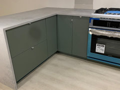
    @Therese N hm would white grout on white tile be too much? I prefer it clean. But yeah i'll consider that! I guess it depends on what tile i get


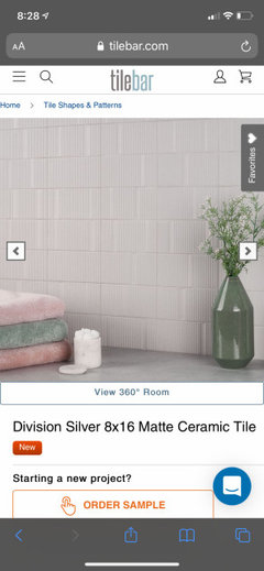
    also considering this tile in silver or white, i like the texture. thoughts? i will be ordering a bunch of samples.


  • 5 years ago

    It’s personal preference. That’s a cool tile. Worth getting a sample. My only thought is cleaning the part above the stove. Maybe they have coordinating flat ones too.

    Annie B. thanked Therese N