Software
Houzz Logo Print
pearlseyes

Stacked or Staggered? Like?

5 years ago
last modified: 5 years ago
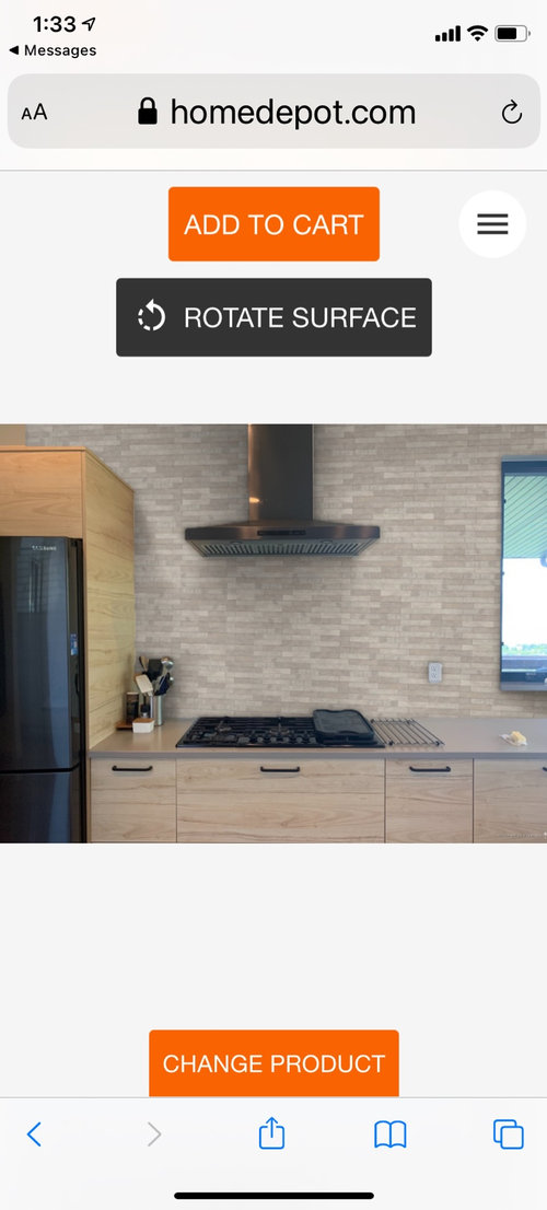
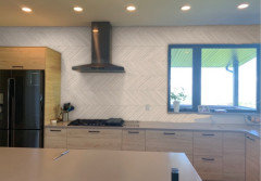
After four years, I think I’ve finally decided on a backsplash for my kitchen. Should I stack or stagger it? I have a modem home with a minimal aesthetic.

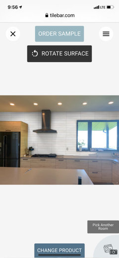
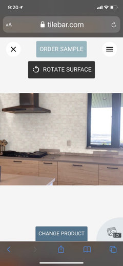
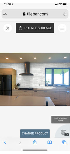
Home Depot visualizer used Capella Ivory brick. Do you like?


https://youtu.be/DTNckRy-GVw

stacked
Staggered
Pick a new tile

Comments (28)

  • 5 years ago

    the staggered shown in the pic is a 1/3 overlap - I kinda like that.

    Alecia Mickelsen thanked just_janni
  • 5 years ago

    Staggered. But long thin tile as backsplash is pretty dated. Perhaps you don’t care so that’s great. But I thought I’d give you a heads up.

    Alecia Mickelsen thanked M Miller
  • 5 years ago

    @M Miller I didn’t know that. What would you suggest?

  • 5 years ago

    @rebasheba Thank you for your feedback. I've been second guessing myself. The size is 2 1/3 by 10. Is that outdated? Do you think it looks nice with my kitchen or do you possibly have another suggestion that suits my style? I only have my hubby and son to give me input and they just don’t care. Heheh

  • 5 years ago

    Not a pro. Your OP picture shows the tile at about 1/2 size, which may be what's causing people to say it looks dated. I think the stacked look doesn't work as well with tile that has a lot of variation (could be personal preference), so I would say staggered. However stacked looks more modern IMO. I just wouldn't pick it with that particular tile.

    Alecia Mickelsen thanked anj_p
  • 5 years ago

    I love stacked, I think it's so much more interesting and modern.

    for some reason it looks really dated to me staggered, so the pattern really does make a big difference. (the way it's staggered in the home depot screenshot-- it looks like that stonework everybody was putting on their fireplaces a decade ago.)

    Alecia Mickelsen thanked User
  • 5 years ago

    Great question. I originally picked the staggered but, as I read the comments, I'm questioning myself. I'm for whatever looks modern.

    Alecia Mickelsen thanked tc9876
  • 5 years ago

    I'm thinking I have chosen the wrong backsplash since a lot of feedback is hinting at it being dated. The last thing I want is for it to look a decade old. Maybe I need to post a video so everyone can get a feel for my space. I need a backsplash because my walls are taking a beating behind my gas range and sink. I just can’t seem to find anything that works with my counter top and modern aesthetic.

  • 5 years ago

    Here is a video to get a better idea. I also have concrete stairs leading to my loft next to the kitchen.

    https://youtu.be/DTNckRy-GVw

  • 5 years ago

    @Alecia Mickelsen I really like your kitchen. What type of cabinets do you have? It is modern to me.

  • 5 years ago

    It looks dated in the Home Depot mock up because as someone above noted, it is showing as half size or smaller in the mock up. Those little tiny tiles are super dated. But the actual size of the tile showing in your kitchen is not dated at all.


    I quite like the tile and think it looks really nice in your kitchen. Funny though that the stacked is a much more modern look and I am quite a fan, but i'm not sure if i like *this* tile stacked. And the staggered looks more ordinary in your kitchen with this tile. Sorry i'm not helping much! But i also think you've chosen a lovely tile!

    Alecia Mickelsen thanked H202
  • 5 years ago
    last modified: 5 years ago

    I'm thinking I have chosen the wrong backsplash since a lot of feedback is hinting at it being dated.

    honestly, I think stacked will make it look great. it's only the staggered pattern I don't like for this particular tile. what I like is how organic it seems, so it's not ultra modern.

    however, upon second glance, the color kind of matches the tone of your cabinets and countertop too well. overall it could look pretty bland. consider stacked tile but in a lighter color or white?

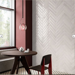
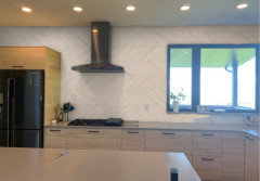
    like, imagine this tile in a stacked pattern, not herringbone. it's from tilebar:


    Alecia Mickelsen thanked User
  • 5 years ago
    last modified: 5 years ago

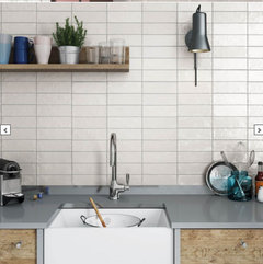
    or if you wanted to keep that organic feel, look for tiles that have a slightly uneven texture:


    Alecia Mickelsen thanked User
  • 5 years ago

    @User Do you know which tile your second pic is from? Funny thing...before you sent your last response, I was on Tilebar and selected a pretty similar tile as your first pic. I don't like the layout but it was the only option.


  • 5 years ago

    @tc9876 They are Ikea cabinets in light ash.


  • 5 years ago

    I thought they might be. I would not have thought they could look that nice

  • 5 years ago

    they're from Tile Bar: https://www.tilebar.com/montauk-gin-2x8-ceramic-wall-tile.html

    these ones from Lowes look identical: https://www.lowes.com/pd/Nassau-38-Pack-Gin-Ceramic-Common-Actual-8-in-x-2-in/5001251323

    the color name for both of them is "Gin" so that makes me wonder if they're basically the same tile under different brands?

  • 5 years ago

    I love your cabinets. I would get a simpler tile and make sure you see it in person.

  • 5 years ago
    last modified: 5 years ago

    I have to agree with the comments that just in the HD pic, the tile looks to be a dated look, and is perhaps deceiving. In your "vote" pics, it looks good. The colors go well with your counter and cabinetry, which is hard to do. I prefer the staggered. I don't like how the stacked echoes or extends the vertical lines of your base cabinetry - a bit too much vertical lines for me.

  • 5 years ago
    last modified: 5 years ago

    @pearlseyes I think what works about what you've chosen is that it is very modern (i think elongated rectangles look great and a nice change from standard subways) while the texture and color variegation softens the look. In that way it harmonizes with your kitchen, which is crisply modern but has natural touches like the wood grain.


    If you look at for example Cle tile they have several products of thin, long tiles and they look stellar, not dated.


    Also, if you like them that is what matters most here! That said, if you are not fully convinced, maybe this thread is showing you you aren't totally in love with these.

  • 5 years ago

    What about vertical stacked?

  • 5 years ago

    What about these?

  • 5 years ago
    last modified: 5 years ago

    I love #1!

    #4 is cool, but I think herringbone is on it's way out. (I personally love herringbone, but I wouldn't want to commit to anything expensive.)

  • 5 years ago

    Alecia- Have you tried to see what stacked vertically looks like?

    That is a modern fresh look, and I think it would look good in your kitchen!

  • 5 years ago
    last modified: 5 years ago

    From your last set of pics, I like #2. I strongly dislike #3. Not #4 either cause I think herringbone would not be right in your kitchen. As for the stacked, I just don’t like the looks of stacked tile. I don’t have a specific reason. I just think staggered looks much better, and you won’t get tired of it.

  • 5 years ago

    I think stacked tile fits so well in your beautiful kitchen. I prefer horizontal stacked to vertical, but that’s me. I don’t know if you’ve seen Heath Ceramics tile, but I think it would look just perfect. Fireclay Tile might be worth a look, too.

  • 5 years ago

    Stacked is more modern to me. but would not stack a busy tile

Sponsored
Mary Shipley Interiors
Average rating: 4.8 out of 5 stars34 Reviews
Columbus OH Premier Interior Designer 10x Best of Houzz