Software
Houzz Logo Print
hzdeleted_19691726

Still thinking about painting this tiny room ...

5 years ago
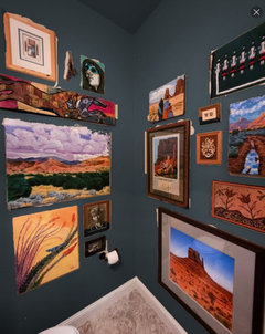
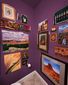
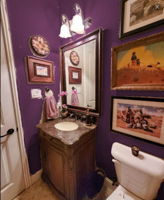
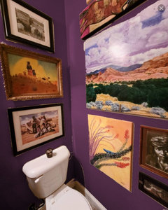
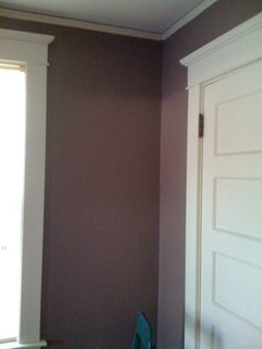
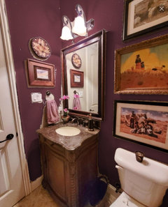
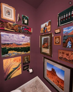
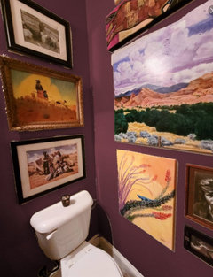
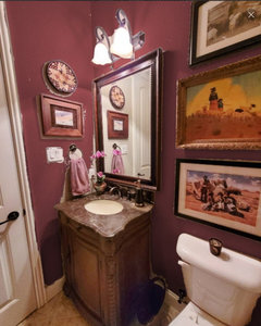
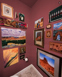
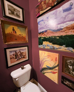
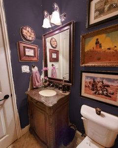
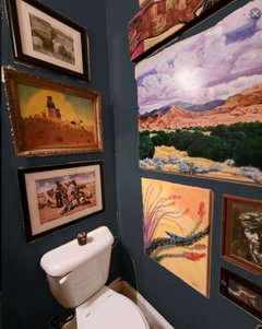
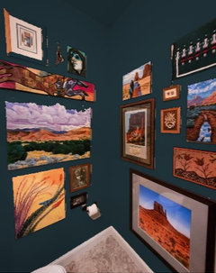
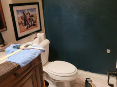
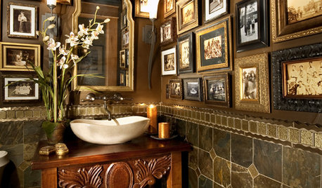
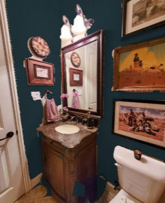
I've posted here about it before but never did it. From time to time the idea of painting our powder room, which is right off the foyer, comes to mind and won't rest for some time. It's back again. It may be a little more compelling than before too... I'm feeling more confident about making a change, somehow. And heck, it's a small space so no huge commitment involved. Following are pics of the room, which has been hung pretty much floor to ceiling with a collection of Navajo themed art pieces that are special to me. (Some of you may know that I have adopted Navajo grandparents, and the culture has long had a place in my heart.)
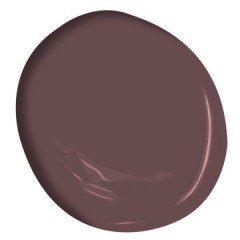
I'm looking closely at Benjamin Moore Shadow, which seems like it might be the right shade of dark, dusky purple. I don't want anything too saturated, which I fear could come across as cartoonish. What do y'all think about this color? Any other suggestions?
I have considered wallpaper, but would much rather paint. Would certainly appreciate your thoughts on color, or if you think it's left well enough alone as it is.

Comments (91)

  • 5 years ago
    last modified: 5 years ago

    On my screen, Caponata gets my vote. Close second is Deep Purple. That said, I've been led astray by BM colours on my screen before. Quite a few of their test strips have looked nothing like their website renderings so I strongly recommend you start by getting test strips of all these yummy purples in your space. Won't take you long to see which ones have the more harmonious tone with your flooring and vanity.

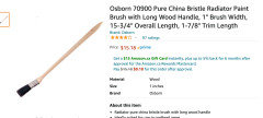
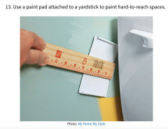
    Protect your surfaces well and finagle something to paint those slivers of exposed walls! :) (If Trailrunner's pics don't convince you to run to the paint store this morning.. :D) Long radiator brushes exist but maybe you can tape a narrow brush on a bit of yard stick? And then there are paint pads. Would a sponge brush be easier to use for those spots? They can be easily cut to a better size. You're bound to find a proven technique with a more thorough Google search than mine. Test out the techniques on poster board before trying them on your wall. Can't imagine you'd need more than two light coats in both these tight spots (one feathering behind the vanity on its right side would be more than good enough for my lazy ass :P).


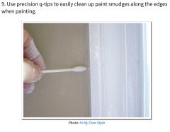
    Not sure how good this tip is for clean up (pardon the pun) but I wondered if it would be a good tool to deposit paint (for the right side of the vanity)?


    Good luck!! Looking forward to the after pics. :)


    ETA: Applying a sample stick-on piece might work, but not sure how long-lasting it would be - ?


    I know, it's not a perfect solution but it's a powder room. Probably doesn't get as much humidity as a regular bathroom. This sample stick on idea might end up being a lasting "interim" solution. Heck, I was going to suggest sliding a painted poster board behind the vanity. :P The baseboard might complicate that idea though. But really, those bits of wall do not have to be "perfect" to look good.

    User thanked tartanmeup
  • 5 years ago
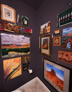
    The Kalamata is nothing like that picture! its SO much deeper. you will definitely have to get strips to see the actual color. My photos are much more accurate. good luck! c

    User thanked User
  • 5 years ago

    Thank you for the clever ideas! I'm really leaning towards the thought that "where there's a will, there's a way." First things first though: We don't even own a stepladder that's the proper size to use in this very small room, but we're ordering one from Amazon, probably this week. (Need it to change out some fluorescent bulbs in a closet anyway. DH said, "How have we lived in this house for 6 years without a 6' stepladder and managed not to die yet?" ;-) )


    I may order some sample sheets today. I'm also going to look at other brands, as I do like BM but am not married to it. Actually, if Lowes had something I could just pop in and pick up, that would be ideal, as there's a store very close to my house.


    I see exactly what you mean about the Kalamata, Trail. It does look much deeper in your pics, whereas in the BM Visualizer, it has almost a mauve quality about it. It's very pretty either way though! That said, the powder room is a tiny dark little space, with only the 2-bulb fixture above the vanity for light. I think any paint color is going to tend to look darker in there than it would in a room that receives natural light.

  • 5 years ago

    I visited in a home once that had a powder room painted a deep dark purply blue. It was stunning! I think it would be wonderful in your powder room too.


    You might consider LED bulbs in your 2 bulb fixture. If so, use them while you are sampling paint to you get the same rendition of color. I like 3000K - 35000K bulbs which I percieve as less murky than the 2700K bulbs that are supposed to mimic an ordinary incandescent bulb. I believe you also need to look for a CRI (color rendering index) of 90+ but that is a rabbit hole I’ve never gone down, so you may need to do a little reading about it.

    User thanked bbstx
  • 5 years ago
    last modified: 5 years ago

    This is BM Elderberry Wine. I really like the slight tinge of red undertone. Thoughts? (And yeah, I know it could look vastly different on various monitors and in person.)


  • 5 years ago
    Perfect!!!

    User thanked User
  • 5 years ago

    I’m not sure if I have a good sense of the color of your counter — is it a bit mauve-y? If so, some of the colors may not be a great combo with the stone.


    Another one to check out, maybe — BM Cinnamon Slate. We have this on our exterior doors.


    User thanked Sueb20
  • 5 years ago
    Hmmm ... I'm really liking this one. BM Radicchio:


  • 5 years ago
    I tried Cinnamon Slate, but it's not as dark as I'd like.

  • 5 years ago

    I like the Radicchio better than the Elderberry which is too purplish for my personal taste

    User thanked 3katz4me
  • 5 years ago

    Yeah, I'm starting to think I don't want the room to look like a purple dinosaur blew up in there. I'm leaning now more towards a reddish purple, maybe a little to the cordovan side. (Of course, DH likes the purpley ones. But he did say "whatever you think best", bless him.)

  • 5 years ago

    BM Pottery Red. Not purple, but surprisingly I feel quite drawn to this color!


  • 5 years ago
    last modified: 5 years ago

    Ida, have you considered something like the first photo wall color in Annie's post upthread? In fact, if you look at some images of the Wadsworth Atheneum, there are some very compelling wall colors.

    User thanked Bunny
  • 5 years ago

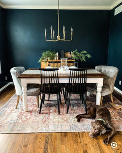
    Have you tried BM Stunning? I'm not good at undertones, but it's purple and not grapey. We painted our LR, kitchen and entry way this spring, and almost went with Stunning, but in the end chose Old Navy. Your bathroom is such a small space and with a deep, saturated color, I would use BM Aura Matte Finish (so velvety!), so your lovely art really pops. Here's my LR, the dark walls really sets off the art IMO.


    User thanked lakeaffect_gw
  • 5 years ago
    last modified: 5 years ago

    I do like the Atheneum colors. I particularly like that pumpkin shade, but it's very close to something we had in our previous home at one time. I think I'm ready for something completely different. I looked at BM Stunning, but it didn't seem quite right in the visualizer.

    I quite like BM Black Raspberry.


    Or at least I think I do, until I start looking at all the other 38,975,194 colors.

  • 5 years ago

    I also love the top two colors in Annie's post but I'm all in on orangey reds! Ran across another option - BM Dark Walnut


    User thanked rubyclaire
  • 5 years ago

    Um ... I may have just fallen in love, folks.


    BM After Midnight:


  • 5 years ago

    Sorry ... I know I've veered into annoying territory long ago. One more that I'm loving - BM Velvet Cloak:


  • 5 years ago

    I prefer those last two over the more grapey ones posted earlier. They become the background instead of the story.

    User thanked Olychick
  • 5 years ago

    Well put, Oly. I was thinking the very same, but didn’t have the words for it.

    User thanked Bunny
  • 5 years ago

    Yes, Oly, perfect way to describe it! I think it may come down to one of those two.

  • 5 years ago

    The Velvet Cloak is how my walls look in real life and the pics I posted above.

    All the more reason to get samples. I did use Aura Matte and it does give a beautiful finish.

    User thanked User
  • 5 years ago

    I think I'll send DH to pick up sample pots tomorrow of After Midnight and Velvet Cloak. We do need to test how they'll look in that little space, for sure.

  • 5 years ago

    So would you recommend the Aura matte over eggshell?


  • 5 years ago

    I love Velvet Cloak. So Sophisticated.

    User thanked mtnrdredux_gw
  • 5 years ago

    I think I prefer it too, Mtn. Of course DH likes After Midnight. 🙄

  • 5 years ago

    You are putting it in a bathroom so Im not certain if using Matte would be advisable. I domt know how much splashing you get in there! Eggshell will have a sheen to it but the Matte in a very dark color can show everything. Talk to your paint store.

    User thanked User
  • 5 years ago

    I ended up with the Martha Stewart color because all the BM colors were too bright and not grayed down enough for me. So I would suggest looking at other company's colors. Keep in mind that if you like BM paints, they can pretty much mix anyone's color for you.


    BM Aura products are not supposed to show streaks. Even in our Mbath which is light in color, the paint is marked with streaks from water splashes as we reach for hand towels and such with damp hands. It's spendy, but I think it would be worth it. If I repaint our mbath, it will be with aura paint for sure.


    As far as finish, I like a higher gloss on paint that is darker, so I would probably go with pearl or satin. Just be aware that the higher the gloss, the more difficult the application. Going back to touch up spots will show as the added layers increase the gloss.

    User thanked Annie Deighnaugh
  • 5 years ago

    Velvet Cloak! And I love the name too hehe

    User thanked Bumblebeez SC Zone 7
  • 5 years ago
    last modified: 5 years ago

    BM Aura in the really dark Matte does ” burnish” when it is rubbed against. I have been using very dark colors in various Matte finishes, including Aura, from BM since 2007. They all burnish when dry contact rubbed against . The bathroom is tiny and contact will be inevitable. I would definitely use a ” finish” that IS touchy 😊 but with as little shine as possible since as Annie says touchups will have issues.


    None of this stopped me from using very dark colors in my AL house in lots of rooms including the powder room for the swimming pool! And here in our VA house I have the very dark green on the kitchen walls including behind the gas Blue Star with NO backsplash! Go for it. c

    User thanked User
  • 5 years ago
    last modified: 5 years ago

    We are going to get a sample of SW Dark Night too ... it's a deep blue black with decidedly green undertones.


  • 5 years ago

    This is going to be lovely. I love the Velvet Cloak, but the After Midnight mockup really made me swoon. I think it really plays so well with the art.

    User thanked localeater
  • 5 years ago

    Fwiw, @User, I got a very different feel looking at your latest Visualizer pictures on my phone this morning versus my laptop. The colours were cloying, not welcoming at all. :( I was quite surprised. Sharing because to me, it's another example of how untrustworthy screen pics can be.


    I like how Olychick expressed the colour should be the background and not the story. I think that's your aim as well. When you say you're getting a sample of SW Dark Night, do you mean a test can or a test strip? Because I wouldn't buy a test can of any paint before checking out a slew of paper test strips in the space first. Gets expensive quickly. Annie mentioned the BM colours being too bright. I had trouble finding pinks I liked in BM colours for this reason. They were all too saturated. You mentioned a Lowe's near you. They have Valspar, right? I'm not familiar with their paint at all but yes, most of these places can mix any colour OR paint match a colour you want. They can paint match practically any item as long as it's not too reflective. Maybe there's a piece of pottery or a sunset in an artwork that's inspiring you? (Just a thought, not a wild goose chase, I hope. ;-)) Lighting was also mentioned. That is crucial, of course. Artificial lighting can be difficult to optimize.

    User thanked tartanmeup
  • 5 years ago
    last modified: 5 years ago

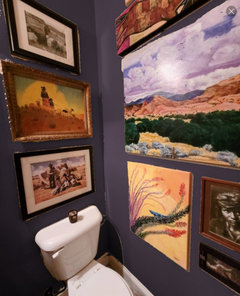
    The more I ponder (and it seems like ALL I have been doing for the past 48 hours is pondering paint!), the more I lean towards a deep, inky blue. It seems that my initial idea of a purple shade just won't quite work with the flooring and vanity, and we've only got a paint budget right now, so those things won't be replaced. DH really liked BM After Midnight, but I fear it may be more black than I really want. I'm excited to see what SW Night Sky looks like in the space -- and DH is picking up a sample pot as I type. :-) The SW visualizer gives these mockups, but I know it'll look different when actually on the wall.


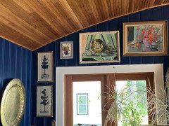
    ETA: I was, in fact, inspired by a nearly identical color in a painting that hangs in our workout room. It's a color that sort of draws me in, and makes me think of being in remote places as dusk fades to darkness, watching little bats flying above my head.

  • 5 years ago
    last modified: 5 years ago

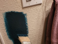
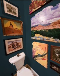
    So ... a little drama unfolding around here! I painted a swatch of Dark Night and instantly said yep, that's it. This bit is still drying, but I'm already loving it. It's going to take forever to finish this, but it'll be worth it. I hope!


    I need a roller and need to buy a gallon of paint, of course. Probably will take 3 coats for optimal coverage.


  • 5 years ago

    Wowzers!

    User thanked Zalco/bring back Sophie!
  • 5 years ago

    Excellent choice!


    User thanked Annie Deighnaugh
  • 5 years ago

    My art is going to pop, pop, pop!

  • 5 years ago

    Beautiful! I had a DR with Real Navy on the walls in AL from 2002-2017 when we moved. Never tired of that rich color. Perfect choice.

    User thanked User
  • 5 years ago

    Gorgeous

    User thanked localeater
  • 5 years ago

    Gorgeous color!!

    User thanked amykath
  • 5 years ago

    So stunning!

    User thanked roarah
  • 5 years ago

    Love the color!

    User thanked rubyclaire
  • 5 years ago

    Perfect! Can’t wait to see the finished room!

    User thanked bbstx
  • 5 years ago

    Ooo, that looks like a nice deep colour! You're quick to move forward. (And more agile than I am a painter! I'm too much of a klutz to even think of opening a can of paint in that room before removing the art and covering everything. I'm impressed.)

    User thanked tartanmeup
  • 5 years ago

    Gorgeous!


    User thanked teeda
  • 5 years ago
    last modified: 5 years ago

    Ida, I need an update! I can't wait to see more paint on your walls.

    User thanked Bunny
  • 5 years ago

    I love, love the inky blue!! Excellent choice and cant wait to see it all back together with your neat art.

    User thanked OutsidePlaying
  • 5 years ago

    It totally says "you" to me, (well, from what limited knowledge I have of you from this forum, lol!) Not that the other colors wouldn't have also been nice, I liked them all. But just from other things I have seen from your home, etc., it seems like a great way to go. Almost can't go wrong.

    User thanked l pinkmountain
Sponsored
NME Builders LLC
Average rating: 5 out of 5 stars2 Reviews
Remodeling Company in New Albany, Ohio