

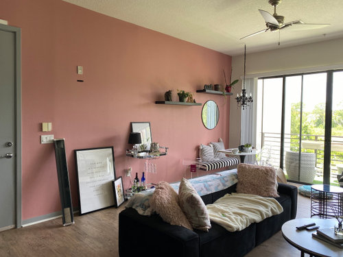
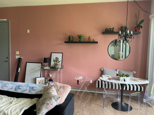
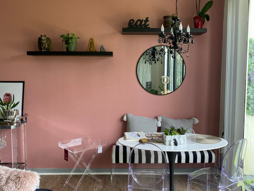
Help Create Balance on Wall
5 years ago
last modified: 5 years ago
Featured Answer
Sort by:Oldest
Comments (13)
 5 years ago
Related Professionals
Chillicothe Furniture & Accessories · Macon Flooring Contractors · Dover Interior Designers & Decorators · Port Saint Lucie Interior Designers & Decorators · Kalamazoo Interior Designers & Decorators · Gillette Interior Designers & Decorators · Spartanburg Kitchen & Bathroom Designers · Clarksville Kitchen & Bathroom Designers · San Jose Interior Designers & Decorators · Plymouth Architects & Building Designers · Saint George Architects & Building Designers · Decatur Kitchen & Bathroom Designers · Vineland Kitchen & Bathroom Designers · Murfreesboro Kitchen & Bathroom Designers · Clearlake Kitchen & Bathroom Designers 5 years ago
- 5 years ago
 PRO5 years ago
- 5 years ago
- 5 years ago
- 5 years ago
 5 years ago
- PRO5 years ago
- 5 years ago
- 5 years ago
Related Stories
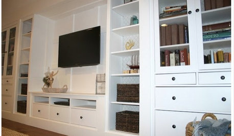
DIY PROJECTSHow to Create Your Own Semicustom Media Wall
Don’t let the price of a custom built-in stop you. Put one together with ready-made pieces and a little finish help
Full Story
COLORPick-a-Paint Help: How to Create a Whole-House Color Palette
Don't be daunted. With these strategies, building a cohesive palette for your entire home is less difficult than it seems
Full Story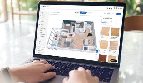
HOUZZ PRODUCT NEWSHouzz Pro 3D Floor Planner Helps You Quickly Create 3D Images
Help clients visualize their remodeled spaces in 3D with Benjamin Moore paint colors and wood, carpet and tile flooring
Full Story0
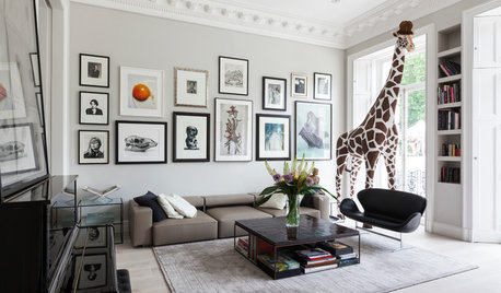
ARTAn Insider’s Guide to Creating the Perfect Gallery Wall
Bring your room to life with these expert tips for grouping artwork and photographs
Full Story
FEEL-GOOD HOME8 Ways to Create a Home That Helps You Recharge
A cozy corner for napping and an area for outdoor fun could help you find new sources of energy
Full Story
DECORATING 101Interior Design Basics to Help You Create a Better Space
Let these pro tips guide you as you plan a room layout, size furniture, hang art and more
Full Story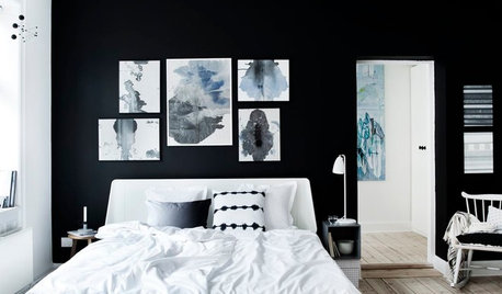
WALL TREATMENTSHow to Create a Feature Wall (Without Going Back to the ’90s)
Paint can be your friend in creating the feature wall 2.0
Full Story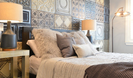
WALL TREATMENTSIdea of the Day: Tin Tiles Create a Striking Accent Wall
A bachelor's bedroom has the industrial style he loves but also is warm and comfortable
Full Story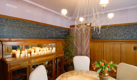
DECORATING GUIDESHow to Create a Great Dining Room Wall
Shelves, candles, stonework, wallpaper and chalkboard paint make dramatic backdrops for feasts
Full Story
HOUZZ PRODUCT NEWSHow Houzz Pro Helps Designers Create Fast, Beautiful Proposals
Stay top of mind and win more projects with branded proposals and documents that showcase your professionalism and skill
Full Story0


Maureen