Software
Houzz Logo Print
recordaras

Is this too much gray for a tiny guest bath?

5 years ago
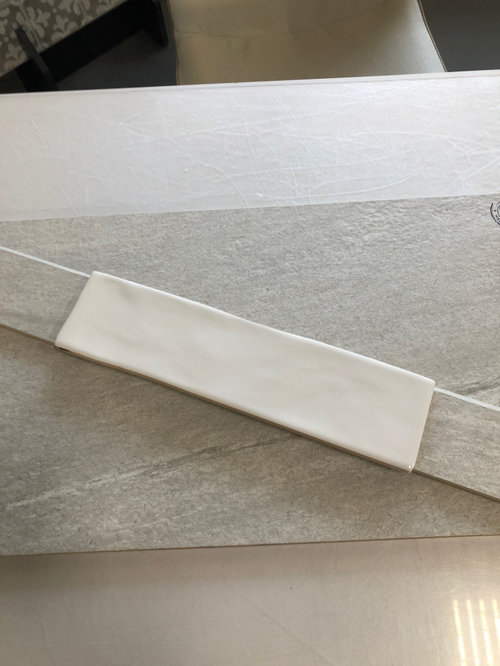
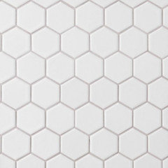
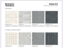
Tile will be the end of me! I finally found a tile I really like - it’s the Bedrosians Urban 2.0 in Nova White, in real life it has an almost iridescent quality that’s very pretty. I was thinking about doing it on the tub walls and floor of our teeny guest bath, and to do a white tile behind the vanity. My designer just got back to me saying it will be too much gray for such a small space - arghhhh. What do you folks think?

Comments (46)

  • 5 years ago

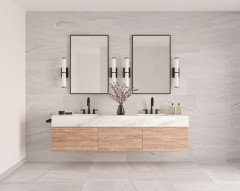
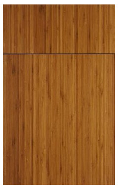
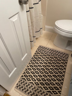
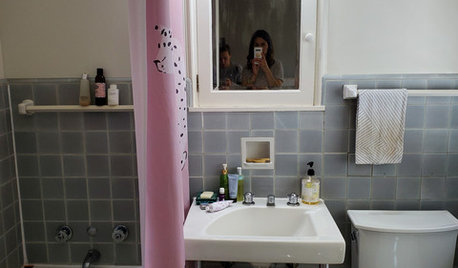
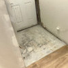
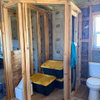
    Apologies for the photos, the space is so small it’s pretty much impossible to take a decent picture. Here’s a promo photo of the Bedrosians, and the Designcraft bamboo finish I’ve selected for the vanity (this can still be changed). Counter is supposed to be Caesarstone Vivid White.

  • 5 years ago

    It is your space, use the tile you love.

    Put in layered lighting in the daylight spectrum

    Paint the walls a white that ties everything together

    Looks cool

  • 5 years ago

    A small guest bathroom needs a light finish. Gray and white is a good combo. Use 50-50 or 40-60 gray and white, with only white next to the bamboo. Don’t use shiny slick tile on the shower floor or bathroom floor...a slip hazard when a wet foot meets glossy smooth tile.

  • 5 years ago

    Thanks Rawketgrl. I’ve found it absurdly difficult to find a porcelain tile I love, so the thought of starting over is pretty painful.

  • 5 years ago

    It is not matte vs polished that effect how slipperly a tile is look for the coefficient of friction rating.

  • 5 years ago

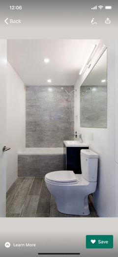
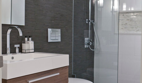
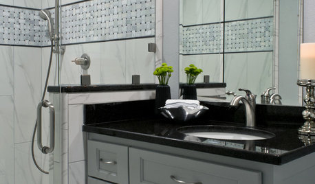
    Do you folks think that doing something like this - with white on the two short tub surround walls along with the vanity wall and gray on the large tub wall and floor - would look better? We are not tiling the side of the tub like in the photo, that will remain white.

  • 5 years ago

    I hear ya! Tile is pretty personal and I like that yours is not subway! So overdone.

    Go with what you have picked and then white choices for everywhere else and it will be lovely.

  • 5 years ago
    last modified: 5 years ago

    Is this a tub or shower only? Shower pan or tile?


    I would would the 12x24 on shower walls and bathroom floor. No tile behind vanity. Paint the walls white. Do a hex on the shower floor if not using a shower pan


  • 5 years ago
    last modified: 5 years ago

    With that bamboo vanity, you won't have too much gray

  • 5 years ago

    This will be a regular tub/shower combo. We unfortunately need some kind of backsplash by the vanity and I was hoping to avoid the standard 4” counter piece.

  • 5 years ago

    Are you keeping a shower curtain or using glass? If you stick with a white shower curtain you can use whatever you like behind the tub. If you use glass, I like the gray on the floor and the back of the tub area, with white behind the vanity on on the short side of the backtub walls. But I think the gray is fine also the way you intended it. Maybe the designer is concerned that the gray doesn't relate to the rest of your house?

  • 5 years ago
    last modified: 5 years ago

    We are keeping the shower curtain! I’m glad to hear that so far nobody has any major concerns about the gray. The other colors around the bathroom are BM Nelson Blue (a grayish blue) in the bedroom, and Balboa Mist in the entry, as well as Spring Bud in my daughter’s room. Our trim through the condo is Decorator’s White.

  • PRO
    5 years ago

    I like it a lot! Especially in a smaller space - it will be very cohesive. And it's not too much gray - you have a white tub, white tile on the feature wall, a white toilet and I would assume white paint on the walls.

    Please tile to the ceiling in your tub area though...

    Good luck!

  • 5 years ago

    Thanks! Yes, definitely tiling all the way up - the ceiling in that room is pretty low to accommodate some duct work, so not planning on drawing any additional attention to that.

  • 5 years ago

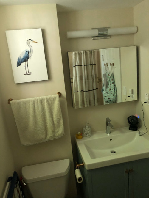
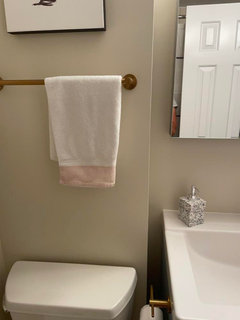
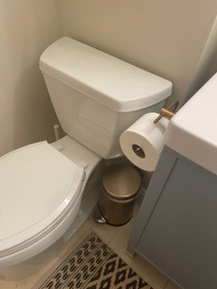
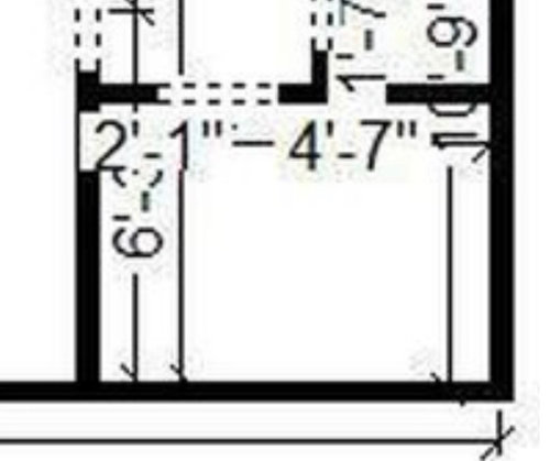
    And as an aside, I was considering adding a couple of inches to this silly bumpout wall so that it goes all the way to the vanity. Can’t decide if it will make the space look more cramped or make the whole setup look more intentional. I’d love to hear your thoughts!

  • 5 years ago

    Cant clean in the gap..... so make it go all the way to the vanity. Neater and easier to clean floor around toilet.

  • 5 years ago

    That’s actually a good point that I didn’t consider - our current vanity has legs so cleaning there isn’t an issue, but the one we’re getting will have a toekick so it will definitely be problematic.

  • 5 years ago

    I wouldn't move the wall. It will make the sink area more cramped, and it's only a few inches to clean so not a big deal.

  • 5 years ago

    This is my biggest concern considering how small the space already is. I had considered using some filler to move just the cabinet out, but then the light would be off center (it’s centered on the vanity, not the wall) and I’m already spending a small fortune on electrical with this remodel, not really wanting to add more to that.

  • 5 years ago

    Gorgeous wood for the vanity! Not too much gray, IMHO rooms look smaller when you start to add too many colors and patterns. Your color scheme will make it feel soothing and spa-like. Please use tile on floor with high coefficient of friction so it is less slippery when wet. Rather than move the wall, add a filler piece to that side of the vanity, that is done all the time to fill gaps. If you later feel the room needs a pop of color, add color in the towels and wall art.

  • PRO
    5 years ago

    Bit hard to tell how the samples you posted will be in a small bathroom area in real life. In the once photo you posted as an example (medium gray on the tub wall and floor) doesn't seem very pleasant. Accentuating the tub wall and matching the floor tile actually seems to make this particular space seem smaller and more cramped. For a very small bathroom like your I might suggest all white for the walls to make the space visually expanded. Flooring can contrast and provide the space a base to anchor too. Good luck!

  • 5 years ago

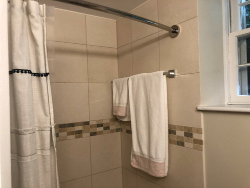
    You can’t see in the photos but right now the floor and wall tile are the same - and while it would not have been my first choice (a pinkish beige), the result doesn’t strike me as offensive. I just threw a rug on the floor to cover some of it up. Hoping the gray will be a similar neutral backdrop. I think white might be a little too “sterile” for the space if that makes sense.

  • 5 years ago

    Another option could be to do one of the slightly darker colors in the same series on the floor, will have to head back to the showroom to see how they look together.

  • 5 years ago

    Stick with the lighter gray. Don't second guess yourself. Your new photo shows how tight the space is, so you want it light - no big contrasts in color.


  • PRO
    5 years ago

    I would not pad out that wall - it will make the vanity too squished!

  • 5 years ago

    If the light lines up over the faucet, don’t worry about adding the filler piece at the gap. The light and faucet will fool the eye into thinking it is fine. The countertop a few inches longer to reach all the way to the wall over the filler piece is done all the time by the pros to make the vanity look custom.

  • 5 years ago

    Hmm. Well since the vanity is custom we could probably get the next size up which is 33” that would go almost all the way to the bumpout wall… only issue is that it’s going to be pretty tight next to the toilet - there’s already barely any room for the tp holder and elbows. I believe that was my rationale behind going the 30” vanity and extended wall route vs 33” vanity and existing wall.

  • 5 years ago

    Must you attach the TP holder to the vanity or will guests have more leg room with a movable freestanding one?

  • 5 years ago

    We actually started out with a free standing one and there was no good spot to put it unfortunately! But I just took another look and with the toilet bumped out like that it’s actually not as bad as I thought and doesn’t affect elbows, just the tp holder. We could probably get creative with some holder solution (maybe a free standing with smaller base than we had before, or one of those weird vertical ones). Oh my god the designer is going to kill me if I throw one more change at her at this stage. 🙈🙈🙈

  • 5 years ago

    Okay told the designer that we are sticking with the gray tile and 33” vanity instead of building out the bumpout wall. Still need to find shower wall and floor tile for our master bathroom, but we seem to be nearing the end of the planning process! Cabinets are 20 weeks out though, so remodel isn’t planned to start till January. I am both excited and terrified, ha.

  • PRO
    5 years ago

    You need to keep 15" from the center of the toilet to either side. That is a code in most areas - sometimes even 18" . So keep that in mind when shopping for your vanity size and centering it in that space


  • 5 years ago

    Nothing in that bathroom is to code unfortunately - it’s 12.5” from the wall and currently 14” from the vanity, and we’re on a concrete slab so redoing the toilet rough in isn’t going to happen. It’s a 1940s building converted to condos in the 80s with lots of quirks.

  • PRO
    5 years ago

    Sorry - I guess if the vanity is shallow enough that it doesn't interfere with the " seat " then you could go wider. It's a comfort thing too. I had a toilet in a 24" space. On the one side was a tub with a curtain so it didn't seem that bad, but once a glass door went on there- forget it! Good thing I was changing out the vanity too. I made it 3" smaller and while not perfect it felt like I added a foot!

  • 5 years ago

    Yes that was initially my thinking behind sticking with the existing 30”, but because the toilet is bumped out about 10” from the wall it actually strangely works out - the front edge of the vanity hits far enough towards the back of the seat to not get in the way. Now finding a spot for a toilet paper holder will be a challenge, but I think I’ll take that over living with that gap.

  • 5 years ago

    Have you tried TP holder hung on side wall? 8-12” from toilet seat and the TP horizontal bar 26” from the floor? FYI, building code is usually the exact middle (center line) of the toilet must be at least 15” from the faucet (not from edge of vanity) and 30” standing room in front of the toilet. So adding 3” to one side of counter won’t affect the faucet or toilet placement. 30” of wall space to side of toilet should allow for a wall hung TP holder.

  • PRO
    5 years ago

    It is okay and will be better with more lights!

  • 5 years ago

    The previous owners had the holder on the wall so we got to try out that arrangement - unfortunately it really gets in the way, especially when you are opening/closing the curtain of the window right above it, but I will definitely revisit once everything is in place!

  • 5 years ago

    Oh and to give you an idea of how not to code this bathroom is - not only is there just 12.5” from the side wall to center of toilet, but I just measured and toilet to edge of tub is a whopping 13.5”. 😂 We’re in a major city, so living space gets… interesting. Not quite NYC levels of interesting, but you learn to live with many things that I am sure are shocking for many Houzzers. :)

  • 5 years ago

    Your room is compact so every inch you save is essential. I see a problem with leg room in front of the toilet, you must feel squished in that space. I know you want to eliminate large costs but since you’ve hired a designer it tells me you want to get this right. Have you thought of using a wall mount toilet? It will initially cost more but will take up less room from every side and it will be so easy to clean around. Wall mount toilets have been around for years in Europe and are now becoming popular in North America. They are usually sold in high-end stores, but look on line they are also sold on Wayfair, Overstock and Amazon for less than in the stores. You need a pro to install it - the water tank goes behind the drywall, hence the space saving.

    I agree with other comments above that you should keep your tiles simple and neutral. In your photo I saw (what looked like) a light grey floor tile with a linear white tile. Those tiles together will look great. Good luck.

  • 5 years ago

    Thanks - if this was our only bathroom I would definitely look into that, however this being a guest/kids bath (my daughter is only 2.5, so who knows if we’ll stay here long enough for it to become “her” bathroom) I’m not sure I’m ready to get quite that ambitious! That bumpout behind the existing toilet is almost certainly a whole giant can o’worms that I do not have it in me to tackle right now.

  • 5 years ago

    And an aside, but I’ve been using the guest bath for the past 6 months or so - ever since we noticed that the walk-in was leaking. I’m originally from Europe so that probably helps, but I actually really enjoy the compact size. Cleaning is a breeze and everything you need is within arm’s reach. And once the master is finished I’m sure it will feel HUGE!

  • 5 years ago

    Is it an elongated toilet? Definitely switch to a round bowl.

  • 5 years ago

    If the vanity is custom you could ask for a recess into the side cabinet of the vanity.

  • 5 years ago

    I hope you’re sticking with your initial plan. It doesn’t seem like too much gray to me in a small space that needs mainly o e color plus white. I get the toilet paper holder problem! Been there!

  • 5 years ago

    RedRyder I am going for it! Hopefully it will turn out well. Now if only I could figure our the master bath tile…