Software
Houzz Logo Print
ideliver144

Neutral wall color for Master Bedroom

13 years ago
last modified: 13 years ago
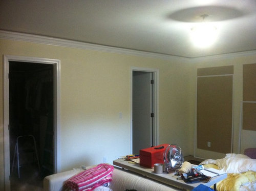
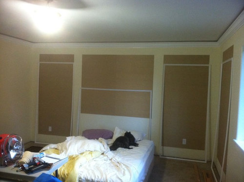
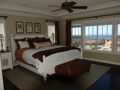
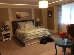
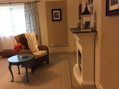
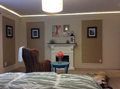
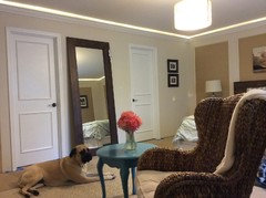
I am inept at choosing "cream" or "off-white" colors, they always turn out very nice, but not what I was going for, Yellow! In the midst of mounting the trim moulding around the grasscloth panels I panicked and halted the entire project to search for another wall color. Keeping a tropical, beachy theme in mind, I want to go with a neutral tone and bring color into the room with curtains bedding etc. The fourth picture is our inspiration photo.

Comments (46)

  • PRO
    13 years ago
    You are right the yellow isn't working. Take the lead from the color of your grass cloth. Go a couple of shades lighter with the same undertone for a monochromatic look. This will give a nice cohesive backdrop for your bright accessories.
    Toni Morgan thanked Color Designs
  • PRO
    13 years ago
    Those screens that I can picture either side of the bed are distracting. I agree with the previous post, go lighter with the same color... throw some nice texture in, and, are you near a beach??
    Toni Morgan thanked Sustainable Dwellings
  • 13 years ago
    Is it a large room? What are the dimensions? Those grass sections are a neat idea, but I think it breaks up the space too much, as it seems you have sections of them on 3 walls? If you want to keep it beachy and less formal I would maybe not trim them out. It's hard to see what style you want. Do you have a picture of the furniture you are putting in the room?

    I agree that you should keep in the same tones of the grass cloth. I would even bring in a piece of it to the paint store, as they can then provide some options.
    Toni Morgan thanked evamdesign
  • 13 years ago
    Thanks for the input. We went to the paint store and brought the grass cloth with us. We found a color to do just what you all suggested. We got Sherwin Williams, Moderate White. Sounds boring but it should work.

    The room is fairly large? 14x18 we were using the grass cloth panels to break up the space and a place for our photography.

    The beachy the theme is more if a color scheme than theme. I want to use beach glass blues and greens. We have a bed and two nightstands in the garage being painted and plan to purchase a pair of chairs with side table.
  • PRO
    13 years ago
    Toni, Moderate White sounds a little light to me. You might want to consider going down one more to 6141 Softer Tan. Just a thought.
    Toni Morgan thanked PaintColorHelp.com Dallas
  • 13 years ago
    That was fast! :) I am not sure of the color as it is always best to see it live so to speak. I would suggest painting a section of your wall alongside a grass panel the new color, and if it is too white as was suggested, it is super easy to go back to the store and they can add more color if needed. What color are you painting the bed and nightstands?
    Toni Morgan thanked evamdesign
  • 13 years ago
    the dog looks really happy and comfy :) love your inspiration photo. I agree about the moderate color that you got, after all it could be moonlight :)
    Toni Morgan thanked mousemaker
  • 13 years ago
    Are you mounting the inspiration photo above the fireplace? It would be great there.
    Toni Morgan thanked Dar Eckert
  • 13 years ago
    Seems like too much contrast between the light yellow and grass-cloth but when you have the other colors in the room the contrast will be minimized. The greens and blues in there will definitely take center stage. It will be lovely.
    Toni Morgan thanked Dar Eckert
  • 13 years ago
    I am painting the bed a dark brown and using a custom color glaze (left over paint) for a faux bios finish, I was going to do the same for the nightstands but I am up for suggestions. I realize I need to post more photos for real ideas.

    The Inspiration photo will go above the fireplace! The photo was taken the day of our wedding in Hanalei, Kauai. Good memory for the bedroom ;).

    Mousemaker, that is actually my kitty! we call him 13 pounds of fuzz and love :)

    I appreciate all your feedback, now I get to paint ..... again.
  • 13 years ago
    I'm looking at your inspiration photo (beauty!) and wondering if you've considered going with a watery green/blue, like the colour of the sky in the upper left of the photo, as a wall colour.
    Just the voice of experience, but it really is worth it to do some test patches to audition your wall colour. I usually grab a sheet of Bristol board and make a giant paint chip to live with for a couple of days.
    You don't want to walk into a colour you hate 1/2 the time because of the way it reacts to artificial light.
    The dark brown bed will be the weight of the silhouette of the headland in the photo, and would really anchor a 'sky, sea, and sand' wall.
    You could go with classic canvas white bedding (duvet, shams) and incorporate a wonderful variety of ocean colours in pillows, maybe a bed runner. And some nice soft metallics. Maybe a little mercury glass, something bronzey like the sunset on the sea. I think maybe a real colour on the wall won't fight so hard with the grass cloth panels.
    Sorry to go on at such length, but that inspiration photo is REALLY inspirational!
    Looking forward to the evolution of your lovely room....
    Toni Morgan thanked beeloved
  • 13 years ago
    now that I look more carefully :) of course it's a kitty!!! :) we used to have three, one was quite hefty :)
    I think BEE loved ideas are good...live with the colors for a few days and see how you like them.
    Toni Morgan thanked mousemaker
  • PRO
    13 years ago
    The Moderate White is not dark enough to balance with your grass cloth. If the undertone matches then move to the Softer Tan. Also look to the colors on the strips on each side of the Moderate White. SW 6148 Wool Skein is a beautiful color I have used in a client's house. For a little more yellow on the other side look at SW 6134 Netsuke. Don't be too limited in your samples and make them big. Do your ceiling in a lighter version of your paint choice not pure white as in your trim. Definitely pull that beautiful blue into your room. You've been given some good advice in this dialogue.
    Toni Morgan thanked Color Designs
  • PRO
    13 years ago
    Don't forget to post a photo of the finished project when you get chance ;)
    Toni Morgan thanked Fotoviva Art Prints
  • PRO
    13 years ago
    Benjamin Moore-white sand would look great
    Toni Morgan thanked Bluebird Hill Interiors
  • 13 years ago
    Take a sample of the grasscloth and have them colormatch the paint to it. Very easy and great way to match something specific. I also would paint the panel trim the same color as the walls; more cohesive that way. Incorporate the grasscloth or similar fabric as window coverings, lamp shades, and even as a covered headboard. Good luck
    Toni Morgan thanked alwaysdesigning
  • PRO
    13 years ago
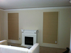
    The soft blue would be good on the ceiling, and if it's in the budget, I'd change the fireplace or remove it. Seems to be too small in scale with the panels, and doesn't seem to go with the feel you are creating. Also seems too low to be seem from bed.................
    Toni Morgan thanked Defined Design
  • 13 years ago
    Benjamin Moore Swiss Coffee
    Toni Morgan thanked venturgirl
  • 13 years ago
    Ben Moore has a beautiful neutral - Wicker- that is soft, yet changes a bit with the light...will get darker in the eves and has a beautiful peachy pinkness in the sunset...good luck. I love the grass cloth panels
    Toni Morgan thanked NANCIE BOUDREAU
  • 13 years ago
    All my neutrals used turn out slightly yellow until I discovered Benjamin Moore's Edgecombe Grey - highly recommend!
    Toni Morgan thanked homelodge
  • 13 years ago
    There's a great beachy color I used years ago for my former beach house - herbivore. It's not really a green not really a grey. Dunn Edwards had it in California, and several others will be able to match it.
    Toni Morgan thanked Heather Feldman
  • 13 years ago
    Just painted a guest room in Ralph Lauren Cream Stone..........creamy, muted off-white with gray. Just enough color with white trim!
    Toni Morgan thanked worth05
  • 13 years ago
    1. Creamy SW7012, Sherwin-Williams
    2. Acadia White OC-38, Benjamin Moore
    3. Manchester Tan HC-81, Benjamin Moore
    4. Edgecomb Grey, HC-173, Benjamin Moore
    Toni Morgan thanked Kicksychick
  • 13 years ago
    Sounds like you already chose- my best advice in choosing any color is you need to bring the samples into the room where your are painting and see what it looks like in different lighting/times of the day etc..it will save you from making another mistake and having to repaint!
    Toni Morgan thanked Amy Stanley
  • 13 years ago
    We have just painted a guest room with Bittersweet Stem, # SW 7536. It is from the Sherwin Williams' HGTV Home, Rustic Refined collection. We really love it. The room faces East, and the light coming in is not making the color go pink, green or yellow. It is a very nice neutral beige color. We had tried over 85 color samples from many stores before the whole family all choose this as our favorite. We are also using a white trim. Try it you might like it.
    Toni Morgan thanked phenix81
  • 13 years ago
    Benjamin Moore Linen White is an oldie but goodie. It is a creamy white.
    Toni Morgan thanked mountainglory
  • 13 years ago
    I think we could all suggest colors until you are totally confused....if not already. The issue here is to diminish the contrast between your grass cloth and the walls, including the moulding trim. My suggestion is to find a colour strip at the paint store that has your grass cloth colour on it and then select your other paint colours from it, going either lighter or darker. Where you live and what kind of natural light you have little control over or what kind of artificial light you introduce, will affect any colour you choose at different times during the day. The real truth is you will never know for sure how the whole package is going to look until it is all done, lit, draperies hung, bed made and other design elements in place. As in any painting, the introduction of another colour changes the look of every other colour already in place. As any artist, a decorator needs to test and reject and modify and change. There is no one right solution up front to ensure a perfect room. It's all about adding, eliminating, modifying.
    Toni Morgan thanked briancare
  • 13 years ago
    creamy or off-whites always have undertones of another color ,blur, pink,green, etc. compare your color chip to a true white to determine the undertone that you want to compliment the grass cloth
    Toni Morgan thanked lpllb27
  • PRO
    13 years ago
    briancare has it right. Lots of good paint colors suggested and ones that I would have recommended. I would also paint your moulding around the grassclosth the same color as the walls. That way you have the texture but not too busy with your furniture and other items going in.
    Toni Morgan thanked User
  • 13 years ago
    OK, First I appreciate all the feedback that I have received! Briancare summed it up very well for me in regards to diminishing the contrast between the moulding, grasscloth and walls, changing light, added color etc. I know a lot of you thought darker paint but we went with the Moderate White. The color changes between natural throughout the day and artificial at night are very subtle. Once the room was painted we noticed that the contrast between the moulding and the grasscloth was very stark and looked cheap and I remembered the advice from alwaysdesigning and tried a sample of the moulding with the same paint color and the difference was amazing. I dreaded painting the moulding, I'm pretty good with a brush but the space and time needed was going to be very daunting. No to mention we already had two installed. I took the paint swatch to the store with me and actually sprayed it in the aisle onto the swatch. ; ) I was able to match the Moderate White with a Rustoleum heirloom white spray paint almost exactly! We finished putting the moulding up last night and are very pleased. I posted pictures, but obviously we have a ways to go and again I appreciate all of your input. Beeloved, thanks for the design tips, dreams of mercury glass in my head and DefinedDesign I am hatching plans for the fireplace. Hope you appreciate the step ladder nightstands LOL, next trend for DIYers?
  • 13 years ago
    Looks great!
  • 13 years ago
    Wow, fantastic job! I love the colour. Creamy and soft without reading yellow. Congrats on a great choice. Just revisiting the fireplace. It does make a nice focal point for your sitting area. Maybe you could raise it on a little plinth and paint it a darker colour to give it more presence and minimize the contrast with the 'firebox'. (My thanks as well to briancare re: diminishing contrast). I don't know how you'll bring yourself to part with the stepladder night stands, but I'll be interested to see what you replace them with!
  • 13 years ago
    Another soft white to perhaps check out...Benjamin Moore White Down. I had been looking for a light, creamy shade to run in hallway off our beachy family room. Like you, I was trying to steer away from it being too yellow. After many tester pots of off whites, we landed on this one and very happy with it!
  • 13 years ago
    It is all about the inspiration photo. Pick up the blue...try Wyeth Blue by Benjamin Moore for walls Ceiling would look great picking up the grasscloth color...check out the BM historical colors. Another cool possibility is to wallpaper the ceiling with creamy background and little stars with gold accents! Dreamy. The trim needs to be beefed up if possible....needs to make more of a statement, be more important. Trim color should mimic the off white color in the photo...BM linen white perhaps. The ceiling light should be replaced.... with a wicker woven look ceiling fan.
  • 13 years ago
    rinqreation has it all right! (See above post) the grasscloth should be a feature Not something to disguise milky sea blue from the inspiration photo pairs beautifully with the grasscloth color (also in the photo) Nature does it best! the molding around the grasscloth should enhance the look. Bigger more important molding needed for that. it looks wimpy now...like an afterthought.
  • 13 years ago
    I like the subtle blues instead....
  • 13 years ago
    I like the blues also and did view the picture that rinqreation posted, however I did not want to commit to blue color for the walls. I am a woman who frequently changes her mind, partly due to fantastic sites like houzz.com and I wanted the ability to change out the more trendy things like pillows, bedding, curtains, lamps and yes even the inspiration photo. I believe the the color I chose will allow me to do that without changing all the main fixtures of the room
  • 13 years ago
    bee-loved, I think the ladder nightstands are a beach theme, right? they're like life guard posts! :)
    and I agree, the color looks great. once you get the bedding and lighting, etc. all set you will love it.
  • 13 years ago
    Antique white...not quite as yellow as the one you have chosen...it's kind of a tannish white, looks great with any color, I particularly like it with white trim. Have seen it available in most every brand of paint, think it is a standard color.
  • 13 years ago
    IMK Color Consulting
    I would go deeper. Grasscloth is so beautiful and rich looking I would select a color that is a deeper shade of the grasscloth. Keep trim, furniture and drapery white and use Asian styled dark wood for coffee table, end tables; a ceiling fan with blades that look like fans; large plants in baskets. It will give a British Colonial feeling and I think it will be very fresh.
  • 13 years ago
    I think your fireplace needs a larger, more substantial mantle on top to ground it a bit better...you could extend it out to the edges of your grasscloth inserts, perhaps use wood the color of driftwood (an actual piece of driftwood made into a mantle would be excellent, but a piece that large would be difficult to find).
  • 13 years ago
    I see a plug behind the fireplace, so if it's electrical, please change it's casing or remove it, it adds nothing tropical to your room.. If you're crafty enough, you could use some old pallets or faux stone to build a new mantle around it. (like gypsyrose also suggested)
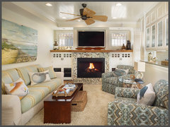
    Coastal Living · More Info

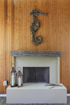
    Sophisticated Beach · More Info

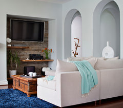
    Moonlight Beach - California · More Info

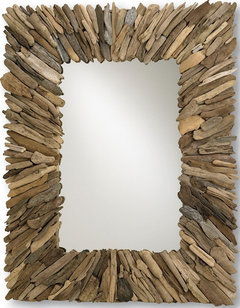
    Currey & Co Beachhead Mirror · More Info
  • 13 years ago
    If this is a bedroom I'd go with a nice soft sky blue. It's a very soothing color so great for a bedroom and still very bright. You've got a lot of neutrals in the room already. The grass cloth, the carpet color (which IMO give you that tropical beach sand color) and white trim. Use the blue and you'll bring in the sky/ocean color then use some more vibrant accessories to make things pop and really get that tropical vibe you're looking for.
  • 12 years ago
    Almost one year later....
  • 12 years ago
    last modified: 12 years ago
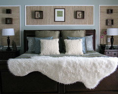
    Turned out great...looks like an antique white that you went with....notice the entire color scheme goes with the dog perfectly, should have used him for your inspiration :)