Software
Houzz Logo Print
jennifer_brostrom76

Will backsplash match kitchen and countertops??

5 years ago
last modified: 5 years ago

Hello, All.

We are mostly through our kitchen reno.

Still need to finish some custom cabinets, install island lighting and repaint for the 9th time (not joking... but also not liking the toned back blue-green that I tried to find a hue of the cabinets).

The following is a list of the items in our kitchen, some pics of the kitchen and then the backsplash that I'm thinking of using.

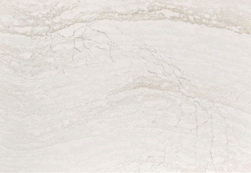
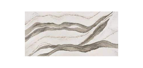
  • Island Countertop: Cambria Skara Brae (quartz)
  • Perimeter Counterops: Cambria Ironsbridge (quartz)
  • Kitchen Cabinets are from Kraftmaid in:

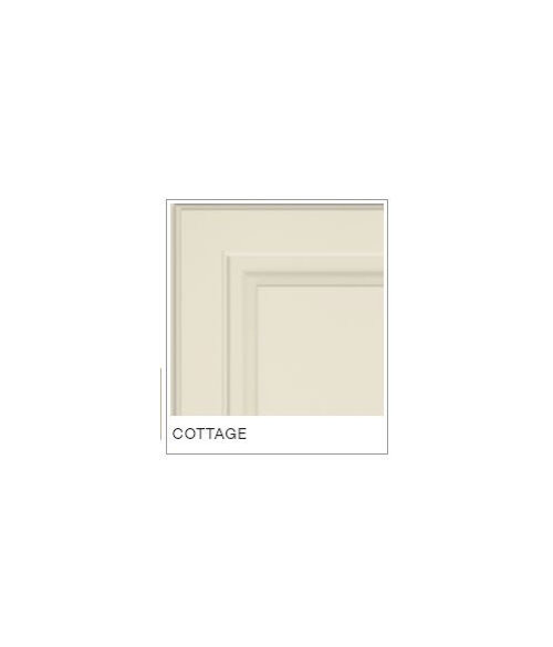
"Cottage" (cream) - Most uppers & base cabinets

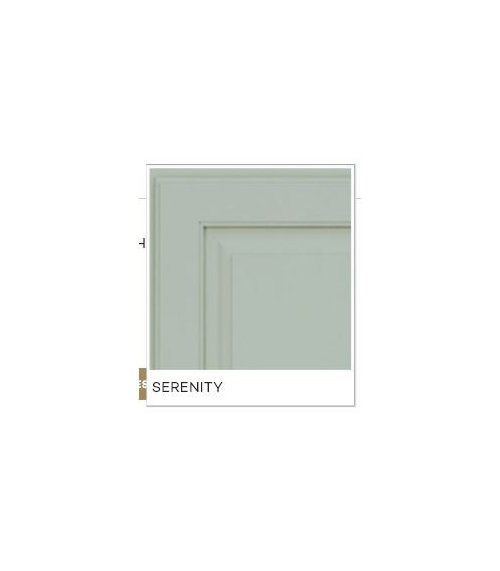
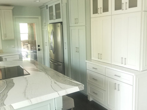
"Serenity" (blue-green) - Island & some full-height pantries & pullouts surrounding the refrigerator

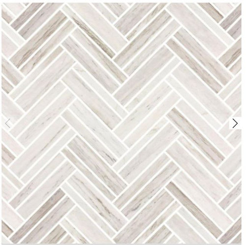
? Will this backsplash clash with my countertops?

? Will this backsplash be to muted or too busy?

? What color grout? Lightest white or cream instead?

** Also, I plan to repaint the wall from the blue-green you see to a greige. Any suggestions on a color that will match these other elements. Or perhaps a different color suggestions other than greige?

I'm concerned I won't like the grout. UGH.

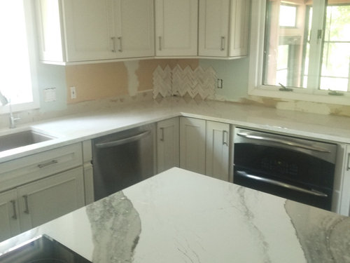
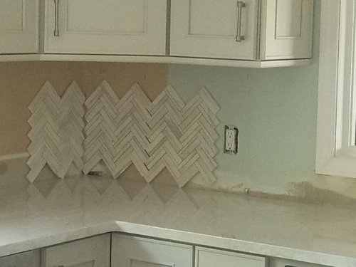
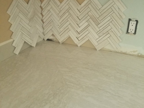
(image below: actual backsplash samples laid on countertop to see them next to each other)


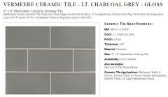
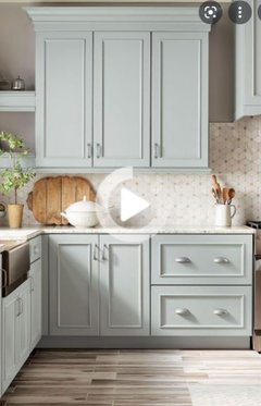
(image below: of backsplash idea from Floor & Decor website)


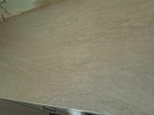
(image below: google image of Skara Brae - this is our island countertop)


(image below: google image of Ironsbridge - this our parameter countertops)


(image below: "Cottage" cabinet color - this image looks a little yellow)


(image below: "Serenity" cabinet color)


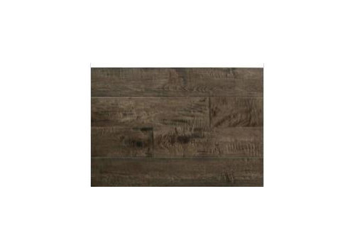
(image below: Google image of Somerset "Dark Forest" Maple flooring)


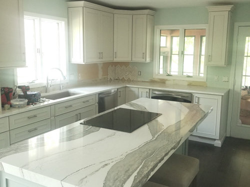
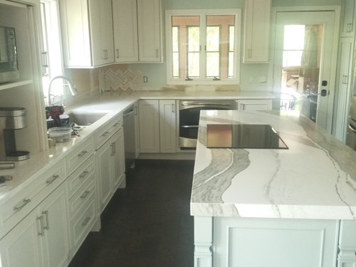
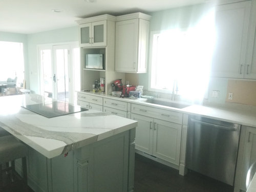
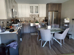
(images below: our kitchen - ** work in progress**)

** You can see, there isn't much area that will require this backsplash. Just the areas under the upper cabinets & underneath the windows.


(ignore the cabinet below: it's a custom cabinet - work-in-progress. It will have pocket doors!)


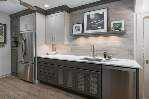
What about something like this backsplash tile instead?

Does anyone know what it is?


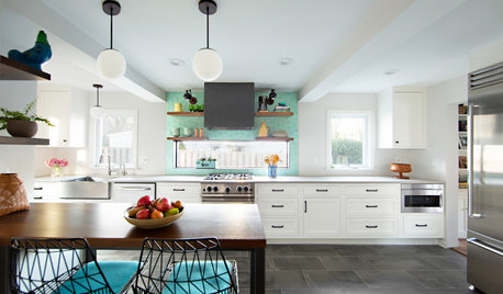
Valley Road Kitchen · More Info


Comments (19)

  • 5 years ago

    From the picture it looks ok with the perimeter but it's too much for the island top which is the show piece in your kitchen

  • 5 years ago

    Your island has soft curves, the backsplash has sharp edges. I dont' think it matches well.

  • 5 years ago

    In general, I am not a fan of the smaller pieces. I think you should go with something plainer. Let the island counter top be the star.

    This is hand-made and beautiful. It comes in different shapes and sizes.


  • PRO
    5 years ago

    Love the tile... I had a customer do something similar - definitely the same color with ironsbridge tops and his uppers were cottage...he didn't get me very good pictures but maybe this will help


    He used a grout called storm from Bostik so it blended the tile a little and made it look softer.

    As far as your wall color... I think you need some contrast... I found this picture - it might help


    I think some contrast would be nice.

    Good luck!

  • 5 years ago

    You already have two "stones". A third would be too much of a good thing. I'd try to find a simple shape in the "Serenity" color.

  • 5 years ago

    Thank you, Everyone! This is all GREAT advise!

    Thank you. Thank you. Feel free to keep the ideas & color ideas coming too. :-)

  • 5 years ago

    I like your choices. The two counters and herringbone backsplash are monochromatic yet they are in different scale which adds interest without being too busy. I would grout in white. I believe you’d be happy in the end.

  • 5 years ago
    last modified: 5 years ago
    Hi Everyone,

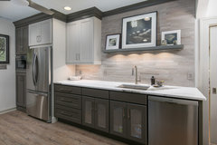
    What about this backsplash tile?

    Does anyone know what it is?

    Valley Road Kitchen · More Info


  • 5 years ago
    last modified: 5 years ago
    Keep the wall color and look for a quieter backsplash.

  • 5 years ago

    I, personally, do not like a patterned counter paired with a patterned backsplash. It's too busy for me, especially with a different pattern on the island. I do love both of Jan's suggestions of painting the walls a soft white and finding a matching soft green backsplash. That would be so beautiful!

  • 5 years ago

    That last one from Jan is great….ties the island color to the perimeter ….

  • 5 years ago

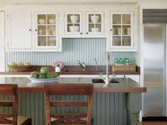
    If you did not want to commit to a colored backsplash you could install a bead board or vertical shiplap backsplash painted in your serenity island color which would be easier to change out if you wanted a color change in the future. The texture of a white handmade subway tile would be a nice match as well and also allow you to easily change out wall/island colors too. Then you could add in your island color with either an appliance, utensil holder, or window treatment. I agree your island stone is the focal point and the chevron pattern does not relate to the organic lines of the stone. Nice remodel!


  • 5 years ago

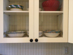
    I also think your choices are too busy to be in the same kitchen as your counters, which are the stars. I am prejudiced about the beadboard idea as. I have that in my kitchen. It runs up the back wall of the cabinets with glass doors as well.
    I also agree with @Jan Moyer. Bring out the green in a plain solid tile.

  • 5 years ago

    Thank you all so much for the GREAT input!
    I've gotten a little lost along the way.

  • PRO
    5 years ago

    I agree with Jan Moyer. I think the island has a lot of movement and pattern. The simpler the better on the back splash. I love the cabinet colors they are gorgeous. I can’t wait to see the finished product.

  • 5 years ago

    agree with others... island is the star. your choice of b/s, a no-go for above stated reasons.

    jan has a great suggetion!

    i don't see beadboard as a choice, will compete-not in a good way- with the island.

    simple is best here, let that island shine!!

  • 5 years ago

    If I just had that small amount of wall space to tile, I would price the perimeter counter material (perhaps in a thinner dimension) and use that. They may be able to template it in one or at most one piece. Benefits…blends with your countertop, no grout lines.

  • 5 years ago

    Jan and several others are suggesting you change the wall color to Cottage White and add a green backsplash. That is, in effect, the reverse of your current green walls and (Cottage White) backsplash tile idea.


    While I think either color pattern works, I love your green walls and don't think a switch-over to Cottage White walls is necessary.


    Do I think carrying that green (in a green tile) into the small backsplash area would be attractive? Yes, I do, whether you leave the walls green or paint them white.


    Do I think using a tile in the creamy color of the tile you've posted would also be attractive? Yes, I do. Posters are objecting to the posted tiles' busyness in terms of its multi-coloredness, its severe shape, its stone material. I am the outlier because I think it could work while it would not be my first choice in terms of shape. Your second choice is worse IMO because it looks very modern, while your kitchen is a lovely cottage.


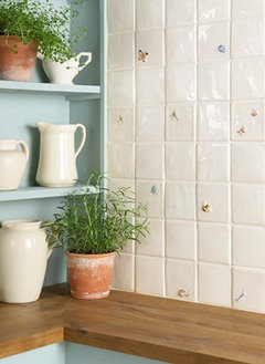
    Maybe look at Winchester Tile Company's tiles. https://www.winchestertiles.com/ They are the very essence of cottage, with both cream or green hues that would be stunning. In addition to rectangles (often referred to as 'subway' tile), they offer squares, which might be perfect. For fun, here's some of their decorated tiles mixed in with a cream shade that looks spot on.


    Good luck - your kitchen is too adorable for words and you obviously have a great eye for color.


Sponsored
Haus Studio
Average rating: 4.8 out of 5 stars28 Reviews
Franklin County's Preferred Custom Cabinetry & Design Studio