Software
Houzz Logo Print
juliab51

What was I thinking? Paint suggestions for bath needed.

5 years ago
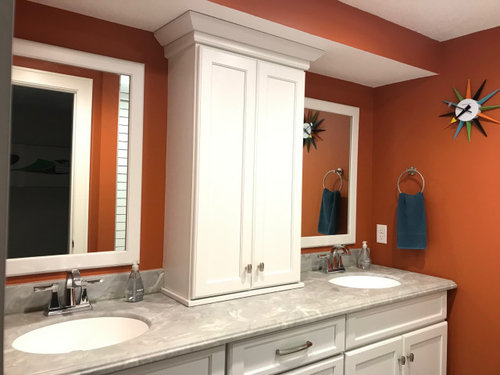
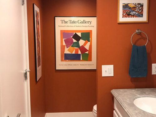
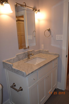
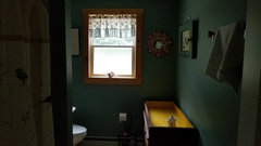
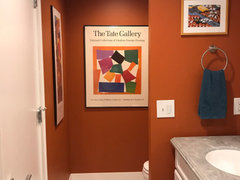
I have a narrow windowless bathroom in our lower level that needs re-doing. Does anyone have a favorite color to suggest? The walls were such a lifeless gray when we moved in that I decided go bold, which seemed like a good idea at the time.... Four years later, I want something easier and more flattering to live with. The tile, fixtures, vanity and trim are all white, with a gray faux marble corian-type counter. This is off the family room and can't be too wimpy, though the lighting isn't great, just ceiling cans, so I don't want to go too dark, either.


Comments (70)

  • PRO
    5 years ago

    Whatever you do I would paint the face of the soffit ‘ceiling white’ to de emphasize it.

    juliab51 thanked HALLETT & Co.
  • 5 years ago

    Wow, Beth, you've given me a lot to consider here. I know I don't want to stay with the rusty colors, but will get some more of these blue and green chips tomorrow. I am liking the idea of contrast with the white, but definitely do not want this windowless room to get any darker.

    Lisa, there is a large oil painting with various shades of soft green just outside the door, so green would work. It is good to hear about your experience with Sea Salt.

  • 5 years ago

    Hi Julia. I tried the SW visualizer too; I'm not as good at it as Melissa R up there is. :) The dark orange is tough to paint over in the visualizer. There is an "orange effect" to watch out for.


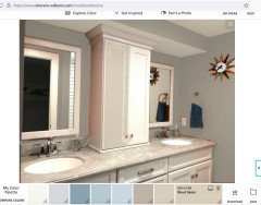
    I was trying to find something neutral that is complimentary to the tones in the countertop yet just enough of somethin' there to offset the white of the cabinetry and fixtures. I finally gave up trying to get this color on the walls, bc it looks darker and bluer to me than it really is, but it went pretty true on the center cabinet, bc that is already pure white! LOL

    I have this color (SW Wool Skein) in my family room, and it's soft on the eyes but light enough to read an "almost white" in bright light. Up against a true white, it does look like a warm light grayish neutral. It plays well with greens and blues, and bright artworks.


    What I'm trying to say is that "Wool Skein" looks blue-y gray and clashes w the countertops when "visualized" over the orange in your photo, but on the white cabinet, it looks terrific with the countertop and still pops the whites in there.


    Another more dramatic countertop coordinating color I found accidentally by trying to erase the orange effect the visualizer seems to have such trouble with.

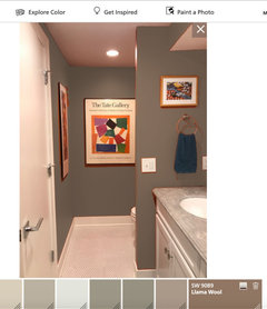
    Came up with a darker more dramatic thing, but still neutral. This is "Llama wool" which is a putrid brown, LOL (I'd never have picked it other than it seemed to counteract the orange on the app) but I do think it looks great in the photo w the art and the countertops and fixtures.


    Definitely your best bet is gonna be to paint it with a good few layers of blocking primer and go from there.

    juliab51 thanked rredpenn
  • 5 years ago

    I had my friend paint her bath a soothing spa feel green. She loves it. She said her mom wanted peach. I said no. You'll tire of it fast. She needs it repainted & will keep the green I chose

    juliab51 thanked happyleg
  • 5 years ago

    You mentioned the bathroom was previously a "lifeless" gray... and here I'm offering you greiges. LOL What color are the walls outside this room, out in the FR? You might not go totally wrong with a pure white base and a touch of that color mixed into the white so it ties in w the family room seamlessly.

    I do think going with a color that pulls from/compliments the countertop is the way to go. That would keep the room feeling pleasant, spacious and brighter.

    Honestly, your art does a great job of bringing "the life" into the space, and a white behind them would also work well.

  • 5 years ago
    last modified: 5 years ago

    More good ideas. Thanks, rred! I'll see what I can come up with tomorrow.

  • 5 years ago

    If you like the blue/green color of Sea Salt but want a more saturated color, Comfort Gray or Contented (both SW) will likely work for you. They are very similar to each other, but typically Comfort Gray leans blue and Contented leans green.

    juliab51 thanked lwfromny
  • 5 years ago

    Thanks, lwfromny. I'll try those two, for sure.

  • 5 years ago

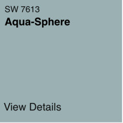
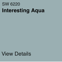
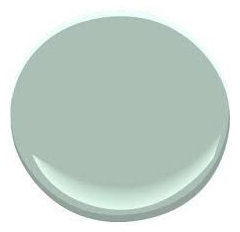
    I just picked up another twenty or so paint chips, including all the ones suggested here, and these are the top contenders: They look pretty identical here, but are slightly different in real life, and just seem to work the best with the counter.


    (This is the Room & Board paint.)

  • 5 years ago
    last modified: 5 years ago

    Thanks for all the suggestions and mock ups. I'll make my final decision once the room is primed.

  • 5 years ago

    You might consider BM Catalina Blue. It's a deeper color that doesn't look green or blue, but a perfect inbetween, and not too dark.


    juliab51 thanked calidesign
  • 5 years ago

    I'll try that when I go to the Ben Moore dealer. Thanks!

  • 5 years ago

    Pick up a sample of BM Quiet Moments. It’s got just the right touch of grey to work with the countertops but it’s a soothing green. I had a marble floor and shower in a previous bathroom and we painted high wainscoting (the bottom part) Quiet Moments. It’s a knockout color. Used it in a maple kitchen too. Very adaptable.

    juliab51 thanked RedRyder
  • 5 years ago

    RedRyder, I think I used that in my previous home; it is worth a second look. Thanks!

  • PRO
    5 years ago
    last modified: 5 years ago

    Just paint it a nice navy blue. It isn't going to be any "darker" than it is now. : )

    NO. it won't be.

    And before I spent a lick on paint? I'd see if the soffit NEEDED to be there. Beacause giving the tower a boost with a base, is not a difficult thing to do. Adding light above the sinks? Not hard Either, minus the soffit.

    Either way......navy won't change the lighting : ) and will connect with the space outside the bath.

    juliab51 thanked JAN MOYER
  • 5 years ago

    Hi julia! I think your current colour is fabulous, but I do understand one could outgrow it. You said you don’t want anything too whimpy, so I assume you still like bold. Also, considering your love of MCM, I fear you would get tired of a soft shade very soon. Would a darker colour be possible if you did something about the lighting, like stronger ”bulbs” (whatever is in those cans)?

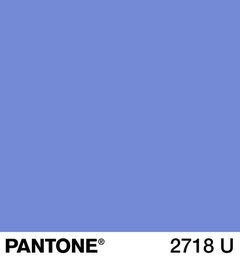
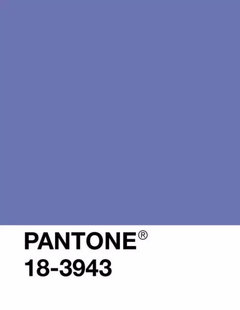
    Or, if better lighting is not possible, how about one of these purple-ish colours?


    Anyway, you’re absolutely right to prime the room first, as it is impossible to pick a colour with this orange still there casting shadows around.

    juliab51 thanked babophz
  • 5 years ago

    In one of my decorating classes, the instructor said the paint color can reflect on your skin tone when you are trying to apply makeup. And said to paint the bathroom a blush tone. 🙂 So our bathrooms are painted SW Sugar Blush, similar to Warm Blush above. As my neighbors remodel their bathrooms, they are buying the mirrors with the light behind them.

    juliab51 thanked glschisler
  • 5 years ago

    Sherwin Williams Sensitive Tint; I've used this as a bathroom color in our past 3 houses. Very calming and serene. My Calacatta marble vanity top and S-W Dover White trim, with dark grey linen texture tile floor and shower surround. Good luck.


    New house in country · More Info


    juliab51 thanked alwaysdesigning
  • 5 years ago

    FWIW, I really like the greyish blues that you posted, like this one


    juliab51 thanked babophz
  • 5 years ago

    Have you considered getting larger mirrors to fill the space over each sink? It would be less visually busy, which to me will still be distracting with a “calmer color”. The frames would be less busy if you paint them with less contrast to the walls. With some mirror changes, you might not even mind the current color so much with larger mirrors.

    juliab51 thanked mbriles35222
  • 5 years ago

    More to think about - thanks. Since this level of the house is our "fun" space, with the TV, bar, two guest rooms mostly used by our adult children and grand kids, and my DH's office, I don't need to be as conservative as I am upstairs. I'm not brave enough to go navy though, so while the Stormy Bay color isn't energetic, I think it would provide enough contrast to the white to satisfy me. I also think it would work behind whatever art we choose. The art there now is just what was left over once we had filled the rest of the rooms. Each piece has orange in it, which inspired the paint in the first place.


    The soffit does have to stay as pipes run through it, but my DH thinks there is enough room to add some lighting, which would eliminate shadows and will be very welcome to overnight guests. If we can't do that, lighted mirrors is something to look into, because I think it is the backlighting while standing at the sinks that is the biggest problem.

  • 5 years ago

    Babo, I forgot to add that purple is a definite no. I had a purple living room for several years in the early aughts, and it scarred me. My forays into bold colors never go well; I should have remembered that when I chose the orange for here.

  • 5 years ago

    I like the Llama wool. Who would have thunk it? The art looked wonderful against it.

  • 5 years ago
    last modified: 5 years ago

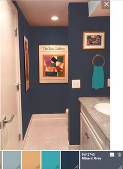
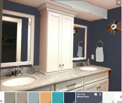
    The art (I'd keep it!) really does pop best against a darker wall... I also liked this navy-ish "SW Mineral Gray" one, Julia, with the rest of the room... the gray grout, the white fixtures and cabinets and chrome door handle. It's fun, but not "in your face" fun, like the orange.

    If you add puck lights in the soffit, painted it ceiling white (good call) so it is less wall/more ceiling, I think this looks really nice! (I made the towel brighter, just to differentiate it on the wall. LOL)


    You might even get away with not having to prime if you went this route. :)


    White towels over here. LOL

    juliab51 thanked rredpenn
  • 5 years ago

    Just like the blues you are looking at that are less saturated colors, purples come in all levels of saturation and don't have to be bright or bold.

    juliab51 thanked Jennifer Hogan
  • 5 years ago

    The navy does look good. Thanks, rred. My purple living room did too, at first.... LOL


  • 5 years ago

    I would choose a color similar to these. The color will be easier on the eyes and still relate to your wall art.

    juliab51 thanked Therese N
  • 5 years ago

    Poor julia, scarred by purple, lol!

    I just wrote a long story about Farrow&Ball Hague Blue, then realized it would probably be too intense for what you want now - even if I don’t find it to be so in real life. Scrolling back, I love the softer darker blues for your room. The Mineral Grey that rred posted, IF (yep, that is a big IF) it is indeed as blue as it comes across in the pic. I think it looks great in the first pic, almost like a denim. Also Beth’s Needlepoint Navy and even her Charcoal Blue. A colour like that would certainly bring out the orange in the artworks and your George Nelson clock.

    juliab51 thanked babophz
  • 5 years ago

    If you put lights in the soffit, they will light up the sink area really well but are not good for makeup. Sconces facing you, on either side of the mirrors at a bit over eye level are best for making up. Or, as you said, a backlit mirror - but make sure it isn’t a harsh LED daytime light (they are too blue for making up). Smaller mirrors will give you ample room to add two sconces on each side. Let us know which samples yo bring home.

    juliab51 thanked RedRyder
  • 5 years ago

    I vote navy.

    juliab51 thanked Lisa Dipiro
  • PRO
    5 years ago

    I painted a small powder room Ben Moore's "Grey Gardens" above the white chair rail. It's a charcoal gray, very dramatic and neutral all at once.


    juliab51 thanked Diana Bier Interiors, LLC
  • 5 years ago

    Our basement bath is dark today because its cloudy outside. Here's a couple pics with the light off and on. The color is pretty saturated. I love it in any light. Its Ben Moore Stratton Blue.

    juliab51 thanked territheresa
  • 5 years ago

    How about a navy on the far back wall where the picture is now, and on the wall behind the mirrors, then a pale or blue gray on the other walls? nothing says every wall has to be the same color, think accent wall.


    Ditto how the color reflects on your face.


    If you can do this, or have a friend who can do this, I would buy some craft paints in blues, grays, whites, and mix as close to a color chip you're thinking of; then paint a piece of poster board. Put THAT up, & you have more color to check it out.

    juliab51 thanked Andrea Foote
  • 5 years ago

    A light gray with blue, green, or mauve undertones would look nice and would be the change you are looking for I think.

    juliab51 thanked Christine Wagner
  • 5 years ago

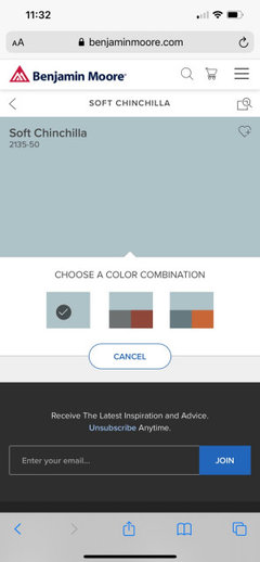
    Look at Benjamin Moore Soft Chinchilla

    juliab51 thanked Carolae
  • 5 years ago

    More good choices! I'll get some chips at the B. Moore dealer. The actual painting may be delayed, though, since we've decided the problems with this bath go beyond the color to the poor lighting and awkward door placement.

    If you expand this view you can see how the door needs to be fully opened to turn on the light, then closed again in order to access the toilet or even use the left hand sink comfortably. So, we are going to see if getting a pocket door is feasible and explore how to get light to the sinks before priming and making the final color decision. Thanks for all the suggestions.

  • 4 years ago
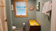
    It has really turned out a very attractive color ! i am so happy for you!

    juliab51 thanked glschisler
  • PRO
    4 years ago

    Looks beautiful, Julia, thanks for coming back and showing us the final product!

    juliab51 thanked Diana Bier Interiors, LLC
  • 4 years ago

    Beautiful!

    juliab51 thanked happyleg
  • 4 years ago
    Thanks for the update. It is always nice to see how things turned out. It looks great.

    juliab51 thanked houssaon
  • 4 years ago
    Looks great! I love a clock in a bath! Time flys when your pampering!

    juliab51 thanked HU-326560860
  • 4 years ago

    Very nice color there! You have a good eye for art - placement, color and scale - good job!

    juliab51 thanked thinkdesignlive
  • 4 years ago

    Wow, Julia, this turned out really nice! Love the towels. Oh and please keep the clock :-)

    juliab51 thanked babophz
  • 4 years ago

    Loving the new look. Great choice!!

    juliab51 thanked R M
  • 4 years ago

    Julia, if you still have the “awkward door” situation, you could get a new door/frame, have it open into the hallway rather than into the bathroom….we did that to one of our smaller en-suite bathrooms (huge bedroom, small bathroom, door opened right into the toilet). Pocket doors are also great, but they are trickier….you need thicker walls, possibly remove electrical etc….IF you have no plumbing in that wall.

    juliab51 thanked coray
  • 4 years ago

    That color is fantastic for the bathroom. It came out great!

    juliab51 thanked RedRyder
  • 4 years ago

    That’s a great color choice, Julia! Changes the whole feel. 👍🏻👍🏻

    juliab51 thanked NagyMama
  • 4 years ago

    Would it solve your problem to switch the door swing to open from the other side. That is, as you walk into the room, the door still swings inward but the hinge is on your right. Or have the door swing outward.

    juliab51 thanked partim
  • 4 years ago

    It is going to be awkward no matter which way the door swings, but we've decided to just live with it the way it is. I'm very happy with the new color which does give the room a whole new feel.