Software
Houzz Logo Print
cynthia_charleville

Backsplash up around window?

4 years ago
Hello!
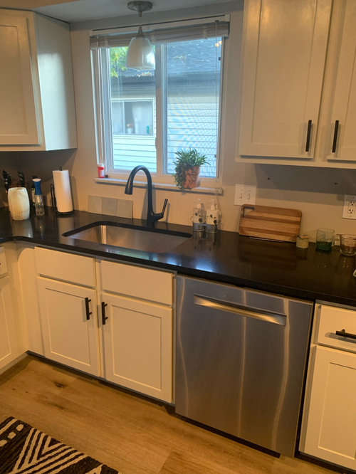
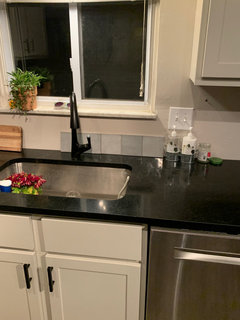
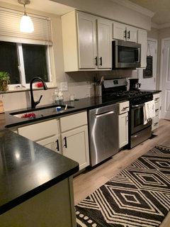
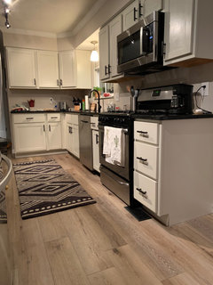
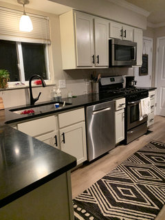
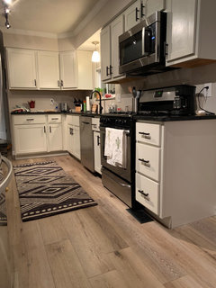
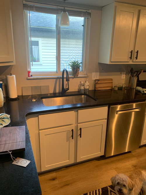
I’m at the end of a kitchen minor renovation (replaced floors throughout house, painted the cabinets myself-never again LOL! and replaced hideous Formica countertops with honed black granite. The pic is making everything look yellow, the cabinets are actually off white)
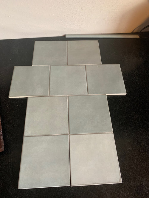
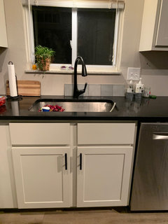
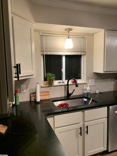
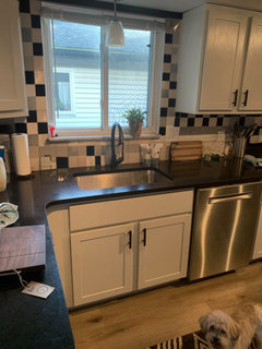
Anyway, I’m wanting to do MSI Renzo Jade as my backsplash. (A few samples below window sill) and my dilemma is should I take it up around the window or stop at the bottom of the cabinets? The tile has a coordinating pencil trim and bullnose so that’s good. What do you all think? I’ve got 6” either side of window and just 2” from top of window to soffit. The Renzo tile is 4x4.
Thanks in advance for any recommendations or suggestions!

Comments (39)

  • 4 years ago

    Also, straight set or off set pattern? I’m going to be getting new blinds or possibly Ronan shade. 😊

  • 4 years ago

    Roman!

  • 4 years ago


    My kitchen is very similar to yours. We just finished our remodel. Put backsplash all the way to the ceiling and live how it looks.


  • 4 years ago

    You have so little wall space to cover to make it to the ceiling, you might as well go for it.

  • 4 years ago

    Nice job on painting the cabinets! Since you only have a sliver of space at the top of your window, I would just tile to the bottom of your cabinets. If you want a more modern look you could stack the tiles. I vote for an offset pattern. Try to get a window covering that goes to the very top of the wall to cover the sliver.

  • 4 years ago

    Yes, to the ceiling.

  • 4 years ago

    I'm not a fan of the look, I find it draws the eye but does not provide an attractive destination. Prefer to have paint up high where there's not much to see.

  • 4 years ago

    Agree to the ceiling.


  • 4 years ago

    I would go all the way around the window, to the ceiling.

  • 4 years ago

    I would take the backsplash up to the ceiling and across the top of the window. Then I would add a simple spring-loaded curtain rod and a pair of curtains, or a pleated window shade for privacy.

  • 4 years ago

    I’m probably the odd one out, but I think slivers of tile around windows look silly. I‘d go up a few inches above the bottom of the cabinets.


  • 4 years ago

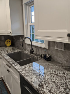
    If that’s the tile you’re using make sure you’re able to visualize it going up the wall as it hugs space between the window and your cabinets) That vertical space is wider than one tile width but narrow than two tiles side by side. Where do the cuts go? Do you like that look? The look of those cuts are even more pronounced if you’re going up to the ceiling.

  • 4 years ago

    I agree with flopsycat this time. Generally, I like an to the ceiling installation(I have it my home) and I honestly think you could do either, but my preference would be to stop at cabinet height this time. Best of luck.

  • 4 years ago

    Straight set to the ceiling! Cabinets looks awesome!! Go you!

  • 4 years ago

    I’d go to the bottom of the cabinets, sometimes less is more.

  • 4 years ago

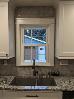
    If you didn’t go all the way up around the window with your tile, what shade paint would you use? You already have white cabinets, black counters, jade tiles all in the same small area. If you use another color in your wall paint, that would be four colors in your window area, not including your window treatment.


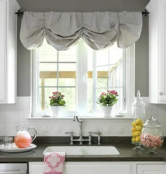
    Also, in the picture shown by flopsycat1, which is adorable, it shows a backsplash in the same color as the cabinets. So with the wall paint and matching valance, that would be 3 colors - white cabinets/backsplash, black counters, and gray wall paint/valance.


    The lovely picture of byanrooy17 is interesting because the counter and the tile are tonal so the impression is of two colors in the area.


    Contrast is an important consideration, too. Flopsycat1 needs that paint around her window for contrast, whereas byanrooy17 creates the contrast with her tile. Because you have contrast with your tile, it would be nice to see it applied all the way up not only to set off the window but also to simplify the number of colors in the window area.


    I also confess to loving the floating impression tiling all the way behind hoods and around windows gives the look.

  • 4 years ago

    I like the look of tile all the way up

  • 4 years ago

    Thank you all for great advice and comments! I will definitely consider each bit of advice before proceeding. You all are great!!

  • 4 years ago

    Also, with such limited walk space there would you do pencil or bullnose? My gut says pencil for a cleaner look but I keep second guessing all of it which is why I’ve done nothing so far. @shugee I painted all the kitchen walls Behr Granite Dust which is a pale taupe gray so that will be the color if I stop it at the cabinets. I really appreciate everyone’s input!

  • 4 years ago

    @weathy that is my biggest struggle here! I think I’ll end up not going all the way up. But loving everyone’s comments!

  • 4 years ago

    You should stop at the bottom of the cabinets and see how you like it…and decide then. Depending on where the cuts are on the tiles on either side of the window, going all the way up may be too busy or choppy. i normally like the look of going all the way up, but if you had more space above the window it would be better for that look. In your case it may be better to stop at the cabinets, or slightly higher.

  • PRO
    4 years ago

    To the bottom of the cabinets and schluter for the edge of the tile that is a nice clean edge and the yellow in the pics is from the lighting change the bulbs to LED 4000K .

  • 4 years ago

    I’d also vote for making your lighting the best it can be and then deciding backsplash - doe you have under cabinet lighting? What does it look like with pendant on? All of those elements effect how you will see this and might effect your final decisions.

  • 4 years ago

    Great job painting your cabinets. My son just bought a new house and would like to update their kitchen, but are now on a budget. They would like to paint their cabinets and replace Formica counter tops also. Did you have any issues with replacing the formica countertops while keeping your cabinets. I have read a few posts that sometimes it is difficult to replace countertop when keep you keep existing cabinets? Also, did you paint your cabinets first or did you have the new countertops installed first?

  • PRO
    4 years ago

    I agree with @flopsycat1 on her suggestion to not bring the tile all the way up around the window. It looks better leaving the wall bare instead.


  • 4 years ago

    I tend to say all the way up, and did that in my own home. However, since your tiles are square, I am not sure it would look good. I would do as flopsycat suggested

  • 4 years ago

    Usually prefer to ceiling but agree with others that given how little wall there is, in your case would stop ar cabinet edge. I’d hang Roman shade ar very top of wall.

  • 4 years ago

    I think a couple inches above bottom of cabinet always looks best, so theres no cut tiles for the height, only for width

  • 4 years ago

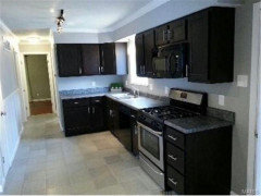
    Amhers104 I apologize for my delay getting back to you. My cabs were installed around 2013, they were in decent shape but just very dark espresso color which over time gets knivked up and worn out looking quite quick. My cabinets had no issues when removing and replacing the countertops. It was A LOT of work with the sanding, cleaning, priming, sanding, cleaning etc then two coats of paint plus the clear coat, major chore but it paid off!! Here’s a before pic

  • 4 years ago

    I’m thrilled this thread got some more comments, I still haven’t finished this and I’m thankful for you all!

  • 4 years ago

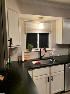
    Funny, the lighting at night is showing a much better representation of how it actually looks. I’m hoping these are helpful but also I think the previous comments have been pretty obvious to not go all the way up. Y’all are great and so appreciated!!

  • 4 years ago

    The lighting at night is a better idea of how it actually looks. I appreciate all your suggestions!!

  • 4 years ago

    Beautiful kitchen! I’m anxious to see it after you have the tile installed!

    Cynthia thanked Holly- Kay
  • 4 years ago

    Has anyone cautioned you about how blue/cool your splash will be in relation to your wall color? I haven’t read all the comments. Are those tile colors repeated anywhere in your decor (it’s not in the rug)….the rug and what I see in your photos makes me suggest your same tiles but in off white tones.

  • 4 years ago

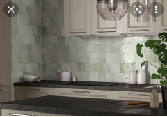
    @thinkdesignlive it’s so frustrating because they are actually a warm jade tone but they show up more blue in the pics. Here is a pic from MSI’s website that gives a better feel for the color. I have a lot of green, turquoise ish accents in my rugs, pillows, hand towels etc. but great advice, thanks!!

  • 4 years ago

    As long as that color relates to your surrounding decor then I think it should be fine.

    Cynthia thanked thinkdesignlive
  • 2 years ago

    You guys....I'm so embarrassed to admit this. I STILL have not completed this project! I am still not convinced on the tile selection (though I haven't found anything I like better) but i am absolutely stumped on how to finish the edges since there is no existing trim to run it into. I dislike the idea of the jolly and the bullnose is just too big for the space. If I used whatever tile I end up with and run it around the window could I use the bullnose on the small inside lip/wall of the window? Hopefully I am explaining that right - I mean the 2" or so part that is perpendicular to the window and would be perpendicular to the actual backsplash. I'm completely open to ideas!

  • 2 years ago

    I like a design all the way up. Not sure I understand what you're asking though. You're talking about tiling into the inside frame and sill of the window? I replaced the front of the sink cabinet with a full board instead of two.