Software
Houzz Logo Print
stephiecaaakes

Uneven cabinet widths next to window

4 years ago
last modified: 4 years ago
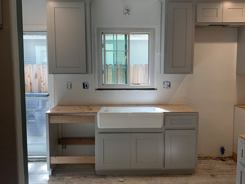
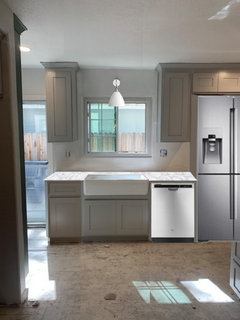
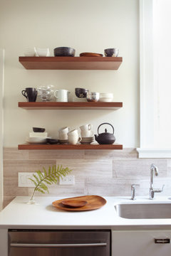
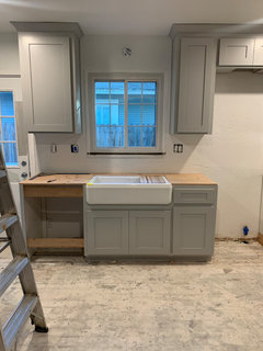
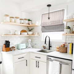
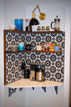
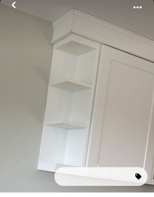
We just had our cabinets installed and the uppers on either side of the sink are uneven widths and its bothering me. We have an awkward kitchen layout, so altering the size of the one on the right to be bigger is not an option because there needs to be room for the range hood. Should I have the one on the left cut down to match the smaller size or will that look odd too because it won’t match up with the edge of the lowers? is there anything else I can do? should i cut the cabinet down and add some shelves on the side like in the second photo? am i overthinking it - do they look fine?


Comments (43)

  • 4 years ago

    Get the appliances in, the counters loaded as you usually have them, and you won't see the issue as much. I would install backsplash all the way around the window up to the ceiling. That will add the bling that should distract the eye from any uneven cabinets. It will be beautiful!

    stephiecaaakes thanked decoenthusiaste
  • 4 years ago

    I agree. It's going to be really nice. Just don't get a black fridge. :)

    stephiecaaakes thanked Fori
  • 4 years ago
    last modified: 4 years ago
    Your eye sees it now, because that‘s all there is TOO look at, but when it is finished, I don’t think it will look off at all. As much as I love symmetry (kinda OCD) it can be overrated.

  • 4 years ago

    It will look good once the range and hood goes in, as it will camouflage the issue of the narrower upper cabinet. Yes you are over thinking this. I like your kitchen; the farmhouse sink is lovely!

  • 4 years ago

    You are over thinking it - because that’s what we do at various stages in a build. It’s going to be fine. My kitchen cupboards are different sizes just like yours. I don’t notice it at all, but I would notice and regret the loss of storage space sacrificed for symmetry. Your kitchen is going to be beautiful.

  • 4 years ago

    Is the sink centered on the window? It looks like its centered in the cabinet but the cabinet isn't centered to the window. These kinds of things are worse now cause you're just now seeing them in real life, but were likely on the plans and didn't bother you.


    If you do a backsplash with mismatched tile, it would make all of this just disappear. They don't have to be loud or have a lot of colors. Doing something like stacked tiles would make it worse.


  • 4 years ago

    I think once everything is in place you won’t even notice…your kitchen will be beautiful

  • 4 years ago

    Agree with everyone who said it’s fine.

  • 4 years ago

    I agree that it will not stick out once the kitchen is completed, however IF it still looks off to you my suggestion would be to remove the cabinet on the left and install open shelving there. Good luck with your renovation, it looks great so far!

  • 4 years ago

    Once your appliances are in it will feel more balanced.

  • PRO
    4 years ago

    It looks odd although, as others have said, it might look better once appliances are installed. But, in the photo as it is now, like you, it bothers the heck out of me. I vote for your idea of reducing the cabinet size and adding shelving as in the photo you posted. Good luck!

  • PRO
    4 years ago

    IMO those cabinets should have been left off that wall just the fridge with a matching panel on the cabinet side. I sure hope the rest of the base cabinets are drawers.I agree the sink looks off but that might be the camers angle. BTW those shelves you show are a totally dated look IMO

  • 4 years ago

    Most people will read the symmetry right around the reveal of the window. If you need the upper storage I would keep it as is. In small kitchen you will not always have the luxury of making a statement of the ceremonial range hood wall or sink wall that we see in magazines and you have to balance needs with esthetics. A paneled DW would help on the lower.

  • 4 years ago

    I would do as others have said….accept what you have. However, you could embrace the asymmetry by completely removing the left side cabinet. And replacing it with three thick wooden shelves. That way, you aren’t remotely trying to “match” what is on the other side of the sink. AND…the off center placement of your sink won’t be as obvious. (Is it off center?). Question…where will your faucet be located? Centered on the sink, or the window, or completely off center? I would go for the last. It has been suggested that you have a busy backsplash or at least one that isn’t completely linear. Yes to that, too! Good luck. I love the color of your cabinets, by the way.

  • PRO
    4 years ago

    Remove both. Make the window work itself. Put a couple of shelves insted, first on the left side and see if you need them on the right side.


  • 4 years ago
    last modified: 4 years ago

    Poor design always stands out. The left cabinet should be the same as the cabinet on the right, and have the same negative space around the window and door as the right cabinet, if possible. If not possible to be the same because of sizing, then more negative space on the door side should be done. It is crowding the door, which isn’t a good look at all.

  • 4 years ago

    Concur with the majority who say it will be fine as is….but if IR drives you nuts I’d make a minor change that makes them appear purposefully different, like leaving one open or putting a glass door on one.

  • 4 years ago

    I think the issue here is the sink not being centered on the window…..the whole thing should be redone so it is centered. The difference in cabinet size would not be an issue for me but not having the sink centered would be.

  • 4 years ago

    If they center the sink, then the DW won't fit.

  • 4 years ago

    Domino effect…..never planned well in the beginning.

  • 4 years ago
    last modified: 4 years ago

    Dang, that is so disappointing. Well the good news is that I see a lovely kitchen so far!

    I could live with it (relunctantly) if I had no $ to fix it. I know it would tick me off for awhile, but from personal experience I have learned that time does make imperfections less noticable as the brain gets used to seeing it that way.

    I do agree that the sink cabinet not centered to the window compounds the issue of the upper cabinets. I hate to say it, but it actually bugs me way more then the assymmetrical uppers.

    I played around on my app to see if there was a way to make it look better. It’s a fun brain game for me. I am only posting this to show a possible look if money and time was no object. Hahaha yeah right!!!


    I switched the cab and the DW locations. New upper made equal size as the right. I assumed that opening was for the fridge. But somehow adding it made the cabinet above it look weirdly small. Then, of course, the super simple job of installing a larger window, moving electrical, light above the window, fix exterior, as well as many other things I’m sure I’m forgetting! 🤯

  • 4 years ago

    I think the issue boils down to the position of the door and window in the plan. Dishwashers are either 24" or 18" and need to be positioned near the sink. Sinks are generally under the window. I am not sure symmetry outweighs layout when you have a tight space to work with. It's hardly effective to move a door and window a few inches for esthetics only. I do think the farmhouse sink emphasizes the limitations of the preexisting conditions.

  • 4 years ago

    I couldn't do it with 2 different widths. I think your picture from the app look a lot better, 2 skinnier cabinets or if storage is not an issue maybe some open shelves instead of cabinets? And BTW what app are you using to do this, I need to design my kitchen,  thanks

  • 4 years ago

    Kasia the app on my ipad is called youdoodle. It is not for design. It is for editing and drawing on a photo. Be sure to start a new thread for help on your kitchen. :)

  • 4 years ago

    Thanks everyone for your input! yes the layout of the kitchen and existing window and door are problems, but there werent any options to change layout without also knocking down lots of walls, moving water and gas lines, and changing layouts of other rooms at a much higher expense that wasnt in the budget (1930’s 850sf house). Yes the sink is off center and that is also bugging me tremendously. it said it would fit in a 36” cabinet but when it came down to it, it doesn’t really. And the dishwasher has to go on that left side next to the door which sqeezes the sink over. I shouldve just gone with a smaller sink but unfortunately that ship has sailed. Maybe the massive cabinet on the left helps distract from that mistake haha. Yes, these mistakes are due to poor planning and a limited budget. Lesson learned.

  • 4 years ago

    I think it looks great. Enjoy your new kitchen!

  • 4 years ago
    last modified: 4 years ago

    resizing the window first might have helped. but honestly, once it's in it should be fine.

    I might have excluded the cabinet on the left altogether and just done open shelving. (you still can)


    only you know how much storage you need.


    stephiecaaakes thanked Beth H. :
  • 4 years ago

    Agree that once the appliance are in place the difference will be less noticeable.


    IF once the appliances are in place you still don't line the symmetry issues, you might consider "decorating" to embrace the differences rather than ripping stuff cabinets


    Using a long swag for your window treatment could cover the top and two sides of the window frame with the part left open being centered with the sink to visually center those two.


    You could remove (and save) the door of the left overhead cabinet and replace it with one the same width as the door on the right overhead cabinet -- close off the left side of the front of that left cabinet. Then, open up the left side of the existing cabinet and put that wider front door on the side of the cabinet (if it fits) or put another door there. No change to the inside of the cabinet -- just two ways to get to what's in it.


    If you cannot reuse that left front door on the side of the cabinet, reuse it elsewhere in the room or dining area or even on an adjoining porch -- or use it to build a rolling cart that could be used in any of those spaces.

    https://www.google.com/search?q=rolling+kitchen+cart+with+cabinet+door&client=firefox-b-1-d&channel=nus5&source=lnms&tbm=isch&sa=X&ved=2ahUKEwiCkdC5icbzAhXyhHIEHW0zAw4Q_AUoAnoECAEQBA&biw=1366&bih=615&dpr=1#imgrc=woB0i4MnZaNRjM 

    stephiecaaakes thanked suezbell
  • 4 years ago

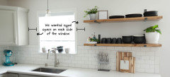
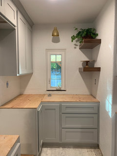
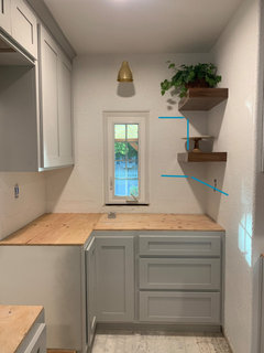
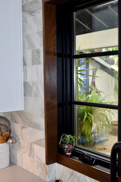
    I just have to add that I measured and the sink is only off center by a half an inch (which is somehow more infuriating?). I may consider seeing if they can do anything with the cabinets to fix it but that sounds expensive. the picture I gave was from an angle that makes it worse, and luckily not an angle most people will see or approach it from. attched is a more centered angle. As far as the cabinet, Im liking the open shelving idea if I decide I dont need the storage. I have open shelving in a walnut on the other window, which I love (see photo)


  • 4 years ago
    last modified: 4 years ago

    looks good. love the walnut. although, why wasn't an L shape done?


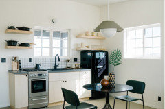
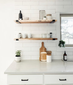
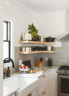
    I would have done it like this, with a little less depth than what you have. .

    I fabricated by own walnut shelves w/1" walnut boards, cut and finished. kreg jigged on the L. cost was $45 for the wood.


    drilled a hole in the back, set a lag bolt into it, and the studs in the wall.

    I honestly think that heavy cabinet on the left of the sink would look better w/the walnut shelves. IMO. what kind of tile are you doing?

  • 4 years ago

    I didnt do L shaped because I didnt like the assymetry of the space between the windows. For an L shape that kept the symmetry, the depth would have been so shallow I feared they’d be useless

  • 4 years ago
    last modified: 4 years ago

    that's because you used 2" boards and what, 8" -9" depth?


    . look at mine above. It wouldn't have looked asymmetrical with thinner boards, and an inch or two shallower. mine are at 7 1/4" and they're fine.

    but no biggie, just making a suggestion. yours looks fine.

  • 4 years ago
    last modified: 4 years ago

    Thanks! I actually may be able to reuse these to the left of the window of the sink in place of the large cabinet and have some new L shaped ones made in place of these based on your suggestion

  • 4 years ago
    last modified: 4 years ago

    are you using brass hardware too? love that metal w/your color. are those custom painted? which color is it? what's your countertop?

    is your window inset enough to do a sill? you could use leftover countertop. Or, use the walnut


    I used the same walnut on mine to trim out the window


  • 4 years ago
    last modified: 4 years ago

    Yes, brass hardware. Yes they are custom painted. color is sherwin williams light french grey. the walls are sherwin williams pure white. countertop is Silestone Calacatta Gold (wasnt my first choice but we are using a remnant in place of a second slab that saved us about $1500)

  • 4 years ago
    last modified: 4 years ago

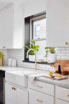
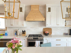
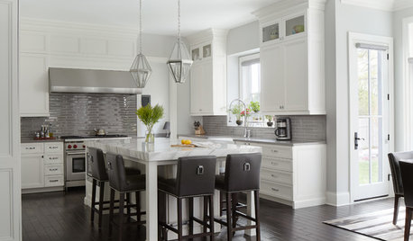
    nice. I love that silestone. here it is in this kitchen w/white cabs and cloe tile


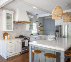
    silestone again here w/walnut accents, gold and woven rattan pendants. see the little shelves?


    what backsplash are you doing

  • 4 years ago

    We are doing cloe in white

  • 4 years ago

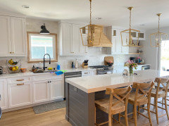
    here's that same first pic from another angle. The poster of this pic put this up on Houzz awhile back when we were discussing Cloe tile. That's how I know she used the calacatta gold


  • 4 years ago

    Looks great!

  • 4 years ago

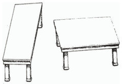
    Someone above probably already suggested this, but if not...the contrasting impact of the wood and open hole for dishwasher are really impacting the visual of imbalance. I think that's also why the sink looks like it's not centered. It's all about perspective creating visual illusions.

    Have you seen this visual illusion? These tables are the same size but our brain says they aren't.


    Lots more illusions here http://brainden.com/visual-illusions.htm

    Get the counter and appliances in and then assess the need for open shelving.

  • 4 years ago

    I would insist on changing one cabinet to make them equidistant from the window.


    When I first moved into my newly-constructed builder spec home, it bothered me that the kitchen cabinets surrounding the window over the sink were uneven, as yours are. I hung lace curtains on the sides, but it still annoyed me. It still bothered me 25 years later when I had the kitchen remodeled and new cabinets ordered. I told my kitchen designer (who ordered the new cabinets) that I wanted the cabinets to match in distance from the window.


    When the new cabinets were installed, the difference in width was even greater. The designer blamed the installer; the installer blamed the designer. In the end, the designer agreed to eat the cost and ordered one new cabinet to be replaced, so that the distance was equal, but they still looked unmatched, since the cabinet on one side was much wider than the other.


    Three years later, I remodeled the kitchen again. I was unhappy altogether with the cabinets and replaced them. The cabinet-maker did the installation, and I enjoy looking at my matched cabinets every day.

  • 4 years ago

    These are equidistant from the window? It's the different widths of the cabinets used to achieve this that is the issue with the OP.