Software
Houzz Logo Print
erinsaidso

Siding conundrum: wonky window placement, massive wall

5 years ago
last modified: 5 years ago
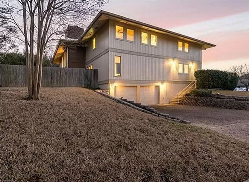
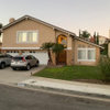
We're gearing up for an exterior overall, in part to address some failing siding that was installed by the previous owners. We're fairly confident we've landed on a color (whiter, brighter, cleaner and will withstand Texas summers), and horizontal lap.

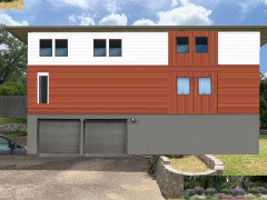
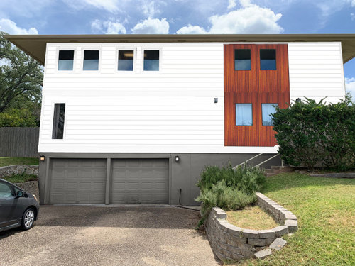
However, beyond that we've been contemplating some sort of treatment around the wall of windows on the far right. This part of the house was an add-on somewhere along the way and interesting decisions were made regarding placement -- differing sizes, positioning, and an odd expanse of space. The thought occurred to try a "natural" wood accent running all the way down, but 1) don't know if that's bordering on too trendy, but 2) more importantly, are we then fighting the existing architecture, trying to make it something it's not. Perhaps instead of contrasting wood, we do contrasting wood direction (horizontal batten) and that will provide the visual break up we're looking for? OR just stop overthinking it and go with a single style of siding...


Side notes: Home was built in 1972. It has a metal hip roof. The only brick is the chimney.


The house now -->


The house with Photoshopped ideas -->


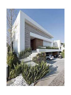
The house visualized by a virtual service -->


Comments (24)

  • 5 years ago

    You mention addition / windows - could be an investment, professional guidance as to adding a window?

    erinsaidso thanked everdebz
  • 5 years ago
    last modified: 5 years ago
    The "before" is much more pleasing to the eye, sorry. The white is massive, no breaks. The first pics vertical siding then has the horizontal piece that breaks it up. What are you going for?

    erinsaidso thanked arcy_gw
  • 5 years ago

    I think the house wants horizontal siding. If you look at the mock-up pic with vertical, it appears weight of the house is crushing the garage. I tweaked your other idea, and I think it gives the illusion of breathing space for the garage doors.

    erinsaidso thanked misecretary
  • 5 years ago

    Don’t add any accents, they’ll only draw attention to the area you’re trying to camouflage.

    erinsaidso thanked Rachel Lee
  • PRO
    5 years ago
    last modified: 5 years ago
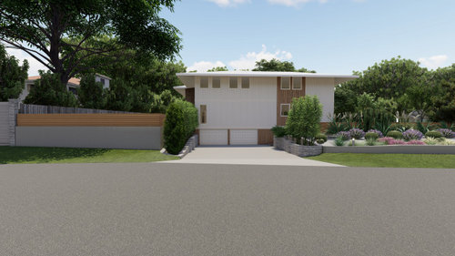
    IMO the white with the wood in the second pic is perfect with the way the windows were done . As for the actual window placement I would need to know what is behind the windows . There is no way to avoid the window placement and I like just tat simple placement of the wood not the one with too much wood .I think if you go with the style of the house and redo the lanscaping to work with the house it could be a fabulous look Stop trying to make this something it is not


    erinsaidso thanked Patricia Colwell Consulting
  • 5 years ago

    @everdebz in some future phase we'd love to rethink the whole window configuration but it's not in the budget right now. And regarding professional guidance, generally we've had trouble finding someone that can help. Design firms want a bigger project (maybe we're asking the wrong ones), we got a mock up from a virtual *landscape* service but the exterior wasn't their prime objective, and then the siding vendor just agrees with whatever we say ;).

  • 5 years ago

    @arcy_gw I really appreciate the honest feedback!


    In "boxing" the windows on the right, either with wood or *some* kind of contrast (materials, color, pattern), our thought was that it somehow introduced some balance resolving the fact the windows are floating off to the side. But obviously (hello, Houzz!) we have our doubts.

  • 5 years ago

    @misecretary thank you for sharing this idea! And agree that the garage, while we don't want to highlight it, also shouldn't look crushed.

  • 5 years ago

    @Rachel Lee thank you for the feedback! Yeah, it's tricky (and the problem). We very well could be overcompensating making it worse, or inventing a problem that isn't really there (or only annoying to us).

  • 5 years ago

    @Patricia Colwell Consulting thanks! The second photo is our kind of quick photoshop rendering.

    • Downstairs, far left, is the only original window on this side of the house. I believe it used to have a mate and when they did the addition didn't put it back (for reasons unknown). This is a bedroom.
    • Downstairs, far right, is another bedroom.
    • Between the two bedrooms is a bathroom.
    • Upstairs, far left, is a small office.
    • The windows in the middle go to a long laundry / utility room.
    • Upstairs, far right, is bedroom.


    We have plans to tackle the landscaping which also make a load of difference. Just trying to address the siding first.

  • 5 years ago

    I like your second rendering, with the lighter wood accent, although that look does seem to be a trend. And the landscaping will make a huge difference! What does the front of your house look like? Any architectural detail there that you could tie in? I've noticed several new builds (Austin) that are incorporating brick so that might be worth considering.

  • 5 years ago

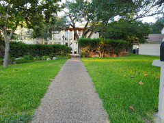
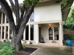
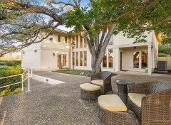
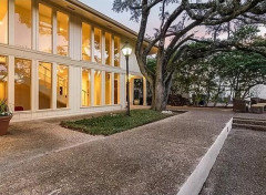
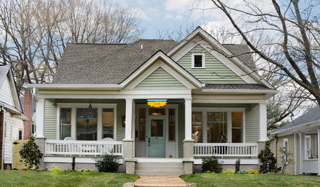
    @stiley this is the front


  • PRO
    5 years ago

    What you have now works well and is more classic than trendy. I'd do the lower level in a darker color, but otherwise, keep the same look.

    erinsaidso thanked PPF.
  • 5 years ago

    I like the wood square boxing in the 4 off center windows. Looks intentional, like you are enjoying your off center house design. Even if you would really rather have something more traditional, might as well make the most of what you do have.

    erinsaidso thanked HU-483565715
  • 5 years ago

    I see that the "problem area" is the side of the house. In that case, I would let it be and not compete with the impressive front.

    erinsaidso thanked Yvonne Martin
  • 5 years ago

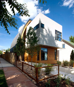
    Of course, this is charcoal and cedar, not white. The visual weight of the lower part intimates that it is capable of supporting the upper section. Not sure white can ever manage that trick. Here the windows are a bit wacky too, so I though it might inspire you.

    Westlight House · More Info


  • 5 years ago

    Wow, love the front of your home! What a surprise after first seeing the side.

    erinsaidso thanked flopsycat1
  • 5 years ago

    @decoenthusiaste nice house! I do think that the wood panel + paint works better with dark than light, which was another struggle we were having. Ultimately the Texas sun had us go with light (white), otherwise darker would likely have been our choice. And this example home you shared definitely has the benefit of different planes / shapes to play with.


    @flopsycat1 thank you! yes, the front of the home, which is the less visible side to passersby, is leaps and bounds more interesting than the garage side. And we think it will really shine once the exterior and landscaping get a refresh.

  • 5 years ago

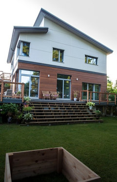
    Maybe with a lighter wood, the white would work as in the charcoal/cedar one I posted. Or put the wood on the bottom since it looks stouter than white underneath the upper volume.


    Modern Heavy Timber Curved Wall Home · More Info


    Surrey Passive House, Canada · More Info


  • 5 years ago
    last modified: 5 years ago

    We had a large blank wall on our driveway elevation, so I think that is what is drawing attention, not the windows. They don't seem that wonky to me.

    I think the current, just slightly darker horizontal belly bands, are an important horizontal element and should be kept.

    What about focusing on the garage? Maybe a simple, contemporary eyebrow pergola? Deeper, contrasting framing? Striking contemporary lights mounted over the garage? New doors? This would emphasize the ground level without breaking up the house into two colors.


    PS: We also have the same recessed entry. We need to enlarge our entry's corner post. @erinsaidso, would you share the width of your corner post? It looks great - your whole house is gorgeous! Thanks.

  • PRO
    5 years ago

    The front is fabulous take thos bushes all away and work on that first then the back will be easier and now seeing the front that landscaping pic I posted works even better

  • 5 years ago

    Your home is beautiful!…new lighting landscaping is the key!
    Leave it as is..so classic and sophisticated..live the vertical siding.

  • 5 years ago

    I would go with the vertical you have now. Much better look.