

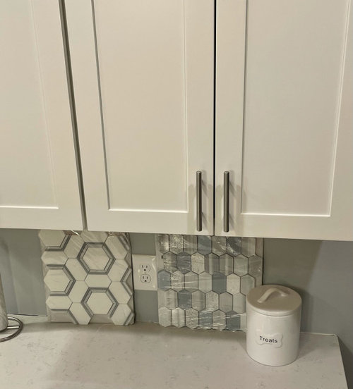
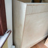
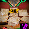
backsplash dilemma ..
4 years ago
Sort by:Oldest
Comments (21)

Related Stories

KITCHEN DESIGNDesign Dilemma: My Kitchen Needs Help!
See how you can update a kitchen with new countertops, light fixtures, paint and hardware
Full Story
REMODELING GUIDESHouzzers to the Rescue: Users Solve Design Dilemmas
The proof is in the painting — and the pond. As Houzz users hit 100,000 discussions, see some of the results of their advice and ideas
Full Story
Design Dilemmas: 5 Questions for Design Stars
Share Your Design Know-How on the Houzz Questions Board
Full Story
KITCHEN DESIGNDesign Dilemma: Lightening Up a Kitchen
What counters and accents could balance the wood in this kitchen?
Full Story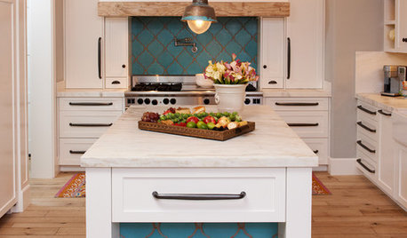
KITCHEN DESIGN10 Gorgeous Backsplash Alternatives to Subway Tile
Artistic installations, back-painted glass and pivoting windows prove there are backsplash possibilities beyond the platform
Full Story
KITCHEN DESIGNCountertop and Backsplash: Making the Perfect Match
Zero in on a kitchen combo you'll love with these strategies and great countertop-backsplash mixes for inspiration
Full Story
MATERIALSKitchen Ideas: How to Choose the Perfect Backsplash
Backsplashes not only protect your walls, they also add color, pattern and texture. Find out which material is right for you
Full Story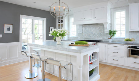
KITCHEN DESIGNHow to Add a Kitchen Backsplash
Great project: Install glass, tile or another decorative material for a gorgeous and protective backsplash
Full Story
KITCHEN DESIGNHouzz Quiz: Which Kitchen Backsplash Material Is Right for You?
With so many options available, see if we can help you narrow down the selection
Full Story
MOST POPULARThe 15 Most Popular Kitchen Storage Ideas on Houzz
Solve common kitchen dilemmas in style with custom and ready-made organizers, drawers, shelves and more
Full Story

tdemonti
lucky998877
Related Professionals
Elmira Interior Designers & Decorators · Fort Collins Interior Designers & Decorators · Kalispell Interior Designers & Decorators · Gainesville Architects & Building Designers · Sarasota Architects & Building Designers · Bangor Architects & Building Designers · Chatham Architects & Building Designers · Grand Forks Kitchen & Bathroom Designers · Norfolk Kitchen & Bathroom Designers · Williamsport Kitchen & Bathroom Designers · Hopkinsville Kitchen & Bathroom Designers · Brooklyn Kitchen & Bathroom Designers · Vineland Custom Countertops · Elmira Custom Countertops · Murrieta Custom CountertopsHU-187528210
herbflavor
jck910
decoenthusiaste
Chayala C
J
K R
Karen Mosher
P JOriginal Author
bearbev
Amy K
acm
eld6161
porkchop_z5b_MI
gilmank
Fori
jennstuff
Olychick
Shannon_WI