

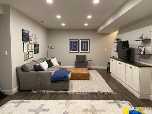
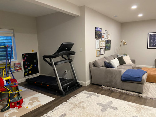
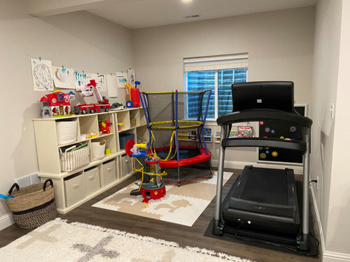
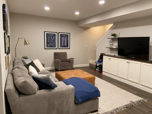
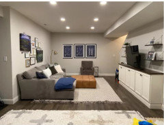
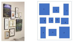
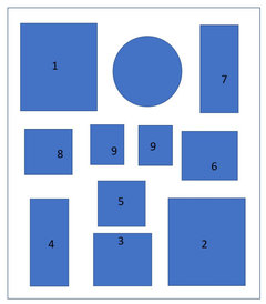
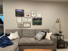
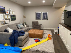
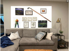
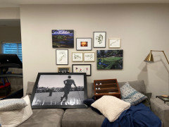
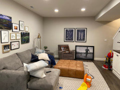
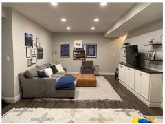
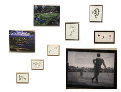
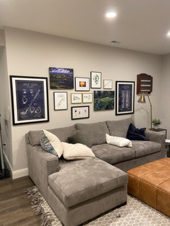
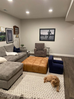
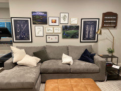
Help to finish my basement design
4 years ago
last modified: 4 years ago
Featured Answer
Sort by:Oldest
Comments (15)
 4 years ago
 4 years ago
Related Professionals
Des Moines Interior Designers & Decorators · Bloomington Architects & Building Designers · Athens Kitchen & Bathroom Designers · Jacksonville Kitchen & Bathroom Designers · Sarnia Kitchen & Bathroom Designers · Gainesville Interior Designers & Decorators · Portsmouth Interior Designers & Decorators · Murfreesboro Interior Designers & Decorators · Yuba City Interior Designers & Decorators · Amarillo Interior Designers & Decorators · Annapolis Kitchen & Bathroom Designers · Chicago Kitchen & Bathroom Designers · Rochester Kitchen & Bathroom Designers · Milwaukee Kitchen & Bathroom Designers · Coeur d'Alene Furniture & Accessories- 4 years ago
 4 years ago
- 4 years ago
- 4 years ago
- 4 years ago
- 4 years ago
- 4 years ago
- 4 years ago
- 4 years agolast modified: 4 years ago
 PRO4 years ago
- 4 years ago
 PRO4 years ago

Related Stories
REMODELING GUIDESContractor Tips: Finish Your Basement the Right Way
Go underground for the great room your home has been missing. Just make sure you consider these elements of finished basement design
Full Story
REMODELING GUIDES11 Ways to Finesse Your Finished Basement
Make your hideaway more enjoyable, fun and suited to your style with these useful tips
Full Story
BASEMENTSDesign Workshop: Is It Time to Let Basements Become Extinct?
Costly and often unnecessary, basements may become obsolete — if they aren’t already. Here are responses to every reason to keep them around
Full Story
BASEMENTSIdeas for Partially Finishing Your Basement
Transform your lower level into a living area, laundry, bathroom or office you can use now — without a full renovation
Full Story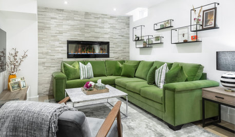
BASEMENTSA Light, Bright Basement Inspired by Midcentury Design
Designers create an organic and airy feel in this underground space in Toronto
Full Story
UNIVERSAL DESIGNMy Houzz: Universal Design Helps an 8-Year-Old Feel at Home
An innovative sensory room, wide doors and hallways, and other thoughtful design moves make this Canadian home work for the whole family
Full Story
BEDROOMSA Little Design Help Goes a Long Way in This Bedroom
A Kentucky couple bring in a designer to polish up a bedroom redesign project they had started
Full Story
HOUZZ PRODUCT NEWSHouzz Pro 3D Floor Planner Helps Clients Visualize Designs
The updated tool shows remodeled spaces in 3D with Benjamin Moore paint colors and wood, carpet and tile flooring
Full Story
HOUZZ PRODUCT NEWSKitchen Cabinet Hardware Finishes That Designers Love Right Now
Designers and remodelers tell us that brushed metal, leather and knurled pulls are among the hottest hardware finishes
Full Story0
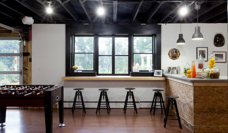
BASEMENTSBasement of the Week: Newly Finished and Open to the Outdoors
Relaxing, working, playing ... a New Jersey family can pick their pastime in this industrial-style walk-out leading to a new patio
Full Story



WestCoast Hopeful