Software
Houzz Logo Print
tiffany_ballard79

Finalizing Kitchen - Wall of turquoise zellige, too much?

4 years ago
Hi Everyone,

We are making the final decisions on the finishes for our kitchen remodel. We need to place orders to make sure things are here in time. I would really appreciate your input and ideas for our finishes.


We have purchased our flooring, appliances (SS), and cabinet/drawer faces.

We are using a white quartz with subtle veining for all surfaces.


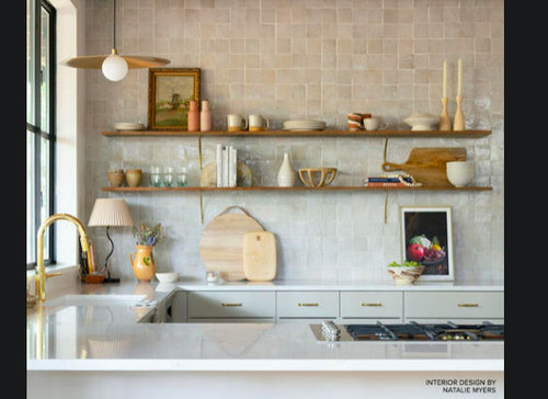
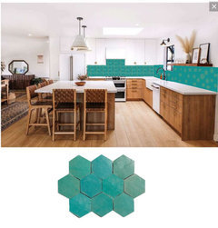
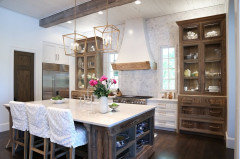
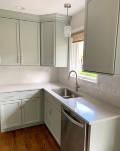
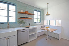
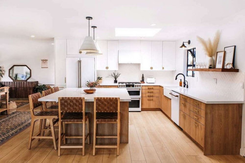
This is an image from a kitchen using the same floors and door fronts as we are using. We are using flooret Soho Signature floors and Semihandmade tahoe fronts (for the appliance wall) and semihandmade white shaker for all the other cabinets (island and cooktop cabinet run).


Backsplash/cooktop wall

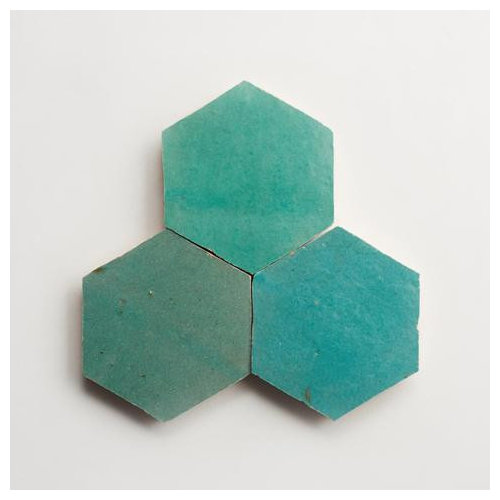
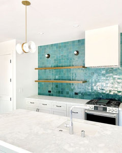
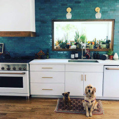
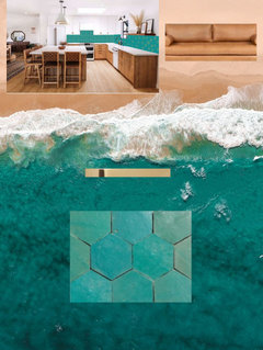
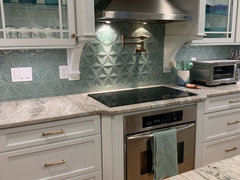
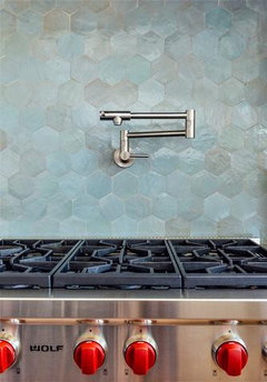
  • backsplash (90% set on using cle zelige tile, but nervous.... here is the tile

My other idea is to use the quartz counters as the backsplash, but I worry it is too much white, safe and boring, no personality


White oak opening shelving (with no hardware, floating). Thinking two shelves to the left of the hood, none to the right. I like the scale of this shelving, but what about the sink that will be right there too?


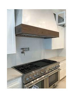
white oak cooktop hood, or should the hood be white or something else?


lighting

  • location of recessed lights
  • pendants for the island (2 or 3). The island will be 11 x 6
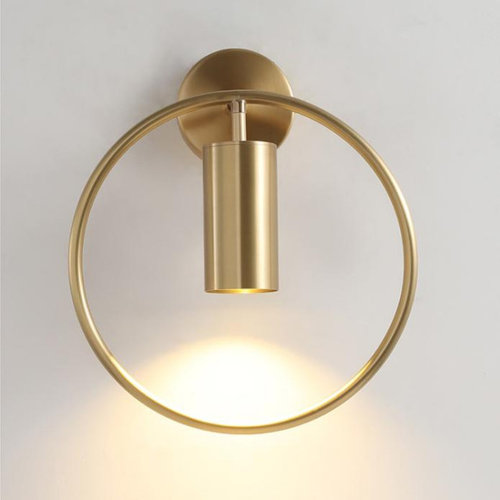
  • scones for the backsplash wall, maybe one over the sink, or one on each side of the cooktop. I like this one for over the sink on the wall,


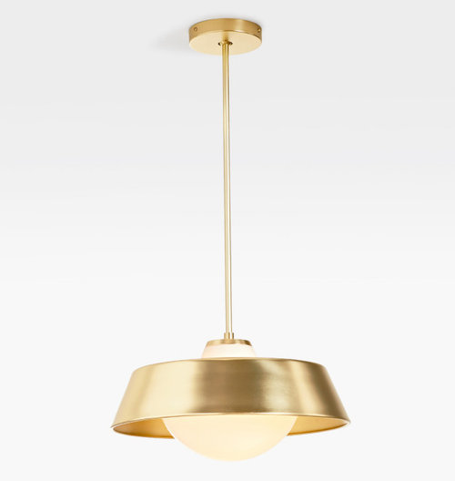
I like these pendants for the island, but I am unsure, maybe we have too much brass and white and need some black somewhere. Do we want 2 or 3 pendants?


hardware

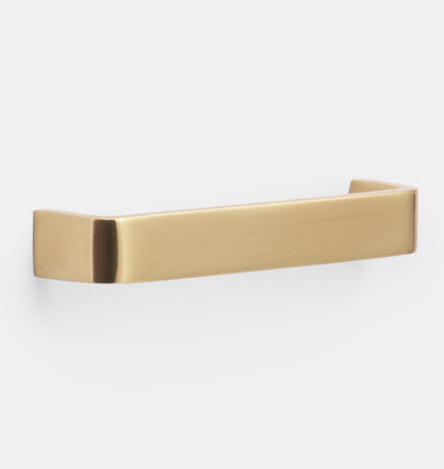
  • I bought one of these and we like it and it matches our faucets. I also like that we won't catch our clothing on it and are less likely to bruise ourselves if we bump into it.

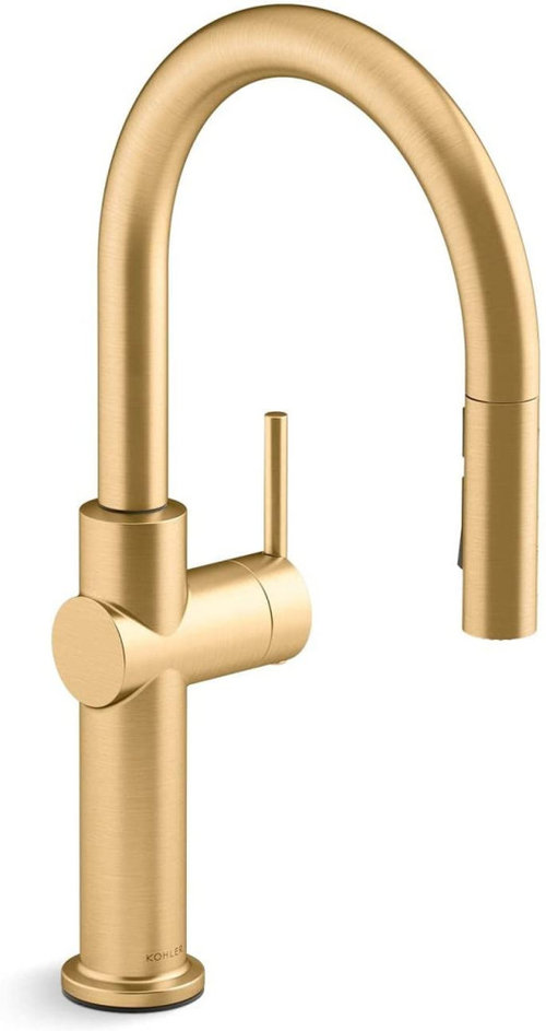
Here are the faucets we are using


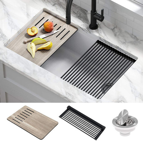
Here are the sinks we plan to use

Worries - I'm worried it is too much white and brass and maybe we need some black somewhere. I know I don't want black hardware on the white cabinets, but I am open to black on the tahoe cabinets. I am also worried about too much turquoise backsplash, but I do LOVE it, like it makes me smile inside and out when I look at, just not sure about soooo much of it, but I also kind of like that idea too...


Thank you for your thoughts and ideas

Comments (52)

  • 4 years ago

    💖

  • 4 years ago
    last modified: 4 years ago

    Love the turquoise. Is there a related color in the adjacent space? I think that backsplash will keep the kitchen from feeling too bland. Given the description of how it makes you feel, I think it's a winner.

    Tiffany Ballard thanked Anna (6B/7A in MD)
  • 4 years ago

    Thanks so much for your thoughtful reply and compliments. My ideas mostly come from the collection of insightful and talented pros and non-pro houzz contributors. Sooooo many hours reading thread, after thread.


    I started with the white zelige, then moved on to what I would call a muddy green/blue and I keep coming back to TURQUOISE...haha...The amount of samples I have in my garage is a bit embarrassing, but at least I work at an arts magnet school, I know they will put my leftover tiles to excellent use. :)


    I get waiting on the finishes, but with shipping and lead time, I do need to make decisions, my contractor is great, but only has so much time. I don't think I can expect him to come back 2 months after the project to install the tile, but maybe we can hold off on that....


    What are your thoughts about mixing the hardware? Or what lighting to add to the cooktop wall?


  • PRO
    4 years ago


    Tiffany Ballard thanked BeverlyFLADeziner
  • 4 years ago

    Thank you so much for the image...that much and more...I still love it...I do have a bold personality :)


    My husband thought the hex would reduce the visual impact a bit more than the 4 x 4. What do you think about the 4 x 4 turquoise instead of the hex?


  • 4 years ago

    Anna, there are adjacent colors and I thought I would LOVE them MORE than the turquoise, but when I put them in the room, they are not as beautiful (to me). My struggle is when I see pictures of the more muted colors, I think they are beautiful, truly....BUT...when I am making my choices, my heart always goes for COLOR, lots of it. haha


  • 4 years ago

    Any thoughts about the other finishes? Lighting, 2 or 3 pendants. Something different than the pendants I chose? Scones on the backsplash wall?

  • PRO
    4 years ago

    This tile from WOW is similar but a little softer. Good price point.


    Tiffany Ballard thanked Kristin Petro Interiors, Inc.
  • 4 years ago
    last modified: 4 years ago

    I have no problem with the turquoise TODAY. However, in a few years you may be sorry you committed to such a strong color. I'm going back in time to when we were first married... harvest gold, avacado...I thought it was so "now". Well it was "now" for about 5 years.

    I do like zelige tile, just would like you to consider something for the long term.

    Have you read this article?


    https://www.remodelista.com/posts/moroccan-zellige-terracotta-tiles-pros-cons/

    Tiffany Ballard thanked elcieg
  • 4 years ago

    I would go for the color, although:

    not small hexagons & not a large area (limit it to one region, behind cooktop say)


    I love the look of mixed pastel tiles, as one might see in a Scandinavian inspired kitchen, and similar to one that has been posted above. I wonder if you can create a mix of zelige tile that incorporates the bold turquoise but also includes several softer colors? Or even just a mix of the turquoise and cream? You would have to create a mock up to be sure that the mix works IRL.


  • 4 years ago

    @Tiffany Ballard - Your inspo photo is drop-dead gorgeous! (and this is coming from a person that is NOT fond of "wood".) While I love your adventurous nature re turquoise tile, IMO that particular shade is not in keeping with the overall vibe (thank you @BeverlyFLADeziner for the visual). Color-matched paint of proposed tiles, applied to a large area after the rest is installed, would be beneficial before making the final selection. You've made beautiful choices - don't rush the last one.

  • 4 years ago

    I love the turquoise color, but I think the hex tile is too small for such a large area.

    Tiffany Ballard thanked spainte2
  • PRO
    4 years ago

    I would select a square format to reduce the number of cuts for such a small area.

    Tiffany Ballard thanked BeverlyFLADeziner
  • 4 years ago

    It is all beautiful but a lot of bling. Does it go with the rest of your home?

    Tiffany Ballard thanked jck910
  • 4 years ago

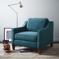
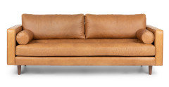
    The rest of the house is still in progress, we have this coach and chairs. Creamy walls. Our dining room table is a simple walnut table from Crate and Barrel. Need to replace our dining room chairs. I will also need to purchase counter stools for the kitchen


  • 4 years ago

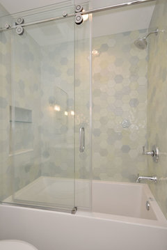
    I love the feel of these pictures. With the lighting in my kitchen, the tile is right in between these two shades,


  • 4 years ago

    You asked about the lights:

    I love the pendant! You just need to be sure that the scale of it works with the space (not too small or too large). Without seeing the floor plan (if you posted a link, I missed it) with all dimensions, can't comment upon whether 2 or 3 are needed. You can get some information from the manufacturer that will help you decide - should be specs available that tell you the diameter of the illuminated area for each pendant (and the closer to the surface, the narrower the diameter will be). You want them to slightly overlap at the edges, to make sure that the work surface is well lit (assuming that they will be going over a work surface and not just an eating space.)

    I don't love the sconce so much, but that is MY taste, not yours.


    Placement of recessed ceiling lights: you can also get the specs on the brand you are planning to use, and use that to determine how far apart they should be. My lighting designer told me to place them centered over the edge of the counter, so no glare and no shadows on the counter; also to be mindful not to place them where an open cabinet door will block the light from illuminating the inside of the cabinet (so you can see deep inside) as much as possible.


    I don't think that you need to bring in black touches. I think that the SS appliances will provide some variety, and also then with perhaps color on the walls (if not from tile) or in things like trivets, tea kettle, canisters, perhaps a little rug - the gold, white and warm wood shine but not be monotonous.

    I like lots of color too, but elected to not have tile - my walls are a soft green-blue (more green or more blue depending on what is against it) and I have bold blue trivets, blue tea pot on the counter, a funky rooster in a corner, and shades of blue, turquoise, green, yellow all through the space in jars and so forth.


    Tiffany Ballard thanked raee_gw zone 5b-6a Ohio
  • 4 years ago

    Love it, follow the advice for the squares.

    Tiffany Ballard thanked Anna (6B/7A in MD)
  • 4 years ago

    I love the turquoise and would absolutely do it if I was in your place. I think either square of hex would work. If my math is right, a 3.5" hex tile has 65% of the surface area of the 4x4 square. I did a 4x4 square in my own kitchen (plain white; I added interest in other elements).


    Tiffany Ballard thanked cawaps
  • 4 years ago

    I could never get bored with the beautiful colors of nature.


    Tiffany Ballard thanked rebunky
  • 4 years ago

    I love the turquoise, and so do you -- go for it!

    Tiffany Ballard thanked porkchop_z5b_MI
  • 4 years ago

    It's such a beautiful color! Safety check: did you see this tile and fall in love with teal? Or have you always been drawn to this color? The more history you have with this color, the more likely you are to love your tiles for years.


    I do wonder though, if the bright color, plus the hex shape, plus the intense texture, adds up to a bit much. Switching to a square or rectangle, or a smooth hex, might bring some calm that would help this beautiful color settle nicely into its surroundings. I LOVE the dark blue tile example you posted. And I think part of its attraction is that the color is the star. The shape and texture are much more subdued, letting the slightly varied deep color really shine.

    Tiffany Ballard thanked mcarroll16
  • 4 years ago

    I think your choices all look gorgeous. I do like the tile - but I agree with BeverlyFLADeziner to go with that colour in square. For some reason when I see hex I think bathrooms. I think more often than not, that is where you see it applied and now it is in my mind.

    The lighting choices are very nice as well. Did you give the dimensions of the island? Maybe I missed it - and what is the diameter of the pendant you've shown.

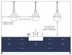
    Here is an article on placement that may help.

    And here are some graphics.

    You may have to order some and see what works best in your space but it comes down to the size and style of the light, the size of the island and personal taste. You'll know it when you see it.

    kitchen spacing diagram - Google Search · More Info

    You were asking about the range hood. What if the hood was white but had a band of walnut around it.

    Something about the shape of the hood bothers me about this first one, but the band of wood is what I like.


    Here is another example. The wood add warmth and texture and will help marry your two door colours together as well.


    Please be sure to come back and post progress and finished photos. I think it will be spectacular.

    Tiffany Ballard thanked mvcanada
  • 4 years ago

    I say if you love it go for it! I’ve been second guessing my counter Bc it’s a bit more bold but it makes me happy looking at it and that’s how you should feel so I’m going for it. The hex seems like it will be a bit small but could work..I did white cabinets and a wood island and hood. I like the contrast between the hood and cabinets.

    Tiffany Ballard thanked newkitchenny55
  • 4 years ago

    I absolutely love the inspiration photos, and would have done something similar if it wouldn't look completely out of place in our late 1920s house. If it's one of your colors, go for it!


    I'm not wild about the hexes though, and they're more expensive to install, on top of the tile type being more expensive to install as well.

    Tiffany Ballard thanked Port of Indecision
  • 4 years ago

    I think it will be gorgeous, but what throws things off is your initial picture with the wood on the bottom and white cabinetry on top. I don't like the look of the turquoise smushed between the two. The 3 colours is too much. However, your inspo pics with the all white and colourful tile works. If I understand your description correctly, The wall of cabs with the tile will be all white, non? I slightly prefer the squares over hexes, but think either could work.

    Tiffany Ballard thanked daisychain Zn3b
  • 4 years ago

    I'm in the minority here . . . I like the hexagon tiles and think this will look beautiful. I do not think you should introduce any black hardware into this design as the tile, stainless, white and wood offer plenty of contrast.

    Tiffany Ballard thanked Rachel
  • 4 years ago

    What are you likely to have sitting on your counters full time? Think about how the colors of small appliances (coffee maker, toaster, etc) will work within the big picture.

    Tiffany Ballard thanked maddielee
  • 4 years ago

    I say go for it. We used a similar but slightly lighter color and an interesting shape in our kitchen refresh and have gotten nothing but compliments on it. Every day it makes me happy.


    Tiffany Ballard thanked clt3
  • 4 years ago

    @clt3 this is beautiful! Is that fantasy brown?

  • 4 years ago

    @Rachel, yes, it's Fantasy Brown.

  • 4 years ago

    Please post updates! We love to see interesting and fun kitchens.

    Tiffany Ballard thanked Anna (6B/7A in MD)
  • 4 years ago

    Love it all, do it because it makes you happy! Regarding the hex shape...I did a much larger hex tile on my fireplace and that shape is exactly what everyone responds to. You can do point up or level top, I'm drawn to the point top pattern. Good luck!

    Tiffany Ballard thanked lucky998877
  • 4 years ago

    Do the turquoise Zellige! You can check out Zia tile too— better customer service. (Though we ordered Cle cement tile for a project and had no prob) please no more white. Everyone does white. You’ll never regret unique and you’ll love your favorite color popping at ya.

    Tiffany Ballard thanked lynne3450
  • 4 years ago

    PS I LOVE your style and taste!!!

    Tiffany Ballard thanked lynne3450
  • PRO
    4 years ago
    last modified: 4 years ago

    This is a kitchen I recently designed with a hexagon tile backsplash (in shades of white). This might help you to visualize the scale.


    Tiffany Ballard thanked Kristin Petro Interiors, Inc.
  • 4 years ago

    weighing in in favour of the turquoise! I think it will be unique and stunning!

    Also in terms of "will you still love it in the long term" -- you certainly want something you'll enjoy for many years, but if you've totally moved on from this aesthetic in a few years replacing a backsplash isn't a colossal job.

    Tiffany Ballard thanked denkyem
  • 4 years ago

    And is your space going to have the tile up behind shelving or just under cabinets or what? Would be helpful to know just how much tile we are talking about here... :)

  • 4 years ago

    Thank you all so much for your encouragement and input! I only have a couple of minutes right now. The wall of tile will be 21ft and run to the ceiling. It will be behind the shelves and the hood.


    Thank you for the hood idea, I really like the band of wood on the edge.


    I have samples of both cle and Zia. The color and sheen of the cle is a bit richers and a teeny bit shinier. I really want to love the Zia tile more, for the customer service reasons and the quality reasons, and also because the color of the tile is called Tulum, which is where my husband and I were married.


    Turquoise does hold lots of meaning for me.


    Be back later


    THANK YOUI

  • 4 years ago

    You love the tile -- don't wait for our permission, use it! :))


    A backsplash is a relatively easy thing to change, should you want something more restful later (or for resale), so don't let future worries hold you back from current joy.

  • 4 years ago

    raee_gw zone 5b-6a Ohio and @mvcanada - thank you for the suggestions for lighting. The island is 11 x 6. I think I will go with 3. Helpful information about the recessed lighting too.

  • 4 years ago

    judianna20 - Thank you for the link, yes I have read that article and a handful more. I have also read the reviews about cle. So far, the samples cle send have been high quality. I think I will tape my samples to my wall, take some pics and see what looks best.


    zelige makes me nervous, but I have a highly skilled tile person...go big, or go home, yes?

  • 4 years ago

    I would do teal but in a lighter muted version…I find with most my clients that insisted on bright strong colored tile have regretted it…tired of the strong color quickly.

    Tiffany Ballard thanked Home Interiors With Ease
  • 4 years ago

    Thank you HIWE - we still love the turquoise, but I did order some samples of this color


    The room is north east facing, so I think it may not be too pastel.

  • 4 years ago

    lovely


    Tiffany Ballard thanked Rachel
  • 4 years ago

    "...there are adjacent colors and I thought I would LOVE them MORE than the turquoise, but when I put them in the room, they are not as beautiful (to me). My struggle is when I see pictures of the more muted colors, I think they are beautiful, truly....BUT...when I am making my choices, my heart always goes for COLOR, lots of it. haha"


    I feel like you already have your answer, from your own keyboard. My personal philosophy is to try to avoid choosing things you love that are super on-trend (that is infatuation- not love), and try to avoid choosing things that feel 'meh' to you now, because you are worried about what you may or may not like 10 years from now. Be brave. In 5 years, you can look at that wall of turquoise and have a constant reminder that you had the courage to live boldly follow your heart.


    (disclaimer- this advice comes from a person who drove to a car dealer in another state because they were the only ones within 400 miles who had the car I wanted in mint green. And every day that mint green car makes me smile.)

    Tiffany Ballard thanked sholt576
  • 4 years ago

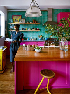
    I found this wonderfully bold kitchen using the zellige turquoise tiles. The owners are from Jamaica and wanted their home to remind them of their Caribbean roots. A friend asked how she got her husband on board with the hot pink cabinets. She said it was his idea! It brought him fond memories of his father who had a magenta colored Cadillac.


    So I guess my point is that if you have a personal connection to the bright turquoise, it brings you happy memories, it makes you do the happy dance, then you should definitely go with your heart. You will always regret it if you don’t. The more subtle blue hex backsplash above is gorgeous, but will it bring you as much joy as the bold turquoise?

    Not sure about sitting on that yellow stool! 🤣

  • 4 years ago

    @rebunky that kitchen is lovely!

  • last year

    @Tiffany Ballard I know this thread is not new but I NEEEED to know what you went with. I am so invested. 😂 I have turquise zelliege being installed next week. I like you ruminated on them for some time. And have so many samples of tones (light and deep) but kept coming back to the true turqoise like you. I am going with 2" x 6" tiles. I also replaced our black stainless range and over range microwave with a red range and hood. I would love to hear and see how it all turned out for you and share with you too.