

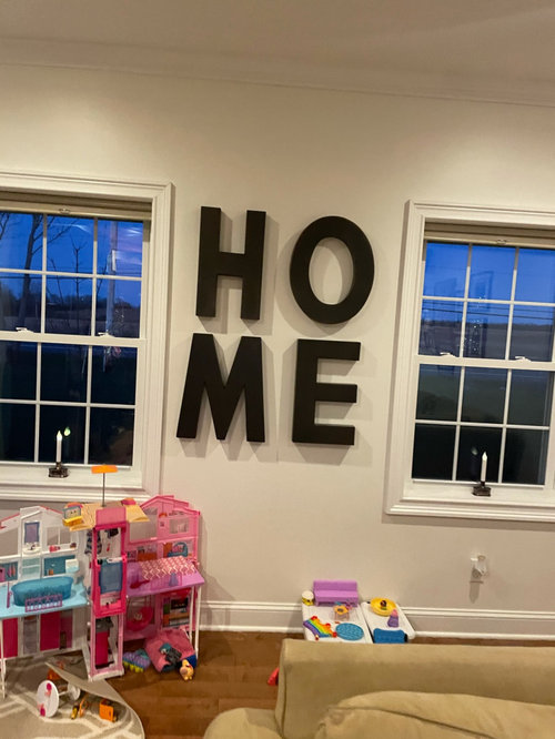
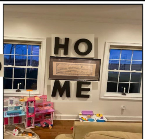
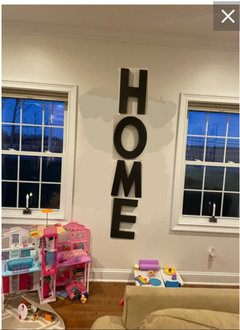
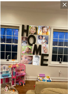
How does this look?
4 years ago

Featured Answer
Sort by:Oldest
Comments (34)
 4 years ago
Related Professionals
Jacksonville Interior Designers & Decorators · Clearlake Interior Designers & Decorators · Washington Kitchen & Bathroom Designers · Montgomery Furniture & Accessories · Ocala Furniture & Accessories · Selma Design-Build Firms · Danbury Design-Build Firms · Sterling Design-Build Firms · Potsdam Interior Designers & Decorators · Kenosha Interior Designers & Decorators · Belleville Architects & Building Designers · Show Low Architects & Building Designers · Chatham Architects & Building Designers · York Kitchen & Bathroom Designers · Hilton Head Island Kitchen & Bathroom Designers- 4 years ago
 4 years ago
 4 years agolast modified: 4 years ago
- 4 years ago
 PRO4 years ago
- 4 years ago
 4 years ago
- 4 years ago
- 4 years ago
- 4 years ago
- 4 years ago
- 4 years ago
- 4 years ago
 4 years ago
- 4 years ago
- 4 years ago
 PRO4 years ago
- PRO4 years ago
- 4 years ago
- 4 years ago
 4 years agolast modified: 4 years ago
- 4 years ago
- 4 years ago
- 4 years ago
 4 years ago
 4 years ago
- 4 years ago
 PRO4 years ago
 4 years ago
 4 years ago
 PRO4 years ago
- 4 years ago




Related Stories

INSIDE HOUZZHow Much Does a Remodel Cost, and How Long Does It Take?
The 2016 Houzz & Home survey asked 120,000 Houzzers about their renovation projects. Here’s what they said
Full Story
FUN HOUZZ10 Truly Irritating Things Your Partner Does in the Kitchen
Dirty dishes, food scraps in the sink — will the madness ever stop?
Full Story
Movie: How Much Does Your Building Weigh, Mr. Foster?
New documentary explores the famed British architect's rise to international success
Full Story
LIFEHouzz Call: What Does Summer Look Like at Your Home?
Kids, water, sunshine, backyards, cold drinks — share photos of what summer at home means to you
Full Story
KITCHEN DESIGNHow Much Does a Kitchen Makeover Cost?
See what upgrades you can expect in 3 budget ranges, from basic swap-outs to full-on overhauls
Full Story
MOST POPULARWhen Does a House Become a Home?
Getting settled can take more than arranging all your stuff. Discover how to make a real connection with where you live
Full Story
LANDSCAPE DESIGNDoes Your Landscape Need a Little ‘Cosmic Latte’?
Beige — the color of the universe — can be both building block and backdrop in a contemporary garden
Full Story
DECORATING GUIDESWhat Does Your Inspiration Board Say About You?
Scraps pinned on a mood board may provide clues to your personality. See what your board reveals
Full Story
ROOM OF THE DAYRoom of the Day: Living Room Does a Vintage-Meets-Modern Balancing Act
Old is new again in this Austin, Texas, living room full of easy decorating tricks
Full Story
FEEL-GOOD HOMEDoes Your Home Make You Happy?
How to design an interior that speaks to your heart as well as your eyes
Full Story



jmm1837