Software
Houzz Logo Print
mxk3

BM Edgecomb Gray wackiness

4 years ago

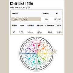
I looked at the Colorography color wheel which puts it on the warm side of the YR family, but easyRGB lists a different hue angle and puts it just a teeeny tiny bit over into the YG family.


Whichever one it is, I am so surprised at how fleshy orange EG looks on my walls. Like wow. There is nothing else orange or red in the area or outside the window that cause such a color shift. Ugh, another no-go color.


My other one in the wall is BM Old Prairie, I have to sit on that one a while. It doesn't look bad on the wall that gets sun, but a bit too bright on the wall that gets no direct light. It's a sunny day today, if it looks like prison gray when it's overcast that's a no-go.


I'm getting very frustrated because everything in the Y family pulls yellow or really ugly orange-yellow tan on my walls, greiges are pulling pink, so I think I'm pretty much limited to something with green undertones. But, I need to be careful not to pull too much green from the color, I have a green kitchen and don't want to live in a big green box. Dang if I didn't do so much green in the kitchen I'd just do a green on the walls and call it a day. Sigh....


Eh, I've been through this before, I'll figure it out. I don't have a phone to snap pics right now, but I'll probably be back on the board asking for concrete input if after about 15-20 more attempts I still can't find "it". Guess I just wanted to vent and stress it to everyone that thinks they can just pick a color based on the paint chip and it will look fine -- no, it probably won't.


BTW -- yes I have Samplize samples of some colors but couple I wanted to sample directly on the walls.


Comments (9)

  • PRO
    4 years ago
    last modified: 4 years ago

    IMO your lighting needs to be addressed and stop reading all the stuff about paint choices get some poster board large get some samples paint the boards with 2 coats then move them around to see how they look in the spaces. BTW LED 4000K lighting will make color stay true at night the same as daylight if you go too warm with the lighting it casts a yellow glow on everything. there is something going on with your lighting if that color ever would look flesh toned.

  • PRO
    4 years ago

    Whichever one it is, I am so surprised at how fleshy orange EG looks on my walls.


    EG's Munsell hue family is 2.02 Yellow. Over near the Yellow-Red Hue Family. Which explains its fleshy orange overtones.... because it's literally over near the tail end of the orange hue family.


    EasyR's published LCh hue angle is 90.


    2.02 Y and 90 degrees are less than 10 degrees a part. The reason why they're different is because they're two different notations for two different color models. Both strive to numerically define color appearance the way a human eye sees it under a defined light source.


    Factual color notations are a fabulous first approximation of color appearance. LCh and Munsell are always close, rarely exactly the same. Which is ideal because the difference effectively represents the fact that not everyone perceives color the same way.


    Which is why I always include both LCh and Munsell. Considering the range between the two sets realistic expectations for how a color will actually show up when in place.


    In the case of EG, thanks to the notations we know to look for orangeish, greenish or a neutral warmish gray.


  • 4 years ago

    Patricia -- I tested the paint on a primed wall in the daytime with the sun streaming in, which is the time of day I'm in there the most; lightbulbs have nothing to do with it.


    Lori -- that is helpful. There's something about that particular wall and the way the southern light hits it that is causing all kinds of wonkiness with these light colors. BM Gentle Cream looked like orange sherbet, and BM Pale Almond ended up soft bright yellow.


    I'm very tempted to go darker, I might get some Samplize or sample cans and go down in the range of Sag Harbor Gray or Sandy Hook Gray as a starting point. Or just keep trying lightish colors I know lean to the green side of things.

  • 4 years ago

    Thank you for that explanation, Jennifer - it is helpful.


    I did prime the walls white -- not the entire wall but quite a large area so the samples are not directly next to the wall color.


    I'm actually not specifically looking for a grey color; I'm not against it, I just have to be very, very careful because we're cloudy much of the time up here in MI and grey can be utterly depressing so I would want a grey that's warm enough to offset it. But greige = pulls pink in this house. Too bad, too -- because my other house had some nice greige.

  • 4 years ago

    This apparently can lean a little green...


  • 3 years ago

    Hello. I have the same issue with Edgecomb Gray after painting my living room and now trying to get another off white colour that does not go so yellow green and wondering if you did get a colour that worked.

  • 3 years ago

    Brian -- I ended up painting that area BM High Park, which is a greyed-green, not even close to Edgecomb Grey LOL!


    Regarding off-whites, though, I did paint other areas of the house BM Moonlight White and I LOVE IT! People on the boards jump and down about how wonderful BM Simply White is -- well, it's certainly quite nice but it's too white for my house. Moonlight White is one color down on the same paint strip. It has an ever so slight silvery-green cast to it, which keeps it from looking too yellow; it just looks like a clean, soft white in my house and glows with a beautiful warmth in the morning and evening lights.


    Whites and off-whites are super-tricky, though -- you have to sample, sample, sample and then sample some more until you get one that looks good in YOUR setting.

  • 3 years ago

    @Brian Dowdall, look at BM Pale Oak. It's lighter than EG, so maybe isn't what you're looking for, but it is not as yellow-green - at least in the light conditions I have. Have you looked at Balboa Mist?