Software
Houzz Logo Print
gatorgal

ARE THESE PENDANTS TOO LARGE?

4 years ago
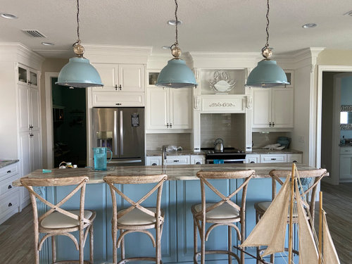
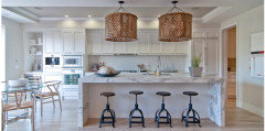
They are 17" and the island is 9.5 ft.


Comments (39)

  • 4 years ago

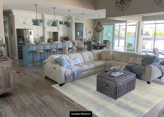
    The color of the island matches the pendants better than the photo color. Do they overpower the white cabinets and take all the focus off the rest of the kitchen?

  • PRO
    4 years ago
    I always advise our clients to have what they like, so if you love it....

    As to opinion from a design/build/remodel firm in the Dallas area for 30+ years, yes, they are too large, and colormatching makes it such that all the eye goes to is the island and pendants.

    Formula used is generally, for 3 pendants, divide island length into 1/3's--yours is 108", so 1/3 is 38. 1/3 of that dimension is approx the max. diameter pendants/mini pendants should be, so yours would equal between 12-13" max. Currently, at 17", that is just under half odf the total length of the island, making them seem too large for the space--like I said, opinion only!

    gatorgal thanked Mil-Ron Custom Construction
  • 4 years ago
    I think it's too much of that color, and they are too large. I'd go with two glass pendants.

    gatorgal thanked tfitz1006
  • 4 years ago
    Maybe try it with just 2 - keep the ones at either end and take down the middle one. See if that works better for your eye and with the scale of the island/room.


    gatorgal thanked mvcanada
  • PRO
    4 years ago

    I would do 3 glass pendants the solid look and that matching color is IMO too much heavieness and too much matching

    gatorgal thanked Patricia Colwell Consulting
  • 4 years ago
    last modified: 4 years ago

    Looks like 30"+/- between each pendant and 6 " from end. A commonly recommended spacing. The colour matching may be bringing too much of a draw to the island.


    Oversize Pendants Houzz

    (We're planning 4 pendants for a 12 ft. island. So by Mil-Ron's "rule," the max. pendant diameter should be 9". Don't think so. But will check that out.)

    gatorgal thanked worthy
  • 4 years ago

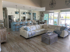
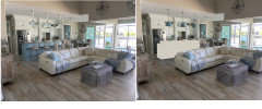
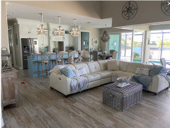
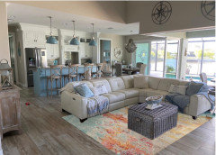
    I am posting another photo of the complete area. Is it still drawing too much attention by having the lights match the island and being too big? My husband just put them up and I guess I have to live with them. Should I maybe get the blue shades painted silver? Any ideas?

  • 4 years ago

    Personally, I love them and I think that they look fantastic in your space. Your water view! Perfect with the pendants.

    gatorgal thanked Sally T
  • 4 years ago

    Thanks sally! i have been thinking of removing the middle one as one person suggested but then the other 2 would probably be too far apart

  • 4 years ago
    last modified: 4 years ago

    I was going to say I think they're fabulous with your island colors and stools!

    I think you could get by with two but it would be better to move the pendants, not just remove the middle one and leave an unbalanced gap.


    gatorgal thanked barncatz
  • 4 years ago

    Looks awesome to me!

    gatorgal thanked rebunky
  • 4 years ago

    Looks lovely!! You have a great open space that nicely accommodates the 3 pendants. Well done!! Dont overthink it.

    gatorgal thanked kculbers
  • 4 years ago

    I agree - I think they are great in the context of the larger room - I would live with them and if they still bug you in a year then change them. It is nice to see something different :)

    gatorgal thanked la_la Girl
  • 4 years ago

    I like them

    gatorgal thanked emilyam819
  • 4 years ago

    Just a tad oversized. Cover them with aluminum foil and see if that changes anything before you think of painting.

    gatorgal thanked Angel 18432
  • 4 years ago

    I think the size and spacing are good for the space. I would prefer that they not match the island and perhaps spray them white.

    gatorgal thanked Kate
  • 4 years ago

    If you have a minimum of 6" between pendants and no more than 12" between pendants, then you're okay.

    I, however, think the pendants are too large and too heavy looking and overpower the air space.

    gatorgal thanked elcieg
  • 4 years ago

    What about adding another bold element to balance the pendants? In Worthy’s pic, the visual weight of the black barstools seems to balance oversized pendants. Barstools that are more solid and/or dark might bring the heft your lights need. I love your lights! They help make your beautiful blue island a showstopper. Grand rooms need grand gestures!

    gatorgal thanked Mama Cita
  • 4 years ago
    last modified: 4 years ago

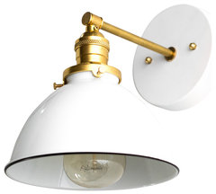
    I like them, but not here and not in a trio. They don't really appear to match the island and are visually heavy. Did you take one to the paint store to get a true match? This one has a pendant version and the company, Peared Creation, has lots of great ones.


    White and Raw Brass Modern Industrial Wall Sconce · More Info


    gatorgal thanked decoenthusiaste
  • 4 years ago

    I love them, I dont love how they match, scale is a little large. but they are awesome.

    Im not mad at the scale but I think the shape . These probably give you amazing task lighting as well, so if you love them keep them. I would not do glass bc of your can light placement you would loose the task light these provide. Glass just spills light everywhere. here is something similar, its distressed so its not quite as matchy but fits the vibe.Or I thought, paint the island? (crazy )I know


    gatorgal thanked RL Relocation LLC
  • gatorgal thanked RL Relocation LLC
  • gatorgal thanked RL Relocation LLC
  • 4 years ago
    last modified: 4 years ago

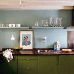
    I was just on another site that features a lot of European homes and it struck me how homogenous American kitchen design can be, with such a devotion to "matching". Here's a photo from a current French kitchen. Can you imagine the response if this kitchen owner had posted looking for feedback?


    Anyway, I'd add a large rag rug in your living area and call it a happy, blue day:


    gatorgal thanked barncatz
  • 4 years ago

    It's sort of a rock and a hard place - your room is large but with a large fixture combined with the ceiling height change and raised height counter, it tends towards reading as a "wall of fixtures."


    I think I'd take some hooks and try them about 6" higher. Nothing permanent, unless you like them better, then get them lifted by an electrician. But I'd probably look for a recessed linear led fixture - get the light but not the visual barrier.


  • 4 years ago

    I like the color of the pendants.

    I think they look too large in the close-up picture ... but right-sized in the farther-away picture.

    gatorgal thanked Mrs Pete
  • 4 years ago

    A bit off topic, but @barncatz, I’d love to know the name of that site!

  • 4 years ago

    @chinacatpeekin the photo is from Remodelista.

  • 4 years ago

    I think the lights are kinda great!


    They are the icing in the room. Very unexpected and yet they work so well with that view.


    If I walked into your home, I would love seeing them, because your space is not like many others.


    It works!


    gatorgal thanked njmomma
  • 4 years ago
    last modified: 4 years ago

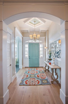
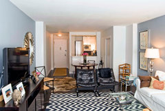
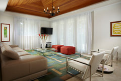
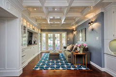
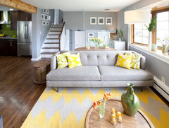
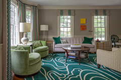
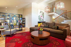
    the balance would arrive easily with a large patterned area rug around the seating zone. so the bit of visuals provided w the pendants would be part of the bounce the eyes do back to the ground level by the chairs/couch. thats what I would do. Leave the fixtures they look good. I might change the fixture at the table area to a "close to ceiling " simple piece. that would be easy. web sites allow customization of sizes and good pricing for all kinds of area rugs

    Lehi, House of Turquoise Blog, Featured Article · More Info


    39 Gramercy Park North · More Info


    Miami - Stephen Tulloch - Contemporary - By J Design Group - Interior Designers · More Info


    Miller Kitchen/Family Room Remodel · More Info


    Pasquella Living Room · More Info


    gatorgal thanked herbflavor
  • 4 years ago

    Yes, good idea. I think Barncatz had suggested a rug also! Thank you so much!

  • 4 years ago

    Would you get a rug with a lot of blue in it to balance it out or could it be more neutral and still accomplish the same purpose?

  • 4 years ago
    last modified: 4 years ago

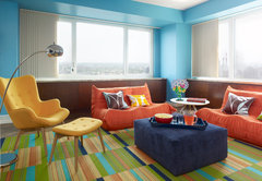
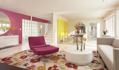
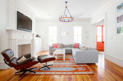
    rug: find a website and just look....space looks large..full of light..neutral furnishings. the kitchen blue is not bold..... I would bring in another color coral/green/yellows/ even just more blue shades... ..whatever you like. you are on water there/ you can be a little vibrant I think. A rug is not a permanent thing....you can push the envelope a bit.

    Lexington Green · More Info


    Porter Ranch Home · More Info


    Duplex City Residence · More Info


    Cedar Lake International Style · More Info


    My Houzz: A Celebration of Color in an Artist’s Family Home · More Info


    Manhattan · More Info


    gatorgal thanked herbflavor
  • 4 years ago

    On the hunt for the rug! You're the best!

  • 4 years ago

    re area rugs: my mom always liked the options for rugs at Ikea ....you dont think of Ikea for flooring but they do have choices there. We used to just browse at the interesting Scandi style [they use colors and neutrals both] and had fun seeing what they had. Other is local flooring stores do have area rugs hanging on the side wall typically. not a huge number but they will offer some discounts on their in stock picks. I think they like to keep some in and move them through so you can get lucky. But lots of online vendors these days .

  • 4 years ago
    last modified: 4 years ago

    The more I look at your space, the more I love. I mean every single thing is the perfect example of the ”Coastal” design.

    I like herbflavors idea of a rug. I think it would be the finishing touch.

    I quickly browsed the Rugs Direct site. Here is the just the first one I came across under the blue catagory that I thought might look nice. It kind of reminded me of an ocean swirl and brings in some subtle colors. There are tons more though you could try. Just pick the ”See in my room” and then upload your photo. You can also move it around or spin it. Actually, I think it was under the multi category.


    gatorgal thanked rebunky
  • 4 years ago
    last modified: 4 years ago

    oh thats nice. the bit of yellow or alternatively a coral? gives a nice touch. never fear color. layer the yellow w a toss pillow or two.

    San Francisco Pied á terre · More Info


    gatorgal thanked herbflavor
  • 4 years ago

    Sorry, now I am in rug shopping mode haha! I am also looking for my living room as well. I just realized that the rugs on this site are a little pricey, but they seem very good quality.

    Here are is one I consider pretty neutral that I thought was nice.


    And here is one with a pop of coral color that herbflavor mentioned.

    Ok, I will quit now! 🤪


    gatorgal thanked rebunky
  • 4 years ago

    That app is awesome! will make it much easier! With the rugs I dont even notice my pendants are large! This is an awesome board with great people helping