Software
Houzz Logo Print
cvachris

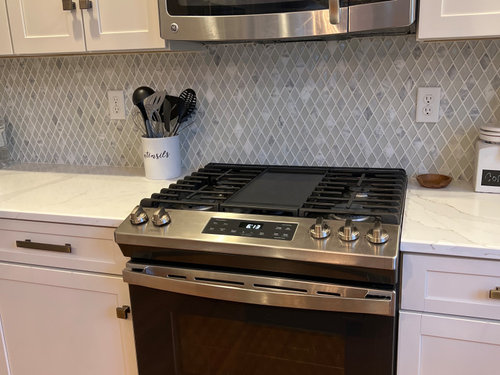
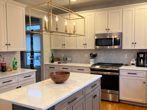
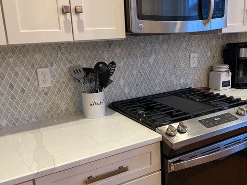
Help I hate my new backsplash!

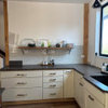
We just got our new backsplash installed 2 days ago and I’m so


upset because it looks blue to me. I need everyone’s honest opinions and suggestions on what to do!

Comments (46)

  • 4 years ago

    I think it’s beautiful! Do you have under cabinet lighting? It reads gray to me.

  • 4 years ago

    Thanks! i dont but my husband did suggest maybe trying that. Do you think it matches ok?

  • 4 years ago
    last modified: 4 years ago

    Not blue at all to me, I think it is beautiful! Goes really nice with your counter and cabinets, good job!


  • PRO
    4 years ago

    Looks like fine work to moi....and I see gray. I think it matches nicely.

  • 4 years ago

    I would have been afraid to use that but i think it looks great! Enjoy!

  • 4 years ago
    last modified: 4 years ago

    I think it looks beautiful too!

  • 4 years ago
    last modified: 4 years ago

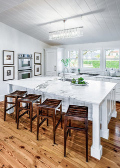
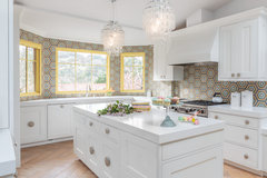
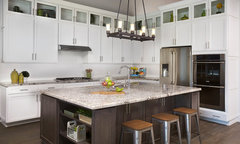
    its nice in several ways. I find it unique and special like a pearl necklace but not over done for your space. maybe work on under cab lighting. I might change the pendant fixture if you decide to go with the new look. can you hang two pendants or is opening for one only with wider spread of the down segment? here are some prettier pendants take or leave and one in the black format / basic but enough detail and I like the black tone maybe with the tile and the white kitchen now.

    Kitchen Renovation · More Info


    Beach Chic Design Kitchen · More Info


    Country Club Colonial Revival · More Info


    Fun-kay Kitchen · More Info


    Bianco Antico Granite · More Info


    Christina Alessandro thanked herbflavor
  • PRO
    4 years ago

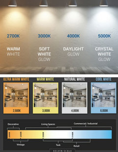
    Looks grey to me. Maybe try changing the K of your lights.


  • 4 years ago

    That is a very pretty backsplash!! As mentioned consider getting under cabinet lighting. None of the lighting appears adequate but may be my monitor.

  • 4 years ago
    last modified: 4 years ago

    I, too, see only gray and think it looks very nice. If you look at the gray item in your utensil holder, they look close to the same color. If you live with it a while and are still unhappy, try purchasing a couple of those stick on battery operated lights in a warm color temperature to see if you like the difference before you go to the expense of installing wired lights.

  • 4 years ago

    @herbflavor i actually wanted to switch to pendants but its a pain i only have one hole in the ceiling. That fixture was actually black I just spray painted it gold today

  • 4 years ago

    Absolutely love it. Give yourself a few days living with it

  • 4 years ago

    LOVE it - not blue and looks great with the island!

  • 4 years ago

    spray paint and fixture...metals series? maybe switch back to cooler metal or black or white. not sure the gold is super great. when you get to it. down the line once the tile is more settled in your mind serach for a new pendant I think. the catalogues are full of amazing selections. in meantime countertop items-upgrade to colored canisters or stainless or crystal bowl/vase/ etc. I know you must have some things. the tile is a good backdrop. here are some basic countertop things but w a shiny surface/ not elaborate. very nice . your visuals w the new tile can be really nice right at eye level there. good luck

    Traditional Ranch Country · More Info


  • 4 years ago

    The backsplash is nice, but I would change the cabinet hardware to round, will help soften the sharp look.

  • 4 years ago

    I think it looks beautiful!

  • 4 years ago

    Ooo l like it. The color softens the stark white of the cabinets.

  • 4 years ago

    Looks gray and great to me! I think you need under cabinet lights and may need to change the bulbs in the kitchen. It’s not looking blue to most of us.

  • 4 years ago

    ^^ This. I don’t see blue at all! I really like it.

  • 4 years ago

    What I’m seeing is that the light falling on the upper cabinets seems to be a warmer color temperature and making your cabinets look more yellow-golden, which makes the backsplash look a bit blue in comparison. I do love the backsplash though :)

  • 4 years ago

    Maybe a little bluish. Maybe even a bit lavenderish. Mostly reads gray. I like it.


    (Your installer is pretty good. It's hard to make those sheet mosaic things look so perfect.)

  • 4 years ago

    Truly it’s gorgeous. Don’t second guess your decision.

  • 4 years ago

    Really beautiful!!

  • 4 years ago

    Your backsplash is very elegant and looks great with everything, it may appear a tad blue but really doesn’t look bad, the gold light actually ties everything g together, don’t go black like suggested, will make your kitchen have a different feel to it.

  • 4 years ago

    It doesn't look blue to me! I think it looks great, it adds dimension and contrast to the white cabinets and ties in your grey island. A welcome reprieve from white subway tiles.

  • 4 years ago

    The tone of the grey is slightly cool but the grout appears to be a bit warmer. I think is looks good.

  • 4 years ago
    last modified: 4 years ago

    Well gee. Clearly appears blue to me in picture #1 and lavender in picture #2. Is that not what you intended?

  • 4 years ago

    Looks good. I would suggest first changing your lighting to something brighter. It just might be a lighting issue.

  • 4 years ago
    last modified: 4 years ago

    Boy, if you had asked about installing a multi-colored, diamond shaped backsplash, this board would have said no, I bet.

    Glad you didn't ask, because it looks great, especially with your island. (Can I ask what color your island is?) I agree that your lighting is maybe making your upper cabinets look warmer/more yellow and so your eye is seeing blue in the adjacent backsplash. A pretty easy fix, if you want to make it. I wouldn't change a thing.

  • 4 years ago

    I don't see blue. Is your kitchen north facing? When I was sampling paint colors, my north light made some paints have a weird blue tone but only for a few hours during the day.

  • 4 years ago

    Looks beautiful! Does not look blue at all…just grey. I would do a lighter brushed nickel hardware and matching silver pendant lights. Love the quartz…is that silestone calacatta gold? I am looking to install the same

  • 4 years ago

    i agree that this is really pretty!

  • 4 years ago

    Gorgeous! It looks grey to me up close. From the distance, maybe a hint of blue, but that may be the lighting.

  • 4 years ago

    @Cp77 yep it’s calacatta gold!

  • 4 years ago

    I think your backsplash is beautiful...a cool slightly bluish gray, but then, I love blue, so I much prefer this to something more gray-gray, which is so overdone these days. The pattern has real interest up close, but from a distance, doesn't look busy at all...love it! I do think that your cabinet hardware and your light fixture metal might be more in tune with each other, but great job!

  • 4 years ago

    On my monitor I see only gray and your kitchen is gorgeous. I love the backspash!

  • 4 years ago

    It looks gray to me, and is pretty. Nice kitchen!

  • 4 years ago
    last modified: 4 years ago

    I think the backsplash is very pretty but I see what you're talking about. Switching out the white and clear items on the counter top for black and very dark grey might help tone down the light colors and bring out the darker colors. I agree with earlier suggestion of exploring different light bulb shades.

  • 4 years ago

    I like your island lighting. How many lights are in it? Do you have a source?

  • 4 years ago

    It’s beautiful. Live with it a while.

  • 4 years ago

    It's a beautiful GRAY backsplash.

  • 4 years ago

    LOVE it!

  • 4 years ago

    Very pretty!


    I've had a few instances where I freak out over something like this because the end result isn't EXACTLY what I'd pictured . . . and I usually obsess over these things. I think this may be happening to you also. It really looks lovely and has some nice personality. I think if you give it a little time you'll be happy.

  • 4 years ago
    last modified: 4 years ago

    It looks nice. I don't like decorating with gray, but I wouldn't have a problem buying a house with that kitchen and would also not feel any need to replace anything any time soon.


    I think you are having a case of "full coverage shock" ... when a seeing a full size version of a product that you only saw in a small sample and your mind had decided it was going to look a certain way, which wasn't quite right! 🙂 Been there, done that!

  • 3 years ago

    I think it looks great.