Software
Houzz Logo Print
kpenni

Need Help with Bathroom Paint Please!

4 years ago
last modified: 4 years ago
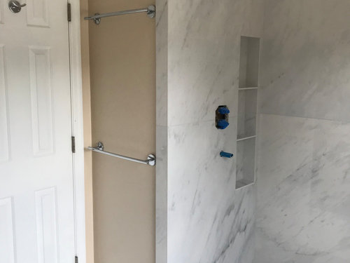
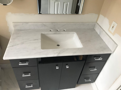
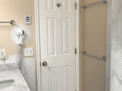
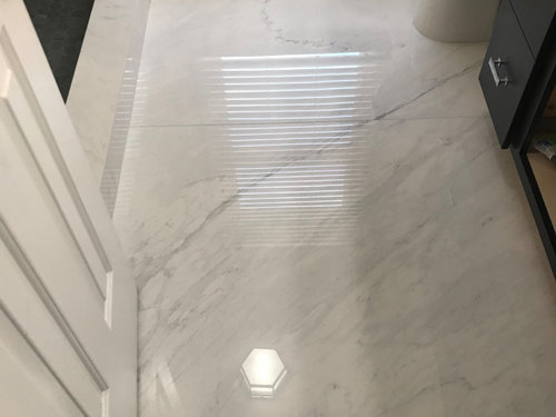
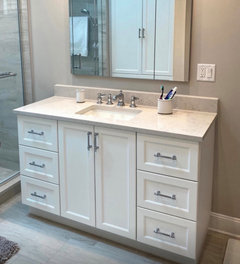
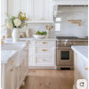
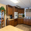
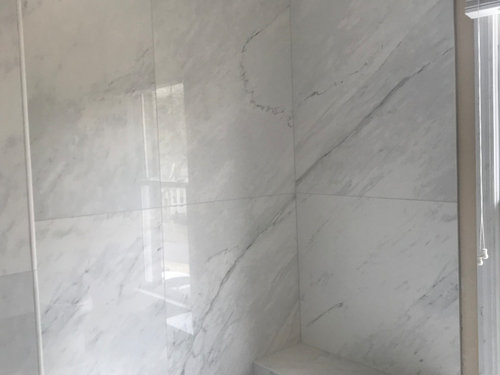
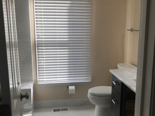
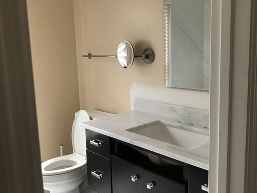
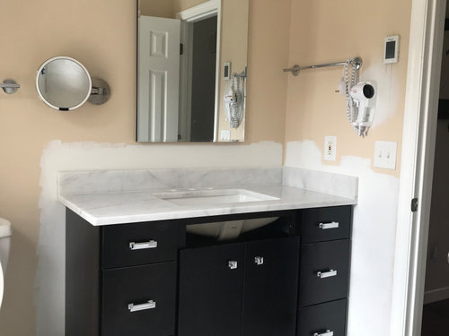
Hi Houzz friends! You all are so helpful and have great taste! We're almost finished with our guest bathroom remodel (but it's the one I use daily). We used large format porcelain tile on the bathroom floor and shower walls, charcoal hex on the shower floor and Carrara marble countertop. The tile is whiter/lighter in person than the pictures. The vanity is a really dark brown, almost black. Would love any suggestions for paint please. Thanks! Btw, we're switching out the light fixtures and pulls. Here are some photos of what we have so far. If you click on the photo, it shows it bigger...


Comments (27)

  • 4 years ago

    Thank you Beth! Great suggestions!

  • 4 years ago

    BM Silver Satin.

    kpenni thanked kandrewspa
  • 4 years ago

    Thanks kandrewspa! I think we actually painted the rest of our house in that! Love it!

  • 4 years ago

    Fleur de sel Sherwin williams

    kpenni thanked Kristen Clover
  • 4 years ago

    Bring home a sample of Sherman Williams City Loft.

    kpenni thanked Gerry
  • 4 years ago

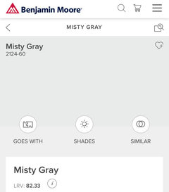
    Also look at BM Misty Gray

    kpenni thanked Carolae
  • 4 years ago

    Great suggestions! Thank you so much Kristen Clover, Gerry and Carolae! I'll check all those out. There are so many paint colors out there, this is a huge help!

  • 4 years ago

    We color matched the lightest gray in our muti toned tile. Took home so many samples that just clashed.


    By doing so, it actually came out darker.

    kpenni thanked eld6161
  • 4 years ago

    Thank you eld6161! It turned out good!


  • 4 years ago

    New dilemma! Turns out the background of the large format tile is much creamier than the countertop. I didn't even realize it until I tried some different paint samples. If the paint has cool undertones, it seems like it makes the tile look dingy and if it's warm, the countertop makes the paint look dingy. I really liked BM Misty Gray, but when we painted the wall, it looked way too blue. Do you guys think my only option is to go darker for a contrast to both? I was really trying not to do that. Am I worrying too much about how the paint interacts with both the tile and countertop? There isn't much wall space by the shower, and floor, so maybe I should focus on how the paint looks next to the countertop. This is SO hard.

  • 4 years ago
    last modified: 4 years ago
    BM Classic Gray

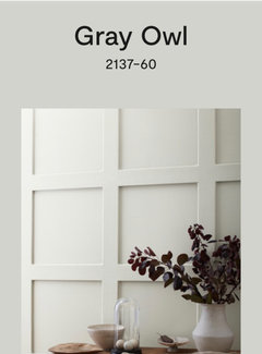
    BM Gray Owl

    SW On the Rocks

    SW Amazing Gray

    kpenni thanked eld6161
  • 4 years ago

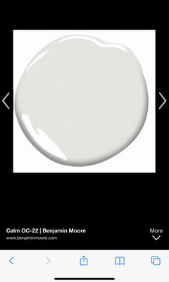
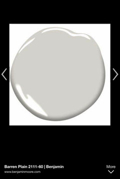
    Have you tried BM Calm, suggested by Beth? It’s a versatile color that looks good with both cool and warm tones. If you want to go a little darker, try BM Barren Plain. Neither color will look blue.

    kpenni thanked Carolae
  • 4 years ago
    last modified: 4 years ago
    Thank you! I hadn't tried the BM Calm because I was worried it would be too purple (things tend to look purple in there too). I will definitely try those two next! There's hope! yay *Had to edit because I realized I said too blue, but should be too purple*

  • 4 years ago

    Is the lighting in your shower the same as over your vanity? Different kinds of bulbs can make a difference in the appearance of your tile and countertop. Just a thought….

    kpenni thanked ptreckel
  • 4 years ago

    Good point ptreckel. We have one flushmount in the ceiling closer to the shower and one fixture over the vanity. They are the same lumens and kelvin, but because the one fixture is over the vanity, it does shine down on it a little, making it look brighter. I like bright so I can see better for makeup, so not sure if I can adjust that part much. I was going to try going down on the kelvin over the vanity a little, just don't want too warm. Thanks for the suggestion!

  • 4 years ago

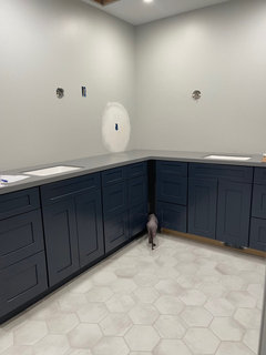
    Picking paint is so hard! Lighting changes everything. I went through several colors noted about (love those peel and stick paint samples!!) and ended up doing BM Stonington Gray. Pardon my cat’s rear end. He’s been supervising this entire project lol. Good luck!

    kpenni thanked User
  • 4 years ago

    BM Calm is a light, muted (grayed) brown/taupe. It won’t look blue, but it’s possible you’ll sometimes detect a hint of purple/pink depending on the artificial light and natural light at different times of the day in your bathroom. I think it’s worth painting a large area on your wall to see if you like it. Make sure there’s a large border of white around your new paint samples if you paint over the Misty Gray or current wall color.

    kpenni thanked Carolae
  • 4 years ago

    i just painted calm in my living area. prior to that I had Silver Dollar which was blue. calm is not. it's a grayish white.

    kpenni thanked Beth H. :
  • 4 years ago
    last modified: 4 years ago
    This is crazy! Gray Cloud looks purple, Calm, Barren Plain and Silver Satin look brown. Nothing I tried from SW works. Fleur de Sel was close, but looks kind of green. A friend suggested Pebble Beach and Silvery Moon. Pebble beach isn't bad but seems a little dark and Silvery Moon might work, but looks a little off, on the greenish side. I tried Baby's Breath and White Christmas (love the name) and I liked those, it's just hard to tell how they will look on all the walls. Should I try to have them lighten Pebble Beach since the tone seems good? Any thoughts on White Christmas or Baby's Breath? I even tried switching the light bulbs, but that made it worse. Any thoughts on Farrow & Ball paint? I haven't ventured there yet...

  • 4 years ago

    “Brown” is the most neutral, in my opinion, and Calm is very light. Does Calm look good with both your countertop and tile? You said your vanity is very dark brown, so you already have brown in your bathroom. @Lori Sawaya (The Land of Color) posts on Houzz occasionally and she could explain this scientifically, but it’s my understanding that grays /“grieges” always lean in some color direction, which may be pronounced depending on the lighting, both natural and artificial, as well as the presence of other colors in the room and even outside (such as lots of trees/greenery).

  • 4 years ago

    I would look at Gray Owl. Really pretty color.

    kpenni thanked tfitz1006
  • 4 years ago

    Hi Carolae, thank you so much for trying to help! We had brown/beiges in there before, so I'm trying to go with more grays/whites. It's so strange, but Calm doesn't look good anywhere. Maybe the vanity is causing problems, but I can't change the color of that and it is almost black. I'd like to stay with the cooler tones, just not blue or purple (lol).

    Thanks tfitz1006- I just ordered some more from Samplize and Gray Owl is in there! Fingers crossed!

  • 4 years ago
    last modified: 4 years ago
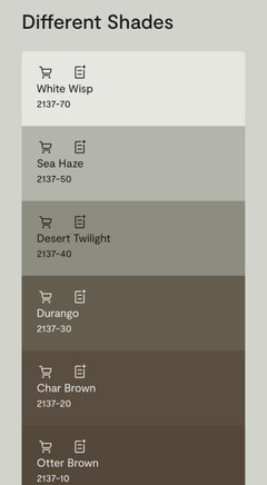
    The problem is that “cool” grays very often look blue or blue-purple when painted on the wall (BM Seattle Gray is an example of this). Some “warm” grays may appear slightly green but you might like that better if you don’t like Calm. Benjamin Moore Color Preview colors are arranged on the paint strips as shades from light to dark. If you look at the darker colors on a strip, you’ll get a better idea of how the lightest color on the strip will appear on your wall. This is helpful when looking for a light neutral. (BM Classic Colors are not those of varying shade on each color strip, btw.)

    kpenni thanked Carolae
  • 4 years ago

    BM Gray Owl is a “warm” gray, and is between White Wisp and Sea Haze on the color strip. It may appear slightly green or green-brown on your walls, but could appeal to you and look lovely in your room. I’m posting this as an example of how I use the BM Color Preview color strips.

    kpenni thanked Carolae
  • 4 years ago

    Of course it’s better to look at the color strips in person than online.

    kpenni thanked Carolae
  • 4 years ago

    I have been trying to use that trick with the strips and it does help, until I get the sample in the bathroom! And the BM Classic Colors did throw me off when I looked at those strips. Going to work on it some more and I'll let you know how it goes. Thanks!