Software
Houzz Logo Print
tim_moffitt24

Is the kitchen too busy?

4 years ago
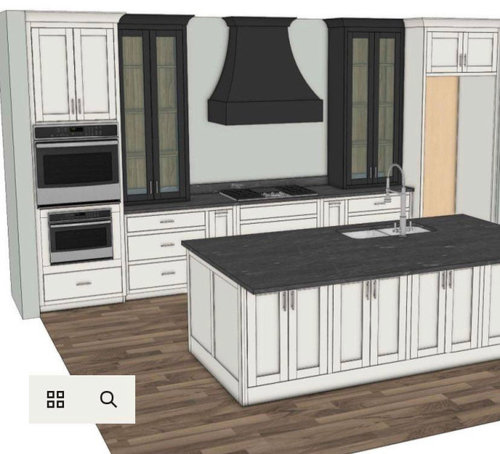
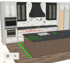
Hello! I am in the process of rehabbing a home (ARV will be around 1.5-1.6mm) - while I am experienced in these projects, this one is the most expensive by far. I want to make sure the design is next-level(ish) and wanted to see thoughts on the kitchen. Rendering attached.


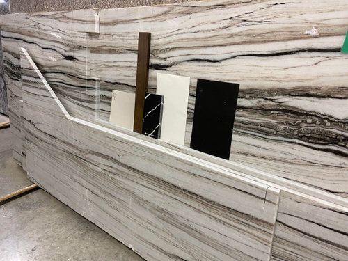
1. I really, really the inspiration pictures (posted at the end) - lighter background with heavier/dark veining but am having a hard time sourcing that stone. I've found one that I like (called natural stone Mirage, below) this is the lighter with thick veins running straight through, and my design items sitting on it. This stone will be for the backsplash by range hood, and countertop for those wall cabinets.


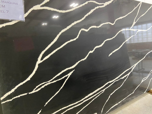
2. Marquina Midnight (black w/ white veining) I'd like to do on the island, with a waterfall on one side. This waterfall side will be the main entrance to the kitchen, so the wood island won't be seen from the entrance (first impressions matter, so this would *maybe* help it not be so busy upon first glance)


3. There will be 3 different colors for the cabinets. Island will be a medium-dark wood (mominee match is what the cabinet maker calls the stain). Range hood and two counter-to-ceiling cabinets will be black, and the rest of the wall cabinets will be white. (SW White dove, and SW Onyx)


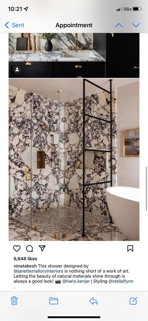
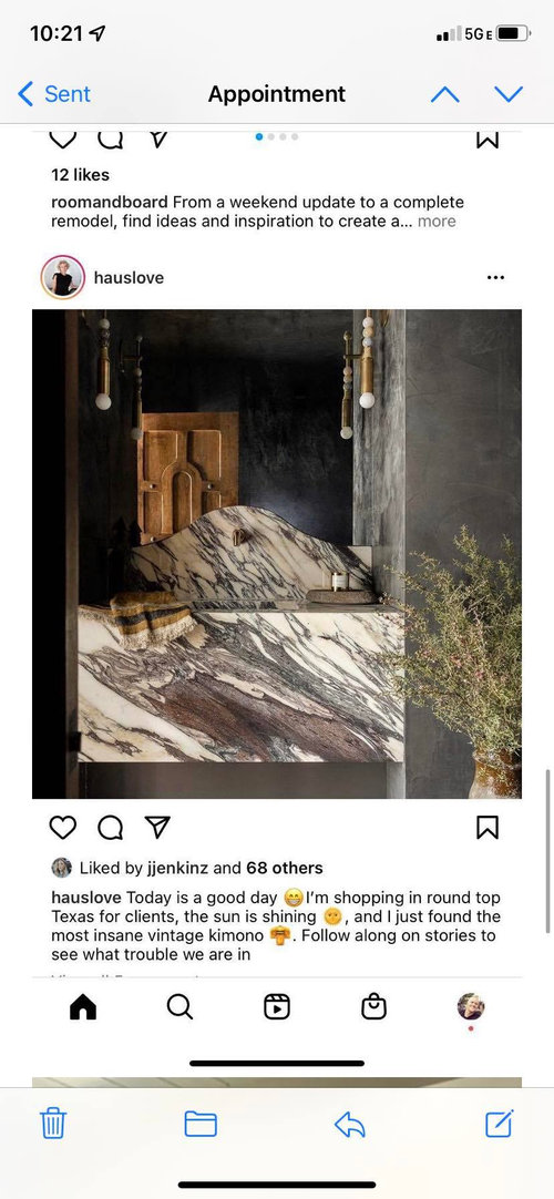
Between the 3 colors of cabinets, and 2 (busy-ish) stones, I am nervous that this will be too much going on, but I'm unsure of how to figure that out beyond getting advice from others. Please help! Inspo pics attached for the first type of stone.


Comments (39)

  • 4 years ago
    last modified: 4 years ago

    Sorry, but I think it will be too busy (and I designed my kitchen with two different cab colours and two different counters).

    Those stones are both beautiful, but are too much together - esp. if you're using one as the splash. I'd also stick to two cab colours.

    The cabs running to the counter beside the range are really going to affect your prep space. Do you cook or is it just for show?

    ETA: next level, to me, means well designed not just lots of cool elements. Do you have a designer helping with this?

  • 4 years ago

    I agree with @daisychain Zn3b - both stones are gorgeous but I would choose one

  • 4 years ago

    I am the designer for our projects. Unfortunately cabinet colors can’t be changed - I don’t think that part will be quite as invasive. Mainly worried about stone. Do you think just straight black for the island/waterfall would help, or just sticking to one stone altogether?

  • PRO
    4 years ago

    Is this house for you to live in?

  • 4 years ago

    No, we plan to list it upon completion

  • 4 years ago

    Way too busy.

  • 4 years ago

    It's really busy. Options:

    1. Use one counter and one cabinet color through. Consider using natural stone Mirage everywhere and pulling a color like black from the countertop for all cabs. Not sure you want to mix up cabinet colors with such a busy countertop.

    2. Just make island cabinet and countertop black + natural stone Mirage and make perimeter counters white or light gray. Pull from the natural stone for the perimeter colors.


    I hope you have a lot of natural light. If not, this kitchen will be dark. Consider skylights if windows are not an option.

    Tim Moffitt thanked J T
  • 4 years ago

    Hard no. Waaaaay too much and feels disconnected.
    Pick one featured design element. The rendering of the kitchen looks traditional and your stone choices scream modern. I think you need to figure out who your target demographic is and what they are looking for. If they are looking for a fully renovated home, you need to give them a well designed kitchen

  • 4 years ago

    Lol, well thank you everyone for your honesty 😂 does anyone have a good program used for renderings/design boards/etc.? That would help me a ton visualizing everything together

  • 4 years ago

    The problem isn’t the rendering program. That one is pretty good. The layout isn’t very functional. There is only 1 location on the side of the sink that is a good prep space for cooking. And that location isn’t even in the work triangle. At the very least, the cabinets coming down to the countertop need to be removed.

  • 4 years ago

    If you are building for resale, you should stick to mainstream traditional materials so you get maximum interest in the home. No busyness. No out-of-the-ordinary cabinet configurations. No contrasting patterns.

    Appeal to the masses for resale and save the decorating flare for your own home.


    Tim Moffitt thanked littlebug zone 5 Missouri
  • 4 years ago

    I love having space next to the range to set out ingredients, chop last minute additions and set out plates for plating. I think it is worthwhile re-examining those cabinets that come down and block the countertop.


    Also, since it is for re-sale, the kitchen in the movie Somethings Gotta Give has stayed popular for 20 years (something to consider since you want to attract as many interested buyers as possible).


    Best of luck in your renovation and sale!

    Tim Moffitt thanked isabellagracepan
  • 4 years ago
    last modified: 4 years ago

    Although I think that first stone is gorgeous, I don't care for the black/white stone (just a personal preference--it'd be beautiful in someone else's home).

    To the idea of going "next level": If the home is in area of similar property values, there is no need to go "next level". Are you sure you're not overbuilding for the neighborhood? It seems risky, but I guess you know your location. $1.5M may sound like a lot where you live (and maybe it is!!), but that is entirely location dependent.

    It is entirely possible to build a simple, yet beautiful home. The "newness" and for sure the cleanliness, may be enough to indicate "next level". I agree with @littlebug zone 5 Missouri that choosing statement stone for the counter, and mixing up anything is really just playing a guessing game with what buyers want, and I see no reason to assume all the buyers want those particular stones/cabinet colors.

    Finally, the first thing I noticed in the photo was the cabinets resting on the countertops right there next to the stove. There is nothing fab about having nowhere to set your pans, and having splatter and spills drench the sides of your cabinets.

    Tim Moffitt thanked Mrs. S
  • 4 years ago

    Personally I think three different cabinet colors and two different (and busy) stones is too much. I would use the first stone on all of the countertops and backsplash and maybe limit the cabinets to just two colors rather than three. I think if you update your digital rendering to show a very busy countertop and backsplash along the wall, a totally different busy stone on the island, and a third finish on the island, you'll be able to visualize better what you are planning to do. Right now your rendering is only showing two cabinet finishes, one countertop, and a very quiet backsplash area. That is totally different than your planned materials.

    Tim Moffitt thanked pricklypearcactus
  • 4 years ago

    The problem isn’t the program. The problem is the wielder of the program. The non designer playing designer.


    Hire an experienced kitchen designer. And actually listen to them.


  • 4 years ago
    last modified: 4 years ago

    I know, constructive critisism can sometimes be hard to hear! We all just want any future home buyer to not only have a beautiful kitchen, but one that functions well for cooking, storage, etc. And of course for you to get the most $ return on your investment.

    As far as the aesthetics, if I am understanding your vision correctly, yes it is way, way too busy imho. To be brutally honest, the saying “hot mess” popped into my head. Sorry. 🙁You have some great ideas, but you just need to reign them in and organize them a little better. You want to make things look appealing for the majority of buyers, but that doesn’t have to mean boring.

    Years ago on gardenweb (now houzz) I learned about having ”too many clowns in the kitchen”. I remember this one poster explained it so well. I had to look up so I would quote it correctly. She said,

    ”During my overlong thinking process regarding our kitchen addition, I developed a concept called "how many clowns in a room?" What I mean here is how many strong presences can an interior decor tolerate. One clown is great entertainment, too many clowns and I go sit in another room; no clowns and I'm unsatisfied.”

    I found that explaination so helpful to keep in mind, whether I am picking materials for myself, helping a friend, or for one of my gc husband‘s projects. I always try and decide first which element should be the “clown” or the star of the show. Is it the countertop? Bold color or patterned backsplash? Floor? Cabinets? etc etc…

    I think mixing a natural stone like marble with a manmade quartz (especially one with the big fake looking veins) would not look good. That would tell me that a designer (not neccessarily meaning a professional designer, but someone who at least has good design sense) was definitely not involved. Plus as mentioned, that quartz is much too modern looking to fit in with the cabinet style and the overall design.

    There is a famous thread I will link below. It really helped me learn about designing a functional kitchen layout. It describes the way most people cook and how a kitchen should flow. It is totally hilarious too!

    https://www.houzz.com/discussions/2699918/looking-for-layout-help-memorize-this-first

    I also wanted to mention that I would rethink the idea of only having one side of the island have a waterfall edge. I think that would look unbalanced from the straight on view. I think if I were a buyer, I would wonder why the builder did that. Is it unfinished? Did they run out of material or something?

    You might check out the program called Room Sketcher. I downloaded the free version but never really got the hang of it enough to finish a project. The paid version seemed to make some pretty realistic renderings from what I saw in the tutorial video.

    Tim Moffitt thanked rebunky
  • 4 years ago

    That bigger oven over the smaller oven (or microwave) doesn't look great or say designer high end. Get models that have the same width so it looks intentional.

  • 4 years ago

    The kitchen looks traditional and not the best style to go with a waterfall counter. I know waterfall counters have become something that many people want to add to average transitional kitchens, but they look best in a sleek minimalist modern kitchen.

  • 4 years ago

    It’s great that you want to do so something artistic - and I don’t know what area of the world you are in, and so that is also a factor. But for this flip, I would recommend that you keep it as simple as possible - unless you are going to enlist the help of a designer to help you coordinate the finishes. And even with a designer, you may or may not get the best results.


    The stones you are showing are very bold - and even if coordinated well, they are also very taste specific. So when you combine the fact that the materials are very taste specific, combined with the fact that most people want to play it safe with design (and I have found this to be true in most any price range) - so with that, you are potentially creating a space that is likely to be less conducive to quick resale at your price point or above.


    And also - keep in mind that no matter what you put in - a majority of buyers are going to just tear it out and put in what they want. And especially so if they think it is too ’busy’; they will likely be showing up on this design forum (or similar) complaining (and getting lots of support).


    If this was a 30 million dollar townhouse in NYC - I would say go for it; but it would still need to be well-designed and coordinated. The aesthetics would definitely need to make sense... and you could not just throw all those materials together haphazardly. But in certain NYC areas, in general, and definitely with a 30 million dollar townhouse, it is a far different audience than a 1.5 million dollar place, just about anywhere.


    But you have to know your market. You have to know what is selling in your area. imo you probably will not go wrong with good quality, well selected, very simple stone material, etc. You might consider it boring. But the majority (of America at least) wants safe and boring.


    The other side of this coin is that simple is not always boring- in fact, to the contrary. And this can also be considered a factor at any price point. As Leonardo DaVinci said: ”Simplicity is the ultimate sophistication.” Coco Chanel has a similar quote attributed to her.


    But if your particular market would potentially receive it well, and you really want to go ahead and use any of those stones in your mix - you really need a designer. And a good one.

    Tim Moffitt thanked freedomplace1
  • 4 years ago

    I love your inspiration pics. I am a black and white gal at heart and those just sing to me. The main thing they all have in common is that the stone is the star. There is nothing competing with it. In the two that has wood cabinets one is painted black (and is a vanity not a whole kitchen) and the other is light and sits quietly in the background.

    Make the white and black stone the star. With all that other stuff it just gets muddled and won't give you the "oh oh oh!!" factor you are looking for.

    Tim Moffitt thanked aziline
  • 4 years ago

    In that price house is an amazing stand alone range not expected? Really, installing a cook top?

  • 4 years ago

    I agree with other comments that it is too busy. Additionally, for resale, you should go with something more neutral and less controversial. Even just one of the stones in the colors you shown would be a turn-off for me. I think some people love that style, but I certainly don't. I would look at what's popular in terms of other homes in the area. The cooktop versus range is also probably personal preference. We prefer an upscale cooktop with separate storage for pans and pots in the cabinets underneath, withseparate wall ovens.

    Tim Moffitt thanked T T
  • 4 years ago
    last modified: 4 years ago

    I don't know what country this house is going to be in.

    The stones you show above are very taste-specific.

    Namely, your taste.

    You may luck out and find someone who has exactly your tastes.

    Do you really want to take that chance?

    If you are a flipper, what you need to do is act like you are a buyer and go look at some homes for sale in the price range you plan to sell this house for in the same area.

    Look at the kitchens and bathrooms, the counter materials and patterns and fixtures and cabinets.

    Look at the lighting.

    You might even try to talk to a realtor to get you into some homes for sale that are not open to the public.

    Because you may need a realtor to sell your home and if it is a good property they will want to represent you and so will be happy to help you know.

    And above all, remember you are not decorating to your taste, you are decorating to appeal to the majority of buyers in the demographic you want to sell to.

    Even if you think they are ignorant so-and-sos, who cares. You want them to buy this house.

    Put the jazzy snazzy stone in your own home and you will be able to afford it with the profits you make selling this home with the run-of-the-mill marble or granite that 90% of the population like.

    Tim Moffitt thanked loobab
  • 4 years ago
    last modified: 4 years ago

    Would something like this work?

    I kept to your vision of the three different cabinet colors and the two different stones. I picked a slightly more sedate marble for the backsplash. Certainly still a wow factor in my opinion.


    I shortened the black uppers so they are off the counter as many suggested.

    I didn’t know what isle space you had planned, but 48” would be the minimum I would do for this style kitchen. I have 52” in my kitchen and I love it. Two people can easily move around without bumping butts. DW can be open and you still have plenty space to walk behind it.

    I moved the sink further down so there is move space on the fridge side. I wasn’t sure where you planned the diswasher, but I would like the DW on the right side of the sink. That way it is out of the work zone or triangle. The trash pullout could then be on the left under the main prep area.

    I extended the island to line up with the perimeter area in order to allow space for the dw to move over there and just because I like things to line up I guess. ☺️

    You notice I skipped the waterfall on the island as well. It looks great with ultra modern kitchens, but I don’t think it works here.

    Best wishes with your project!

    Tim Moffitt thanked rebunky
  • 4 years ago

    Thank you all (or, most of you, I should say) I appreciate constructive feedback, hence why I posted to begin with worrying about it being too busy. I got some great ideas and will be tweaking accordingly. Stay tuned!

  • 4 years ago
    last modified: 4 years ago

    Here's another suggestion-

    In many parts of the U.S. , high-end home buyers want two sinks and two ovens in their larger home.

    Even if they eat in restaurants all the time.

    Also, it is a mistake to have the sink directly opposite the rangetop. If there are two people working in the kitchen at once, they are bumping behinds.

    I am not happy with your stove and microwave situation either.

    Firstly, with your stove with the top down door, no one wants to lean over a hot hot door to take something out.

    With a wall oven you want a side-opening door.

    As an adult, I do not want to have to bend down that low for the microwave.

    I would prefer to put it in the bottom of one of the cabinets on either side of the cooktop.

    That way you don't need to bend down, and in addition, you have the counter right next to it on which to slide a hot dish. And NO, the children do not need to access the microwave by themselves. Children should not be handling or cooking hot food/drink unsupervised. Ever. For any reason.

    And have two wall ovens, raising the top one.

    And find a place for the second sink. Maybe on the wall we don't see?

    Also, reconsider the split sink. It won't fit large pots and pans and so is inconvenient.

    Please make sure the aisle between the range top and the sink is wide enough.

  • 4 years ago
    last modified: 4 years ago

    @loobab you should watch MasterChef Jr or Kids Baking Championships. Kids can be well-trained in the kitchen, and shouldn’t have to be limited by their height if the parents approve.

  • 4 years ago

    I guess I just don’t understand why you’d want to make such expensive, taste-specific selections for a home you’re rehabbing for resale? I get choosing higher end finishes for a million-dollar home, but IMO this reads as a mish-mash of trendy and/or pricey buzzword items tossed together to sound appealing in a listing, not as a thoughtful design.

  • 4 years ago
    last modified: 4 years ago

    Whether or not parents approve of small children handling dangerous materials is immaterial.

    If they go to school with a burn or other injury from unsupervised cooking and a teacher or school nurse finds out how it was incurred ( or emergency room personnel, or any other mandated reporter), that is a report to various and sundry state agencies that are a hassle, to say the very least.

    Children can be removed from the home first, and the investigation undertaken while the children are placed elsewhere.

    So much for your fancy TV shows.

  • 4 years ago

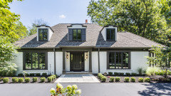
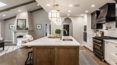
    Here are a few of the after’s ✨

  • 4 years ago

    Wow, really pretty!

  • 4 years ago

    Beautiful! Glad you took all that wonderful advice to heart; looks fabulous and functional!

  • 4 years ago

    Agree! Kitchen looks like a great space to work in.

  • 4 years ago

    Wow! Kitchen turned out gorgeous! Everything looks amazing.

    I am so glad you listened to the advice given regarding the upper cabinets not going down to the countertop.

    I am so glad you decided on keeping the countertop and backsplash simple, if going with the 3 different cabinet colors. This design will appeal to so many more buyers.

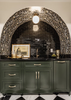
    I love that you had some fun with the arched bar area. Great job Tim!

    Tim Moffitt thanked rebunky
  • 4 years ago

    Beautiful.

  • 4 years ago

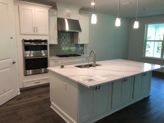
    Your layout looks kind of like mine. I'll let you know if I like it if my builder ever finishes and I ever close...


  • 4 years ago

    @rebunky thank you so much! I appreciate your help :) Glad you were able to see the 'after' too!


    Thank you all! I'm so excited with how it turned out. Accepted an offer 50K over list price.


    @Bob Smith it looks beautiful! Fingers crossed for a quicker timeline!

  • 4 years ago

    Beautiful renovation! What wall paint color did you use for the entry?