Software
Houzz Logo Print
chcarvin

Paint color help

4 years ago
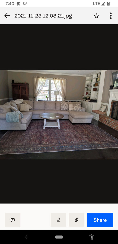
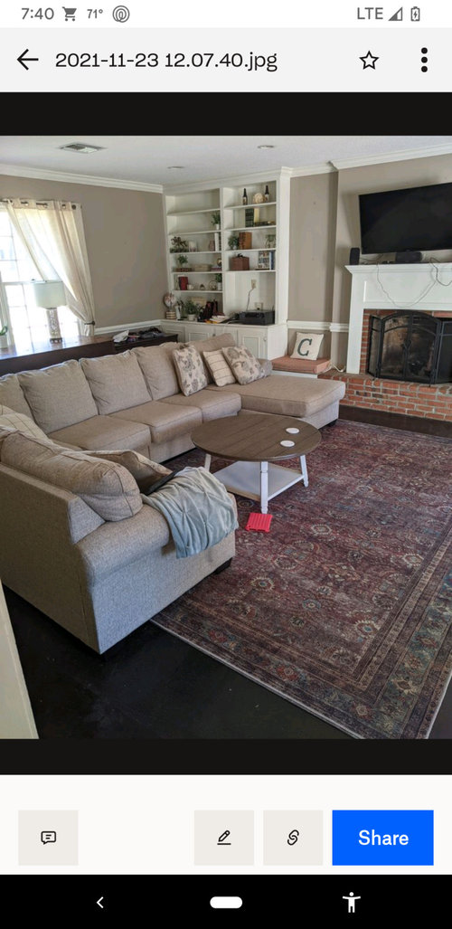
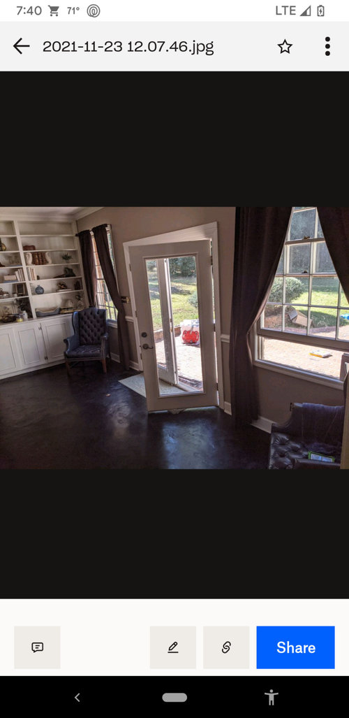
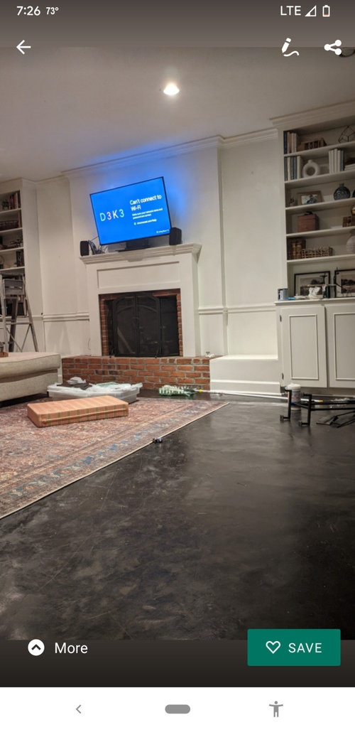
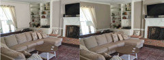
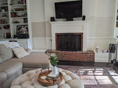
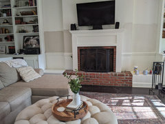
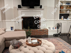
I've been painting and repainting this room and I just can't figure out what I like. And it's a big room, so I need to stick with something for my sanity's sake! Currently it is BM Cotswold, though I fiddled around with White Dove and black mantle/shelves. For now I would like to leave the book shelves white, but what color for the wall would best compliment the black cement floors? My husband likes an earthy feel, but I'm torn between that and having a lighter color-- though I did not like the white on the walls as much as I thought I would.
Most of these pictures are old and the tv placement and a lot of furniture are different, but the sectional and rug are still there and would like the color to compliment those pieces as well.
****This is a garage turned bonus room, so I'm not looking to make a lot of big improvements, just focusing on the paint color. Thank you!!

Comments (31)

  • 4 years ago
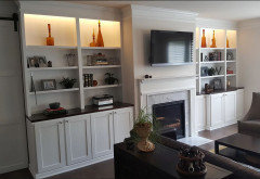
    I think the white looks really nice, but if I understand your post, it's "too white"?

    The color you have/had BM Cotwold, looks nice but I can see it's kind of dark. It has LRV of 39 = pretty dark).When I went to look it up, it gave versions that are in the family but lighter. For example, Peau de Soie and Feather Down. How do those seem to you? On the BM website it shows both matching and similar colors.

    if you scroll down the BM website

  • 4 years ago

    I agree with @salonva, the Cotswold is too dark and too close to the color of your sofas. I like the white walls better, but not a fan of the black fireplace surround. There are a lot of choices that are lighter such as the ones @salonva mentioned, plus Edgecomb Gray, Pale Oak and Ballet White. I'm feeling bad for you because of how much work you have already put into this, painting this room twice.


    Some rooms are just more difficult than others to get the paint color right. I have hit the color right on the first try a couple times (I have painted two houses completely in my lifetime). There was one room in my previous house that we tried probably ten different colors before getting it right, but we only painted sample sizes while we were trying to decide. Have you tried Samplize.com? They sell peel and stick samples. Or just paint a small area and look at it over the course of a week to see if it grows on you before you paint the whole room. It's difficult for strangers online to tell you what color to use because colors look different IRL. I do love your rug!

  • 4 years ago

    I can never be sure when viewing colors over the internet, as the colors may look very different on my screen than on someone else's and are always different than in real life, but what I am seeing is that your walls were more beige than your sofa, which seems to lean taupe.


    I agree with others that your previous color was too dark, but also too yellow beige.


    Your room with a taupe undertone. . .(used SW site and picked Popular Gray) (again, reality and computer renditions of colors are often not the same).


    Comparison:


    Note how the curtains look dingy next to the new wall color.

    Your old wall color actually looked dingy next to the cleaner gray/beige of the sofa.

  • 4 years ago

    Thank you for the feedback. Would a color like Pale Oak be a little too light and not contrast with the White Dove enough or should I try something like that?

  • 4 years ago

    Pale Oak has an LRV of 68.65 and White Dove is 83.16, so that is plenty of contrast. I find a difference of 5-10 to be noticeable. Jennifer has a good point about the undertone. I think Pale Oak is worth a try.

  • 4 years ago

    Pale Oak is a pale taupe and may be perfect for the wall color. White Dove is not my favorite trim color, tend to prefer something cleaner (Simply white is probably my top pick), but both work well with Pale Oak.

  • 4 years ago

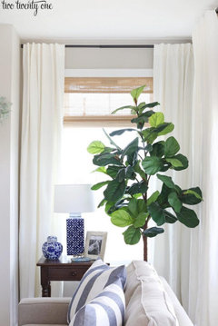
    You have terrific windows in that room - I would be tempted to raise the rods closer to the ceiling and add woven shades (for texture) and stationary linen panels on the sides to frame the view. Having the rod wider than the window can let you frame it with panels without cutting off any natural light - I feel like the current panels are adding to the dark feel


    PS I love Pale Oak, that is def one to try!


  • 4 years ago

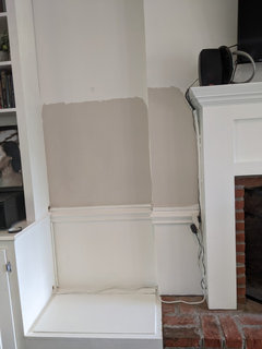
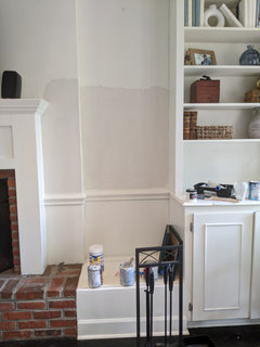
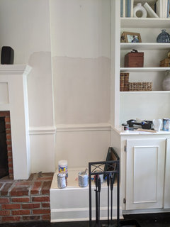
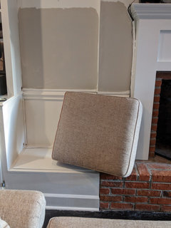
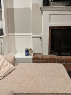
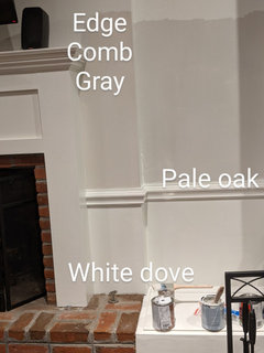
    Thank you for the great feedback! I'm testing pale oak (on right) and Revere Pewter (on left). I read that white dove next to Pale Oak makes it pull more gray, so yes -- maybe a different white for shelves. Phew! Also playing with removing some shelves and painting the backs black...

  • 4 years ago

    Thank you for the great feedback! I'm testing pale oak (on right) and Revere Pewter (on left). I read that white dove next to Pale Oak makes it pull more gray, so yes -- maybe a different white for shelves. Phew! Also playing with removing some shelves and painting the backs black...

  • 4 years ago

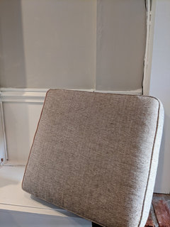
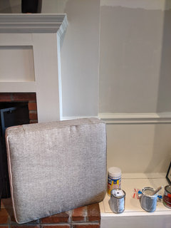
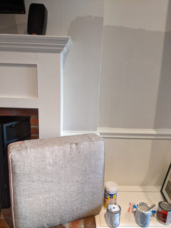
    Set one of your sofa cushions next to the samples you painted. It is hard to know from a computer screen, but although both Revere Pewter and Pale Oak are beige/gray Revere Pewter has a green undertone (greige - green grey/green beige) , where the Pale Oak has a pink undertone (taupe - pink beige/violet gray). Both are slight and both work well with a lot of colors, but your sofa also seems to be gray/beige and on my screen looks like it leans taupe vs green.

  • 4 years ago

    Have you upgraded your lighting? Have you tested in overcast/rainy weather? Have you tested on all walls (see samplize.com for peel and stick samples) or just that one? Generally fabrics and textiles should inform your paint choice, so get those in good light when picking through samples.

  • 4 years ago

    I would check out Behr Chic Grey, it is a lovely warm grey that I have used in my home with great success. Here is some info on it.

    https://www.hackrea.com/stories/chic-gray-behr-ppu26-10/

    Good luck it is not easy to pick paint colors.

  • 4 years ago

    Here are cushions next to Revere pewter. Couch is definitely a tan/beige.

  • 4 years ago

    And this is the pale oak.

  • 4 years ago

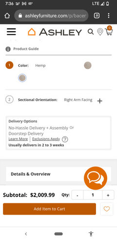
    I know it's hard to tell on computer. Thanks for trying. The website describes couch color as "hemp".

  • 4 years ago

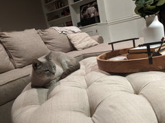
    This ottoman is now here instead of table and it's more of a beige too.

  • 4 years ago

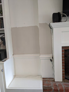
    I slapped some accessible beige (closest to mantle-- Revere pewter to the left) on to see how that looked and it's very similar to the couch. I'm concerned Pale Oak is pulling too gray, although it's my favorite so far. Looking for the perfect taupe that is light and pulls more beige, I think. Any other ideas?

  • 4 years ago

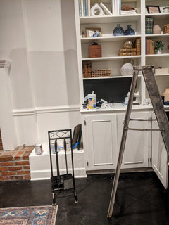
    Is that *too* much beige? The black on shelves definitely breaks it up though and pulls in the black from the floor. But... would that be too much BLACK? Mercy, I'm a mess! Shelf here pictured next to pale oak.

  • 4 years ago

    One more thought for the night if anyone is listening. Haha I had some edgecomb gray I decided to try and it may be my favorite. I can't wait to see what they look like in the morning.

    (TV/wires are a work in progress as well)

  • 4 years ago

    I can see from the pics - Revere Pewter is too green. Edgecomb has the taupe undertones vs green. You may have hit the nail on the head.


  • 4 years ago
    last modified: 4 years ago

    Whatever color you choose to paint the walls, I suggest you paint the fireplace the same color and bookcases the same color. However, the two bench seat nooks on either side of the fireplace? Paint the benches a color that is in the same vein as the brick and the rug, down to the floor to extend the line of the brick to the eye. Take the tip to raise your curtain rod to the ceiling and get some substantial drapes that echo that brick and rug. Put some great inviting pillows on the sofa that are also picking up that brick and rug color primarily.

    I wouldn’t make the fireplace and bookcases the focal point of the room, since they are utlilitaran. I’d make the conversational circle of the sofa and rug the focal point and nicely frame the big sunny window for pizzaz and interest.

  • 4 years ago


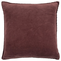
    Rizzy Home Transitional Solid Pillow Cover With Wine Finish COVT13192BA002222 · More Info


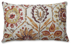
    Pillow Perfect Indoor Antique Stone Spice Purple Rectangular Throw Pillow · More Info


    Serenta Textured Velvet Pillow Shell, Set of 4, Ruby Wine · More Info


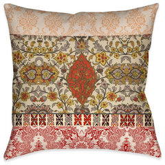
    Laural Home Red Spice Bohemian Tapestry 18" X 18" Indoor Decorative Pillow · More Info


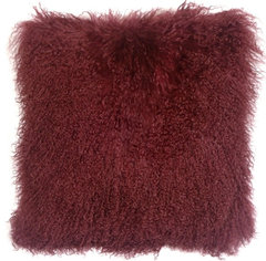
    Genuine Mongolian Sheepskin Throw Pillow with Insert (16+ Colors), Wine · More Info

    And get some more round wooden trays for your ottoman

  • 4 years ago

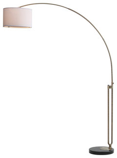
    How about moving the dark curtains leading out to the back yard to other side of the room, to the window that looks onto the street? And instead of a table lamp in front of the window, how about putting an arc floor lamp in the corner that would give you some light over the sofa?


    Safavieh Polaris 84" High Arc Floor Lamp · More Info


    For the windows heading out to the yard, how about some much breezier casual curtains, even just sheers? Pull the leather chairs out further from the corner and get a bigger area rug for the doorway


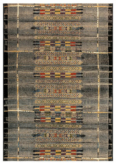
    Marina Tribal Stripe Indoor/Outdoor Rug, Black, 4'10"x7'6" · More Info


  • 4 years ago
    last modified: 4 years ago

    Curtains like these might work well on the windows overlooking the yard


    https://www.overstock.com/Home-Garden/Porch-Den-Narup-Geometric-Back-Tab-Curtain-Panel/30548092/product.html?opre=1&option=55040446


    what also might be fun is to buy 2 of the indoor-outdoor rugs like the one I posted — they are very inexpensive and put one right inside the door and the other right outside the door in the yars.

  • 4 years ago

    Black is such a strong color and it makes displaying anything but white or very light items difficult. Have you considered painting just the top of the cabinets black and leaving the rest white. Something like this


    Get yourself just a few items for on the shelves that are red or blue or both to tie the carpet colors into the décor.


  • 4 years ago

    I've been staring at the colors until my eyes cross the last few days and I think all except for Accessible beige are pulling too grey. I'm considering lightening the accessible beige by 25 or 50%. Do you think that's a good option?

  • 4 years ago

    I have suggested this color before- SW Modern Gray- because I used it and accessbile beige in my last house. They were both great- but for some reason I got many complements on the Modern Gray. It's really a greige- and it might have been the exposure of the room but it was really lovely. Since you are considering accessible beige but want it lighter, have a look at Modern Gray.

    Modern Gray vs Accessible Beige

  • 4 years ago

    Accessible Beige has green undertones. Modern Gray has more of the pink undertones and is a taupe. Natural Linen is more beige with pinker undertones vs greener undertones.

  • 4 years ago

    I really like the lightened accessible beige, but it is very close to the color of the couch. Will I end up regretting that?

  • 4 years ago

    I think you have landed on the color that you like. Take a break for a couple of days - your brain has to be color fried by now. Then paint a large board with the new color and set it in the room next to the fireplace and just live with it for a couple of days before committing to it for all the walls. If your still happy with it next weekend move it around the room and see if you are happy with it everywhere. Don't have any of your other colors around competing for your attention.


    See how you feel about it when it is all by itself and your mind is no longer overwhelmed.


    I usually pick a color and don't end up painting for a couple of weeks and I recheck my color choice before buying the paint. Am I still sure. 9 out of 10 times it is still the right choice. Once in a while I will look at it and think "What was I thinking!".

Sponsored
Whisler Home Improvement
Average rating: 5 out of 5 stars9 Reviews
Franklin County's Committed Home Improvement Professionals