Software
Houzz Logo Print
tudorsally

table help please! part 2

4 years ago
last modified: 4 years ago
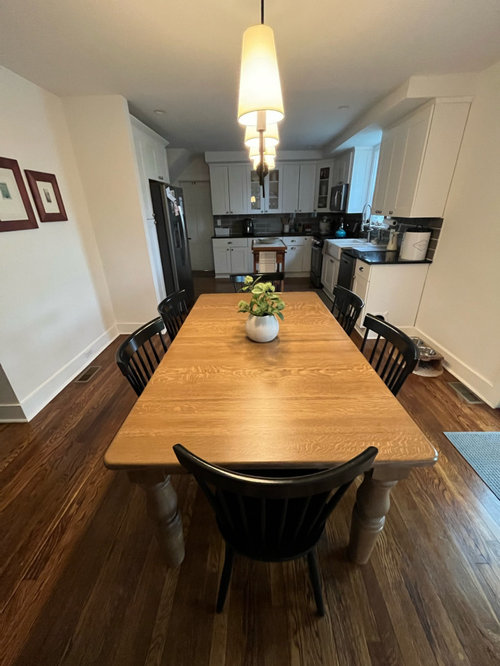
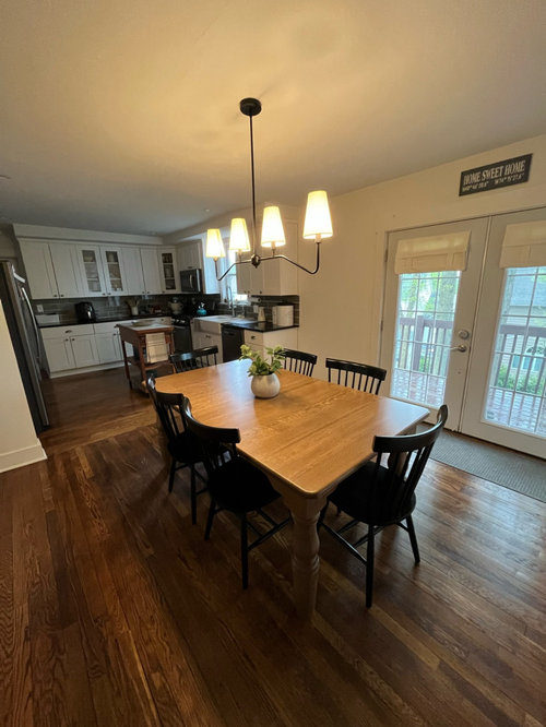
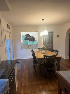
I recently posted about our beautiful new table. It was custom made but didn’t turn out exactly as I envisioned.

Folks here suggested how to make improvements. I’ve removed the rug, switched out the light fixture, and changed the window curtains.


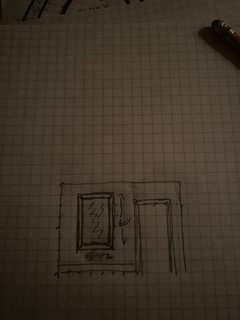
Next up is improving the wall art. I’m planning on changing the gallery wall to black frames. Also, removing the two smaller wooden frames for one larger piece.


I do not think adding a black cabinet is an option due to space. Also, I’d prefer not to remove the kitchen cart as we use it often. However, I could potentially replace it with something else.


Let me know your thoughts. Thanks!!

Before and current photos included here.


Comments (60)

  • 4 years ago

    If big enough

  • 4 years ago
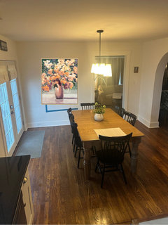
    New chandelier looks perfect.

  • 4 years ago

    The dining area looks very bare. Can you put something on the wall above the pet feeding area?

    Does it have to be black and white?

    You can use a vintage botanical print of fruit,or vegetables or a vintage pasta poster.

    I do like great black frames.


  • 4 years ago


  • 4 years ago


  • 4 years ago

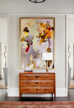
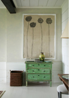
    if you want to go more monichromatic these would add texture on that starement piece wall. They are not small. they come in 36 inch and 48 inch in 2 colorways. they have the same vibe as your elephant portrait. . again, not seeing the rest of your house its hard to know for sure what may work. The key to using these pieces in a large piece is hanging them in an artful overlapping arrangement mixing sizes and colors and will the space.

  • 4 years ago

    Thanks for these ideas! I am going to continue to look for a large piece here. I haven’t yet found something that fits the space and is within budget.

    Also, the space is 7 feet wide and 8 feet tall.

  • 4 years ago


  • 4 years ago

    Im coming up with around 40 x 60 finished size. put blue painters tape on wall to make sure not too big. im still sering art there though and not the rattan basket lids. (You need the mass to play off your chunky table . the basket lids would be better on your wall with the mahogany frame. whether you do color or black/ gold/ white or black/silver white depends on test of your house.


    can you send me axpuc if your backsplash?

  • 4 years ago

    Pic

  • 4 years ago


  • 4 years ago

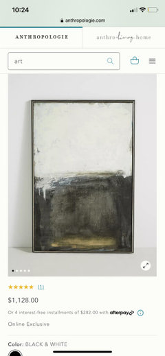
    Check sites like anthropogie, pottery barn, crate and barrel as tgey sell gallery pook art for less than galleries. look in their clearance section,. you can sometimes find bargains. dont be tempted by underscaled pieces though even if you love the image. Tge piece above frim anthripologie is the right size and would look great in your space....if your cabinet hardware was gold. There are better choices if you stay with silver.

  • 4 years ago

    https://www.perigold.com/decor/pdp/beige-scribbles-1-framed-graphic-art-print-on-canvas-icsj1612.html?piid=


    perigold has some nice art more reasonable tgan gallery price also. you can filter by size. you could also do an unframed canvas piece to keep things simple. im showing you things i like that work color and size wise imo. art is very subjective and personal though.

  • 4 years ago

    Thanks! Will check out those places!

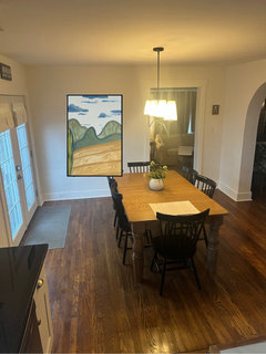
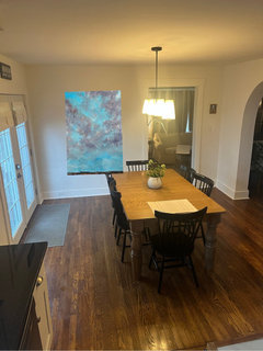
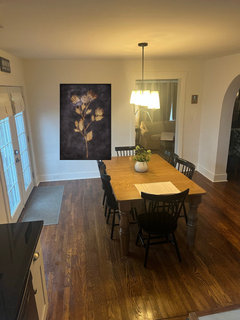
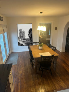
    I did find a few 48x48. Would that work? These are to scale (within a couple inches).

  • 4 years ago

    Here’s the backsplash!

  • 4 years ago

    Very nice on the backsplash. Honest opinion - Yes, think 48 x 48 works but the way you are showing them in this picture it is hung much too high. I incorrectly stated above that most people hang their art too low; its actually the opposite they hang too high. Just google -how to properly hang art. thise pieces need to come diwn probably 9 inches to a foot.


    i like the 48x 48 if youre finding more pieces, but I am still seeing something more rectangular to follow the space. I also think your piece needs to have a fair amount of the various shades of browns in it to tie your table color and floor color up onto the wall. the reason designers like color stufirs is because they are easy to tie color paleetes snd aren't bust. They have a way of quieting a room, but typing it together. if comtemporary is not your taste - you can find something easilt though. The piece definitely needs some black also. The pieces you sent are reading to bright / pastel, but it could just be the digital photos. I. has no black/ brown or table color. 2. same problem. 3. the chair is too pastel and the image doesnt evoke dining to me. 4. to bright, no blacks/ browns/ table color.


  • 4 years ago

    Understood.

    Here are some samples of 60x40ish.

  • 4 years ago

    Two other options. Love the Perigold options and will contniue to look.


  • 4 years ago

    yep. thats the size you want imo.

  • 4 years ago

    Of these images i personally like 3 the best, but i still ferl it doesnt have enough blacks/browns in it.

  • 4 years ago

    I preferred it with tue carpet. I thought the rug was great and helped to separate the hardwood colour from table leg colour. I think the window coverings are great and the light too. Love it with no table runner

  • 4 years ago

    https://www.perigold.com/decor/pdp/fresh-leaves-framed-painting-on-canvas-icuc3237.html?piid=


    This piece is in a floater frame which would look very good in your space.

  • 4 years ago

    But again, i really don't know the color palette of your home and I'm just guessing what might work. If you do a more traditional piece...I'd go a different direction than the baskets. Those work better mixed with modern art imo.

  • 4 years ago

    Oooooo, actually I like that A LOT. It’s a little more than I had allocated (though still a fair price, I’m just trying to budget). Will need to ponder it…..

    The rest of the home is mostly neutrals. Some grays and blues. This is room through the arched doorway.

  • 4 years ago

    This helps to see your living room. Can you send a pic of art above fireplace.

  • 4 years ago

    You're living room looks very nice. I'm thinking I'm adding too much color.....you want adjoining rooms to relate.

  • 4 years ago

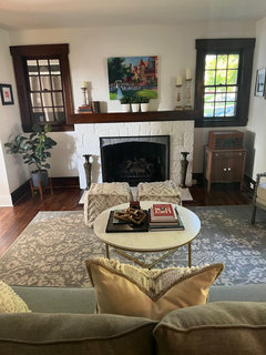
    Living room!

  • 4 years ago

    i know i have been all over the place on my opinioon color/ no color but i think after seeing your living room that you need to stay more in the neutrals browns/ grays / black and maybe just a dash of color in your kitchen dining art.


    Youre living room is very well done and balanced color wise. it is light but very effectively rocks to darker tones with the woodwork and art. You do not have the dark woodwork in the eat in kitchen (which is no problem).


    you’re also moving into a different tone of wood in the kitchen bs the living room. its red mahogand and red moving to more of a maple with the fining. This is also fine because. houses where all the furniture is ine finish are boring. still when you are within the same toom you want to stay within same the color color family.


    Thise african weaved discs would no doubt look good if you wanted to do those instead of art. They would play off your living room ottomas well and add texture.


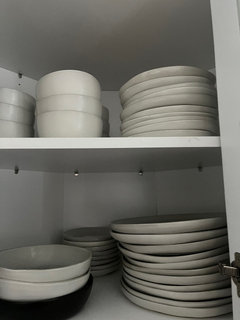
    Not that one make a decorating decision around dishes, but could you send me a pic of your everyday dishes. Will give me a better idea of your taste.


  • 4 years ago


    I think the art will be easier for you to execute/ install though. if you go this route it needs to be thought out. they need to overlap, be diffetent sizes and again fill the space.

  • 4 years ago

    Its possible i like the art though with the trees and its the black frame that bothers me. maybe if it were framed a light tone of the peachy- orange in wood or framed in an intersting pff white wood that fixes things. the piece itself has enough black to pull in your chairs and chandelier….im not seeing the black frame on your art (at keadt on this piece) now that im looking at this.

  • 4 years ago

    I do like the image of the trees though….the more i look its the black frame thats bothering me. it doesnt relate to your woodwork or your cabinet hardware and looks random. You need to add black to this piece.


    as i said mixing metal finishes looks good, BUT it requires no more tgan three, one finish to dominate a secind and the third to be a two tone effect. i suggest teading articles on muxing metal finishrs effectively. you could make this black frame work by changing your cabinet hardware to black possibly, im not sure if doing thst throws off your hardware look in living room. sorry to be so long winded, but the “devil is in the details“ when it comes to color and scale

  • 4 years ago

    I understand. It’s a lot.

    Quick photo of dishes…

  • 4 years ago

    I sense you are not into contemporary and I absolutely understand budget. May I ask you put this piece on your wall though just so I can see how the frame coloration works.


    https://www.perigold.com/decor/pdp/chc-art-inc-on-the-surface-floater-frame-graphic-art-on-canvas-yklj1618.html?piid=

  • 4 years ago

    https://www.perigold.com/decor/pdp/chc-art-inc-monument-floater-frame-painting-on-canvas-yklj1529.html?piid=


    ditto on this one .....i understand contremporary not your taste, but again i just want to see for color and frame color if you could paste this in

  • 4 years ago

    Here the are!

  • 4 years ago

    Ok, that helps.

  • 4 years ago

    https://www.perigold.com/decor/pdp/you-may-come-in-photograph-on-glass-icuc6038.html?piid=


    may i see this to see how colors work? im trying to figure out how much, if any of the table color tones you might need. Im also trying to figure out how much light to dark.


    i really like the trees... but i cant get past the black frame on it. even a weathered grey could work. i would def not buy and reframe though....v expensive for custom framing on large pieces. need to find something you love that works as is. is your living room art unframed?

  • 4 years ago

    https://www.perigold.com/decor/pdp/you-may-come-in-photograph-on-glass-icuc6038.html?piid=


    this is a totally different concept and youll either like it or hate it. it does have the same kind of vibe as your living room art.

  • 4 years ago

    Highly dislike. lol

  • 4 years ago

    Here it is..

  • 4 years ago

    https://www.perigold.com/decor/pdp/wendover-art-group-bouquet-painting-on-canvas-ezxr9205.html?piid=


    See how this one works please. Nothing is coming close to the trees. I think possible some of these work, but when plugged in the become much brighter than they are.

  • 4 years ago

    This one is a bit smaller.

  • 4 years ago

    Have you considered painting your French doors black? I think it would work nicely with the black chairs and other black accents.

  • 4 years ago

    Just the doors, not the wood trim on the walls.

  • 4 years ago

    Im back again, I like the scene with the woods best and i really think there is no replacement for the look of an oil painting. (I'm not a fan of large pieces where glass or acrylic is invoved). they are heavy and no glare glass is expensive and doesn't always work.


    if you woukd purchase the woods piece I would probably not do framed art in that spot to right of arch. I would hang something that adds texture and interest there.


    The basket lids would be okay, but they are too "global" and "bohemian" to mix with that particular landscape imo - and i think you need to collage some largish scale pieces that are more rustic. Nottom line- too much framed art gets boring and isnt ad interesting as a room that mixes.


    Word of advice - dont feel like you have to fill every wall wither. A few larger scale statement pieces will give you the edited look i believe youre after and negative wall space gives the eye a rest.


    i think the digital photos are throwing me a bit and i cant imagine the black frame on the woods landscspe wouldnt work. The fact the piece is in a floating frame is a big plus also.


    Good luck on finishing your room. i ferl confident based on your living room it will look great when youre finished.


  • 4 years ago

    Your update with the light fixture is perfect! I do agree with painting your french doors black. It's gutsy but will make a strong design statement.

    Art is a personal and emotional purchase. I find it almost impossible to buy art without my client with me in the gallery. You may even have a landscape or abstract photo you have taken, that can be printed in black and white, to the size you need. Frame it with a black gallery frame and wide beveled edge matte in white.

    I love curtain panels to add color and texture to a room. Install simple black iron curtain rods 10" beyond the actual french door frame. Hang the panels ceiling to floor. A beautiful Pierre Frey printed linen with a border would enhance the space.


  • 4 years ago

    BTW your table is gorgeous. Without additional embellishments in a room to complete the design, it is impossible to visualize the total effect. That table is the star!

    You do have room for a cabinet on the left side of the french doors. Not a high cabinet, but a low wood cabinet as a server.


  • 4 years ago

    For art on the far wall (small art prints now) consider framing an antique street map to cover that entire wall.