

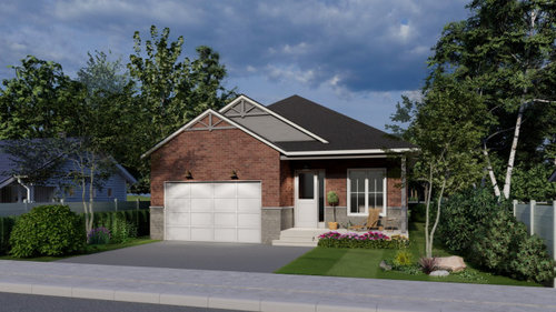
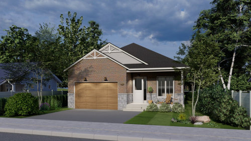
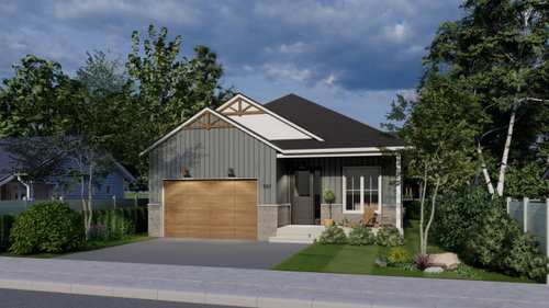
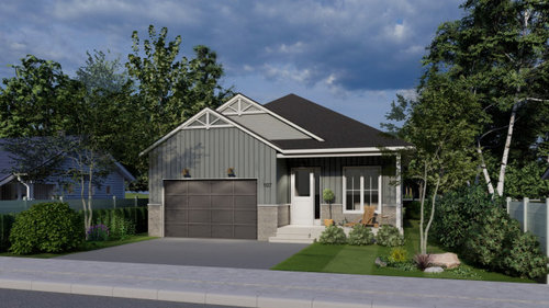
Look for critique on the elevation design
4 years ago
Featured Answer
Sort by:Oldest
Comments (11)
 PRO4 years ago
 PRO4 years ago
Related Professionals
Washington Architects & Building Designers · Milwaukee Architects & Building Designers · Athens Design-Build Firms · Myrtle Beach Design-Build Firms · Charlottesville Design-Build Firms · Williston Design-Build Firms · Calgary Design-Build Firms · Sanford Design-Build Firms · Cape Girardeau Home Builders · Hobbs Home Builders · Beaumont Interior Designers & Decorators · Willmar Architects & Building Designers · Hannibal Kitchen & Bathroom Designers · Martinsburg Kitchen & Bathroom Designers · Newburyport Kitchen & Bathroom Designers 4 years ago
- PRO4 years ago
 4 years agolast modified: 4 years ago
 4 years ago
 4 years ago
- PRO4 years ago
 4 years ago
 4 years ago

Related Stories
LANDSCAPE DESIGNFresh Design Elevates a Salt Lake City Backyard
A new fire feature, a Japanese soaking tub, an outdoor kitchen and a dining area offer the best of outdoor living
Full Story
TASTEMAKERSDwell on Design 2012 Expo Debuts Inventive Designs
Dry-erase decals, adorable doorbells, mod storage and a whole lot more are hooking the crowds at this Los Angeles show
Full Story
MODERN HOMESHouzz Tour: A Designer’s Art Moderne Home — Emphasis on the Art
Before and after: Colorful art and furniture bring this 1937 Sacramento home up to date while complementing its history
Full Story
SELLING YOUR HOUSEA Designer’s Top 10 Tips for Increasing Home Value
These suggestions for decorating, remodeling and adding storage will help your home stand out on the market
Full Story
HOUZZ TV LIVEFresh Makeover for a Designer’s Own Kitchen and Master Bath
Donna McMahon creates inviting spaces with contemporary style and smart storage
Full Story
HOUZZ TVStep Inside an English Designer’s Upbeat Eclectic Home
Watch and read how a designer created a light, airy and colorful kitchen and dining area, and other rooms with drama
Full Story
ARTElevate the Garden With Understated Art Pieces
These 10 simple, thoughtful objects bring beauty and a sense of place to the landscape
Full Story
DENS AND LIBRARIESDesigner's Touch: 10 Cozy Dens
Elevate your den from DVD dumping ground to a welcoming, sophisticated room using these pro tips
Full Story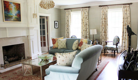
WINDOW TREATMENTS9 Upgrades to Elevate Your Window Treatments
Find out what the pros do to turn an ordinary window covering into a standout design feature — and what it costs
Full Story
FURNITUREIconic Designs: 10 Modern Dining Chairs to Know
Elevate your dining space with classic chairs by some of the 20th century’s revered designers
Full Story

Jennifer K