Software
Houzz Logo Print
macbeth3n1

Need help with kitchen backsplash placement

4 years ago
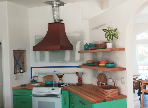


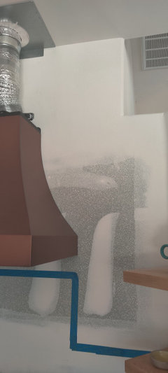
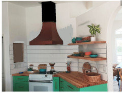
Because of the odd wall shapes, we're not sure how to place the tile. The hood will be moved down a few inches, most likely in line with the bottom of the upper shelf. Should we tile straight across, at the level of the lower shelf? Or go up to the hood, and if so where do we go vertical? We do have to tile above the countertop on the wall with the niche, because the wall is uneven and there's a large gap.

(There is another, straight area of the kitchen which has the same cabinet/butcher block/shelves, that we may also tile to the lower shelf.)

The tile will probably be zellige in an off-white shade. We are awaiting the GE Cafe range in matte white with induction cooktop & copper knobs. Please ignore the messy stove.

Comments (49)

  • PRO
    4 years ago

    I'd tile right up to the bottom edge of the hood on that wall and to the same height on the niche wall. Then go right to the underside of the first shelf on the open shelf wall.

    Beth thanked Sabrina Alfin Interiors
  • 4 years ago
    Is that flex duct connected to your range hood? Not safe. You should get that replaced with rigid metal ducting.


    Sorry, no advice on tile, but other talented design people here are sure to help you with that.

    Beth thanked mcarroll16
  • 4 years ago
    If it were mine

    I would leave the hood offset from the shelf. Looks fine where it is.

    I would only tile up to the curve on the Hood wall... that is past the straight edge where it begins to curve on top. I would paint the other walls. The cubby wall a fun color and leave the shelf wall white to show off your dishes. Everyone will have a different opinion, brace yourself. Just have fun decorating!

    Beth thanked Lyn Nielson
  • 4 years ago

    @Sabrina Alfin Interiors: I appreciate your input! The left edge of the niche is very small (2.5" to the end of the counter), so we didn't think we would place any there. Would you do that, though?

    @mcarroll16: Thank you for letting us know. That is the ducting sent with the hood. My husband is looking into it now!

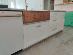
    @Lyn Nielson: That would actually be my choice. The problem is, our butcher block and the walls are not flush, there is quite a gap. I'm ok with it, but my husband is bothered by it lol.

  • 4 years ago
    No advice on the backsplash, but want to say I LOVE your cabinet color! So fun!

    What color did you use?

    Beth thanked justcallmepool
  • 4 years ago

    @eld6161: I thought of that, but with the weird cutout on the top right, I think it would look weird

    .

  • 4 years ago
    @justcallmepool: thanks! Fun is what I'm going for 😊 that color is matched by SW (for their good cabinet paint) to Behr "Garden Swing".

  • 4 years ago

    im with eld6161, i would tile the whole wall behind cooktop and i don't think it will look weird.

    also, i would match the B/S color with your island countertop to tie it all together.

    Love your cab color, FUN!!! did u use the same color on your island cabs?

    Beth thanked sprtphntc7a
  • 4 years ago

    @sprtphntc7a: thanks! We do also have to tile the side wall (with the niche), at least above the counter. It's too big of a gap to fill with grout.

    The island cabinets are actually white :)

    I am also trying to figure out what to do on the back of the island. I'd like something kind of dramatic.


  • 4 years ago
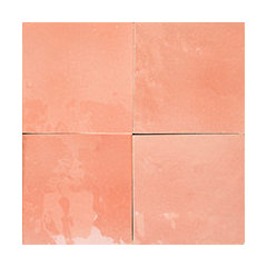
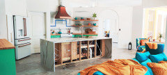
    I would love to see a pic of the whole kitchen. Love the colors!

    Beth thanked Hellogardener
  • 4 years ago
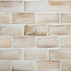
    last modified: 4 years ago

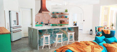
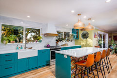
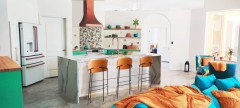
    @Hellogardener, not sure if these really help, but here goes! The green is a tad lighter than in the photos, tough to capture. Handles are brushed gold, hex (CB2), faucet champagne bronze (Kraus Oletto, might switch that out), copper sink, hood, appliance handles and future pot filler. Britannica gold quartz (Cambria), maple butcher block & shelves (Walnut Woodworks), Fitch cloud floor tiles (Happy Floors) . Paint colors are Pure White & Garden Swing (color matched, SW Emerald). Much left to do!


  • 4 years ago

    Super cute. Your style is right up my alley!

    Beth thanked Hellogardener
  • 4 years ago

    Mine, too! What a nice looking space!

    Beth thanked theotherjaye
  • 4 years ago

    I think the oddities in wall layout above the stove should be accented as a design feature…painted green like the cabinets?..above whatever line you choose for the tile…in this quirky shaped area it would seem perfect …..with your decor…the wall with the curved door opening could even be a turquoise like your couch…from what you have shown us this is a very stunning space…very graphic and full of life

    Beth thanked btydrvn
  • 4 years ago

    To be honest it seems the tile could be colorful..rather than white …in the same spirit of featuring/ accentuating the unusual angles

    Beth thanked btydrvn
  • 4 years ago

    I would actually love to do more color, likely orangey yellow or a terracotta-blush, possibly a pattern... not sure my dh can handle any more though! I'm holding out for something dramatic on the back of the island. Maybe a fun wallpaper!

  • 4 years ago
    last modified: 4 years ago

    WOW! I am absolutely in love with your space! It would make me do my little happy dance every time I walked into the room! It is wonderful to see someone having fun with color.

    If it were my choice, I would absolutely do your idea of a terracotta color tile. I would do it all the way up on all 3 walls. Don’t worry about the one side that has the little cut out. It would look really beautiful. You have such great natural light, and I think something darker on that side would really draw your eye in.

    Here is my attempt at a mockup. I wasn’t sure how the range hood would be finished.


    I wasn’t quite sure about the wallpaper idea, but you have such great style, I am sure whatever you did would look amazing!

    I made it a plain white for now, so that you could focus on the tile. What do you think? I was thinking you could then add some bar stools with leather seats in that terracotta coppery color?

    Oh and did you notice I added the matching ge cafe range? I figured you must be on the wait list for it like everyone else. 😂

    Forgot to add, the tile I used was this one from Encore Ceramics. They have some other colors too. I wasn’t sure which one would work best with your Britanica gold quartz.


    Beth thanked rebunky
  • 4 years ago
    last modified: 4 years ago

    I think I messed up on the left side above the top shelf. But looking closer, I think it might look weird with the tile going up higher then where the arch starts curving on the opening.

    Here it is stopped under the second shelf and then under the first shelf.


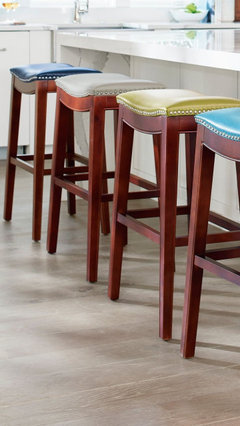
    These bar stools in four different colors might be fun too. Ok, I will quit decorating your house now! Haha!


    Beth thanked rebunky
  • PRO
    4 years ago

    Don't over complicate this. Line up the hood with the bottom of the shelf. That becomes your line for the tile.


    Beth thanked BeverlyFLADeziner
  • 4 years ago

    What Beverly said, with that terracotta tile!

    Beth thanked Rachel Lee
  • PRO
    4 years ago

    If you tile the whole wall, pull the hood, tile, and reinstall the hood please. You've got to replace the flex duct anyway.

    Beth thanked Joseph Corlett, LLC
  • 4 years ago
    last modified: 4 years ago

    @Joseph Corlett, LLC absolutely, we'll do that. The hood is only installed temporarily, so we can use it.

  • 4 years ago
    last modified: 4 years ago

    @rebunky WOW!!! I am amazed at your mock-up skills! You have some great ideas!!

    I especially love that you added the Cafe range. Yes, we've been waiting since last August. Any day now, haha 😂 🤞

    As to the tile, we'll probably go a bit lighter so the hood stands out, but yes! Also I think we've decided we'll keep it lower, more like how @BeverlyFLADeziner shows it, although I don't think we'll tile behind the shelf. As to the niche wall, if there's curvy gap between the wood & the wall, do we have to tile it?


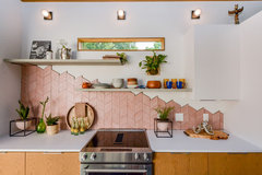
    We have also considered a random tile finishing on the top edge, to play along with the different heights. Sort of like this (but different, more random):


    O' Keefe · More Info


    Maybe with hexagons?

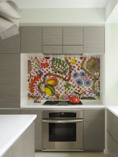
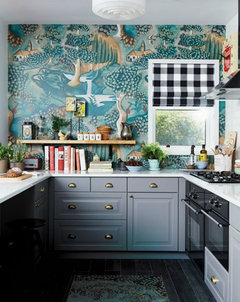
    For the wallpaper, or maybe fabric under plexiglass, here's some of my inspo:


    Bohemian Apartment Kitchen with Fabric Backsplash · More Info


    Eclectic Kitchen Design · More Info


    I love this pattern:


    Beth's ideas · More Info


    I would probably do this on the back of the island rather than the backsplash.

    Thanks so much for all your ideas! It is fun, but exhausting.

    We are also planning primary & guest bathroom remodels & then laundry room... I'm quite overwhelmed

  • 4 years ago

    Ok this was quite the challege!

    I tried to show the lighter colored tile you picked (which would look great btw!) randomly cascading down from the hood, but it was hard to make it look right. Hopefully you can visualize it looking better.

    I picked the middle wallpaper to use on the island because seemed to have some of that tile color in it. Plus it was the one with the largest amount of pattern so I could cut and paste it to fit much better.

    This mockup was so much fun for me! I don’t get out much. Lol!


    I think as far as the countertop gap under the niche, if you don’t want to tile, maybe just add a short simple wood trim piece stained to match the counters and shelves? You could then add wood shelves on the bottom of the niche that sticks out a little further then the wall to set stuff. Or maybe sort of like this one?


    Beth thanked rebunky
  • 4 years ago
    last modified: 4 years ago

    OMG yes!! You nailed it!!!! I can't wait to show my husband, I so hope he will be on board. The island is perfect!! Now to figure out how to do that...

    And the uneven tile placement...perfect! And maybe just use that to hide the gap, too

    And the niche...yes! That's the look I'm going for, with the little wood shelf! And either white, or a pop of that fabric/wallpaper 😆

  • 4 years ago


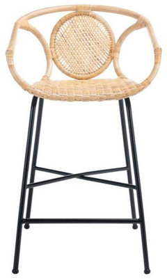
    Btw these are the stools I ordered:

    Beth's ideas · More Info

  • 4 years ago

    You know what, I actually like it too! I mean, yes, yes, I know it might be too wild for some people. It is bold, vibrant, fun, exciting, and sparks so much joy! Yet, it is still tasteful and beautiful. Probably a perfect description of youself am I right? I just have to say it… You go girl!

    Beth thanked rebunky
  • 4 years ago
    last modified: 4 years ago

    Had to add the new stools to show hubby. I wasn’t sure on the size and of course they’d be flipped around with back showing. 💕


    I just showed my husband and he really liked it. He said the island was cool and looked kinda like an aquarium. 😂 He can‘t see too good!

  • 4 years ago

    Your mockups are really helping me with choices! I'll need the make sure whatever island design I choose, it should pull in the color of the backsplash. I feel like there's too much coppery color on the back wall, and none on the back of the island.maybe I need to stick with my original "natural" color tile, which would echo the stools. Then I'd need a pattern on the island with the copper, the natural, and a bit of the green. Sounds like a tile I chose way back when...


    Beth's ideas · More Info

    Problem with this one is the navy blue. I really wish it were black 😕

  • 4 years ago

    PS if your husband likes it, maybe mine will too! Plus the underwater look would work well since we're at the beach

  • 4 years ago

    @rebunky has done you a huge favor! I don’t know why you are eliminating your original tile choice from the mix. Even with navy blue it would be stunning. I like it better than the terra-cotta,
    Your modest stools can easily be spray painted at the end of your design journey. I was shocked to see something so simple from you!

    Your kitchen is delightful. And yes @rebunky: Most of us need to get out more and stop obsessing on Houzz. I love what you did for @Beth.

    Beth thanked RedRyder
  • 4 years ago

    The chairs are adorable…but…if you spend much time seated there …will they be comfortable?…the backs look low and not very substantial for leaning backward?…don’t know how accurate your color portrayal is on the terracotta tiles …but it looks drab among all the crisp colors?…orange seems more in character with the rest

    Beth thanked btydrvn
  • 4 years ago
    last modified: 4 years ago

    Ok I am officially obsessed with your adorable home. And at the beach? Awesome!

    Here is a completely different direction. This is just a thought I had. I figured it doesn’t hurt to throw out ideas because you never know when it could lead to something.

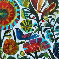
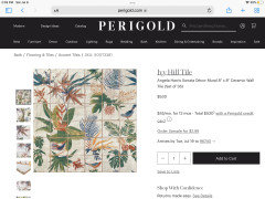
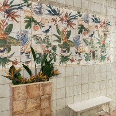
    Your earlier inspiration photos with the tropical-ish mural behind the stove mixed with the one with the bird reminded me of this tile mural I had seen someone else on here do.


    I put the mural just under the hood with the above coordinating beige squares for the field tile. I then threw in a few random single tiles from the mural around. I made the back of the island the green cabinet color. No worries you don’t like it, you won’t hurt my feelings. I am just playing! The scale of the tile size might be off. I am still learning how to judge that better.


    If you want, I am happy to mock up any other backsplash tiles and other island wallpaper choices as you narrow it down.

    Beth thanked rebunky
  • 4 years ago

    Rebunky, this last version is my favorite. I love the green on the back of the island. And the stools really stand out against it.

    That rule mural is great or any mural would look so neat. What a fun place!

    Beth thanked justcallmepool
  • 4 years ago

    OMG, Rebunky's last design is incredible. Somehow that busy tile design feels bright and actually simpler than the other mockups. And it really ties the entire space together. Green on the back of the island also really streamlines and unifies the design.

  • 4 years ago

    Funny, we were drawn to that mural tile at the Tile Shop when a salesman pulled us away, saying it was too busy for our space! It comes in a coppery tone too.


    I'm still not sure on the green on the island. It looks fine in the photo but imagine it on 8 ft length. My husband definitely doesn't like it... I do like how the stools stand out against it though. We could easily give it a try, it's just paint! Maybe on beadboard or something for some texture. Or maybe I can find another way to bring that color in there.


    I'm still considering wallpaper or fabric there ... I feel like it's an easy way to try out something bold that's removable, rather than the much more permanent tile. Also lots of choices!


    Thanks @rebunky! I'll post the zellige I was considering, and look for more mural ideas. Murals are really big here so I think it would be cool! Maybe something tropical which would tie in our outdoor space & bathroom...

  • 4 years ago

    You could paint some large poster boards and tape on the island to see how you like it.
    Also maybe look at the peel and stick wallpapers bc that’s easily removed or changed out.

    Beth thanked justcallmepool
  • 4 years ago

    You know I wasn’t sure on the green, but it needed something darker or the stools just blended in and looked very plain.

    Here it a quick rendition with a white back panel and brighter colored stools if kept the mural. I also thought of doing some kind of grasscloth wallpaper? I can try more ideas later for you.

    Zellage tile would look great!


  • 4 years ago

    @justcallmepool that's what I was thinking, too. They also have vinyl floor cloths but probably not as much selection.


  • 4 years ago

    The more I'm looking at that backsplash the more I like it though. I love how you added some patterned tiles here & there at random too!

  • 4 years ago

    @rebunky I found a few fun and normal tiles for inspo

    Beth's ideas · More Info


    Beth's ideas · More Info


    Beth's ideas · More Info


    Beth's ideas · More Info


    Beth's ideas · More Info


  • 4 years ago
    last modified: 4 years ago

    Ok lets start with a more sedate ”normal” look first. Although, still mixed with fun!

    This tile is one I had picked out in the very begining along with that terracota one. I will post this one first since I was already working on it paired with a wooden slat or reeded look for the back of the island. It was too hard to add your bar stools, so just imagine it with them.

    With this look, I felt like the backsplash looked best going all the way up behind the hood. This is my favorite so far! It actually feels really good to me. I also think this tile would tie in very nice with the island countertop.


    What I like is that it lets your amazing copper hood be the star. It also lets your eyes have a little rest as they pan around the room taking in all the fun pops of color. It adds a calming element, but it certainly isn’t boring.

    I quickly played with those fun tiles. They are cool! I didn’t know what size they were, and I had no clue how to layout a pattern. Sorry, I totally botched this one! 😳😂

    I really do not like how I did that feature behind the range. I am reluctant to even post this, but I will anyways just to give you some idea on how the colors look.


    Beth thanked rebunky
  • 4 years ago

    Dang, now I think I'm with Rebunky again on this and like those neutral-ish tiles on the whole back wall. It DOES let the beautiful copper hood stand out and be the star. And it should be!


    Those wood slats are kind of interesting on the island, that's a cool idea. I also thought maybe some kind of geometric wood molding.

    Beth thanked justcallmepool
  • 4 years ago

    I love the green island and the wood island. I think the key is just to do something more than white there. With all the other amazing color in the room, the white island doesn't look plain, it looks unfinished. Such a beautiful space coming together!

    Beth thanked mcarroll16
  • 4 years ago

    We have thought about the wood on the island. I especially love the reed look, so thanks for showing that! not sure if the stools will just blend in or clash with texture though. I thought about it a while ago, to bring the wood/warmth over there, since we have tile floor & the quartz. The stools would do that, too though.

    @mcarroll16 no worries there, white was never an option for me 😆


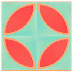
    The wild tiles are likely not going to happen, I had to design them myself & the shipping is ridiculous! I was just having fun. And since finding anything with that green, or really any green, is nearly impossible! Blue is all they seem to have.


    I added in the poppy red because I got a BB&B flyer with those colors together & love it!! The tangerine/cantaloupe is another color I have elsewhere in the home (you can see a glimpse of it on our patio through the window)


    I'm actually going to try to get hubby to agree to a lighter shade of that on the ceiling...


    Now. The problem with the tiling all the way up is that weird cut out. You probably didn't notice it on the original photo, but I'll try to mark it up for you.


    I'm also not a fan of subway (sorry!) 😔


    But what about my off-white zellige? That has been my main thought on that wall...I love the organic look of it, and the variation in color/texture. And the glaze reminds of of the seashells and would again bring in a little bit of the beachy idea...


    I am truly leaning towards the zellige (off-white with rosy undertones maybe), either squares or hexagons, still considering the random top edge, ... with some pattern on the island....I'll probably test out the wallpaper on there. Or have my daughter paint a mural for me! 😉


    I do love everything you're doing! It's so helpful to me & I can't thank you enough. 💕

  • 4 years ago

    Here's another inspiration & tile photo


    1900 Taylor St. · More Info


    Beth's ideas · More Info


  • 4 years ago
    last modified: 4 years ago

    I think the off white zellage would be great! If you want to do the random edge, I think the hex tends to be better to make that random detail. I would probably pick the square if you’re just going straight across under the hood. If you have you’re heart set on a mural or pattern on the island back, then the all one color off white zellige on all the backsplash would be a perfect choise.

    Here it is on that side wall. I cut it out from this photo. It does have a hint of the pinky tones, and like you said ties in the beach since it reminds me of an oyster shell. Oh and notice I tried some in the little niche and added a wood shelf?


    It will be so pretty! Please update us as you narrow down your choices!

    Beth thanked rebunky
  • 4 years ago

    I love it. Which seller of zellige did you use there, and what color? I love that it has the pink undertones.


    I have had my heart set on zellige, and something dramatic on the island, since before we moved here last April (2021). I guess sometimes you need to go with your heart ❤️I have had my heart set on zellige, and something dramatic on the island, since before we moved here last April (2021). I guess sometimes you need to go with your heart ❤️