Software
Houzz Logo Print
silk02000

Backsplash Help

4 years ago
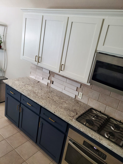
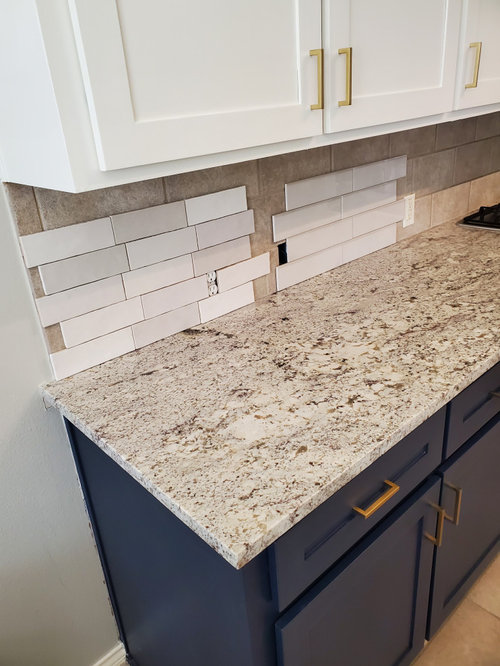
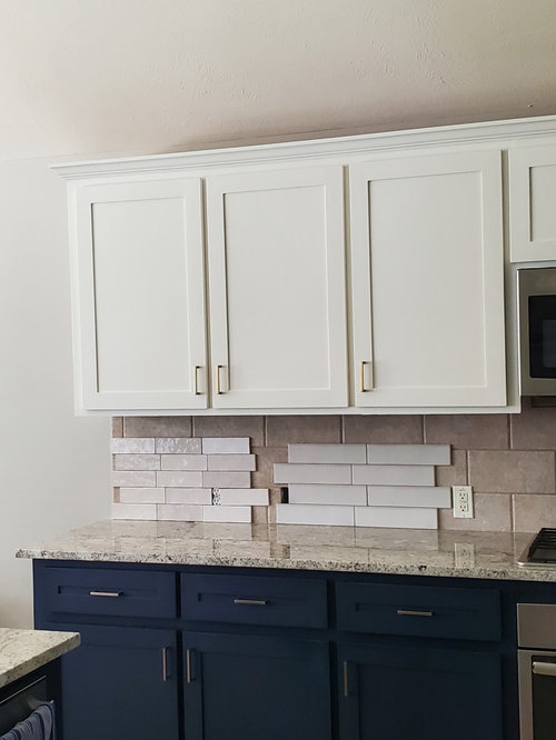
I believe I have it narrowed down to 1 backsplashes. Both are so different and I cannot make up my mind. Looking for some input. Can I do better?

Comments (19)

  • 4 years ago

    Almost. I like the size and texture of the multicolored one better but I think a single color would be better.

  • 4 years ago
    last modified: 4 years ago

    the left one is mauve and it doesnt work / the all white is a cold white but it might be okay. search out solid whites....they vary a lot. i think the hardware is giving emphasis to a white w yellowish undertones ...thats how the cabs look.

  • 4 years ago

    Same issue I have - cabinets appear yellow next to the cool white tile

    Finding a warm white tile I like is proving to be a challenge

  • 4 years ago
    last modified: 4 years ago

    The backsplash that you have now matches well with the counter. i would find a ceramic tile similar in tone but lighter

    There is a bit of a disconnect which is why the tiles you are trying to put there are not working

    Was your kitchen originally all white with that counter?


  • 4 years ago

    Definitely not the one on the left. Could be the lighting but on my screen the right sample looks gray/cool with your cabinets. I’d keep a solid color, simple tile due to the pattern in the counter.

  • 4 years ago

    It could help to cover your current backsplash so you are not seeing the current tiles against it

  • 4 years ago

    I like the size of the tile on the right. Have you considered a matte tile? It might be a soft enough look that it will go well with your uppers. I actually got this tile for our recently renovated kitchen from Floor and Decor (comes from Spain). Sorry about the shadows, the bottom rows give you an idea of what the tile looks like.

  • 4 years ago

    Eaw 513 your cabinets and backsplash look great. My fear with a matte finish is if something like red sauce should need to be cleaned up or water from the sink should splash up onto it. Have you had any issues?

  • 4 years ago

    Eld6161 my cabinets were originally a orange honey oak. The granite is more of a warm creamy color, not stark white. Finding that my camera definitely does not do well with the  color accuracy.

  • 4 years ago

    Chlobud a solid color definitely makes more sense. The color on the right is more like a greige.

  • 4 years ago

    Herbflavor I am definitely not trying to go with a white tile. My thoughts were a grey or a greige color tile. That is what I see when I look at the tile on the right.

  • 4 years ago

    In the overall picture … the floors are complicating the flow… they match the counter and present backsplash…some what…but neither complements the new cabinet colors… to get the best look they all need to be updated

  • 4 years ago

    Love the kitchen upgrades, looks nice. What hardware did you use? I like it.

    I would keep looking for a tile that either matches the upper cabs or the lightest color in the counter.

  • 4 years ago

    Thanks Rawket. The hardware is Champagne Bronze from Amazon Basics.


    It's been so difficult finding the right tile. I am stumped.

  • 4 years ago

    Btydrn I would love to update the flooring, just not in the budget. A remodel of the kitchen would have all most been easier than updating. Hoping the navy on the bottom compliments the flooring more than white would have.

  • 4 years ago

    glass tile can beat out white ceramic sometimes . getting the white is difficult quite often whereas the hazy frosty various light tones in glass marry other surfaces together. I think you probably can find better white but I'd look at glass if they have them where you can see and bring a few in....[3rd one below !!! ] youll get there ...and dont worry about the floor.


    White Glass Subway Tile Kitchen Backsplash · More Info


    Glass Tile Backsplashes by SubwayTileOutlet · More Info


    Vertical White Glass Tile Backsplash · More Info

  • 4 years ago

    In view of your circumstances i might choose the tiles on the right as they seem to blend with the wall color…avoiding any sparkle or texture to draw the eye there

  • 4 years ago
    last modified: 4 years ago

    Ok, just double checking here. What color are your cabinets? when you say:

    ”My thoughts were a grey or a greige color tile. That is what I see when I look at the tile on the right.”

    Do you think your uppers are greige as well? Or are you trying to match the counter? Because you have the two tone cabinets, the counter matches neither, and now are you looking for a fourth color for your bs tile?

    I think you might get a better result if you find a white tile that matches the white of your cabinets. Do the visual experiment first. Find a paint color that is the right white to match the cabinets, and one that is greige. Paint them on cardboard and tape them in place. See which color highlights your counter and looks better in the space. After all, if beige were the right direction to go in, well, you can see how that looks already with the tile that’s there.

  • 4 years ago

    earn44……I guess I did not word that correctly. My cabinets are a lightened Alabaster. There is Agreeable grey on my walls, which is a greige, and there is some grey in the countertop. I have lots of sun coming in all day long. Between the lighting and my camera not picking up the colors properly, pictures are not the best. That being said there is a creamy color in the countertop that I am going to try and work off of. I took the tile on the right down. Somehow I am still liking the one on the left, but still going to continue to search.