Software
Houzz Logo Print
lisa_crawford115

Kitchen Island Dilemma

4 years ago

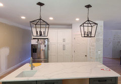
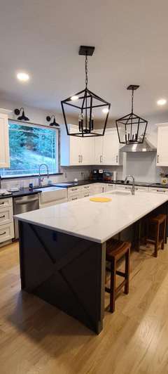
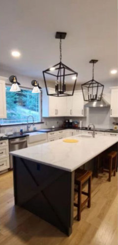
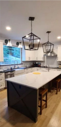
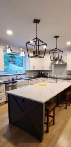
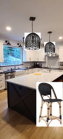
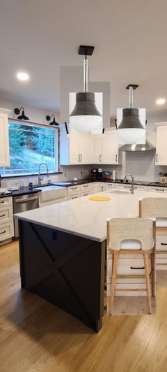
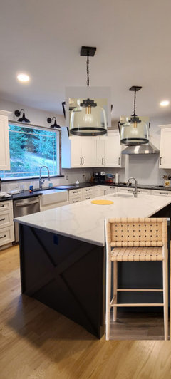
Hi. Well, our kitchen remodel is really taking shape. We're waiting for the backsplash and the hood to be completed now. I picked out some farmhouse island pendants that I have loved in other people's photos and online, but now that they're up, I'm not sure I like them. There's something funky about them that I just can't put my finger on. I don't know if the spacing is off (although I researched a lot first), if they're too busy, color is wrong, etc. My island is 102.5 inches long, and each light is 16 inches wide at the top and 12 inches at the bottom. We put the center of each light approx 24 inches in from each end. Now when I was doing research, the countertops were not intalled yet and I was going from a template, so the island measured 93 inches. Quite a difference. Right now, there's about 37 inches between them at the top and 41 inches at the bottom. Still, they look fairly large, and another one might be overkill.
Another factor is the prep sink at one end of the island. Visually, it separates the island into two areas, so having one of the lights partially over that sink is throwing me off. Would it be better to only have lights over the blank counter?
And do you feel that the barn lights over the sink are OK with the island light style? Would it be better to go with more of a domed shade to match those? My husband will kill me because these were such a pain to install, but they have to look good lol. Please give me all your thoughts. Thank you!

Comments (33)

  • 4 years ago


  • 4 years ago


  • 4 years ago
    last modified: 4 years ago

    (not a pro) I think the lights are nice, if they are above eye level when standing at the counter and if they provide nice light for the island. What would make my slightly OCD self a bit nuts is how the canopies are off-kilter from the island (and maybe from each other, hard to tell with photo angle.) I'd want them squared off so that the sides are parallel with the edges of the island. (I think it's why I've always preferred round lights and canopies - avoiding off kilter corners.)

    ETA: I think your kitchen looks lovely and I hope you enjoy all the beautiful parts of it!

    Lisa Crawford thanked chicagoans
  • 4 years ago

    My gut response is that the island pendants are too big...they scream "look at me" which takes the focus away from the room. And, I don't think they complement the barn lights over the window. Try something simpler over the island.

    Lisa Crawford thanked Moore4
  • 4 years ago

    They feel a little bulky for the space to me--but we had lights that initially felt too big too and they grew on me over the years. I like the barn lights and wouldn't mess with those, but you could explore something a little more delicate over the island to see if you like that look better. I would also just see how you feel about these after some time has passed, though--if you love the fixtures themselves and they provide the light you need, they may work out fine. Since they're already up, I'd worry about other things and then circle back to this to see if you still want to switch them out after some time with them.

    Lisa Crawford thanked artemis78
  • 4 years ago

    Chicogans, yes lol, the canopies are off kilter by the same amt. I liked this in my brother's house, but I think you're right that they should be squared up. Thank you!

  • 4 years ago

    Moore4, I think too busy comes to mind. I'm doing a square of accent tile under the hood that isn't in yet, and I want that to be the focal point.

  • 4 years ago

    artemis78 they do seem bulky for the space, even though by the lighting formula they are ok. It's just a visual thing I guess. The style may be throwing me off.

  • PRO
    4 years ago

    I actually like them. The size doesn't bother me. The canopies definitely need to be fixed.

    On a side note, please when looking at paint samples do not paint them on the wall like that. It's not very helpful. You are better off painting a piece of poster board that you can move around the rooms and look at a larger section of color at different times of the day. It will make the selection process much easier.


    Good luck!

  • 4 years ago

    Debbie Washburn thank you! Yes, we will be fixing the canopies. The paint is a nightmare all its own, lol, in this northwest forest room.🤣

  • 4 years ago

    I like the light fixtures and also agree about the canopies. Very lovely kitchen. What are your counters?


    I had to LOL at the paint samples. My husband seems to think I'm the only person in the world who has to have several paint samples before I can pick a color. I used those peel and stick paint samples when we did our bathroom....life changing lol!

  • 4 years ago

    Too big and black and busy. They don’t let your eye move past them.

  • 4 years ago

    I actually like both chloebud. I think the difference is that I have other bronze elements in my kitchen. The dark fixtures seem out of place in this picture.

  • 4 years ago

    jenstl thank you! The counters were the most awful conundrum. I was originally trying to do all white quartz, but after looking at dozens of choices, none of the whites matched just right with the cabinet white. So...I did an about face and went with black mist honed granite on the perimeter. I was soo nervous, but I am in love. It's the most unusual granite I've ever seen in that the movement is subtle and understated. The island is radianz dolce quartz.

  • 4 years ago

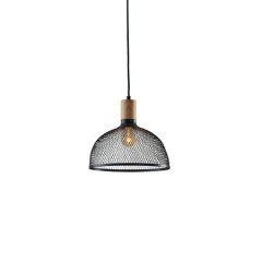
    Lisa, that’s a good point. I like this 4-lite pendant but it’s for a single ceiling connection.


  • 4 years ago
    last modified: 4 years ago

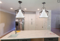
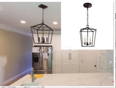
    I love the before and after that chloebud posted. You're right that the dark fixtures work with your other finishes but I also think the dark fixtures highlight the spacing. Are you able to return? If so...

    https://www.shadesoflight.com/products/cowbell-chic-pendant-small?sku=PE19113+++DB&source=sag&category=Pendant_Lights

    https://www.lampsplus.com/products/hinkley-winnie-18-inch-wide-polished-white-pendant-light__70x08.html

    Lisa Crawford thanked er612
  • 4 years ago

    er612 cool pic! I see what you're saying. Food for thought...I can't return them because my husband mutilates things when he installs them.😬 Maybe spray them a different color?

  • 4 years ago

    Definitely the pendants are too big. Maybe use them in a hallway?

  • 4 years ago

    Katherine Canon maybe my pictures aren't doing the island size justice. It's almost a 9 foot island. The lights are only 16 inches at the widest part. So some designers would actually say that's not enough according to the formula they use.

  • 4 years ago

    Another option would be to replace the sconces above the sink. I would install something with a glass shade or silver finish.


    Lisa Crawford thanked er612
  • 4 years ago

    OMG @Lisa Crawford. I love ur kitchen. And it’s just fine the way it is!! The lights are stunning and they make a statement. I hate the kitchens that have the tiny pendant lights. Excellent!

    Lisa Crawford thanked Blair
  • PRO
    4 years ago
    last modified: 4 years ago

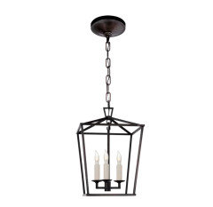
    Those are the knock off of these, ........same black iron. narrower frame . See the candle color?

    That's also part of the problem . This is a nine foot island. Visual Comfort Lanterns in aged iron. Quality matters. Not every knock off measures up.: ) as refinement gets lost. Darlana mini 14 inch tall below ( had a low ceiling )

    Next size up is small, and 16 tall I believe


    Interior Design Work · More Info


    https://www.circalighting.com/darlana-mini-lantern-chc2175/#2461=36341


    Lisa Crawford thanked JAN MOYER
  • 4 years ago

    @JAN MOYER thanks for your detailed response! I actually did have the option to choose the white candles. I personally didn't like the stark contrast of the white and dark with so much already going on. I prefer a monochromatic look.

  • 4 years ago

    @Blair thank you so much! That makes me feel better. ❤️

  • PRO
    4 years ago
    last modified: 4 years ago

    The black candles make them "heavy" : ) There's white behind them in the cabinets. .... The frame was plenty of black is the point. A roll of white cash register paper and a test visual wrapped around those candles? Would probably change your mind on that. If so?

    https://www.bplampsupply.com/category/72_candle-covers--candle-sleeves

  • 4 years ago
    last modified: 4 years ago

    IMO the cage pendants prevent me from getting a good view of your LOVELY cabinets. I think I would go with something less bossy and more subtle.

    IMO barn lights don't go stylistically with the clean look of the cabinets.

    I would re-think both sets of lights. They don't need to be statements or hog attention: your counters and cabinets deserve looking at!

  • 4 years ago
    last modified: 4 years ago

    I agree w/Jan. I like them but I think it's too heavy looking.

    You have a lot of black (which I like!) but those are very dark/heavy over the island.

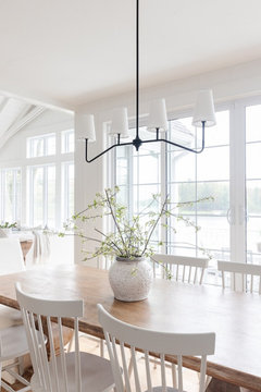
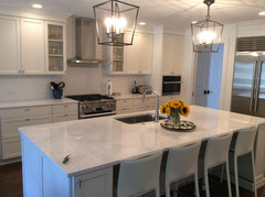
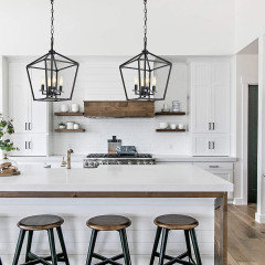
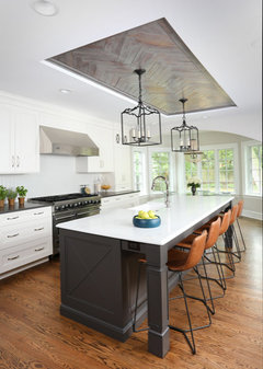
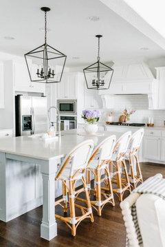
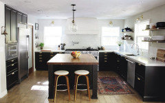
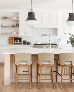
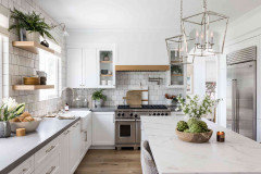
    This one works because there is a tone of white in this kitchen compared to yours. (BTW, I think you should ditch your chimney vent and do something like this one, or the other in the pics I'm going to show you. Especially w/a wood trim piece.


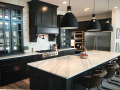
    Very similar to yours, color-wise. I think these lanterns are thinner


    These pendants seem a bit lighter than yours. maybe it's because of the thinner, charcoal metal color


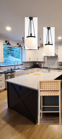
    I really like these Hood Classic Pendant lights. (they come in tons of options w/color and globe glass) I don't think your plain black sconces are the best choice


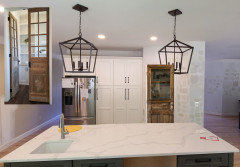
    BTW, and idea for you pantry door. do a salvage wood w/glass (to break up that solid run of cabinets)


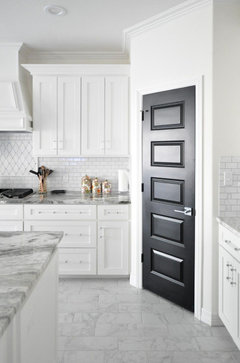
    or, you could do a door like this painted to match your island.


    do you like the rattan chairs? they have black. I paired them here w/a black woven material. (you could also do the natural color)


    A lot of black in this one. I like these sconces and pendants. the runner is nice too


    Tried to photoshop this one. And this is the vent hood cover you should get.


    or this one w/the oak trim piece. and I love how they put glass on those two cabs w/more wood.

    you could always go w/the silver lantern.


    Or, do a black hood cover. calacatta backsplash tile


    black and glass.


    Lisa Crawford thanked Beth H. :
  • 4 years ago

    They are high contrast against everything else in the space but simple and airy - so i would wait until the room is done to make any changes. I think it will be easier to judge once the BS is in and all the small/distracting counter clutter is dealt with - sorry if i missed this but have you chosen stools/chairs for the island?

    Lisa Crawford thanked la_la Girl
  • 4 years ago

    I am of the view that pendants (like busy backsplashes) almost always look too fussy in a kitchen. Any pendants. I've said this before on here! Like people have these beautiful kitchens and because one of the "check list" items is "pendants", they insist on adding them. But the end result is much like a older woman who thinks her outfit needs a gaudy "statement necklace" - because that's what 65-year old women do. Resist the urge.... Now that the cutouts are there, just do white or clear pendants .

    Lisa Crawford thanked H202
  • 4 years ago

    @la_la Girl I think you're right. It's probably best to get everything in place and then step back to judge. No, I don't have stools yet.

  • 4 years ago

    @Beth H. : thanks for all the suggestions and effort! They're are some cool ideas in your photos. I'll definitely consider some of these.

  • 4 years ago

    The lights are fun but i don’t think they belong in a traditional kitchen. i don’t think they match and they definitely steal the show. your kitchen is lovely but it is hard to appreciate that! i would go smaller or something that blends in a lot more. i might be kind of with h202 here and often don’t like them. i find picking out lights to be one of the most difficult things though!