Software
Houzz Logo Print
mcarroll16

Please help me like this color

4 years ago
last modified: 4 years ago
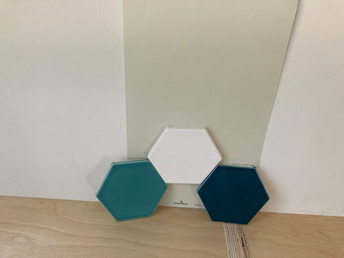
ETA: Our designer strongly recommends we paint our kitchen walls Sea Wind (Benjamin Moore). Husband is on board. I want to be on board too, but I just hate it. The new cabinets are white, with big splashes of walnut. We will have a backsplash of blue and white hex tiles. I don't see how this paint color works with the tile colors, or helps the kitchen feel fresh and energizing.

Please tell me why I'm wrong. My head says I should listen to the pro whose advice we paid for. My heart says this color is dreary and makes the tile less vibrant. Can you give me a color-theory reason why this paint will actually work?

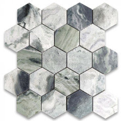
Pictures below of the tile in front of Sea Wind sample, and the in-progress kitchen for some context. The room faces north, and we have sad gray winter light for 7 months of the year (Seattle area).


Comments (48)

  • 4 years ago

    Sigh. Houzz ate the entire text of my post. I've added it back to the original post.

  • 4 years ago

    Blech, no. That's a yucky color even on a Google search, before you add in the fun brightness of your backsplash tiles.

    mcarroll16 thanked Port of Indecision
  • 4 years ago

    How high will the backsplash go? Have you told her that you hate the color? She should be able to offer other options. It is your house after all

    mcarroll16 thanked gurukaram
  • 4 years ago
    last modified: 4 years ago
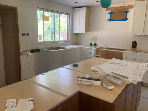
    Backsplash will go all the way to the hood on the wall pictured, although there will also be another upper there (currently missing as it arrived damaged). Tile only goes up the bottom of the cabinets on the sink wall. There's also a missing upper there waiting for replacement. So really tile and paint will only "touch" right around the window. But there's enough blank wall for that color to be a big part of the room.

    Gurukaram, I did tell her I hated the color. But the focus of her site visit was on cabinet problems. And she may feel stuck here. She already suggested some blue shades that DH vetoed. Her immediate focus was on discouraging us from going with white walls.

  • 4 years ago
    last modified: 4 years ago

    I like sea wind, it is a lovely off white with green undertones. It looks good with natural wood tones. I don't like the tiles. Get a mix with green undertones, gray/blue and white.


    mcarroll16 thanked elcieg
  • 4 years ago

    It seems sort of muddy. I do not care for it . Tell her you do not like it and get a color you like. Good luck

    mcarroll16 thanked oreolucca1
  • 4 years ago
    last modified: 4 years ago

    @elcieg, the tiles are paid for and sitting in our garage. DH selected them, and is super excited about them. The paint needs to selected to fit the tile, not the other way around.

  • 4 years ago
    last modified: 4 years ago

    He picked the tiles, you pick the paint. If you don’t like abandoned hospital green, don’t use it. It sounds to me as though you might be happier with white walls, or blue.


    mcarroll16 thanked eam44
  • 4 years ago

    I didn't understand that from your post. Okay, definitely with you. Sea Wind and those tiles are not a match made in heaven.

    mcarroll16 thanked elcieg
  • 4 years ago

    Thanks. I would be happiest with blue walls. White is would be the compromise color. I don't think that white would be bad though, I think that maybe designers get tired of white.

  • 4 years ago

    i think that it is a lovely background color. I used something similar in our kitchen with medium wood cabinets, lighter wood dining table with red cushions, and a teal rug under the table. The pale green pulls it all together in a way that white or grey wouldn't be able to do.


    Remember, it's only paint! Paint is the easiest thing to change in a kitchen.

    mcarroll16 thanked Yvonne Martin
  • 4 years ago

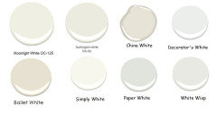
    @eam44 thanks, I wll check out that color! My top pick is Palladian Blue, but DH hates it. BM Opal Essence is the potential compromise, and Simply White. Opal Essence has a chance because DH loves a pun.

  • 4 years ago

    @elcieg that is a gorgeous blue. Do you know what the name & brand is?

  • 4 years ago

    I cannot help you like this color. It's ugly, dingy and dreary next to those gorgeous, vibrant tiles.

  • 4 years ago
    last modified: 4 years ago

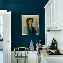
    Poor natural light needs color on the walls. Thinking you go with the color of one of the tiles because you will have enough of white cabinets, woodwork, ceiling, to break it up. Don't introduce a 5th color. Teal works with walnut, too. Hard to match using a monitor. This is B.M. Aegean Teal


  • 4 years ago

    Re: Simply White: It's a pretty bright white. If you find it too bright, try Moonlight White (2143-60), the next one down on the strip. I have that in my hallway, and it's a beautiful white, easier to live with on the walls than Simply White would be.

  • 4 years ago
    last modified: 4 years ago

    Can you wait until everything else is done (including the lighting) before you pick a paint color?

    Paint colors change all the time with light and time of day.

    I like the deep color judianna picked, if your walls can handle a deep color. But you really won’t know how the room will look until it’s done.

    If you like the bluegreens, I used bm smoke and iceberg in a bathroom one time and I loved it. It looked a lot prettier in the bathroom than it does online. We used GE reveal full spectrum light bulbs (before the ban). The light color temperature is a huge factor with blues and taupes. If you narrow it down to a general hue, your paint color will be obvious once everything else is done.

    mcarroll16 thanked kelli_ga
  • 4 years ago

    Personally, I would match the white of the cabinets. There isn't a lot of wall space and you want the tiles to shine.

    mcarroll16 thanked jck910
  • 4 years ago

    I'm just guessing on a color. Monitors are so fickle. Take both of the blue/green tiles to a paint store an have them match the color. Just don't do a white wall...white doesn't make things brighter, especially if you have lights on a lot.

    mcarroll16 thanked elcieg
  • 4 years ago

    @porkchop_z5b_MI we are actually going with Moonlight White for the living room. It's a great color! But it comes off a little dark and gray in the kitchen. Simply White seems reasonably warm without tipping into actual yellow. It's definitely a bit warmer than the cabinets.


    @kelli_ga we have to have the colors picked out soon if we want the contractor to do the painting. We had actually planned to do the painting ourselves, at a leisurely pace. But we're now looking at finishing at least 3 months later than planned,. We've been living without a kitchen or any living area furniture since June. We need pros to paint and have everything done ASAP. But that's one reason we're looking at white. Easier to repaint in a year or so, when we've had time to really consider a color.


    @jck910 there's not much wall around the cabinet. But there's a 22-foot long wall behind the island, and several feet of wall in the breakfast nook part of the room, so the paint will be a big block of color. The cabinets are a propietary color of the cabinet maker. I'm worried that trying to match will land is in a bad "almost" zone.

  • 4 years ago

    I know a thing or two about sad gray light. I live in Cleveland. Luckily my kitchen faces south. A great lighting plan can help! It’ll be worth every penny.

  • 4 years ago

    I think white is the answer. My first thought was a very very light color that jives with the teal tile, but if spouse doesn't like Palladian blue (darn, I love that one) then I would think he would not like that either.

    Sea wind (coastal) is just not in the same universe as your chosen finishes (mid mod); sorry about your designer?

    mcarroll16 thanked rebasheba
  • 4 years ago
    last modified: 4 years ago

    We did white walls in a recent bathroom project with green tile because we didn't want the walls to compete with the tile as the prominent color element. It is literally the only room in our house that isn't a color--we generally aren't neutral wall people--but it works there. I might consider that here for the same reason--white isn't exciting, but if you pick the right white it can just fade into the background, especially since it doesn't look like there's too much wall to paint. (We used BM Swiss Coffee, which is the same formula as Simply White but 25% darker--Simply White was too bright/white for our room.)

  • 4 years ago

    Thanks everyone! This has been very helpful! At least I feel better about rejecting Sea Wind. I think we will do white for now, so we can finish before Christmas, but we will do it with the goal of finding a great color to repaint ourselves. Maybe after the holiday season.


    @artemis78 thanks for that tip! I'll order some Swiss Coffee samples from Samplize. We both agree that something a bit darker than Simply White would be good, but the Moonlight White isn't quite right in that room, and Old Praire (next on the swatch) is heading into the same dreary zone as Sea Wind.


    @kandrewspa you have a good eye for color! Newport Green is exactly where the tile is. I've got some large swatches of Blue Bonnet, but it ends up going baby blue in the room. That's the tricky thing with light blues. When we're ready to work on the color, I'll definitely try Blue Bonnet at 50%. Hopefully the really pale blues will be less likely to turn nursery-colored.

  • 4 years ago

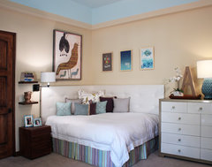
    not sure what big splashes of walnut means ...but note the great wall color w the wall art blues and greens..like your tiles. would be nice also with wood tones wherever you are installing the walnut.......

    Sophisticated Teen · More Info

    Colors go with colors.

  • 4 years ago

    We used the color Emmie's Room in our kitchen. We have a North facing window and west facing.


  • 4 years ago

    Huh, that color does not speak to me. I just don't vibe well with creams and yellows. It's a personal failing.


    "Splashes of walnut" is a walnut island, walnut fridge surround, cabinet between fridge and sink that is white but has a walnut-framed glass door, walnut crown above the upper cabinets. Walnut-toned dining chairs with teal cushions, hopefully a walnut-topped small console table where the toaster and microwave, walnut or other dark-toned table.

  • 4 years ago

    Oh, Emmie's Room is nice! Adding that to the file for later consideration. Thanks!

  • 4 years ago

    Think color wheel opposites. You have the teal of the tile and the orange brown of the walnut. Pull an orangeish color from the walnut wood family.


    Look how this Antique Copper sets off the teal!


    mcarroll16 thanked Amy Loves Pink Bathrooms
  • 4 years ago

    SW Sea Salt may work for you. It's a subtle blue-green neutral.

    mcarroll16 thanked anna_682
  • 4 years ago

    I was just going to say sea salt! thats what we ended up with recently - palladian blue was an awful bright baby boy blue in our space. i think a light blue green would be nice. that copper could be fabulous too but i would be nervous about pullung it off. blue greens are tough though so i would definitely get some samples.

    mcarroll16 thanked lharpie
  • PRO
    4 years ago

    This color is a combination of green and gray. You can select an off-white that is more neutral in undertones.


    mcarroll16 thanked BeverlyFLADeziner
  • 4 years ago

    Thanks Beverly! I'll add a couple of those whites to Monday's Samplize order.

  • 4 years ago

    Dont do it! You are going to see it every day you have to love it There are many many other options Keep looking!

    mcarroll16 thanked siouxz
  • PRO
    4 years ago

    NO NO NO I have no clue how that color would work with those choices and please make sure all that lighting is LED 4000K for sure . I have to say I do not love hex tiles for backspalsh but maybe post a pic of what that layout will look like , what is the counter ? I do not see how the tile connects to what you have described at all.

    mcarroll16 thanked Patricia Colwell Consulting
  • 4 years ago

    Are you sure the cabinet paint color is proprietary? My cabinet manufacturer told me the color they used: SW Extra White. (The cabinets look more brown than the paint strip, but that could be a lighting/sheen issue.)

    See if you can ask the manufacturer directly.

    mcarroll16 thanked kelli_ga
  • 4 years ago

    The counter is Pental Crystal White, a terrazo-look white quartz. I don't love hex either, but marriage means compromise. And I'm not posting the layout because I'm already second-guessing some parts, it's too late to change anything (unless I want to risk divorce), and internet criticism of the overall design is something I just can't handle right now. Especially if it's correct.


    But thank you for the paint color advice. That's the one thing I can still change, and the area where Houzz advice is super helpful. Everyone here has helped me feel better about vetoing Sea Wind.

  • 4 years ago

    I think you need a color with a bit more saturatiion and a bit less gray. It's a lovely color but not in Seattle in north light.

    mcarroll16 thanked cpartist
  • 4 years ago

    @kelli_ga good idea. The cabinet rep is coming this week to examine the damaged cabinets, so I'll ask him about the paint color. They are quite white--somewhere between Simply White and Chantilly Lace. Just under a lot of shadow in that picture. Dark smoky weather right now, and we're still waiting for lighting to be installed.

  • 4 years ago
    last modified: 4 years ago

    I could see a color more like Barely Teal 2048-70 or Spring Mint 2040-70. Both pick up the teal tile better.

    No white because in your light it will just be more dullness. I also like Judianna's suggestion if you're willing to go bold.

    mcarroll16 thanked cpartist
  • 4 years ago

    Thanks! Adding those to the Samplize order.

  • 4 years ago

    They should tell you the cabinet paint color because some customers will want to paint crown moulding and/or baseboards or other trim to match.

    They might try to sell you matching paint though. I think they wanted $25 a quart for mine which I though was crazy until I went to the SW store and priced their cabinet paint. (SW offers discounts.) But you shouldn’t need to buy expensive cabinet paint for trim. Definitely not for walls.

  • 4 years ago

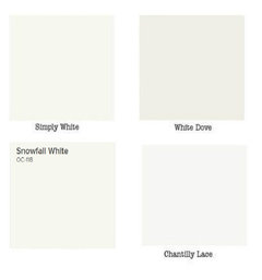
    Ok, followup question if people are willing to indulge me. If I go with a light teal wall color (Barely Teal, Opal Essence, what white should I use for the ceiling? We're using Simply White for the living room ceiling, but that might be too warm for a teal wall?


    Judianna's colors are gorgeous. I would do that in a heart beat, but I'm not likely to persuade DH. I might be posting a thread in a couple of months with the full kitchen layout, to get advice on a dark teal accent wall.

  • 4 years ago

    Do you have painted trim in this room? If so, I'd match that color in a flat ceiling paint. If you're using Simply White everywhere else, I'd start by trying that out--I know it's technically a "warm" white, but it can also sometimes have green undertones in the right light, so I'd call it borderline. We have Swiss Coffee (darker version) in a room with a cool green palette and it works fine--I picked it partly because it reads much cooler than the creamy/warm Acadia White we have for ceilings and trim in the rest of our house.

    I was also going to suggest an accent wall as a solution to your dilemma, too--there's no reason the wall with the tile needs to match the longer wall, if you want to use a white or light color against the backsplash and something with more color elsewhere. If you go that route, though, I might try to pick two from from the same paint chip card, so maybe that will help you narrow down which lighter shade to use.

    mcarroll16 thanked artemis78
  • 4 years ago

    I love your tiles very very cool. Maybe chantilley lace for ceiling its fairly bright. I tried pure white for mine and thought it grayed out and was too stark . Extra white is supposed to be pretty but i knew for me too stark ended up with alabaster and it looks good but its more of an ivory

    mcarroll16 thanked oreolucca1
  • 4 years ago

    @artemis78 we will have painted baseboard trim, but that color isn't picked yet. Probably White OC 151 or Chantilly Lace. So maybe that's where we should go with the ceiling. I think Swiss Coffee would be too dark for the ceiling--ceilings are only 92" high. Great idea about coordinating an accent wall color with a light color near the tile, thanks!


    @oreolucca1 thanks. We're committed to Benjamin Moore colors. Mostly because of path dependence--I've already used their paint for years, own 5 fan decks, have a strong sense of the color choices in that line. And I know what Aura, Regal, and Advance all feel like to paint with. I don't want to learn the feel of another paint. We will look at Chantilly Lace for the ceiling and baseboards if we go for teal walls.

  • 4 years ago
    last modified: 4 years ago

    I like the ceiling to be the same as the trim, but in flat finish. No mistakes then on undertones. My trim and ceilings are B.M. Pure White and I like it. I have had a few houses in the past and I have used Simply White, Acadia White ( in my 1840 Cape), Chantilly Lace. Over all the years I have been decorating, my favorite combination is Decorator's White and Linen White on the walls. There is something about that simple combination that makes it work with just about anything.


    mcarroll16 thanked elcieg