Software
Houzz Logo Print
jgrisbaum

Backsplash tile advice

3 years ago
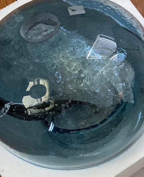
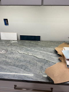
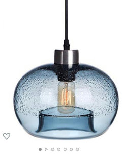
We are ready to choose backsplash tile for our kitchen renovation. Wall color is Sterling from Home Depot. We like color and we have some blue glass pendant lights to be installed over the island. Here is the kitchen and also a picture of the glass color pendant lights. We’re thinking about doing the square white tile for the main part of the backsplash and then the blue tiles over the stove/range. Any opinions? I am not able to upload any other pics of the many tile samples we have… I will try in a comment.

Comments (49)

  • 3 years ago

    All of the tile samples and a sample of a darker blue tile

  • PRO
    3 years ago

    Only the pic of the light fixture posted. Can you upload the others?

  • 3 years ago

    I like that dark gray one (between the hexagon and the big white one).

  • 3 years ago

    I’d say no to the really dark one, but the med blue (looks close to the pendant) seems fine. I don’t think, however, I’d mix the 2 the way you’re suggesting….too stark, imo. If you want to mix in some blue behind the range I’d suggest a white tile with a pattern that has that blue in it. I’m not an industry professional, it’s just my opinion…..if you like that look (all white, then all blue), it’s your kitchen, so go ahead.

  • 3 years ago

    We don’t have the pendants up yet, but here’s a picture from online

  • PRO
    3 years ago

    I'd totally go for the patterned tile. It will liven up all those neutrals. Will be gorgeous!

  • 3 years ago

    I forgot to mention that I'm not super keen on the two-tone thing. You have fabulous counters and pendants already. You don't need more "interest". But if you do opt for a different color behind the range, why not white there and the color everywhere else?

  • 3 years ago

    Fori we were thinking the blue behind the stove would show less splashes from cooking, lol.

  • 3 years ago

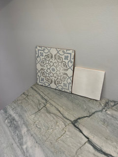
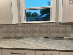
    How do you feel about this patterned tile, pictured here with the white square tile? I love it but it may be too much with the countertops…

  • PRO
    3 years ago

    I'd do the patterned tile alone. You don't need accent tile with this pattern.

  • 3 years ago

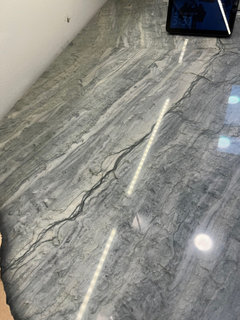
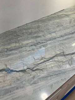
    The countertops

  • 3 years ago

    I've been told you're supposed to clean those but have no personal experience with that. :P


    I think white will hide greasy spots better, actually. Guess you need to do a splatter test. Lean them up behind your stove (if it's being used yet) and see?

  • 3 years ago

    Thank you all 👍

  • PRO
    3 years ago

    I like the patterned tile as well. I also really like that hex tile! It may be a little dark - maybe in a lighter color?

    Good luck!

    The tops are beautiful!

  • 3 years ago

    The hex tile is a flower, very cute

  • PRO
    3 years ago

    I think that tile is too dark. I still like the pattern on the more neutral tile.

    Jen g thanked Sabrina Alfin Interiors
  • 3 years ago
    last modified: 3 years ago

    The counters are amazing! I agree that they should be the star, and a quiet backsplash is the best choice. The patterned tile is lovely... but IMO not with the counters. The mockup below is rough, but hopefully shows you how the patterned tile would compete with those gorgeous counters.


    I'd go mellower/solid in a color that complements the counters.


    (Not the right color, but a pale green/blue/grey to match the counters is what I was going for):


    Jen g thanked chicagoans
  • 3 years ago

    @chicagoans Thank you so much! How did you do that? Very cool.


  • 3 years ago
    last modified: 3 years ago

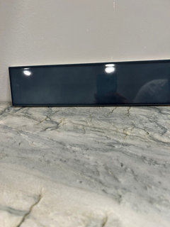
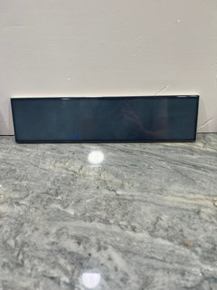
    My family really likes the dark blue tile to pick up the darkest veins in the counter, trying to find a good picture of it but my computer isn't cooperating

  • 3 years ago

    that's great that they love it, but what do u love?? if you are the 'chief cook and bottle washer', then u will be in there the most, so get what feels right to you - what you love and can look at for a long time.

    just a thougt: if your counters are shiny, a nice way to go is a matte B/S. 2 shiny's is a lot of glare.

    Jen g thanked sprtphntc7a
  • 3 years ago

    The person with the best taste/most understanding for design should choose the tile….it’s really not a democratic process. It’s sweet they show an interest, but you choose. I’m guessing you came to Houzz to get input and advice for a reason….

    Jen g thanked coray
  • PRO
    3 years ago

    My general advice is that a backsplash should provide a background and should not try to be the star element in a kitchen. Patterned tiles will look dated (already do IMO). So, would suggest something simple and serene that will look good for years.

    Jen g thanked Norwood Architects
  • 3 years ago

    Jen g: if I’m partly to blame for your looking at patterned backsplash tile, I apologize! When I said (way back when😉) that I wouldn’t suggest all white with a ”sudden patch” of all blue, but rather incorporate the blue tone lightly, I was merely reacting to that idea w/o looking too closely at your counters. I definitely agree with the majority here who suggested your counters are too busy for a patterned backsplash…I would keep it simple. You like the blue glass pendants, and it is a pretty color, but I’d keep the backsplash light and neutral and add more of that blue via accessories, art etc.…it’s more subtle and easily changed, should you want something different in a few years.

    Jen g thanked coray
  • 3 years ago

    I totally agree with everyone who said your countertop is STUNNING and the “star” of the room. Therefore, you need to do something “quiet” on the backsplash. It’s so hard to choose from single tiles lined up - and monitors are all different. But since you asked, I like the dark blue tile on the right but also the square white tile, which is my first choice if it’s ivory. A patterned tile is out. Any patterned tile competes with your countertop.

    And @coray is right - home design is not a democratic process. The right choice may not be what the family votes for but who has design experience here? Houzzers.

    Have you looked at soft greenish-grayish tiles? That might be another option. Maybe we can call on @Beth H to show some other ideas. Stark white may be too harsh next to your stone.

  • 3 years ago

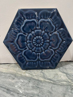
    Here’s a closer picture of the dark blue tile

  • 3 years ago

    And another picture

  • 3 years ago

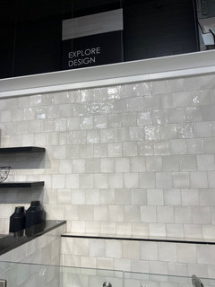
    Here’s the picture of what the white square tiles in the store. I kind of like shiny lol (I really love mother of pearl) and we did put plastic channels for the LED undercabinet lighting to reduce glare

  • 3 years ago

    Like the white, wouldn’t do the dark blue (too harsh, imo), but I like RedRyder’s idea of a soft green-gray!

    Jen g thanked coray
  • 3 years ago

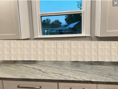
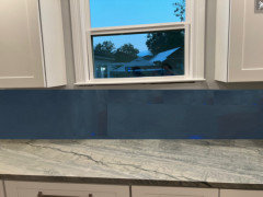
    Your tile. Granted, no grout lines but this will give you an idea. I'd go with a white


    Jen g thanked Melissa R
  • 3 years ago

    Thank you all so much!!!

  • PRO
    3 years ago

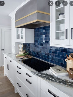
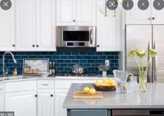
    Here are some darker backsplash with white cabinets. It is a statement for sure:


    Jen g thanked Debbi Washburn
  • 3 years ago

    seeing the mock-up, i love the blue tile, but not in your kitchen. i feel it takes away from your counters and weighs everything down.

    if you love blue, go with a light blue/gray tile to enhance your counters.

    the white tile pic that you posted is pretty, bring them home and see how they look.... maybe that line has shades of blue??

    Jen g thanked sprtphntc7a
  • 3 years ago

    @sprtphntc7a They do have a lighter blue square tile but it was aqua…not good with the counter. They also have a lighter blue subway tile in one of the first pictures I uploaded

  • 3 years ago
    last modified: 3 years ago

    I love dark blue (really any blue), but colors are so site-specific. Even your lightbulbs will change how they look.

    If, like your family, you also really like the dark blue tile, my suggestion would be to find a paint match as close as possible (bring the tile to a paint store and ask them to color match), buy a quart of paint and paint it onto a few pieces of poster board, cut to size to fit between your counters and cabinets. Live with it for a bit in different light. It won't be exactly how the tile would look, but it could give you an idea. Does the dark color complement the counters? Does it feel too dark / like a cave?

    Actually I would do this for any colored tile if you're not sure how it will look. This is a few extra steps and time, and a bit of money, but so much easier than changing your mind after tiles are up.

    Jen g thanked chicagoans
  • 3 years ago

    Absolutely do what @chicagoans said ^^^! The blue might be too harsh but poster board against the wall gives you the best idea - in your house - of how it will look.

    I would still look for a soft, soft grey tile. The white, as pretty as it is, could be too white against the countertop. Can you buy more of those? One tile isn’t great for making a huge decision like this.

    Jen g thanked RedRyder
  • 3 years ago

    We have decided against the dark blue tile. I see what you guys are saying about how it's too much - thank you! And yes, we are going to get a box (or more) of the white square tile and line them up to see what they'll look like. I really like the idea of a light grey tile. It's not white and it won't compete with the counters.

  • 3 years ago

    i think you are on the right track....and yes, you cannot do aqua...

    you can accent your kitchen with dark blues & shades of 'your' blue: towels, rugs, spatualas in utensil holder, art, pottery, so many way to pull in the blues!!

  • 3 years ago

    Wow- I was thinking of doing almost hte same thing! white cabinets, quartz counters (white and gray family like MSI statuary Classique or Caesarstone Statuario Maximus) with blue tile backspalsh and now you have all made me rethnk it! Nooo! I was so excited for blue! Glad i saw this thread though... my choices may be too harsh of a contrast too.

  • 3 years ago

    I think the white would be best, but you could bring in the blue with whatever accessories you will have on the countertop. Kitchenaid makes a Beautiful inky blue mixer

  • 3 years ago

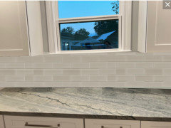
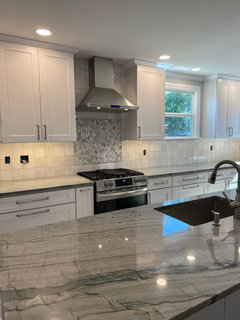
    This is what we chose. Thanks everyone for your help!

  • 3 years ago

    Very pretty!

    Jen g thanked User
  • 3 years ago

    Hey….that’s what we chose!! we love ours, it’s refined, yet a bit rustic.

    Jen g thanked coray
  • 3 years ago

    Looks great! Your countertops are stunning! Enjoy!

    Jen g thanked Lynn Lou
  • 3 years ago

    It came out fabulously! I love the understated white against your gorgeous counters, and the mosaic over the range is *just enough* pattern without being too much.

    Jen g thanked Alyssa Fernandez
  • 3 years ago

    Wow, it’s perfect! Give yourself a huge pat on the back. Enjoy your new kitchen!

    Jen g thanked RedRyder
  • 3 years ago

    Thanks everyone!

  • 3 years ago

    Kitchen is gorgeous! Just getting ready to choose countertops in new build. May I ask what is the name of your counters?

  • 3 years ago

    @ az1980 Sorry I just saw your post. They are Zircon quartzite and we are very happy with them.