Software
Houzz Logo Print
natashalin31

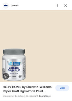
Sherwin Williams’ Paper Kraft Paint color

3 years ago
last modified: 3 years ago

Anyone familiar with the color paper craft from SW? Does the yellow under tone feel outdated to you?

Comments (17)

  • 3 years ago

    Not familiar with that color in particular but context is key. Anything in any color CAN look outdated depending on the balance of the room and all the factors in it.

  • PRO
    3 years ago

    Of course it has yellow . Why on earth do you want to paint walls to look like a paper bag. I need context this to me is a horrible color to want for anywhere.

  • PRO
    3 years ago

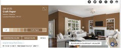
    If you mean Craft Paper color, keep in mind dark paint colors absorb the light and make a room look smaller if you only looking to paint one wall to add abstract it will add a nice detail and make a room look larger.

    If you do an entire room in that color make sure it's a large room with lots of windows.

  • 3 years ago
    last modified: 3 years ago

    Do you think the furnishings such as pillows, drapes, white lights, can make a room with yellow undertone look better than an outdated yellow room. thank you

  • 3 years ago

    Are you trying to work with a room that is already that color, or are you thinking about painting a room that color? Bearing in mind that there are hundreds of possibilities, there are nicer browns if that's what you want. If the room is already painted that color, please post a picture so we can see what you're working with.

  • 3 years ago
    last modified: 3 years ago

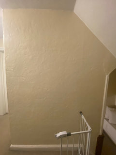
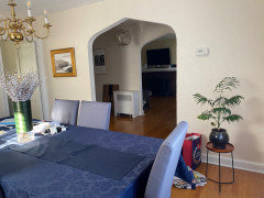
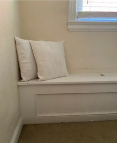
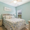
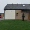
    It’s already painted that color. But I want something now without that yellow undertone. It looks nice in some rooms but not in others of the house. I don’t plan on changing the paint for now. So trying to live with it and enjoy it. Here are pics of it around the house. You'll see it looks nicer in some areas. But overall, Im not pleased with it.


  • 3 years ago

    Thank you so much. I'll play with those colors. My dining room chair covers are gray.

  • 3 years ago

    It looks better than I was expecting based on how the color looks on SW's website. But mojavemaria is spot on about the dining room chairs. If it has been 5-10 years since you last painted I think it's time to bite the bullet and repaint - especially since you don't like the color. Gray is passing by as a trend, so no need to go in that direction unless you like gray. Look at SW Accessible Beige. It tones down the yellow and is a very popular color. You can always paint one room at a time over the course of the next couple years to spread out the expense and/or effort. Do it in the areas you like the least first. I know it's not fun. :-)


    A final piece of advice - sample, sample, sample. It doesn't matter what other people like, it matters how it looks in your house with your stuff. If you haven't tried Samplize.com yet, look into it - they sell peel and stick samples. Great if you don't want to get a roller wet to sample. However, I always end with a large sample of about 10 square feet in the finish I plan to use before I commit. I have been known to change my mind after seeing that.

    Tish Lin thanked kandrewspa
  • 3 years ago

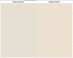
    We only painted 1 year ago, so I have to wait maybe another 5 years or so before repainting. But I also like your idea of one room at a time. For my next color, I have my eye on Shoji White from SW. I've seen it in person, and it's what I was looking for when I purchased Paper Craft not knowing it had yellow in it.

    I am a lover of grays, not just because of the trend. I love grays, blues, and whites.

    Trust me, I learned now how important it is to sample.

    Thank you!

  • PRO
    3 years ago

    MY advice is to make sure none of your lighting is throwing yeallow So change all your light bulbs to LED 4000K that at least will eliminate the yellow cast for the lighting . Then see how everything looks. BTW If I paint a space with a color I hate the first thing I do is repaint instead of trying to make something I dislike work so please change that lighting.

    Tish Lin thanked Patricia Colwell Consulting
  • 3 years ago

    Thank you.

  • 3 years ago

    Question - are you sure about the color you are specifying - Paper Craft is a dark yellow brown, Does not look like the color on your walls.


  • 3 years ago
    last modified: 3 years ago

    My walls are Paper Craft. They do have a Craft Paper which is darker. Why the reverse names - who knows?

    edit - sorry - I've been spelling mine wrong. Mine is actually Paper Kraft.


  • 3 years ago

    Thank you. The color isn't really all that dark - LRV=76 and your spot on with your assessment of Shoji White - very similar, but less yellow, a bit more neutral.


    You say you love blues and grays and that is where I like to start when choosing paint colors.

    The neutral should be the perfect backdrop for your art and décor. If blue and gray make your heart sing and you dislike any yellows I may go with Eider White. I may also want to go with a brighter white.


    Shoji is a bit yellow green and sometimes looks a kind of muddy with blues and grays.


    Rooms that don't get great natural daylight often look better if we use some color on the walls rather than a white. The whole home really doesn't have to be painted one color. My last home had 5 different wall colors and my current home will have 7 or 8 different colors, with just the main living area and hallways in my neutral.


  • 3 years ago

    Thank you!

  • 3 years ago

    @Tish Lin If you message me I can send you my phone number and walk you through how I pick colors.