Software
Houzz Logo Print
brenna_thibault

Backsplash advice. Help me love this tile! There's no going back...

3 years ago

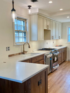
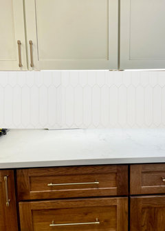
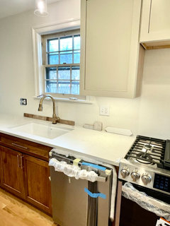
I hope I didn't make a mistake with this backsplash tile, because we're WELL past the return date. Funny how you forget what tile you ordered in August looks like, and then when it's time to finally install it in January it is SO MUCH WHITER than you remembered.


For reference:

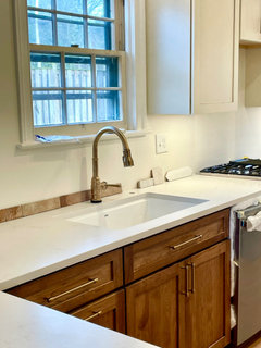
Hickory base cabinets with a saddle stain

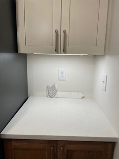
Frosty white uppers with coffee stain (which gives them the off-white appearance)

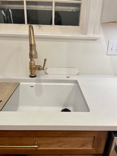
Honed Carrara Tuscony quartz countertops

Natural stained oak floors

Backsplash is Bedrosians 90 degrees in white (tell me that I'll learn to love it!)


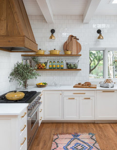
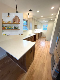
What grout color do you think we should use to bring some harmony to the off-white uppers with the white backsplash tile? The plan is for the tile to extend up the ceiling to the left of the sink with floating shelving. Speaking of floating shelves, would you do something along the hickory color for more contrast with the white backsplash tile or keep to the frosty white/coffee stain (off-white) look for those?


Appreciate your insights. I should have joined Houzz much much earlier in this process! There have been so many "things I'd do differently next time around" moments that I might have avoided. But it's been (mostly) fun!


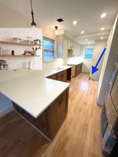
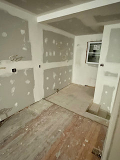
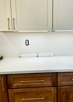
Pics for reference. The countertops aren't yet installed.


countertop


Comments (110)

  • 3 years ago
    Yes, understandable about the larger fridge (we have a second fridge in the garage, plus a 24” under-counter bev fridge in the island, which turned out to be one of our favorite features in the new kitchen…these things are almost a must with counter-depth refrigerators), but, Cyndi, to clarify: it's not that wall that matters, it's the fact that the fridge seems to be across from the peninsula, which narrows the aisle there, and that it sticks out beyond the cabinet. The way appliances last these days, poor Brenna might be buying a new fridge before too long…..though I SINCERELY hope NOT!!!🤞

  • 3 years ago
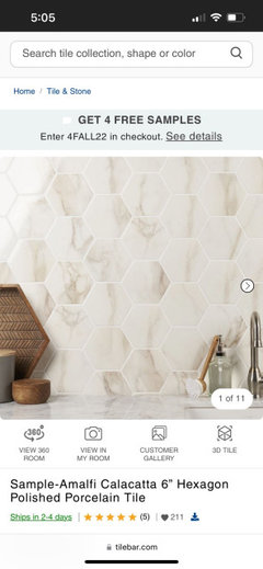
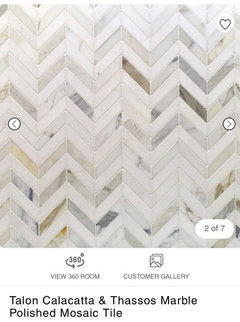
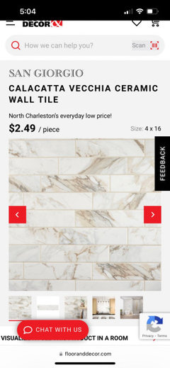
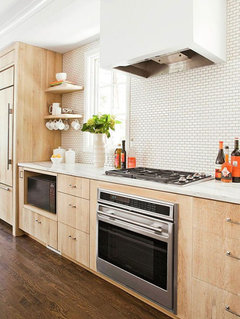
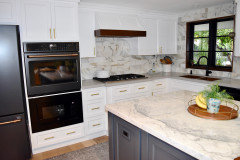
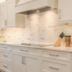
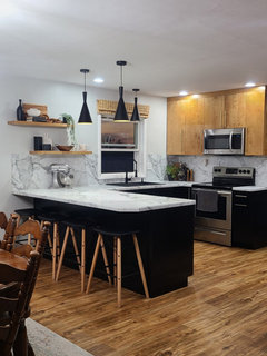
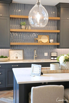
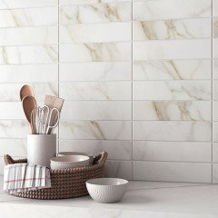
    Your kitchen is going to be beautiful. I would tile the wall to the level of the first floating shelf. You definitely need a backsplash behind the sink. Have you considered a Calacatta gold tile or lookalike. I think it would blend the warmer cabinets and the cooler countertop beautifully. Something like these

  • 3 years ago
    last modified: 3 years ago
    I like what you have.

    or you can pick something else. up to you.


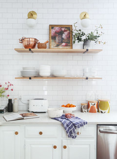
    for the shelving, I'd do at least 2, maybe 3, with 2 sconces.


    and prob tile all the way up

    If doing the white tile, pick the wood to match your lowers (not white)


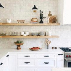
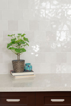
    here's the weathered white Zellige in the smaller square. I love the sconces and natural wood shelves


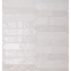
    Portmore tile. (similar to Cloe)


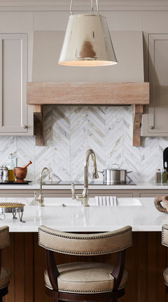
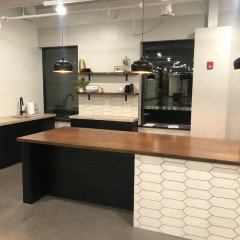
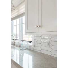
    Calacatta in a chevron. love this tile


    Has the warmer gold veining (which would be nice w/your wood).

    I did it in my own kitchen, but didn't have the wall space to do the chevron. you do


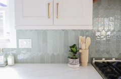
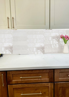
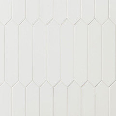
    Here it is in the picket design


    your fireclay tiles will have quite a bit of variation within the one color. a lot of people complain about this, so just keep that in mind


  • 3 years ago
    I don't have advice on the tile selection, but as far as placement, I think the tile should go to the bottom of the cabinet, across the back of the sink, then on the left of the sink, up higher than the bottom of the cabinet. Reason being your kitchen is long and narrow and bringing the tile up higher on the left side will give some needed height difference from the long stretch under the cabinets. And while I'm not a huge open shelf lover, you do need something to occupy that space. If you are not dead set on the shelves, try googling other options. I would personally hang some colorful art. But then only tiling to the height of the cabinet bottom. Your cabinets are beautiful, especially love the walnut. I am concerned about the stairs, they give me anxiety just looking at them. Is there any space at the bottom to start the steps two steps back? So that the first step would start at the first wall?

  • 3 years ago
    gigi, I just noticed that too!

    This has to be a safety concern. can't imagine cooking at the stove and taking a step back, falling to my death?! lol

    but back to the shelves.


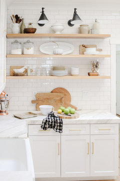
    I'd do 3 like this, and tile all the way up.

    You don't have a lot of backsplash tile space.


    I'd do all around the window, up and over to the peninsula


    I think cutting off the tile like this looks unfinished


  • 3 years ago
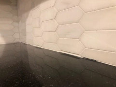
    @Beth H. : I LOVE the Calacatta in both chevron and picket. I just ordered a sample very similar to the hexagon one that @User shared. Thanks for so many great ideas, both of you! I wondered about a sconce over the shelves too Beth, it does feel a little dark over there but our electrician has already wrapped up so I'm not sure if it's still an option. Can't hurt to ask. I may also need to swap out the pretty Edison bulbs for something a little brighter in the fixtures. They seem much dimmer than the average light bulb, though they're nice and warm. They came with the fixtures so maybe they aren't great quality, I don't know. I haven't checked the lumens.

  • 3 years ago
    last modified: 3 years ago
    @gigi4321 and @Beth H. : Oh, the stories I could tell about that set of stairs. They go down to a new mudroom addition and there's no room for them to start farther out as that's the entrance to our finished basement. Our architect originally had those steps placed DIRECTLY in front of the stove. We looked at the plans and just never clocked how wrong this was until the stairs were already in, and I looked up and saw the stove hook up directly across from them. I mentioned immediately to our builder that this seemed wrong and super dangerous. He mentioned putting up a baby gate. (Insert giant eye roll) I pushed and said we absolutely couldn't leave the stove in front of the stairs. He suggested we contact our architect (who is on Houzz and has stellar reviews) and she suggested moving the stairs to be directly beside the back wall, which would have made them inaccessible coming in our back door unless you first entered the house completely and then closed the door. Super convenient when carrying in groceries, right? To change all of that would have been over $9,000. I asked if she would share the cost of making the changes (moving the stairs and the back door) but since we signed off on the plans it would have been totally on us to cover the expense of the changes. I really felt that it was a serious mistake and it would have been generous (and even ethical?) if she could have shared some cost in fixing it, but nope. We didn't have that much left in our budget so had to move cabinets around instead to the tune of $1,500 (our cost, because of course the cabinets were already ordered and sitting in a pod in our driveway waiting to be installed). Now the dishwasher is directly beside the stove, which I don't love, but at least the stove isn't directly at the top of those stairs. When you step back from the stove, that wall is now behind you. And a small hand rail is going in--same oak stained natural as our floors, so hopefully not overly intrusive--so that won't be an open pit to step into inadvertently.


    Whew. Clearly I needed to tell that story!!


    This is where the stove hookup was, originally. Crazy, right?


  • 3 years ago
    Following

  • 3 years ago
    last modified: 3 years ago
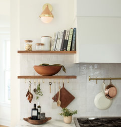
    With all the colors in the room, flooring, lower cabinets, countertop, upper cabinets and wall color I wouldn't add another dimension. I would use the countertop material for a backsplash. I would make it cabinet height under the cabinets and the rest as high as the bottom of the window or possibly just do a 4" after the end of the cabinets. I know - 4 inch is not in vogue, but it may save the kitchen from feeling disjointed with so many different colors and so many linear color breaks.

    I would match the shelves to the lower cabinets.

    .

  • 3 years ago

    Wow, Brenna, that really is a crazy story! Just goes to show you that the pros don’t always see everything, even if it’s something important. I think you did the best you could to improve the situation. In my experience architects are hesitant to offer cost estimates; they always say to ask a builder.

  • PRO
    3 years ago

    Could that top step be turned and coming off a landing than you would enter room from side?

  • PRO
    3 years ago

    Like this..just remove the top step and enter from a landing?

  • 3 years ago

    I was able to find bulbs with that Edison bulb look but at 3700k with a much better CRI on Amazon

  • 3 years ago
    last modified: 3 years ago

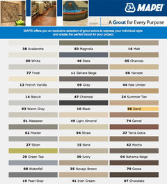
    Yes, I just purchased some better bulbs today @User, hope they help. I have biscuit and warm gray grout to play around with to see if I can figure out a way to like the tile we already have. Pics to come!

  • 3 years ago
    last modified: 3 years ago

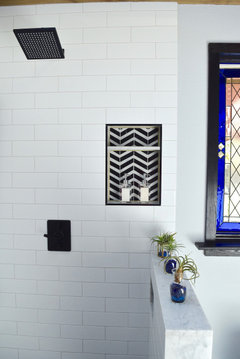
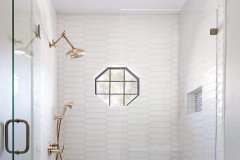
    go w/Mapei warm gray. I used it w/my white tile and my marble tile shown here in my shower


    biscuit is going to be too beige


  • 3 years ago

    @Beth H. : Yep! I tried both and no contest, the warm gray is so much better. Even my 10-year-old walked in and looked at my samples and said "Mom, that one is NOT good" when he saw the biscuit. HAH.

  • PRO
    3 years ago

    Out of the mouths of babes!

  • 3 years ago

    Following…

  • 3 years ago

    I know this is off topic but can you tell me how the cabinets from the cabinet joint are? Did they ship to your home and were there damages? I have an order ready to place. Are you in love with them?

  • 3 years ago

    @denise boyce They're really lovely! Our contractor likes to use Cabinet Joint and has worked with them many times, so he was confident that they'd deliver and they sure did. It took a while--12 weeks from order to delivery--but the cabinets are beautiful. None arrived damaged, and they shipped to our home. One door was the wrong size, but they shipped a new one out promptly. Zero hesitation in recommending them.

  • 3 years ago
    last modified: 3 years ago

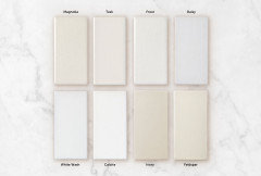
    I've tried and tried to like the herringone tile we have, but after ordering a bazillion samples from other places I've realized that the Bedrosians 90 degree tiles are just the wrong color white. White does work in the space, and I've found a few I like (the Kent white picket tile is lovely in the room) but the 90 degree tile is almost a blue/gray/white. It makes the cabinets look more yellow than creamy. If it were a different white and not so icy gray/blue, it could work--but as anyone who's tried to pick out a "white" paint for a room knows, white comes in SO MANY different colors! Sadly the Bedrosians 90-degree white just isn't working at all with the cabinets in our space.

    So... I like the Kent Picket Polished Ceramic Wall Tile quite a bit, and we could afford it even if I can’t resell the Bedrosians.

    The Cle weathered white is gorgeous (middle of second and third pic). We would have needed to plan for them from the start, I think, not incorporate them as a last-minute decision though. Actually, the square tiles that are 3/8” thick could work, the ¾ inch 2" x 6" tiles are definitely too thick—but all of that aside, unless I can sell the Bedrosian tile we can’t afford it.

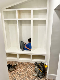
    I also like (and my husband LOVES) the look of these porcelain brick tiles. I know—brick, porcelain or otherwise, is going to make some of your hair stand on end. We used this in our mudroom for flooring—pic below—and on a whim I pulled out some of the samples from when we ordered and combined the Arizona Red (mudroom) with some lighter Tribeca Multicolor samples and the effect brings some real warmth to the kitchen.

    Still waiting on a few natural stone samples…but thought I’d update with pics now that some of the plumbing and appliances are installed to see if it garners new suggestions / ideas / feedback b/c I’m all ears. You’ve been SUPER helpful with the advice, I’m so grateful.

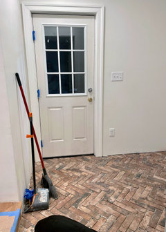
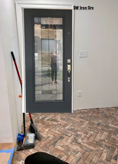
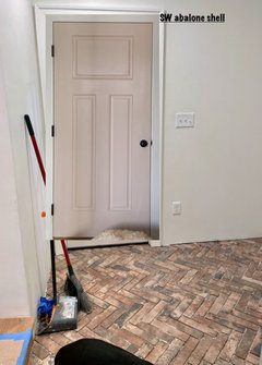
    Speaking of…that back door to the mudroom needs to be painted. Black? Simply White? The built-in cubby shelving will be BM Simply White, same with trim in the kitchen and dining room once they finish it up. Walls are BM White Dove.


  • 3 years ago
    last modified: 3 years ago

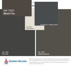
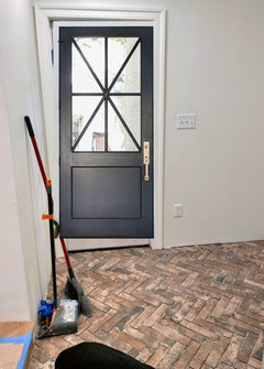
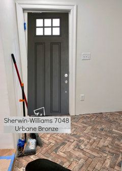
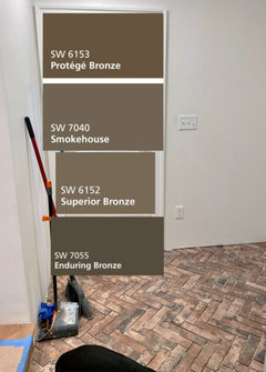
    if you want dark on this door, try one of these. they aren't as harsh as pure black, and a few of them have the brown tones that work w/the brick


    this one would be similar to Wrought Iron


    either of these colors are my fave. grab some samples. (to save money, get the color match w/the Behr sample pots and try those. they won't be exact, but will be close. if you like it, just use the behr paint. Samples for SW and BM are close to $10 each. and you get a lot.


    These choices have more golden hues to them which may work nicely w/your wood cabs. you'll have to grab some samples and see what works.


    I like any of the ones above or, on this one, the top color or the darker bottom color

    Brenna Thibault thanked Beth H. :
  • 3 years ago

    Beth, thank you! These are gorgeous. Love the look of the enduring bronze, urbane bronze and black fox. Great suggestions!

  • 3 years ago
    last modified: 3 years ago

    Our builder is getting antsy and really wants for me to order the new tile.


    Here are the top contenders. I worry that the Amalfi Calacatta matte ceramic may be too much pattern on that full wall, but I like the warmth of the veining. Love the picket shape of the Kent tile.


    Amalfi Calacatta ceramic tile and Kent polished white tile next to our honed quartz countertop and cabinets


  • PRO
    3 years ago

    I like both. Can’t go wrong..but still love your original choice!

  • 3 years ago

    once you put in the shelves, it will be fine. I also like either.


    you have to imagine how it's going to look like decorated. I love these zellige tiles


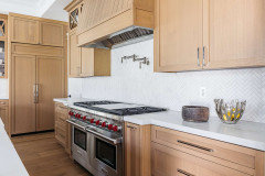
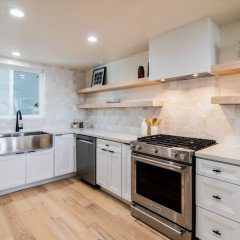
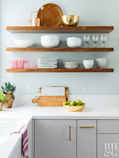
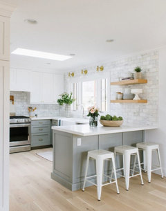
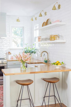
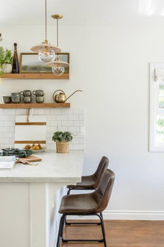
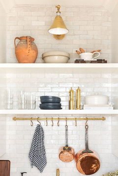
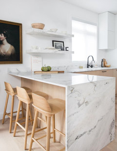
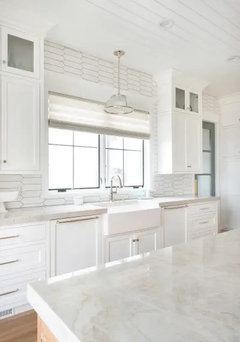
    I wanted to show you the diff the shelves make in this kitchen that another poster did.


    can you get anymore of that countertop? maybe you can run it up the back in a similar fashion?


  • 3 years ago

    it's pretty

  • 3 years ago

    I like Beth H.’s suggestion to use the countertop material as a backsplash. It’s a great, non-fussy look.

  • 3 years ago

    I had my front doors painted Urbane Bronze. It’s a wonderful rich brown.

  • 3 years ago

    Since both would work, pick one based on the shape. The picket is definitely different, the other is more "rich" looking.

  • 3 years ago

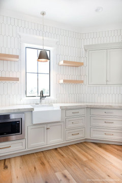
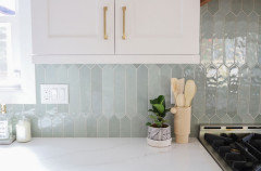
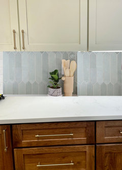
    Picket it is. I’m happy with it and it won’t break the bank! Will share pics once it’s in. Appreciate you all giving me the courage to walk away from the herringbone, even though it was paid for. It will be gorgeous in a future bathroom renovation! You can see the difference between the two whites in the pic below.

  • 3 years ago

    I'm sure its boing to look fine. are you going vertical or horiz?

    where are your pulls from?

  • PRO
    3 years ago

    So glad you made your choice and are happy with it--it looks very nice!

  • 3 years ago

    @Beth H. : the pulls are from Forge Hardware Studio, champagne bronze "Nash".


    We painted some samples and are going with Enduring Bronze for the door--thanks so much for the great suggestions!


    For the picket tile, I was thinking horizontal, particularly because the back of the sink area is almost exactly the height of one of the tiles when standing on end so it might be a pain in the neck to tile vertically; but I wonder if vertical might make our ceilings seem taller!

  • 3 years ago
    last modified: 3 years ago

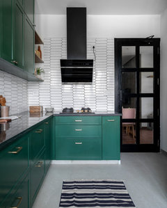
    for some reason I always like the vertical look better. I found some examples of those, but really can't find any horizontal in your size around a window

    these were a few


    Now compare this one^

    to this one:


    yes it will make the ceiling appear taller


    The Renzo tile is pretty. it's a 2.5X13"


    https://www.wayfair.com/home-improvement/pdp/msi-renzo-25-x-13-glossy-ceramic-picket-wall-tile-mvp11522.html

    compare that to the 4x12, which I think is too big


    let me show you the Renzo and how it's cut against the countertop w/the vertical layout


    and this is doing a horizontal layout against the countertop.


    The tile has to be cut exactly down the middle so that it's symmetrical. (look at the first photo w/the Sky Blue tile. see how they cut those at the bottom? that was a good tile job)

    and one not done correctly. Corners are horrible too.


    Always do a dry layout and know where the cuts are going to be. you never want slivers or tiny triangles.


    BTW, here's that Renzo brand in the Dove color


    their 5x5 is also beautifu


    But this Jade? wow. stunning


    here's a 3x12 in a vertical.


    I think I like the thinner size


  • 3 years ago

    Given how long the kitchen is vertical is probably better!

  • 3 years ago

    Beautiful results Brenna, enjoy!

  • 3 years ago

    Looks great, Brenna!

  • 3 years ago

    Everything looks great. Love that you did the picket tiles vertically. The choice of grout is also exactly right. It brightens up the kitchen.

    The door and floors look much better now that they are darker. Next to the brick floor, the back door looks ten times better!

    The dog is also adorable.

  • 3 years ago

    Thanks for taking the time to update with pics. It looks great!

  • PRO
    3 years ago

    Very nice, I wish you many happy memories in your new kitchen!

  • 3 years ago

    Great job and choices on everything. By the way, as a former reading specialist, my favorite picture is of your son curled up in a cubby with a book.

  • 3 years ago

    Love it! Great choices…enjoy

  • 3 years ago

    It looks SO great - bright and warm, lovely! congratulations on your new space

  • 3 years ago

    Nicely finished! Love the puppster and the runner! i think the backsplash looks great—the picture from a distance allowsto see it all together and i think youve done a wonderful job.

  • 3 years ago

    Everything looks great! was that the renzo dove tile you went with?

  • 3 years ago
  • 3 years ago

    Brenna, you did a fab job! I love that kitchen now! the pickets are just enough to add some interest, paired w/the open shelves. really very nice.

    I also really like that back door w/the brick


    your mudroom


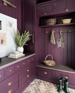
    would look so cool if you copied what this designer did w/this Brinjal color (i'm not saying for you to use this color, but just look at what she did w/the cabinetry)


    Although, this color is fab!

  • 3 years ago

    It looks great!