Software
Houzz Logo Print
webuser_922237536

Kitchen: Too green or too yellow?

3 years ago
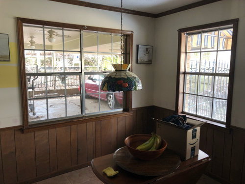
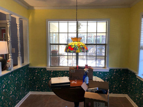
This is our before and after for our kitchen nook. I feel that something doesn’t work in this combo but I can’t figure out what it is. This is only the first coat of yellow and we’ll be applying another soon. Will putting decor on the walls make it look complete? Or is the yellow too yellow or the green too green?

Thanks in advance for any advice 😊

Comments (19)

  • 3 years ago

    There is a lot going on. its fun though! i would choose whichever color you are most fond of and paint the other to match the trim. or you keep both, and you could match the base and chair rail to the green?

  • 3 years ago

    It is fun! I think reno girl is right something with the white trim is what’s throwing it off. It might have to be one of the colors. Art work too could help!

  • 3 years ago

    A lot going on. Consider getting yellow in a deeper warm gold yellow like in the pretty light. Maybe too late but if wallpaper went higher up around first window square it would soften all the molding look going on around the room.

  • PRO
    3 years ago
    last modified: 3 years ago

    Maybe what you really want is to make the light really come alive?

    All the walls, top of chair rail, in a fresh apple green, and paint the lower paneled to trim white.

    At some point? A buttery yellow painted table, and white chars would be great.

    I might remove the spindles in the opening too.

    A happy spot ! The light, star of the show : )


  • 3 years ago
    last modified: 3 years ago

    I like it/ I think I'd leave it. Youve worked the white trim in and that was a lot of extra painting. For me...I'd get a nice white rod with finials above windows..probably extend out quite a bit and put a swooshy sheer curtain so that would tie in w the white...get some holdbacks if sometimes you want full exposure. I dont think I'd leave the window bare so there's another step...then some things on wall so I wouldnt change at this point. .....I dont see a reason to. There's things yet like a rug/ table runner etc ..not really set up yet . Think if you ever got a white pedestal tale !!! Full height sheers or just Half .....but I like something at the windows/ nice hardware to be found. One small thing: I'd raise up the Tiffany shade about 10 in or so/ if you can....seems a bit low .

    Cottage in Historic Wilmington · More Info


    Bathroom Remodels · More Info


    Exclusive Home Vine Curtain Rod/Finial Set, Distressed White, 36" to 72" · More Info


    1" Portia Drapery Curtain Rod, Glossy White, 28"-48" · More Info


    Steel Curtain Holdbacks, Glossy White, Set of 2 · More Info


  • PRO
    3 years ago

    Were you going for a homey, retro look? That's what I am seeing. If this was your objecting then I think you have acheived it. You don't have a lot of wall space for artwork in the photo you have posted. I would suggest installing recessed downlights so the room is better lighter.

  • 3 years ago

    Thank you all for your feedback!

    Herbflavor: I actually already have the first pictured curtain rods. We have white wooden blinds to put up and I think sheer curtains would look really great.

    Our plan is to remove the spindles and make that area into a breakfast bar area. We’ll definitely be raising the lamp too.

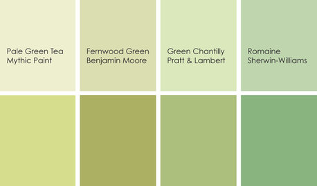
    I think your right. The trim is what’s stopping the flow. The rest of the house is homey with warm color but not so retro. So maybe a warmer yellow or what if I replaced the wall paper with something like this? Maybe it would help the trim flow more?

  • 3 years ago

    you really feel up to stripping the paper ? I kind of like the paper you have . but some people are pretty quick and good w wallpaper I suppose. I think you are fine..I'd just get the table chairs and placemats/vase/bowl etc all set up and take it all in. Its a cute spot.

  • PRO
    3 years ago
    last modified: 3 years ago

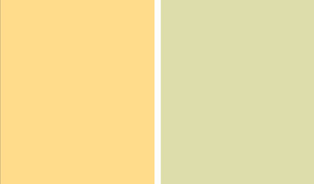
    The yellow is very saturated. I would go with more of a buttercream if yellow is the desired color.

    Are you hoping to coordinate it with the wallpaper? I would instead pull a subtle color from the wallpaper and paint the walls accordingly. It's a great nook and looks like it will have a lot of personality. Good luck!

  • 3 years ago

    Thank you! I really do want to try and keep the wallpaper but I’m not opposed to trying something different. I think I’ll get some warmer yellow paint samples and maybe even the apple green someone mentioned. That might make it feel more cohesive.

  • 3 years ago
    last modified: 3 years ago

    Super cute and charming. I agree with trying a softer, creamier yellow. Keep the paper. :)

  • 3 years ago

    I think its really cute. So nice to see a post where someone hasnt painted everything in sight white. Finish it up. Add your white curtains. Put a centerpiece on the table that goes with everything and enjoy it. I do think, a painted table, might add even more to the room, but it isnt anything you have to do right now.

  • 3 years ago

    I like the idea of a softer yellow. I like the wallpaper and I like the yellow but both are quite strong and one has to take a back seat and be supporting and for me that would be the paint.

    Taking out the spindles is going to go a long way to lessening the effect of the white trim.

  • 3 years ago

    I think Navajo white by sherwin williams could work well here, its a really soft parchment color cream.

  • 3 years ago
    last modified: 3 years ago


  • 3 years ago

    What a fun space, and a great place to start the day: cheerful, hopeful, bright. I can't tell what the pattern is on the wallpaper, and I know you'd like to keep it (it's new!), but I feel that the problem is there is too much contrast (and drama) between the bright yellow paint and the dark background of the paper...I am pretty sure there is some yellow in the paper, but not really enough to "marry" the two.


    You probably wouldn't want to go with a darker paint...keep the room bright and light. I think a lighter wallpaper (lime green background?), with buttery yellow and red accents, with some white, too, and then paint the walls a more buttery yellow would help to bring all of the elements together (including the lovely light fixture). Whatever you do, even if you keep it as is, I am sure you will enjoy many mornings here.

  • 3 years ago

    Perhaps what you are sensing is that the green and the yellow are both strong. They contrast in color but not in intensity. Some knitwear designers suggest a combination of Dark, Light, Bright to putting together three colors. If the white will be your Bright, then I think the green and yellow are both acting as Darks. Changing up the yellow for something less intense might resolve the issue you see. No need go to pastel, but taking it down a notch might do the trick. This is going to be a fun space. Good luck!

  • 3 years ago

    I appreciate what you're trying to do, but it's not working for me, sorry! (though others on here like it, so maybe i'm wrong). Stylewise, the lamp is 70s retro, the wallpaper color and the bright yellow are 80s retro. So high level, it seems like you're combining style visions that don't connect. And then on color, the wallpaper doesn't connect with anything in the room on my screen. The yellow connects with the lamp, though the yellow saturation is a bit strong for me. So sad to say, but i think i would start over, since i think both the paper and the yellow are in conflict with the space, one way or another (and not just in conflict with each other).

  • 3 years ago
    last modified: 3 years ago

    Try a creamy buttery yellow first, that might do the trick. Restoration Hardware used to carry a paint called ”Butter”, i did our entire first floor in it along with creamy woodwork 20 or so years ago … its been changed out since years ago but I always liked it.