Software
Houzz Logo Print
lina_loomis

Help with changing backsplash

3 years ago
last modified: 3 years ago
Hi,

I've finally decided to change my backsplash that I had installed 10+ years ago. I'm so sick of it - not a smart decision!

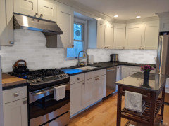
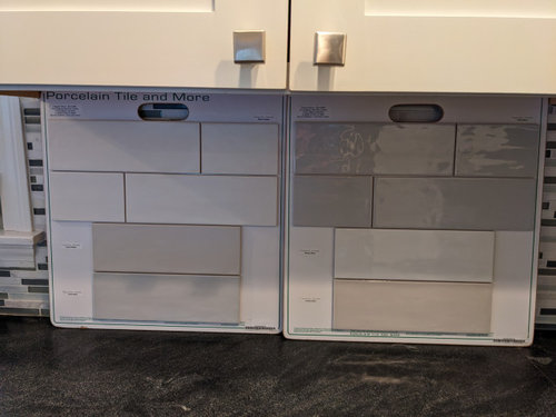
I wanted to go simple, with a white subway tile (perhaps 4x12). However, when I brought home samples, I'm not too sure.... it seems a little clinical?

Do I go matte/glossy? Match to the cabinet white or not? White grout or silver? Smaller subway tile (3x12 or even 3x6)?

Or am I totally off with going white subway in this space?


I would love to hear some feedback / ideas that anyone may have on options, ideas, etc...

Help!

Comments (25)

  • PRO
    3 years ago
    last modified: 3 years ago
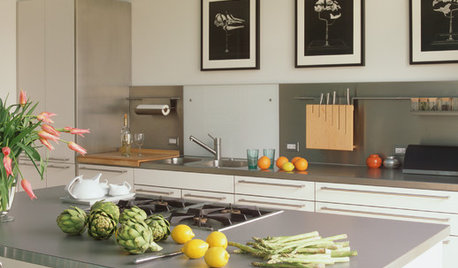
    I would do stainless with those 3 differnt counters I see no reason to go white for backspalsh .

  • 3 years ago
    last modified: 3 years ago
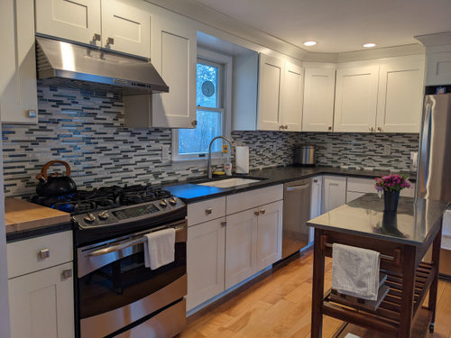
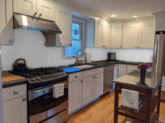
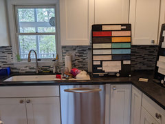
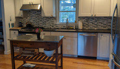
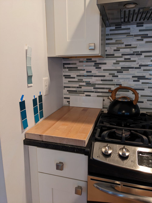
    I don’t see 3 different counters. There’s one counter - black with what looks like soft white / cream spread throughout - more prominent than veining. Then the portable island has a stainless top & there’s a wooden cutting board on short end counter next to stove. Are you painting kitchen too? Those paint chips have very strong blues - I wouldn’t paint any color that dark for walls. Not sure about the one gray tone strip either - the first 3 lighter tones maybe but I would sort out decision for BS first. If you use white, I’d match cabs but be sure it works with the shading in counter too. The cab color is most important as it’s most visible. About the size of tile. Any size larger than the linear tile you have will be less busy / bossy. But, even with solid white BS tiles, there will be a pattern created by the grout lines of tile - even with color matched grout. So, larger tiles, less ’design’, smaller tiles, more design. Your space for BS has a long run on the window wall so larger tiles may work there. But, I’d consider the cuts needed for the smaller spaces such as under the window sill, & also the small space at wall end of stove. To my eye, that large tile sitting there is way too lage. You might look at white shapes like picket tiiles etc just to see what a solid color design would look like. Try to get a larger sample of any tiles you’re considering & do a layout on larger board to prop up against BS And, figure out wall paint first. Looks like a nice kitchen.

    ETA: I don’t like idea of stainless BS. The stainess you have in appliances & hood & island is good & enough.

    lina_loomis thanked KW PNW Z8
  • 3 years ago

    Stainless backsplash?


    Fyi, My counters are all leathered black granite. The kitchen cart is stainless top. (The wood is just a cutting board t

    ).

  • 3 years ago

    I'd go the lightest and Glossy. every kitchen needs a bit of shimmer and shine.

    it will make everything else in the room look better/brighter. Good luck.

    lina_loomis thanked Lyn Nielson
  • 3 years ago
    last modified: 3 years ago
    If you are sick of pattern I'd match the grout to the tile, contrasting grout adds pattern to the backsplash.

    I would do a white but with a bit of a twist. Check out interesting shapes like rhombus or herringbone or handmade style tiles that have a bit of texture or color variation. Whites have different undertones so make sure you look at a sample in your space.

    lina_loomis thanked deegw
  • 3 years ago

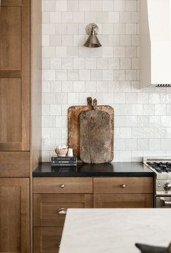
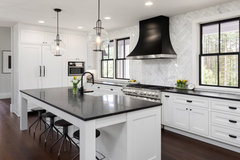
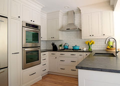
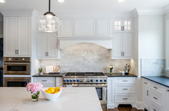
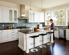
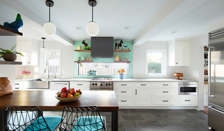
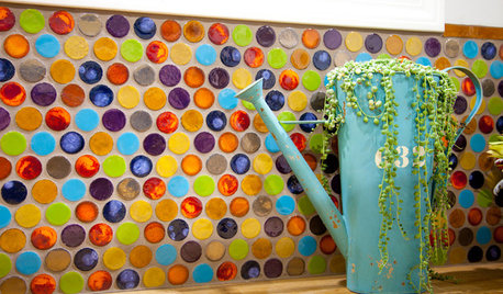
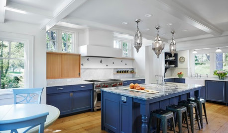
    Here are some things other people did: zellige, small pickets, herringbone, plain white subway, gray subway, marble look subway (you can get this in porcelain for easy care), blue-green subway. If you want to use one of those blues on the paint chip strip you could paint your island cart one of those colors, but I like KW PNW Z8 think they would be overwhelming on walls.


    Dream Kitchen Design with White Oak Cabinets · More Info


    Wells Beach · More Info


    Elegant Modern Black, White and Wood Kitchen and Family Room · More Info


    Rockwood Colonial Larchmont · More Info


    Harborview Renovation · More Info


    Ridge Residence · More Info


    Lake Oswego Custom Home · More Info


  • 3 years ago

    THANK YOU!


    I like the idea of all white, gloss and white grout to mininimize the pattern. But, going with a different shape to add something unique (yet hopefully somewhat timeless, unlike the mosaic mess I have there now). I particularly like the elongated hexagon shape installed horizontally.


    Regarding the paint - my original thought was to paint my bottom cabinets but I got cagey about that idea (it's such a big, permanent decision!) that I decided to keep the cabinets as is and add color to the walls. I only have this one wall in the kitchen, which is basically just a bit of wall since it's open to the dining/living. And a tiny little sliver of wall around the window.


    To me, the backsplash is the more important decision and the paint choice will come later.


  • 3 years ago

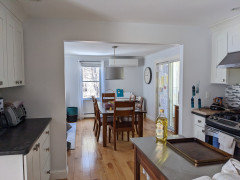
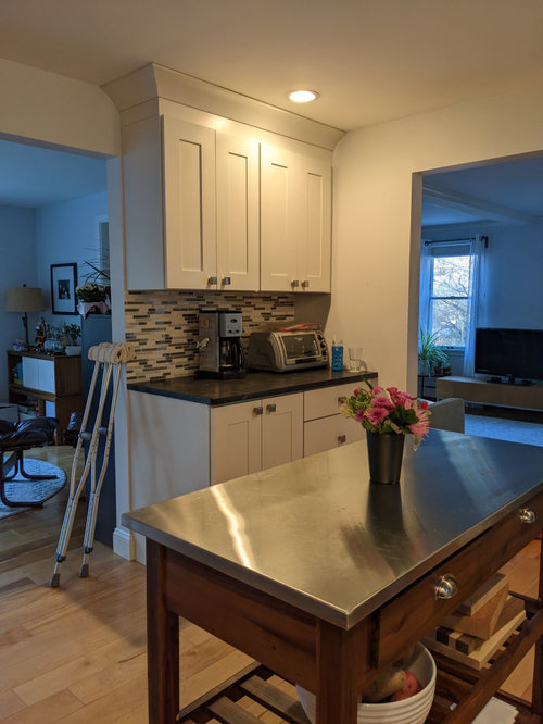
    @lina_loomis Thank you for showing us more of your space. Seeing it confirms my initial thoughts - no dark paint on walls. Happy you aren’t thinking of painting cabs now - huge mistake to do that IMO. Your cabs are so pretty as they are. I agree with @kandrewspa about painting the island cart if you want a splash of color. I did note that there’s not a lot of bare wall space in the kitchen but I think painting the wall between the two spaces will ruin the nice flow & connection the eye sees & follows between the two rooms. My suggestion is to make your new BS decision, get it installed & then reassess any potential changes. If you want color, it can easily be added through decor pieces. Colorful bowls on shelves in island cart, centerpiece on table, rug on floor, art on wall etc. Your current color theme is monochromatic with white /black/ grey & the wood tones in dining table, cart & flooring. Very nice & warm but also a blank slate for adding pops of color & then being able to easily change the color pieces when mood strikes. Win-win!

  • PRO
    3 years ago

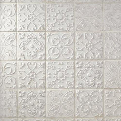
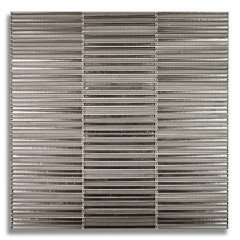
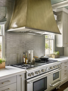
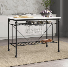
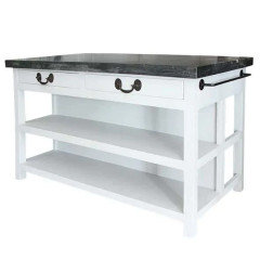
    Here are a few alternatives that you might have not considered. Consider changing out the mobile island.


  • 3 years ago

    So I went to my local tile store and got utterly confused, lol!


    I do like the look of the 4x12 tiles but worry they are too big. So I saw some 2.5x8 and 3x9 which were lovely. Some were all white with undulations/ripples. Some were "variated" in color so that once installed, it wouldn't be exactly all the same white. That is an interesting idea so it wouldn't look so "clinical". But does that create too much pattern and business?


    She explained the need to match to the cabinet, so I'm trying to find a similar paint chip for reference.


    I've looked at a lot of pictures online of different tile sizes. I can't decide whether I like smaller or larger!


    Any thoughts on pros/cons for both?

  • 3 years ago
  • PRO
    3 years ago
    last modified: 3 years ago
    Take a look at products from your local Floor & Decor. They won't break the bank. Also as you go through this process you'll find that it's less overwhelming if you look at a product and only concern yourself with saying "NO" instead of "YES". Minimizes your selections.

    lina_loomis thanked BeverlyFLADeziner
  • 3 years ago

    It would be more helpful to take a cupboard door or drawer front in to tile store to match with tile. Still need to look at both in your space with your lighting. It’s another help to narrow choices.

    lina_loomis thanked KW PNW Z8
  • 3 years ago
    last modified: 3 years ago
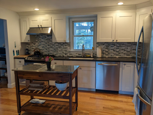
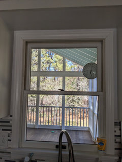
    If you get an interesting shape be sure to think about how the shape will fit under your cabinets. There isn't a lot of space there so keep in mind that some shapes may need more cuts that could impact the look.

    I like the process of eliminating choices by pitting one against the other and discarding the loser.

  • 3 years ago
    last modified: 3 years ago
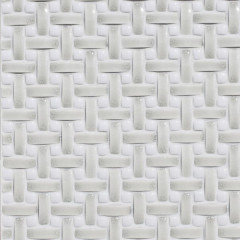
    I've decided to stick with rectangle shape. I'm concerned that hex or picket will look dated on a wall. (I have a hex shower floor that I love, but kitchen backsplash... I don't think it will work for me).

    So now I'm trying to decide on straight white with undulation/ripples or variegated white (but not Zellige) and the size....

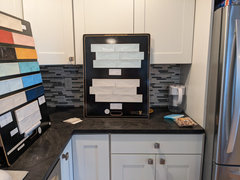
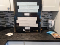
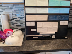
    Here are 3 mockups I did on Tilebar. 3x9. 4/12. 3x8 Variegated. (Of course the colors would be different - I'd chose to match the cabinets except in the case of the variegated - but this gives me an idea of pattern with the different sizes.)

    Thoughts?


  • 3 years ago

    I love the tonal / varigated look. It adds subtle interest & ties in with everything in the room - the stainless etc. It’s also an easier ’match’ to white of cabs. Full disclosure - it’s very close to what I have but my cabs are wood & counters are a creamy white with subtle veining. It adds subtle texture / interest. My original backsplash with different counters had linear glass tile in it like yours too.

  • 3 years ago

    See what size lays out well. Sometimes a tile that works great for a bathroom shower surround isn't quite the right size to lay out on a relatively long narrow backsplash with weird cuts and slivers and so forth.

  • 3 years ago

    The variegated does look the best.

    I thought 4x12 was my winner and then decided it was too big. I took the time to cut out 3x9 on colored paper and pasted them to one wall in the pattern that I desire...thus....3x9 it is.

    Good Luck!

  • 3 years ago

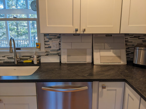
    So I've narrowed down my tile choice but am undecided on the size!   This is equipe artisan (2.5x8) and equipe village (3x5).   Both in white, it's a variegated tile so has color nuances.  


    I really like the smaller size because it's more traditional (yet not a plain 3x6 subway) but also like the longer size because it's more modern.  


    Appreciate any suggestions or input....let me know your thoughts!!

  • 3 years ago

    Nice choices. Do some math to help with decision. Understanding where cuts might happen based on height of tile & width of grout line might make a big difference in best size of tile. Measure the height from counter to bottom of existing window sill trim below the sill - then measure to bottom of sill. Is there an argument for removing the that bottom piece of trim & tiling to right underneath sill? Or, is there a better layout with window trim as is & either the larger or smaller tile? What about up to bottom of cabs from counter? How do both sizes lay out? Same with length of counters - will there be a funny tile cut at both ends or at one end? And, if you can get five or six tiles each size & stack them up against wall to see how it looks. I assume your layout will be same as on each board. FWIW - my preference is the smaller tile with the half over half or whatever it’s called - I think that’s the smaller tile in your first picture. While you’re doing this new BS install, see about getting the plug in plates turned horizontal so they follow the direction of tile. They need to be lined up so the plate lines up correctly with the tile - for the 2.5” width it’s a bit wider so should straddle the tile & line up over a grout line. Sounds complicated but it works out - just need planning.

  • 3 years ago

    Thank you!  I'm asking my installer to come over and do all these assessments....  He already mentioned removing that piece of wood and tiling up to the sill.  The outlets are a good point.  Hadn't thought of that. 


    Regardless of the size, is install both 50% overlap.  So that they line up in the middle of the tile (if that makes sense).  The larger tile board doesn't show that, but the smaller one is lined up as I'd want it installed (these boards are samples from the tile shop).

  • 3 years ago
    last modified: 3 years ago
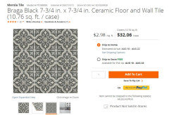
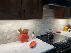
    Here’s how my horizontal plates turned out. Electrician did his best at estimating where tile would be when he moved plug ins so not quite how we wanted them to be lined up but my counters weren’t installed yet. It still looks better than having plates on the vertical plane. My tiles are

    2 1/2” x 5” & are also tonal not solid white. We had an electrician move them & other lighting stuff being done. I think the tile setter cannot move the electrical outlets - you’ll need to have an electrician - or do it yourself. But tile setter not licensed to fuss with electrical stuff.


  • 3 years ago

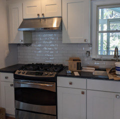
    @lina_loomis It will be stunning! Such a nice difference & your kitchen will feel more open & brighter.

  • 3 years ago
    last modified: 3 years ago
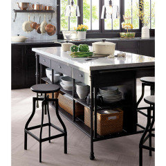
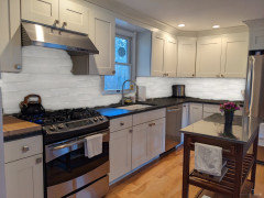
    Looks terrific so far. Sometimes changes look so "right" that you completely forget how the space looked before. It already looks like a completely different kitchen.