Software
Houzz Logo Print
lisa_in_md

What paint color would you use in this kitchen?

3 years ago
last modified: 3 years ago
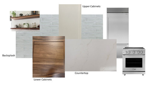
We're in the midst of a kitchen reno and are being asked to choose a paint color before any of the actual materials are here, which I'm finding extremely difficult.

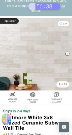
The room is fairly large but won't have a ton of natural light. The lower cabinets are Schrock natural walnut, the top Schrock maple in the coconut color. Countertop is Alleanza Quartz' Calacatta Argento.

Any suggestions for paint color or other thoughts? I've been looking at warm off-whites, but then the backsplash seems cool toned? The accents (cabinet pulls, faucet, etc.) will be black.


Comments (17)

  • 3 years ago
    last modified: 3 years ago

    hate to ask but what flooring will you use? your choices are nice...the splash has a warmth in the blue which plays up the color of the wall cabinets. Natural walnut has its own special character .....so the last thing is the counter.....hope it works w the flooring is the only question I'd have. the walls: just a neutral or slight warmth to an off white....as in the scene with the shelves. I would stick w satin nickel or stainless hardware...not black...but.maybe you have touches of black elsewhere....????

    lisa_in_md thanked herbflavor
  • 3 years ago
    last modified: 3 years ago

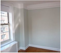
    Great question @herbflavor - the room has light-colored hardwood floors. Here's a photo. We are refinishing them as part of this project and will have the option of changing the stain.


  • 3 years ago

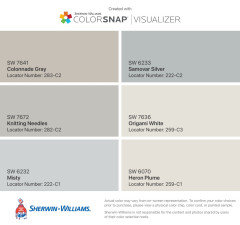
    The cabinets and counter look pretty warm but the backsplash is cool.  Not sure if that's a good match.  I have a similar countertop (MSI Calacatta Miraggio Gold) and below are some I was thinking of.  I'm pretty sure I'm going to try to stick to the same paint which is a light sage color as it will go well with the rest of the house.  What other colors style of decor are the adjoining rooms?

    lisa_in_md thanked Sheila Kelly
  • 3 years ago

    I agree about the backsplash, if you have warm white countertops and upper cabinets that cool color will make them look dingy, I like the options above as the more match and extend the countertops and keep the design more clean, you already have different color upper and lower you might not want to add or try to do too much, then bring color in with accents like ceramics, etc on the countertops.

    Any pics of the kitchen or a sense of the layout, am have a hard time picturing the color with out knowing the space.

    lisa_in_md thanked Mnm 01
  • 3 years ago

    Here's the layout:


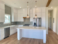
    I really appreciate the advice so far. Here's a photo that made me think the color combo would work.


  • 3 years ago
    last modified: 3 years ago

    You need a wall color that works with the backsplash, because, IMO, it is the brightest "neutral" in your scheme. In turn, the color should also work with the issue that natural light is dim. Consider B.M. Gray Cashmere. It is a chameleon...does gray, when needed, does soft blue, when needed and hints at green, when needed. It covers three exposures..east, south and west and really works with wood tones.


    lisa_in_md thanked elcieg
  • 3 years ago
    last modified: 3 years ago

    @herbflavor FYI, blue is the only primary color on the spectrum (violet, blue, green, yellow, orange, and red) that is cool. Some greens have yellow base, but other wise green is leans cool.

    lisa_in_md thanked elcieg
  • 3 years ago

    Find a paint that is a color match to your upper cabinets. You have likely already determined that your upper cabinet color goes with all of the rest of your finishes, therefore using it will be a sure way to get walls that work too. While your selections are calming and go nicely together, you do have a lot of different finishes happening in the space and a different wall color will just be one more color blocked element, which may be too much. I'd paint the walls and ceilings the same color as the upper cabinets. Doing this will really make the wood and backsplash pop as the special elements they are!


    I really wanted the walnut countertop in my small galley kitchen to be the star so I painted the walls, ceiling, and cabinets the same color. It looks great.

    lisa_in_md thanked Kendrah
  • 3 years ago

    Your kitchen choices are very pretty, although I’m not sure I would bring in black fixtures. They seem too harsh for your palette. I think it’s fine to mix warm and cool tones - it makes the space more dynamic - you may just want to repeat some of the tones to make sure nothing sticks out like a sore thumb. The two that I would focus on are the backsplash and the upper cabinets. You could lean into the backsplash color by choosing a paint with a similar hue. Depending on how much tile (vs. bare wall) you have, you may want to match the walls to the upper cabinet color. Here are some ideas based on your photo.

    lisa_in_md thanked Susie .
  • PRO
    3 years ago

    IN the pic you posted the upper cabinet color does not work with the walnut . IMO the best choice with walnut is a pure white and for sure we need to see the flooring. I think you have too much going on anf your lighting is going to have ahuge effect on the choices. BTW keep the backsplash choice until everything is in place and that is IMO also when you choose wall color but most builders painters donot know how to paint after install.

    lisa_in_md thanked Patricia Colwell Consulting
  • 3 years ago

    I don't know where you are in the process. Are you past the point of no return on any of the selections or do you have the ability to change some of your selections?


    Honestly the picture you posted has creamy uppers that are too yellow with the countertop and lowers (those two look really good together) and the backsplash is really blue gray next to both of the other whites.


    You need to have actual samples that you can take outside and look at in natural daylight.


    If I needed to work with those three choices I would take the upper cabinets into the paint store and have them create a sample color match. Test the match by having them paint the sample on one corner of your sample cabinet, take it outside and look to see if it looks the same in natural daylight. If not have them tweak the formula till they get it right.

    (You can also use a color muse to read the color of the sample and compare it to the color of the cabinet).

    Once you have your color match you can get a sample that is not colored and mix your own samples using varying amounts of colorant and white. I would paint my trim and doors either the same color as the cabinets or slightly lighter. I would paint my walls either the same color as the cabinets or the same color as the trim. The lower sheen on the walls will make it appear darker than the trim or cabinets.


    Picking the backsplash will be a similar process, but you will take your cabinet doors and wall color sample and countertop samples into a tile store and pick a tile that has the same undertones as the cabinets. Again, once you have narrowed the choices to three to four samples take them outside and look at them in natural daylight to make sure their are no hidden undertones.


    lisa_in_md thanked Jennifer Hogan
  • 3 years ago

    I'm not going to suggest a paint color since that's so personal. I like most of your other choices.

    However I'd switch the DW to the left side of your sink so it's not in the prep zone.

    lisa_in_md thanked cpartist
  • 3 years ago

    @cpartist, the reason it's on the right is because there's a pull-out trash can on the left next to the fridge, and we want to be able to have them both open at the same time as needed (scraping plates in the trash and putting in the d/w).

  • 3 years ago

    Thank you all so incredibly much for the input, truly. After listening here and also putting every BM off-white color up against our samples, we've narrowed it down to Ballet White OR Gray Cashmere (I don't have a sample of this one but have large samples of both coming tomorrow from Samplize).


    I'll keep you posted!

  • 3 years ago

    I would also consider Maritime White, BM. It is a beautiful color and slightly less intense than Ballet White.

    lisa_in_md thanked Kendrah
  • 3 years ago

    Matching the cabinets is good advice and just wait on your backsplash until everything else including lighting is in. Then prop up the samples and take a photo for review then.

    lisa_in_md thanked thinkdesignlive