Software
Houzz Logo Print
mkuyekawa

Calling all backsplash gurus

3 years ago
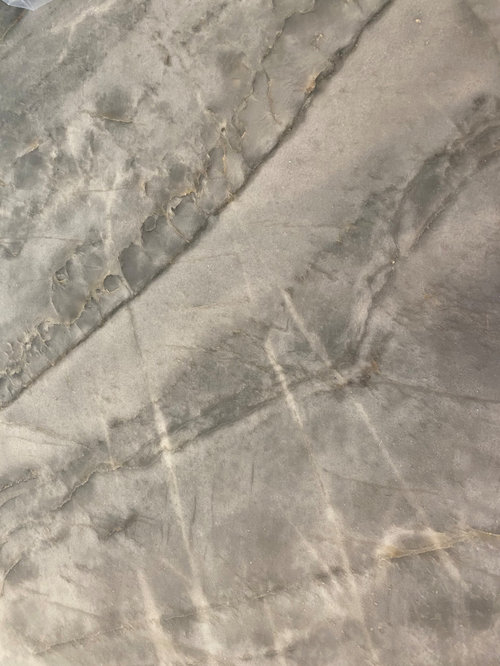
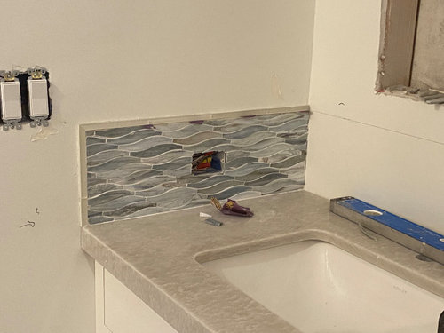
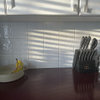
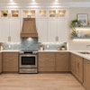
It's backsplash time and I know there are many of you who are great at this. The island counter is blue-grey quartzite (looks bluer and prettier in person). The perimeter counters are off white quartzite . We thought about using the backsplash from the bathroom (see third photo) in the kitchen, but I think I want something less fussy, easier to clean. So thinking subway with a possible a little color (beige/blue/grey ?) to contrast all the white. I pulled out a few random samples, but haven't really started looking yet. Thoughts?


Comments (12)

  • 3 years ago

    of the 4 shown I'd stick w the creamy off white. get as close to the cabinet shade as you can.

  • 3 years ago
    last modified: 3 years ago

    Hey there, I think I recognize your name! I think you had rich wood cabinets with a blueish and grey swirled granite?

    New project? How fun!

    i do love that bathroom backsplash, but agree on it being a little busy for the kitchen. In fact, I think I might have a similar glass tile in my bathroom. I forget the company it is from though. Very pretty!

  • 3 years ago

    Yes rebunky, different house, bigger remodel. 😱 Surprised you remembered!

    Most of the decisions have been made, and I'm not really stressing over this one, but just thought I'd see if you all had any input. By the way, you can ignore the samples I put up there. Those are just some I had laying around and I wanted to get an idea if color would work. Let me add a couple of pictures that give a better idea of the surrounding room. Everything is white. I just wondered if a little color in the backsplash would be a good idea or if I should keep it white and let decor add the color.


    Also, would you continue backsplash into the dining wall between the hutch on the right?

    And yes, I know some of you would not do the different counter tops on different color cabinets, but there was a big screw up with the stone store, and this was the solution, which I have come to terms with.


    Thanks!


  • 3 years ago

    are there times you will want window coverings ..... big patio door and large window at end of kitchen. I'd go more for TEXTURE rather than color w solor blinds or whatever is needed across the big areas of glass. You have a lot of angles w the ceiling and great views ..I'd stay streamlined w the kitchen theme....neutrals... its all very nice.

  • 3 years ago

    Thanks for that idea. Yes, we will probably do solar blinds, Nobody can see in, when that sun is bright, we will need something there.

  • 3 years ago
    last modified: 3 years ago

    I know right! I surprised myself because my memory is usually so bad, but for some weird reason my brain vividly remembers kitchens and user names from the old Gardenweb days. Lol!

    This suggestion may be too busy since it has the slight variations in color, but Romy’s Encore tile backsplash in the Silver crackle was the first thing that popped in my head. Her kitchen was also was also from the good ole days. ;)

    I think the reason this particular tile came to mind was because I noticed both of your gorgeous quartzites had some rosy hues, blueish and greenish (seems like a chameleon because I see both), and warm grey hues. The Encore Silver crackle has those colors too.

    It is really hard to do a backsplash mock up because when I crop the backsplash from other kitchens and add it to yours, the lighting is so different that it looks off. I tried it anyways, but of course you’d get samples.


    Here it is on the perimeter stone


    Here is on the island stone. Ignore the hex shape, I just picked it because the photo showed the details and variation in colors better)


    Your kitchen is absolutely gorgoeous! I actually think the mix up at the stone dealer may have been a happy mistake because I love the countertop and cabinet combinations. 😍

  • 3 years ago
    last modified: 3 years ago

    Love rebunky's suggestion - that is a bullseye IMO. Here is the link to Romy's backsplash thread. (BTW, your gorgeous quartzites are so close in tone, they could be variations, so even believers in "the rule" should like them.) Romy wanted some blueish silver tones, if I recall.

    https://www.houzz.com/discussions/2704151/silver-crackle-backsplash-done#n=97


    "there is a range of tile colors, I'd say about 5 or 6 different tiles shades with each individual tile varying (lighter in the middle of the tile). Some of the tiles are taupe, some are a pale gray, some are a medium gray. I saw a sample board of the silver crackle at my local tile store that was made with predominantly gray tiles. When my tiles came in, I was surprised & disappointed that the tiles were reading more taupe than silver. I even wondered if they sent me the wrong color.
    Once all the boxes were open, there were many more gray tiles than taupe.
    Installed & grouted, the overall look is gray. The taupe tiles add the warmth. They change color depending on the lighting & there are a couple of hours that they read more taupey.
    I was looking for a gray tile & I couldn't be happier. This backsplash is my favorite "thing" in our kitchen. It's impossible to capture the overall look with a photo. There are a couple of pictures on Houzz of the silver crackle, although they, too, don't capture the variation of color, the depth & the little bit of sparkle.
    I believe my grout was Antique White. "


    I'm not sure I correctly understand your tile placement question. If you're asking about that far right section, off the top of my head, my reaction is don't tile. But I guess I'm not sure how it relates to the rest of the kitchen, or what you'll be doing there.

  • 3 years ago
    last modified: 3 years ago

    Thanks Barncatz. Romy’s backsplash was my first love. Still love it! I wanted it for my kitchen so bad, but at that time it was out of my budget.

    The description says hints of dusty rose, glass blue, and mint. That is too funny because I didn’t even read that earlier, and yet that is the exact colors I was seeing in her island quartzite.


  • 3 years ago

    Since you have so much light coming into that beautiful space, and since you have darker stone and cabinets for the island with lighter stone and cabinets for the perimeter, I think you could easily pull off a darker backsplash. Maybe pull the bluest gray from the island stone? I think the crackle glaze would be a showstopper, but if it were darker it would be even better.

  • 2 years ago

    What is the name of the island luntertop?

  • 2 years ago

    The countertop?

  • 2 years ago

    This is the island countertop.