Software
Houzz Logo Print
finndian

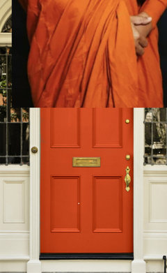
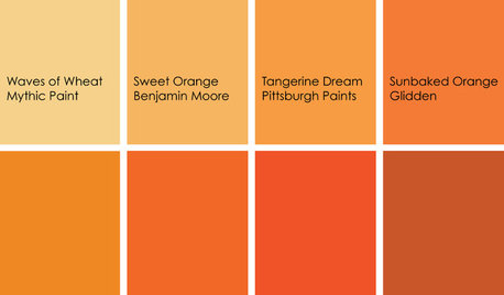
Tibetan monk orange?

3 years ago
last modified: 3 years ago

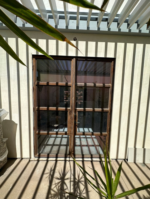
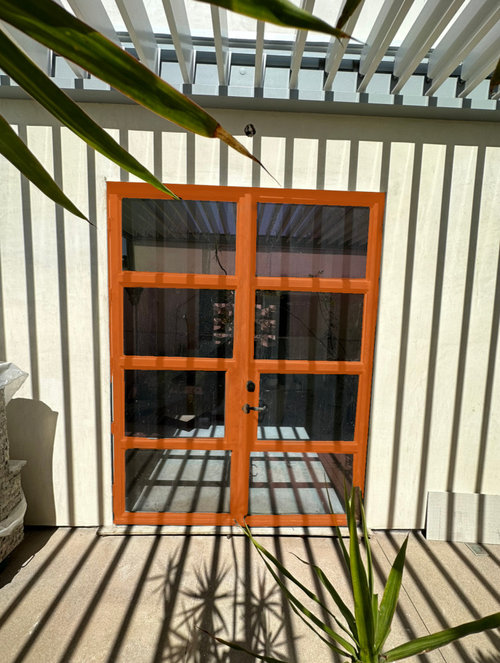
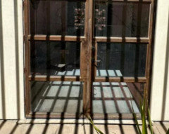
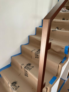
I have steel doors that I need to paint. Someone had them made years ago and at the same time had railings made for the stairs that match... they were all painted pewter color but the outside of the doors pretty much just were active rust red. Should I steer clear of orange? What color might look better.


Does orange have a place in this building?


Comments (86)

  • 2 years ago
    last modified: 2 years ago
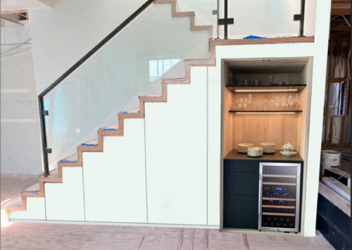
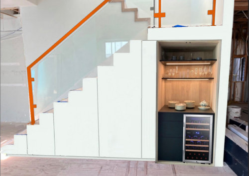
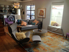
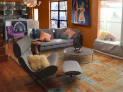
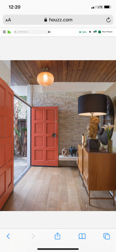
    I posted this photoshop pic here 10 years ago looking for advice on rugs and pillows. I ultimately did not select orange but its always been buzzing around in my head obviously.

  • PRO
    2 years ago
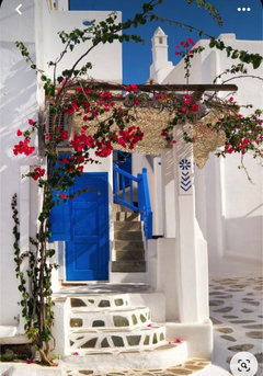
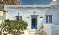
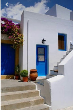
    Paul, that’s an amazing place. Is this your home? Home? Workplace? I read back through this thread twice. So many great ways to go I can see why you are debating with yourself! My thoughts are more about how the space is used? So if more “combined office/work” then the more attention grabbing choice is some brilliant color. I love the Greek Island look of whites with cobalt blue. Then touches of orange could satisfy your desire for some orange but not too much. That palette works with whites, grays, woods etc. Notice how the earthy colors of pottery and the fuchsia Bougainvillea tones work so well with the cobalt/blues. Thoughts?

    Paul F. thanked Flo Mangan
  • 2 years ago
    last modified: 2 years ago
    Thanks Flo. It's my home and I do no actual work there. I do have an art collection that I didn't collect based on any color scheme so its quite eclectic that I need to factor in.

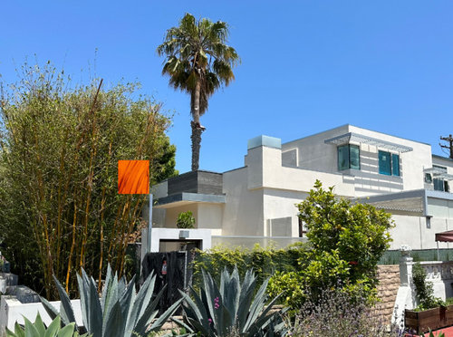
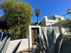
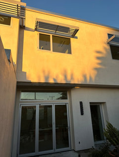
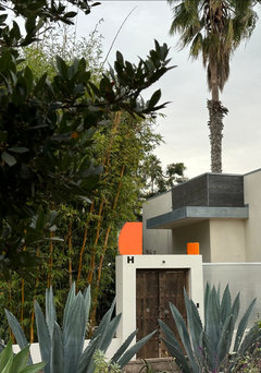
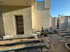
    The exterior is a stucco color called floral white. It all depends on the sun whether it is white, peach, creme. I guess the sky today could stand in for the cobalt/blue.


  • PRO
    2 years ago
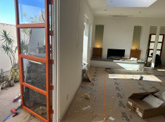
    i love orange but there is something about the color that doesnt work for me when it is in a flat or satin finish.


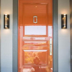
    a lacquered orange door is stunning


    a satin not so much


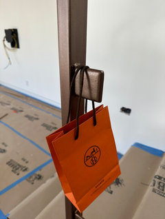
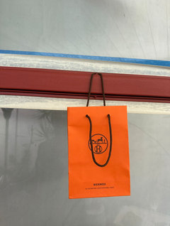
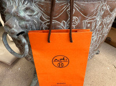
    i think if you are going to do orange it needs to be a Hermes Orange. if youre going to go for it you must go all in!

    Paul F. thanked Design Interior South
  • 2 years ago
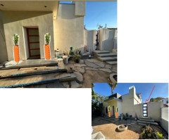
    Kinda like the Monk orange, no?


  • PRO
    2 years ago

    Look up the psychology of orange and blue and see what might drive your decision. Color always evokes emotions so see what you might want to emote for yourself and guests. They are complimentary colors so there’s that.

    Paul F. thanked Flo Mangan
  • 2 years ago
    Paul F. thanked kjoy1
  • 2 years ago
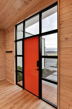
    last modified: 2 years ago
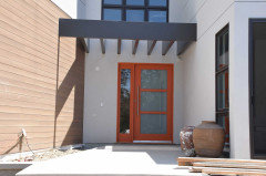
    I think I like the psychology of orange...I like vibrant conversation and risk taking. However, although I photoshopped my livingroom like that 10 years ago, I did end up with white walls, beige rug and gray furniture. Haha, I'm terrible with color so I'm hesitant to try big color commitments. I sure admire people that pull it off successfully.

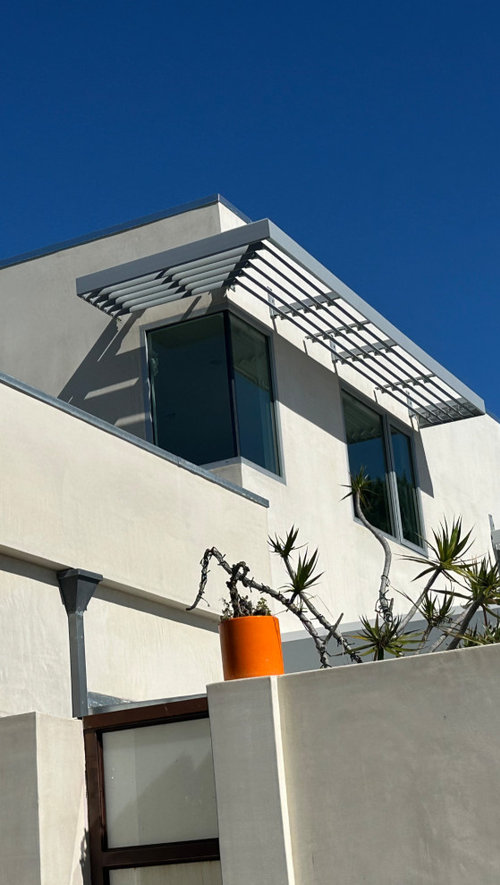
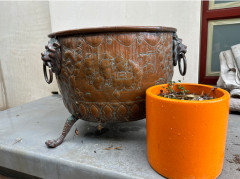
    Here's a sample of the Hermes orange next to a bright orange pot I have, right before the rain today.

    Here's a more yellow/orange that vibes with the bamboo.


  • PRO
    2 years ago

    I like your assessment. I would go a touch more muted orange no gold/yellow. The bamboo stands on it’s own. Love Giant Timber Bamboo. It’s “container” bamboo so no runners to crop up where they aren’t wanted. Just a stunning home! I have felt you leaning orange all along. Funny, you mention the “risk taking psychology factor” and yet you still are uncertain. No go for it!! 😊

    Paul F. thanked Flo Mangan
  • 2 years ago
    last modified: 2 years ago

    I just noticed my bronze pot looks good with orange. I'm probably influenced by @tozmo1 's Bulgari lobby.

    Maybe the inside railing could be painted a metallic bronze and the doors Hermes orange?? I guess not all that different than the active rust it was before priming.


  • 2 years ago

    There's a reactive bronze paint too. There's a chemical used to oxidize it a little or a lot.


  • PRO
    2 years ago

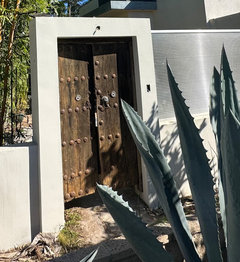
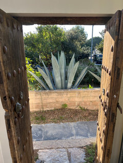
    Love that Paul and it speaks to your home overall including that antique wood gate. Quite a place! Love it.

    Paul F. thanked Flo Mangan
  • 2 years ago

    “Does orange have a place in this building?”

    Absolutely!

    Love the metallic bronze and orange together. Your house is amazing!

    Paul F. thanked k8cd
  • 2 years ago

    Your house would look great with a lacquered orange door. It’s a screaming “Welcome” and then the interior is a whispering “welcome”. They work together in my mind.

    The bronze can be a gorgeous knocker on the orange door.

    Paul F. thanked RedRyder
  • 2 years ago

    Thank you for the kind words! I bought the reactive bronze paint, I'll post a pic when the railing gets painted. The gate predates my ownership and is definitely antique. I do my best to keep it pest free.... its like candy for termites.


  • 2 years ago

    Every time I see this post come up, it makes me think of the Buddhist monastery that I grew up next to. At one point, the house next door to my childhood home in NYC was acquired by Buddhist monks. Monks everywhere... decked out in orange. They were very nice. We had a substantial patch of tiger lilies flanking our stairs and their driveway. As I think of it now, the orange 🍊 flowers really fit in.

    Paul F. thanked freedomplace1
  • 2 years ago

    You’re in LA. Bird of Paradise might be fabulous. My cousin had them in her yard in Carlsbad.


    Paul F. thanked freedomplace1
  • 2 years ago
    last modified: 2 years ago

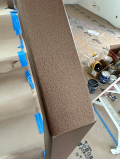
    I had the painter stop at 2 coats of the bronze paint to let the red primer still showing through just a little bit, giving a burnished look. Nice or cheesy?


  • PRO
    2 years ago

    Like it as is! Don’t pull cheesy thru. Haha!

    Paul F. thanked Flo Mangan
  • 2 years ago

    Nice, not cheesy!

    Paul F. thanked RedRyder
  • 2 years ago

    Really nice. Rich looking color.

    Paul F. thanked KW PNW Z8
  • 2 years ago

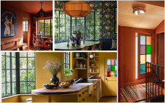
    Kjoy…wow…thanks for that link. Love to see spaces that celebrate colour!

    Paul F. thanked liasch
  • 2 years ago

    I really like it. The painter thought there was something wrong with the paint because it was watery. It's more clear with particles in it. It is Modern Masters reactive metal paint, $100gal. Should be interesting when it starts to oxidize... let's hope it is subtle if I let it happen naturally. I'll report back.

  • PRO
    2 years ago

    Love Modern Masters products! Going to be very cool!!

    Paul F. thanked Flo Mangan
  • 2 years ago

    Paul, that’s an interior stair railing isn’t it? Will it still oxidize?

    Paul F. thanked KW PNW Z8
  • 2 years ago

    I think it needs activator to be immediate but I get marine influence fog and moisture being within a mile to ocean so I get spots of rust on hinges and things inside. I think I'll get some oxidation... I'm not going to help it along though.

  • PRO
    2 years ago

    Interestingly while in a village in the swiss alps we got to witness the monks leaving a church and they were wearing a gold color not orange.

    Paul F. thanked Design Interior South
  • 2 years ago
    last modified: 2 years ago

    @Design Interior South I like the Hermès orange! Thank you for the suggestion! I didn't realize the rope handles on the bags are a bronze color. I went to Hermès on Rodeo drive and asked for a card or paper to color match and they gave me a bag with cologne samples. I thought I was going to get the 'Pretty Woman' treatment in my work clothes...."Sir, we have nothing here for you." but then maybe that is why they gave me cologne! :P


  • PRO
    2 years ago

    thats awesome! i love it!

    Paul F. thanked Design Interior South
  • 2 years ago
    last modified: 2 years ago

    I wonder if orange is still being showcased on and in this Los Angeles house? Designed by Architect Leo Park Yuen, for himself.

    https://www.compass.com/listing/1758-fanning-street-los-angeles-ca-90026/611722267720144673/


    I just discovered it. Looks like a beautiful place, in a fun neighborhood.

    Paul F. thanked freedomplace1
  • 2 years ago

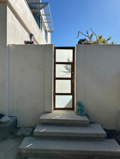
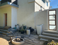
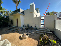
    I have a painter here today working on the doors. The orange is looking good. My question is should the orange color be only on the steel doors that enter the house or should it also be on the matching steel door to my side yard as well.

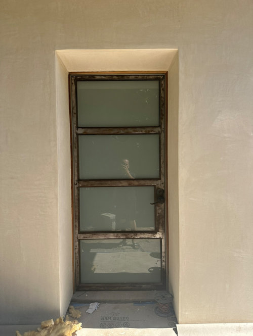
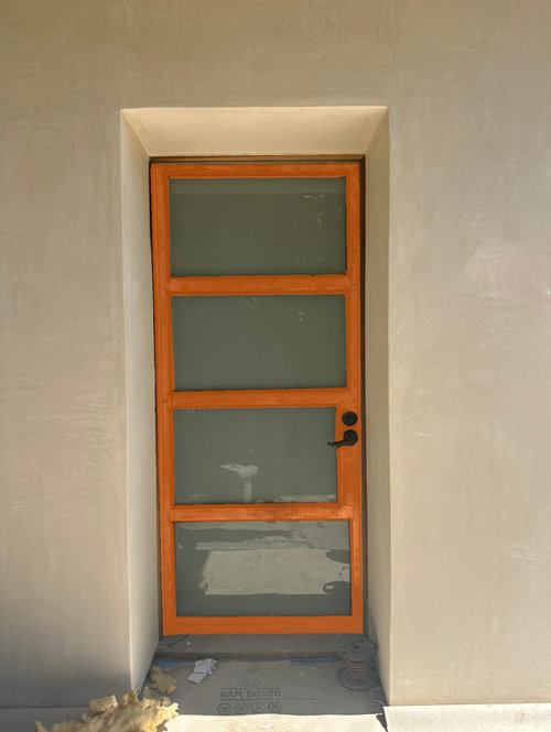
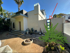
    When you walk into my front yard the overly eye catching door and stairs to my side yard have always been confused with the actual entry. Should I paint that gate the bronze or maybe just change it to a wooden gate to deemphasize it?


  • 2 years ago

    The orange looks so great it’s too bad to not do both in orange. However, the standard advice given here when faced with the dilemma of routing guests to front door with a prominent side door confusion issue is to de emphasize the side door. Seems obvious your front door is the one with the porch top over it & side yard is the one your arrow points at but…. The bronze is what you painted the interior railing, yes? That’s very toned down from the orange color, yes? I think I’d go with the bronze which is more subdued than orange. I would not change to a wooden gate. You have other ways to emphasize the front door entry - pots, lights, house #’s - none of which would be at gate.

    Paul F. thanked KW PNW Z8
  • 2 years ago

    I had two doors to my previous house and did a darker stain on the “not-front-door” to try to convince people to keep walking to the correct entryway. It didn’t work.

    Maybe there is another way to encourage people to go to the correct front door with other decor. Like your house, the first door wasn’t the main door.

    I like the orange for both. It will aesthetically look more cohesive.

    Paul F. thanked RedRyder
  • PRO
    2 years ago

    Primary front door gets orange. Side gate/door de-emphasize with bronze. Add a pair of nice pots to front entry door. Pots and orange door says “here’s entry”.

    Paul F. thanked Flo Mangan
  • PRO
    2 years ago

    Kinda like this.

    Paul F. thanked Flo Mangan
  • 2 years ago

    Well isn’t this a fun dilemma……love the orange accents!

    Paul F. thanked pat1250
  • PRO
    2 years ago

    Here’s another idea to highlight front/entry door. Add a small plaque to right side of door. Design message that suits you and the home history. You can get these made in many styles and shapes.

    Paul F. thanked Flo Mangan
  • 2 years ago

    Fabulous. Really showstopper choice. 👌🏼 Nobody will question it. And if they do, show them the door. ;)


    Jimi Hendrix did “Red House (Over Yonder)” . I suspect if he had been singing about his baby living in grey house or a blue house nobody would have really cared. Then of course the Stones chimed in with the, “I see a red door and I want it painted black.” Brilliant stuff.


    I think the orange on the front door only. Something else on the other door.


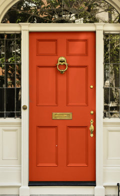
    Here is a Houzz link with lots of orange doors. https://www.houzz.com/photos/query/orange-front-door


    I think this one has your orange and bronze combo.


    The front door in orange will clearly be the front door. The color, alone, should solve any door confusion.


    Lots of great pics on that link. I love this one, too.


    Paul F. thanked freedomplace1
  • 2 years ago
    last modified: 2 years ago

    Sorry, I've been busy trying to get moved back in this weekend! Thanks for the feedback and pics. Yes, bronze for the gate was for the best! It's totally deemphasized and you can see the orange more obviously leading you to the front door.


  • 2 years ago

    Absolutely beautiful! Nice that you’ll be home for holidays!

    Paul F. thanked KW PNW Z8
  • 2 years ago

    Perfect!

    Paul F. thanked tozmo1
  • 2 years ago

    Looks great.

    Paul F. thanked RedRyder
  • 2 years ago
    last modified: 2 years ago

    I love both the orange and bronze doors. I might consider adding some additional landscaping around the bottom of the stairs to the patio door. A nice hedge type of plant, tall grass or some kind of bush with some height that can wrap around those steps make that door even less noticable.


    Paul F. thanked mnmamax3
  • 2 years ago

    Looks really beautiful.

    Paul F. thanked freedomplace1
  • 2 years ago
    last modified: 2 years ago

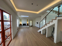
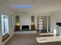
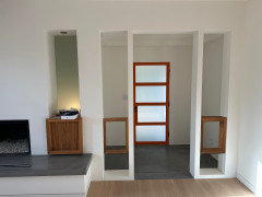
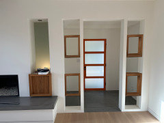
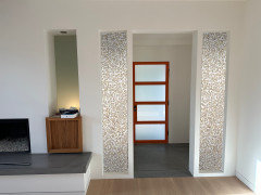
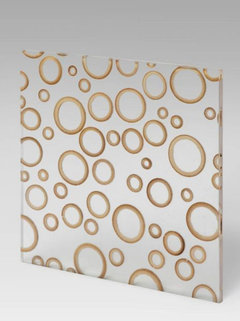
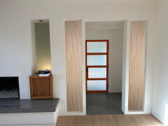
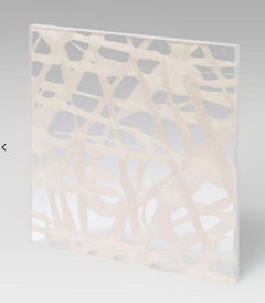
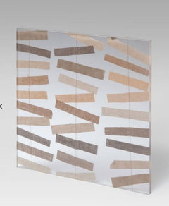
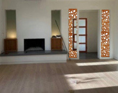
    Thanks so much! Couldn't have done it without everyone's help. NOW, these openings on either side of the front door. Should I leave them alone? Put in shelves, replicate the zebra wood as open boxes? I could also do 3-form architectural resin panels that have various organic materials pressed between transparent and semi transparent resin panels. Here are bamboo strips and bamboo rings.


    Hundreds of interesting designs. https://www.3-form.com/samples


  • 2 years ago

    Yes, I would fill them in with some kind of resin panel. As you say lots of choice.

    Paul F. thanked liasch
  • 2 years ago

    I agree - resin panels. I do like the circles you show. I’d have to see a mockup of the 2 linear designs you show but I think they would be too busy or conflict with the panels of the door & maybe also the openings to left of these panels. Not sure what’s going into them on the cabinets but guessing display with the down lights. I looked at the link & the number of designs is almost overwhelming! In a good way. I like the designs with mettalic shines - like your circles have. I think the mettalic is good with the orange color doors. I also like the ’Aspen’ Grove because it’s a softer linear & opaque for light - but - not mettalic. Overwhelming! 😊

    Paul F. thanked KW PNW Z8
  • 2 years ago

    I like nothing. Wait until you get furniture and art in the space and then decide. For me, there's something endlessly intriguing about a framed open space. Perhaps it will frame something quite beautiful in the distance once you get everything in place in the room. Or, you can plan it to frame something beautiful in the distance.

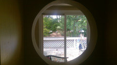
    You can't see it very well, but I planned an open circular interior window (I call it my interior moon gate) in my mudroom so when i came home from work I could pause and say, "Ah..." when I looked out and saw my garden goats. Time to change pace. I like a view, even one we create with what we have.


    Paul F. thanked tozmo1
  • PRO
    2 years ago

    I like a “peel a boo” look on those panels. You could get a lazer cut metal panel with your exact color and keep privacy and budget in order. These come in a variety of finishes and looks. I like a metal look more than other materials in your space.

    Paul F. thanked Flo Mangan
  • 2 years ago

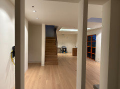
    Here is the view when you step in the door. I'll wait to fill them in if at all.