Software
Houzz Logo Print
irinatee

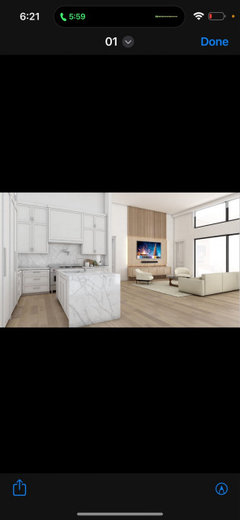
I’m so upset about my kitchen

2 years ago
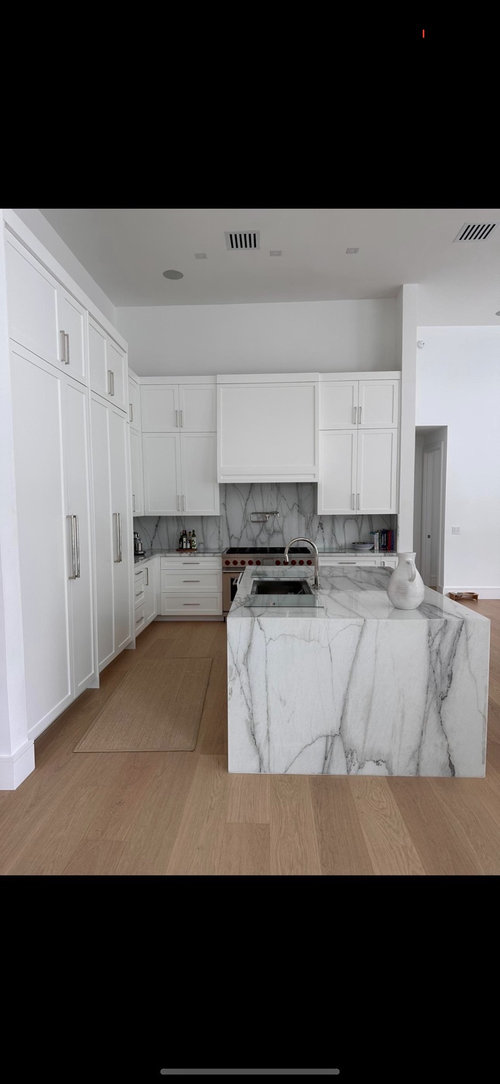
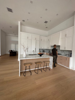
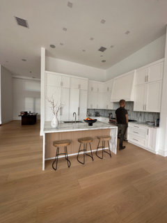
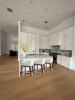
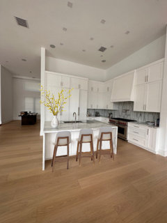
I ran my kitchen backsplash the wrong way per the fabricators opinion. Ugh the kitchen needs to be stagged properly still but this mistake makes me want to sell my house.

Comments (111)

  • PRO
    2 years ago
    last modified: 2 years ago

    This is more like fishing for compliments than a serous complaint.

  • 2 years ago
    last modified: 2 years ago

    She is admitting that friends get a look at her expensive kitchen and they say 'nice floor'. That would be frustrating if that's not the reaction you were going for. It is not an inviting design without some personality as has been pointed out, but the furnishings in the living area will make the space and there is nothing wrong with a plain white utilitarian kitchen in order to blend the kitchen into the walls.

    For example, I have an art collection so my furnishings were selected to take a back seat to the art. Shades of gray and tan, steel and stone. I directed attention away from it on purpose except with my pillows. That's what this kitchen will be, a backdrop to a spectacular living space. Nothing wrong with that. No one ever compliments my furniture.

  • 2 years ago

    I think Paul makes some good points.


    I’ll just add: You have to remember that when you post on a forum like this, you are going to get many opinions. And people saying that you need to add color, all just really comes down to personal preferences; and especially when you have now stated that you were not planning on adding a lot of color, and are looking at creating a space that is more neutral in tone(s), all the screams that you should ADD COLOR are not helpful.


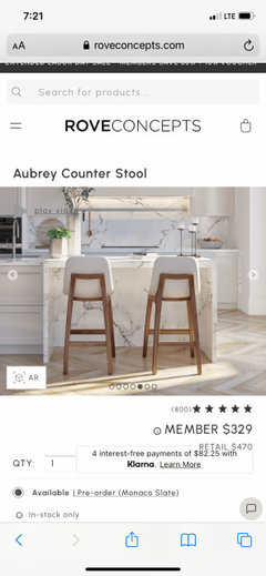
    It is true that some contrast could be nice in your space. But it is not essential. The space is really fine as it is - with your current floor rug and current bar stools. If you ever decide that you want stools with backs, I think the Aubrey stool from Rove Concepts are also very nice.


    Also, it is fine if you don’t want to add pendants, and prefer a more simple, open look. I think under cabinet lighting would be good for you to look into, though, if you don’t have it now.


    But my main advice to you would be: if you don’t like the backsplash, you can obscure a substantial portion of it with some large, wood cutting boards. Wood accents, maybe a plant or two - these things should well work with your described aesthetic.


    My other advice would be: If you are designing a kitchen (or a life) to impress and/ or to please other people - you are potentially wasting your time and money.


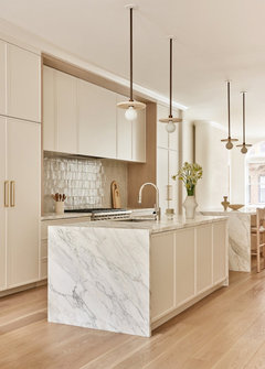
    It’s really a stunning kitchen - and it’s the marble that makes it so. The fabricator absolutely made the right call.


    It is possible that your ”friends” just don’t understand the style. Bold veining is not for everyone. For a lot of people, if it’s not white subway on the splash, they can’t wrap their heads around it. Also - you have to remember, with quartz and other marble look surfaces being so prevalent, some of your friends may just be stunned that you have actual marble. But whatever the case - who cares??


    You could rip out what you have and start over. You could really just take out the current splash and paint the wall area in an eggshell finish; that makes it cleanable, wipeable, and you don’t need to bring in another surface/material. People live really fine without backsplashes. But I think what you currently have is beautiful and striking. And there was just no other way to place that marble; horizontal would not have worked in this case , Once you are not so hyper-focused on the splash - and what you believe ”went wrong” - I think it may just become a part of the background for you.

  • 2 years ago

    Do whatever it takes so that you love your space every time you walk into it….it should make YOU happy….not your guests.

    I know my new kitchen will not be for everyone but just the thought of it nearing completion makes me smile in anticipation.

    Best of luck.

  • 2 years ago

    My first thought re the lack of response to the waterfall marble: it’s an expensive addition with no real function. It’s intended to be impressive and there’s something off-putting about that. If you like it, that’s what matters, of course.

  • PRO
    2 years ago
    last modified: 2 years ago

    "It’s intended to be impressive .... there's something off putting about it"

    It is intended to showcase a marble the op chose, and loves. It's a feature, and star.

    If it puts you off? It's not something you chose, or have to live with, right? Right! : )

  • 2 years ago

    I love it! . Add some VERY tall branches with some green (vs dead brown) leaves to the vase and call it “done”. Resist the urge to clutter your countertops and space above your cabinets with staging. It will only distract from the clean, elegant, contemporary feel and the beautiful materials you have chosen.

  • 2 years ago

    If it puts you off? It's not something you chose, or have to live with, right? Right! : )

    And it's not something Susan Brooks needed to mention here on this thread. What did that get Susan Brooks? Feeling superior?

    The marble is absolutely stunning!

  • 2 years ago

    Thank you for all the people who took the time to write under this post I appreciate you all even the negative comments lol. I’m going to just continue furnishing the rest of the house and I’ll style the kitchen with some natural elements if I hate it down the road I think the easiest solution would be just selecting a beautiful tile to go over the backsplash and maybe changing the lower cabinets to a white oak.

  • 2 years ago

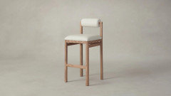
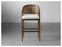
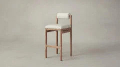
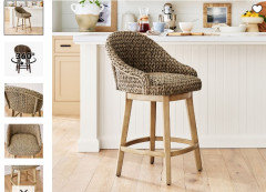
    These are the bar stools I was debating between. The white ash one the back wouldn’t be seen unless looking the side of the island but the natural wood tone the back of seat would be visible when looking from the water fall angle

  • 2 years ago

    I 100% understand your disappointment. But seeing the pictures of the room in the context of your home, the vertical veining actually looks great to me. You have a really contemporary space and the vertical veining is unexpected and contemporary looking. I get why your stomach might be sinking, but I think it is very nice.


    I like the stools with a dark wood seat and iron base. Don't know if they are photoshopped in or you have them in your space.

  • 2 years ago

    Those are there now but they feel too rustic/ farm house for the space

  • 2 years ago
    last modified: 2 years ago

    Changing out the drawer fronts and lower doors.


  • 2 years ago

    I think it is gorgeous and I would be thrilled to have this as my kitchen.

  • 2 years ago

    Thanks Paul what about just changing out the island ?

  • 2 years ago


  • 2 years ago

    Your right about the barstools having a rustic vibe. You can change them out for something a little more upscale.

  • PRO
    2 years ago
    last modified: 2 years ago

    Okay, now im gonna yell!

    Step back ffom the ledge. Theres nothing AROUND the kitchen yet and you’te in your head ripping a cabinet lower to light oak in your mind?!

    No. No No !!!!

    Reminds me of when you have a hot date and tou start re doing your halir amd nakeup, and each fix is worse than the prior! attempt.

    Now….

    Before you begin the rest? Spend on a designer to help you really clarify the feel you want in the living soace.

    Its becoming pretty clear you didnt start with a whole open feel that at the same time took the kitcen into account. A WHOLE vision?

    Slow down- get help. That will lead to small effects in the kitchen and the organic warmth tied to the cool of the kitchen.

    Get to one voice, and not fifty, here

  • 2 years ago

    Since you are asking for opinions, I would skip that first chair you posted. It is pretty, but all I see is a roll of paper towels as the back rest. 🤭🫣


    I think this one Emily posted would look perfect. It looks super comfy too.

    I would add some tall sprigs to the vase and call it done.

    I would love to see how it all comes together once your furniture is placed and it is all decorated! I know it will be stunning!

    Btw, I find it so rude to not compliment a friend on their new home or kitchen when you see it for the first time. Even if it was not MY personal style or taste, I would still say, ”Wow! This is amazing! You have done a fabulous job with all your choises! You must be beyond thrilled!” etc…. What is wrong with people? It blows my mind sometimes. 🙄

  • 2 years ago

    That looks great thanks rebunky! What do you use to photo the images like that ? I was going to avoid using dark woods in the house but maybe I need to rethink my design. I was going to make everything in white wash and natural oak color.

  • 2 years ago
    last modified: 2 years ago

    Despite the distractions of the snark, the yelling, and the dramatic punctuation in this thread, the OP has made strides toward figuring out what she wants. She said above that she wants more natural elements in the kitchen and the space. Not bright colors. That's progress towards a complete vision.

    There is no harm in asking for renderings of possible changes.

  • 2 years ago

    Oops, I thought they had black painted wood legs. I liked the idea of adding some black to the mix with everything else mostly being lighter neutrals.

    I am not a designer, but I liked that it added a nice contrast to all the white cabinets. It also ties in with the black on the range. It also tied in the black piece of furniture in the background, but actually I think you said that was temporary?

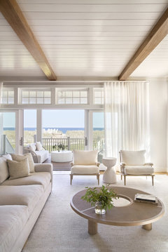
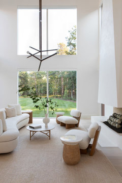
    You could see if the bar chairs have an option for a white oak leg if that would fit your overall vision better. Your inspiration pictures are beautiful and I can see the calm serene look you are after. I would call your style Minimalist, but that probably isn’t the correct term.

    Anyways, I do think adding in some black in metal like for lamps or chandeliers and then maybe adding a few darker shades of browns in textiles, wooden bowls, pillows, woven baskets, etc…here and there around the room would look nice with the majority being all white, cream, beige, and white oak.

  • 2 years ago

    I do think that staying with the natural oak everywhere is a fine choice. I do hope that you live with the backsplash for some time, and end up loving it.

    BTW, my comments above about adding something - wood, black, color in art - don't mean to imply that you need all of those things. Just something or a few things (no cluttering!) that appeals to you and provides a little contrast!

    Jan Moyer is right about moving ahead with furnishing the rest of your space; then you can circle back to the kitchen and see if you still feel the same about it and/or can better decide what, if anything, it is still lacking.

  • PRO
    2 years ago

    I need the Thesaurus lol.

    Pro's ask clients all the time....."give me inspo's, show me something you love !"

    We dig some more - " when you walk in, pour a glass, kick off your shoes, change to your comfy clothes - how do you want it to FEEL?" We mean as a whole. This wide open space, or a space such as a traditional Georgian colonial, with more defined boundaries between rooms. We could say ambiance, atmosphere, mood or vibe, but in the end ? The words hardly matter because it IS all about how you feel when you enter. That's your GPS. It doesn't mean you can't deviate from the map, that it all needs to be one idea, ONE mood; that there can't be side trips! But it is definitely nice to know where that final destination lurks. I'd add that it saves money and regrets, yes true. But when something gnaws at you, doesn't bring you joy? Check the GPS.

  • 2 years ago

    The first thing I would do would be to add pendant task lighting at about 7 feet like in your inspiration photos. With 12 foot cabinets in a kitchen with lighting almost 15 feet up it will be hard to shake off the cavernous feel without it.

  • 2 years ago

    That’s also one reason why i suggested under cabinet lighting - to have some type of lighting at eye level, plus task lighting. also ambient. OP doesn’t want pendants. And so if she doesn’t do undercab lighting, i don’t know how she is going to avoid the Madison Square Garden /arena type feel in there.


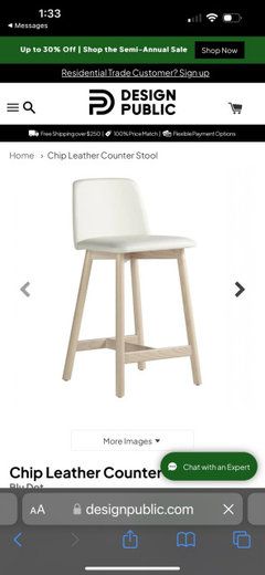
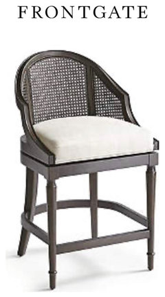
    Paul, would you be able to photoshop these stools into her room? With the white island. TIA if you can. :)


    These are the ones i suggested in my previous comment.

  • 2 years ago

    Those are nice. I have under cabinet lighting and lighting on the top of the cabinets

  • 2 years ago

    Ok - that is excellent. You’re set!! :)

  • 2 years ago
    last modified: 2 years ago

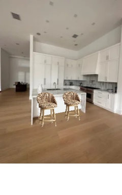
    Sorry I am not Paul, but here is my attempt to add the stools freedomplace suggested. I change my vote to these stools. These look so nice!! The wood legs blend beautifully with the floor.


  • 2 years ago

    Thank you, rebunky! :)

  • 2 years ago

    That backsplash is not oriented the wrong way. It's marble, and has veins in all directions. It looks better this way, IMO.

  • 2 years ago

    Thank you rebunky! I actually love those bar stools! They are perfect. Thank you so much y’all! Great choice freedom place. I am debating between walnut or natural. I am leaning more towards natural but the photoshopped photo is walnut I believe.

  • 2 years ago

    Never mind I think they are actually the natural color in the photoshopped image

  • 2 years ago
    last modified: 2 years ago

    Sorry, I was at Costco. Rebunky's retouching is a finger on an iphone app I believe. That's pretty amazing. I'm paying $20 a month for subscription photoshop! Why?

  • 2 years ago

    Haha Paul!

    Yep, your right. It is an ipad app that I use my finger to draw on and layer images on photos.

    Sorry irinatee, I forgot to answer your question about how I do the mockups. The app is called YouDoodle. There is a free version, but I think I paid around $5 to get rid of the pop up adds. The other thing I use is a website called Cleanpics. It has images with an invisable background. For example, I added this image on top of your photo and then erased to show your white vase instead of the clear.


  • 2 years ago
    last modified: 2 years ago

    I agree 100% with the fabricator. Running the backsplash perpendicular with the island IMO would've looked terrible, or at least off and taken away from the beauty of it.. The way it is looks great!

  • 2 years ago

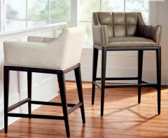
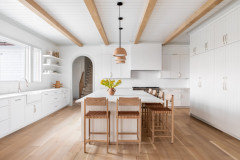
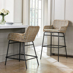
    These barstools look really comfy, neutral, & coastal/beachy:


    (They got distorted & lost too much detail when I shrank them them down, so further shrinking to get closer to real life size to fit 3 would of been even worse.)

  • 2 years ago

    Or these:


  • 2 years ago

    Kelly those are nice too.

    I have the same thing happen with this app when tring to layer a picture on top of a picture sometimes. The top pic gets all grainy and distorted.

  • 2 years ago

    I LOVE what you have done so far. Please don’t get upset, it is a stunning kitchen with a fabulous, clean, and simple “foundation” of elements.

  • 2 years ago

    Right! Its is a blank palette waiting for personality, warmth and texture.

  • 2 years ago

    It’s just beautiful

  • 2 years ago

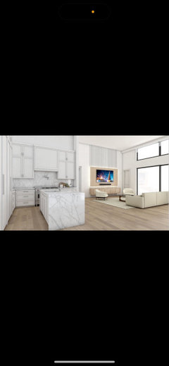
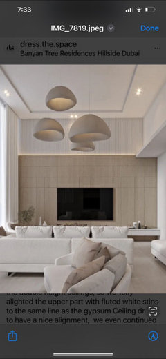
    Trying to decide what to do for the tv unit in the family room. I got two renderings for you guys lol which do you prefer ?

  • 2 years ago

    I think the lighter looks better. The darker would look good if you did that whole wall, but it looks top heavy to me just above the TV.

  • 2 years ago

    I like the second one.

  • 2 years ago

    I agree with @jenny that the lighter looks better.

  • 2 years ago

    Or Should I do the whole wall instead like this?

  • 2 years ago

    That's really pretty. I'd go with the entire wall.

  • 2 years ago

    Yes it’s beautiful

  • 2 years ago

    Your home is gorgeous