Software
Houzz Logo Print
justlinda1967

SW Alabaster White Kitchen Cabinets

3 years ago

We are remodeling our kitchen and having our cabinets custom-built. The cabinet builders suggested Alabaster White for the cabinets. I finally have a color swatch and put it on the wall, and it looks yellow/beige to me in our room. There is zero natural light in my kitchen. So now I am a little freaked out that my cabinets are going to look yellow as well. I want an all-white kitchen with griege and sage green accents. If I am not going with Alabaster - I need to stop them before they paint them to change the color. HELP!

Comments (24)

  • 3 years ago
    last modified: 3 years ago

    if you want white, pick a white with a high reflective # closer to 100

    SW Alabaster is a beautiful soft white with a LRV 82, even in low light, but don't put it next to bright white.

    are your appliances white? Sample colors in the room where they will be.

    Linda King thanked Lyn Nielson
  • 3 years ago

    Pick a different white fast. Alabaster does look yellow when used on the walls. You want a whiter white.

    Linda King thanked cat_ky
  • 3 years ago

    My appliances are stainless steel. Would Pure White be a good choice?

  • PRO
    3 years ago

    First change all the bulbs in all the fixtures to LED 4000K then test colors . BTW you do not brighten a space with paint you use lighting and lots of it in a kitchen IMO. Use poster board to test colors not you walls .It also is helpful to see the rest of your living space becuase the colors in the rest of the main spaces all need to work with the kitchen. Post the pics here in a comment DO NOT start another post

    Linda King thanked Patricia Colwell Consulting
  • 3 years ago

    I would use Alabaster in low light conditions, but I don't have a problem with yellow undertones. I love SW Pure White and BM White Dove for a white that is a happy medium between warm and cool. It does matter what you have next to it. IMO SS goes with everything. Whatever you choose, take a sample door to the showroom when you are choosing countertops. Leave the backsplash for last after everything else is in. What are the floors going to be? You should be choosing the cabinet color to go with the floors. You will probably end up painting the walls and that can also wait, so make sure your perception of the cabinet color isn't being negatively affected by an existing wall color which can be changed.

  • 3 years ago

    The BM White Dove, mentioned above, is definitely yellow in my house, so make sure you test any colors that get suggested!

  • PRO
    3 years ago

    Alabaster is THE most popular white SW color, because it is a great warm white.

    Linda King thanked DeWayne
  • 3 years ago

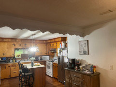
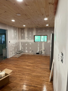
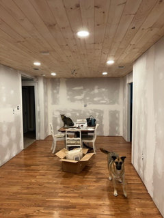
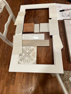
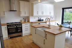
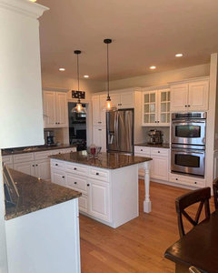
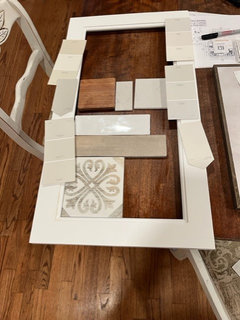
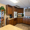
    We have new LED recessed lights, but I am not sure if they are 4000K - but I will check with the contractor. Here are some before pictures of the kitchen (the light over the island will go back up). The ceilings will be white - just haven't picked a white for them. I went back to our cabinet company, and they provided me with a sample door in Alabaster, another they called "just white".

    All the other walls in the house are about to be painted - but right now, the living room is Passive by SW. Our house was built in 1955 so we are redoing everything room by room.


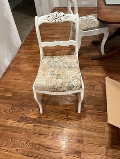
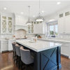
    See what you think. The look I am going for is inspired by the chairs.


  • 3 years ago

    forget the 4000 lighting. it is too bright and you are not in an operating room.

    Enough light ceiling, ambient and under cabinet if possible, plenty bright.

    ... sorry it is such a hassle. SW Alabaster is a beautiful white and would look great with Stainless.

    Linda King thanked Lyn Nielson
  • 3 years ago

    Is that the Alabaster on the cabinet door? It doesn't look yellow to me, but Alabaster is a creamy white (meaning it does lean a little yellow). How does it look next to your appliances? Because stainless is a little bit blue, it may look more yellow next to them. Or it may be fine. Whatever it is next to will influence how you see the color. Right now it's next to a gray wall, so it's going to look more yellow. What is your countertop? Do you have a sample you can look at next to it?


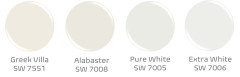
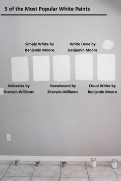
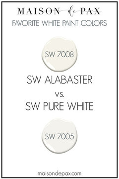
    Here are some comparisons of SW Whites. Pure White is an off-white, but it's chroma is very low so it seems more neutral. It looks a bit gray to some people. Extra white is a higher LRV but seems more "neutral" than Alabaster. Alabaster is a very nice color, but if you're sensitive to yellows it may not be the best color for you.


  • 3 years ago
    last modified: 3 years ago

    Lyn N, wrong on the 4000K in the kitchen. (you're thinking of 5000K and above)

    you may not be operating but one DOES use sharp knives to prepare food. 4000K IS the recommended light for kitchen and task usage

    There is nothing overly bright or sterile looking w/the 4000K light.


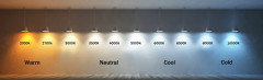
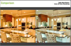
    3000K and below on the left, 4000K on the right. which would you rather work in??


    Alabaster is a very warm white. I would NOT use it in a kitchen w/no natural lighting.

    This is Alabaster. Notice the diff in the color on the left where the natural light doesn't reach. it's very warm/creamy compared to the natural light coming in from above on the right side.


    A better neutral/warm white is Simply White. I don't have a lot of light streaming into my kitchen, but I do have 4000K lighting. This is Simply white. I also did it on the trim and walls


    Pure White is ok too


    look at the diff w/alabaster compared to the other two. (Snowbound is nice. has a tinge of pink undertone)


    again, Alabaster on the left. you see how dingy it is compared to the others?


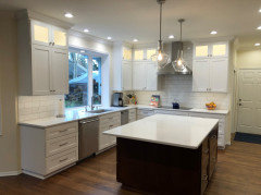
    This is Simply White on the cabs w/a quatz countertop and white subway. lights in the ceiling look to be in the 3500-4000K range.


    Simply White again w/the warmer lighting. these bulbs are easly 3000K or lower. Do you see the diff?


    This is far too dark to work in a kitchen!


    Linda King thanked Beth H. :
  • 3 years ago

    I went with 3500K for all my recessed lights and I find it is a good middle ground for lighting. Go to a good lighting supplier and they will have a better selection that big box stores.

    Linda King thanked chispa
  • 3 years ago
    last modified: 3 years ago

    Don't let your cabinet maker or your contractor pick the cab color for you. they have no clue about lighting and undertones.

    **And ALWAYS have the cab guy give you a painted sample door in the color you want prior to committing to having the entire thing painted!! take the sample door home and view it in you lighting w/your countertop/tile/flooring


    BTW, What is the countertop and your flooring?

    If these are the colors you like, I'd stick w/Simply White or even Pure white.


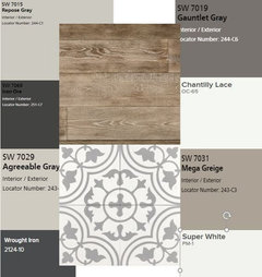
    these are some nice coordinating colors for what you want. **


  • 3 years ago

    I really like the Simply White by Bejamin Moore. My floors are pine hardwood, the color that you see in the photo. I haven't picked the counter tops yet, we plan on going with Quartz and I have been looking at samples. I have to pick a wall, trim and ceiling color before this Tuesday so the contractor can start painting. I wonder how Simply White would look with Pearly White walls.

  • 3 years ago
    last modified: 3 years ago

    Linda, you need to pick the countertop FIRST. It's much easier to match a paint color to the countrtop than vice versa.

    (however, using simply white or even pure white will be neutral enough that most every countertop should work w/it. Unlike Alabaster)

    Go get a sample of Simply White, bring it home and paint one of your old cab doors with it. (prime it first) That's the best way to see it.

    I'm going to link up some articles for you to read. Please, read all of these so you'll have a better understanding of what to choose.

    https://www.kylieminteriors.ca/how-to-choose-the-best-white-for-your-kitchen-cabinets/


    (who makes the Pearly White you have on your walls?

    just showing you the huge diff between these two colors


    or these two


    https://www.maisondepax.com/alabaster-paint-sw-7008-in-real-spaces/

    Full review on Simply White:


    https://www.kylieminteriors.ca/a-colour-review-benjamin-moore-simply-white/


    SW white paint colors:

    https://www.kylieminteriors.ca/the-4-best-white-paint-colors-sherwin-williams/


    And, Kylie goes in to great detail on many diff whites, direction of lighting, even the best whites for cabients

    https://www.kylieminteriors.ca/the-8-best-benjamin-moore-white-paint-colours-undertones-and-more/

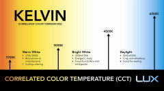
    How kelvins affect your paint colors

    https://www.kylieminteriors.ca/how-light-bulbs-affect-paint-colors-kelvins/

    Linda King thanked Beth H. :
  • 3 years ago

    Older homes, with warm tones, and poor lighting, work best with a more cream color than a bright white. Alabaster really is too white for most kitchens with the one single central light fixture that casts shadows all over your counters. If you are going to add a half dozen recessed lights, plus under cabinet, and pendants, then you can start to see some of the differences in these white shades. Without good lighting, nope, you can’t even tell.

  • 3 years ago

    HU-131248,,,,they've already removed everything and put in lights.


  • PRO
    3 years ago
    last modified: 3 years ago

    Unless you're leaving the lights on 24/7 kelvins, CRI, etc is irrelevant. Absolutely don't do 4K without a dimmer because it's obnoxious to live with in all but the rare occasion when you might need that much perceived lux.

    And even at that, the effect artificial lighting has on color appearance in daylight is the equivalent of spitting into the ocean.

    I went back to our cabinet company, and they provided me with a sample door in Alabaster, another they called "just white".

    Neither color directly maps to actual paint colors in terms of data values because it's not SW product they're mixed in.

    It's going to be the same with their version of Simply White.

    It's possible what you're imagining is something between their Alabaster and their "just white". And maybe they could get there for you, it's worth asking.

    For the ceiling, PPG's Delicate White in flat. Both BenM and SW can mix it accurately. It works with everything.

    I wonder how Simply White would look with Pearly White walls

    It could work.

    Because why: Pearly White is too dark to be a color of white so there's a decent bump of contrast with Simply White which is in fact a color of white. Also, a comfortable spread in terms of Chroma between the two.

    But again, it all depends on what their version of Simply White factually is.


  • 3 years ago

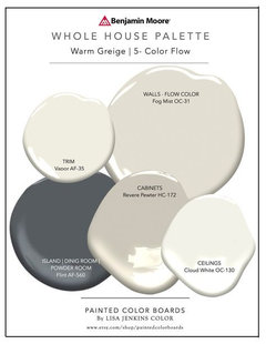
    The cabinet said I could bring in any color swatch with the number. That goes to their paint company who mixes it to the lacquer type paint they use. The recessed lighting can go from 3000 (settings now) up to 5000. Not dimmable. I signed up to use your color table to help me. This is my first kitchen remodel, so I didn’t know where to start. Especially since all the old paneling had to come down, along with all the new wiring.

  • PRO
    3 years ago

    The cabinet said I could bring in any color swatch with the number. That goes to their paint company who mixes it to the lacquer type paint they use.


    Yes, that's the way they all work. The question to ask is to what standard do they qualify a match. If they're just eyeballing it, which most of them do, then their idea of a "match" may not be your idea of a "match".


    The only way to properly qualify a color match/dupe is with the numbers and painters/cabinet makers don't know how to do that.


    The recessed lighting can go from 3000 (settings now) up to 5000.


    Awesome there's some flexibility. The issue comes back to standards - again. Many of the LED lamps, especially the adjustable, on the market are inconsistent in both claimed kelvins and CRI (color rending index). CRI is controversial in its own right.


    It's kind of a hot mess across the board in lighting and color world. Because color science is the engine that makes manufacturing and managing color possible and that can't happen without consistency in light sources.

  • PRO
    3 years ago

    Kelvin has nothing to do with lumens or the foot candles of light. That's just the color of the light. Not the intensity of the light.


    Professional coatings manufacturers have the crossover data to ensure a 95% match of a color of any major brand. That goes for Mohawk to Ilva. Your back yard guys, not so much. But they use house paint to begin with.

  • 3 years ago

    I like using this tool to get numbers on colors. What do you think of it @Lori A. Sawaya ?

    https://www.xrite.com/categories/portable-spectrophotometers/rm200qc

  • PRO
    3 years ago

    What do you think of it @Lori A. Sawaya ?


    It has the pedigree of X-Rite. Which is one of the best of the best in terms of all things color measurement.


    However, the Spectro 1 Pro from Variable and its app is a lot more streamlined, less fussy and more capable because it's a spectrophotometer, not a colorimeter. And a lot less expensive.