Software
Houzz Logo Print
jeremy_joniak

Kitchen design help

2 years ago
last modified: 2 years ago

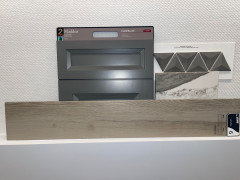
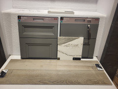
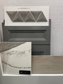
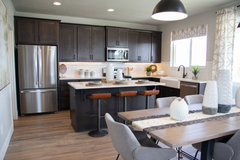
Good morning,Just hoping to get some opinions on if this would look nice together in my new build. These are the selections below, and I'll post some pics as well.1. Painted boulder maddux cabinets2. Skara brae quartz3. Bliss plank flooring (grain)Thank you :)
Pics are in comments forgot to add them here :)

Comments (13)

  • 2 years ago


  • 2 years ago


  • 2 years ago


  • 2 years ago

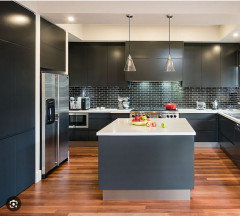
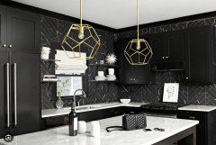
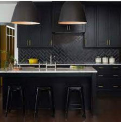
    That looks good, but I don't think the triangle shaped tile is a good choice for a backsplash in a kitchen. You want something flat that's easy to wipe down. Also, a dark backsplash is doubling down on the dark color of the cabinets. Unless the room faces south and is well lit, that could make for a room that is too dark - unless that's what you want. Most of the kitchens I see with dark cabinets have light countertops and backsplashes.


    Brylee Farms · More Info


    Creighton Woods · More Info


  • PRO
    2 years ago
    last modified: 2 years ago

    Hi. I think it looks nice together, except for the backsplash. I would use a lighter tone of the countertop.


    Grey has trended out as a color and you might consider a more classic tone for the cabinet. White or a mid-tone wood grain. Even your floors are taupe (a form of grey). Otherwise the colors work together.....just don't want you to "time-stamp" your home.

    Jeremy Joniak thanked CDR Design, LLC
  • PRO
    2 years ago

    Unless you absolutely love gray as your favorite color, I think you will regret the gray cabinets very very soon. Gray has moved away from being a popular choice, and all manner of colors, plus natural wood tones, are what is current. What's your favorite color? Maybe use it with some natural wood.

  • 2 years ago

    Every choice you show is gray. Too much gray. If you really want gray cabinets, they should be pale dove gray. The flooring should be a narural wood color not grayed wood. The backsplash tile does not work with your counter. Let the counter be the star, don’t have the backsplash compete with it.

  • 2 years ago

    On my monitor the colors look like they work beautifully together. I am seeing a bit of brown in the counter top and backsplash that ties the cabinets and flooring together, but I wonder if it will feel too dark with the backsplash being as dark as it is.


    I could only find a few images of kitchens with dark cabinets and dark backsplashes and lighter countertops. I think it is a darker look than most people want. Could look really good in a kitchen that had tons of natural daylight. My mom's kitchen had clerestory windows around the entire perimeter of the room. Others that I have seen have huge windows on multiple walls. In my 10x10 galley kitchen with one window over the sink that faces north, I would be looking at a black hole.


  • 2 years ago

    Is gray the right color?

    I hate trends - they make things that are perfectly fine choices suddenly become taboo.


    I don't pick my neutrals based on trends and I encourage people I help with color selection not to pick colors based on trends.


    With a new build, where you don't need to be concerned with existing colors I would encourage you to think about the colors that you love. Most of us have a handful of colors that we are drawn to. We pick art and area rugs and bedding and shower curtains and clothing that has some common thread.


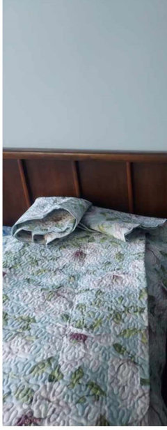
    I just bought a couple of new coverlets (70% off sale at cuddledown). I didn't think about the colors when I ordered them. I liked them and I like to change my bedding about every 6 weeks, rotating though different looks. My spare room and master both have queen sized beds, so bedding is interchangeable.


    (I admit my weakness - not a minimalist when it comes to bedding or dishes and I own at least a dozen different sets of bedding).


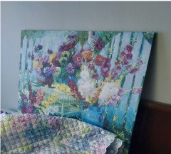
    Both came and I took them into my spare room to see how the colors worked. I spotted a piece of art I recently acquired and thought OMG - this is perfect.


    The second bedspread works with the walls, but will be even better when I get my master painted. Walls will be a muted purple.


    I love blue greens and purples. I also like deep wine reds, which work well as an accent with all the purple and teals.


    This is the last purse that I bought


    And this is my favorite piece of décor in my home


    The neutrals that I use in my home are taupe. That mysterious color between pink beige and violet gray. It works with my colors.


    Walls and flooring are not meant to be the main event, they are the backdrop for all the things you own.


    Will your choices be the perfect backdrop for the things you have bought or will buy for your home simply because you love the colors? That is what makes a neutral good or bad, not how popular it is with the general public.


  • PRO
    2 years ago

    To answer your question, yes they all work well together. However, none of them would be my choice. The quartz is heavily veined and tries to emulate natural stone, but it doesn't hit the mark. It looks fake and is going to be difficult to match, especially if you have a very large island or places where it turns a corner and needs to be cut. I think it's a trend that will go out of fashion fairly quickly.

    The overall color palette is too gray, as many have stated, and it gives a dreary feel. The floor could add some life to the space if it looked like real wood, with some warm tones. The backsplash tile could make a statement in an eye-catching color, but alas it too is gray.

    Don't be afraid of taking a stand on a real color and adding some interest to the room. Keep one gray item and add some warmth with the rest.

  • 2 years ago
    last modified: 2 years ago

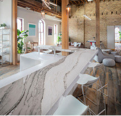
    @Diana Bier Interiors, LLC - I agree with what you wrote except the part about it "tries to emulate natural stone, but it doesn't hit the mark." I think you are missing the purpose of that particular Quartz design called Skara Brae. It is not meant to look like natural stone; it is purposely very dramatic and un-stone-like. It is meant for drama. For a showpiece. For a focal point.

    There are many people who do not want marble or marble-look counter because that is everywhere, including many faux marble Quartzes. They want something different, something that makes a statement. Similar to why some people like a big crystal chandelier in the kitchen. The Skara Brae Quartz is for those people. I am on board with having a dramatic counter! What a wonderful relief from all the sameness we see here! Having said that, the OP's other choices do not go with the Skara Brae.


  • 2 years ago

    Looks very nice.