Software
Houzz Logo Print
webuser_78125170

Can a Window be Too Big? Seeking Opinions (photos/renders included!)

2 years ago
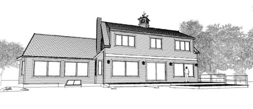
Hello there. Looking for some opinions on window size/arrangement on the first floor of my cape remodel. The primary design goal for my wife and I is "WINDOWS! BIG! AND LOTS OF THEM!" on the first floor. We have a spectacular backyard and really want to lean in to the scenery. Our ideal house is one where you walk inside, and immediately feel like you're still connected with the outside.


With that said, I'm wondering if we've gone "too big", if that's a thing. As in, crossed a point where the penciled in window sizes might be a bit overwhelming for the house and room sizes - almost giving a feeling like void space. The house is a small-ish 2200 sq ft cape with 8 ft ceilings - no 11ft high or vaulted ceilings here. There's also the consideration of window proportionality/arrangement, as in trying to hit traditional 1:2 or 1:1.618 ratios for Width:Height ratios versus just trying to cram big huge off the shelf windows of max size.


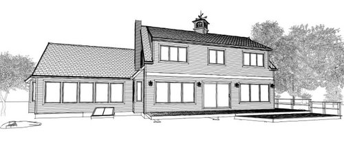
So here are two concepts. The first is just "max window area" with minimum obstruction. Basically, two big 57Wx63H mulled picture windows left and right of the center slider in the living area, and then two similar mulled windows in the first floor master suite (at the left side of the render). Woah, lots of beautiful window, and I'm sure we'll be impressed. But does it lack form/proportionality? Will it feel unbalanced and overwhelming? What are your thoughts?


As an alternative, I also show the same basic window coverage using three mulled 37Wx63H windows in the living area, and five of the same window in the master suite. This is pretty close to the 1:1.618 golden ratio for the individual window rectangles, for what it's worth. It does lose some of the openness of the big 57W windows, but is the form worth the tradeoff? I have been in plenty of homes with 36W individual windows and they certainly don't have any wow factor like a 57W would. But maybe three or more mulled together will?


Anyways, hope this gets the point across. I'm an amateur here and just looking to avoid any major mis-steps before I go too far down any path.


FYI I can make some additional renderings if anyone has any suggestions. Just throw them out.

JB


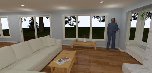
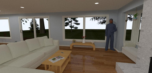
Here it is from the inside...don't mind the stranger lurking...he's just there for scale haha. 6' tall male as a reference.


Comments (8)

  • 2 years ago

    Do a furniture layout on paper, as well. I see more new construction here with gigantic windows with furniture right up against them because there's no place else to put it. Big windows can be great in dining areas where the table and chairs are in the middle, but if you need seating areas and tables to put things on and any storage pieces, a living area has to be gigantic to float everything in the middle away from windows.

  • 2 years ago

    Even though the three window view splits up your view, I find it more pleasing than the pairs.

  • 2 years ago

    I don't know your climate (or budget) but to truly embrace your backyard, think about the midcentury ranch houses: glass that whole back wall, or at least extend the sliders as much as possible. I am in the more windows is better camp, and the windows you're using are already too low to put furniture in front of so you might as well go all out.


    Pay attention to Palimpsest's comment about furniture placement. Especially if you are not a minimalist.


    (The second rendition looks better than the first, to answer the question.)

  • 2 years ago

    I love the wide window walls in mid-century design also, but this house leans more traditional/New England with the cupola and weather vane.

  • 2 years ago

    Oh yeah, it wouldn't be correct at all but it could be very nice. Definitely not something to go on the front of the house.

  • 2 years ago

    I love all the windows, and I think they look just fine, however, I do not see much place to arrange furniture, in that living room. It looks a bit bare, and unfinished.

  • PRO
    2 years ago

    The version with three windows is certainly better proportioned. Since it’s a deck I would just do French doors across the back even if some are just used as windows. I also don’t understand having a mullet house- traditional in the front and modern in the back. Just design a great looking modern house…

  • 2 years ago

    Thanks for all the input, everyone. Good comments.


    Re: Furniture - yep, these big windows definitely limit placement of things like a TV, tables, dressers or couches on external walls. We've thought about that and as minimalists, are OK with the tradeoff. My wife's ideal house would be devoid of furniture and decorations altogether - one step away from looking like you're ready to move out. So we're good with the tradeoff.


    Window walls would be amazing - but we'd have to perform major, major surgery on the house to accommodate. It's just not practical or anywhere close to achievable without basically knocking down and starting over unfortunately. Next house!


    Hallet & Co - ha, mullet house. I like the term. And uhhhh, it does probably apply here. But we're not building from scratch, we're modifying an existing cape style house with all the limitations that come with it, and trying to mold it with as few compromises as possible into something we like and meets our needs. The backside of our house - the part that has a more "modern" look with the big windows - won't be directly viewed by anyone except bugs, animals, trees and us from deep in the backyard woods or the deck. But I do acknowledge the design comment. The front of the house is absolutely way more traditional farmhouse / cape, and not big windows / modern at all. In fact, it can't be - there are way too many design obstructions to accommodate big windows on that side of the house - bathrooms, kitchens, stairways, closets, etc. I attached a pic for reference of what we're thinking of doing with the front. Keep in mind again that this wasn't a clean sheet build, we're modifying existing structure, so compromises exist! But I do like what we ended up with, even if it doesn't quite match the more modern back of the house. I'll take feedback and criticism though for sure! Keep it coming!


    I'll throw in one other render where I did away with the triple windows on the backside of the house on the 2nd floor, and instead made them doubles to better match the pairs of big picture windows on the 1st floor. I think it all works together a bit better.