Software
Houzz Logo Print
bwhirish

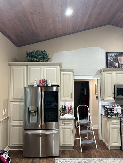
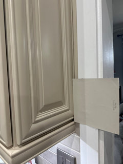
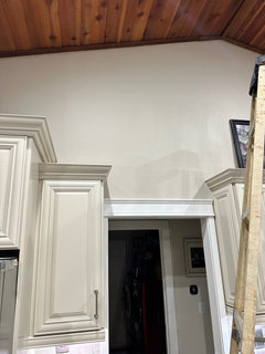
keep going with agreeable gray?

2 years ago
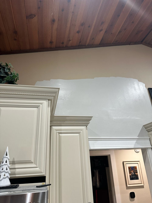
Or, go with another beige? This beige is nomadic desert…

Comments (58)

  • 2 years ago

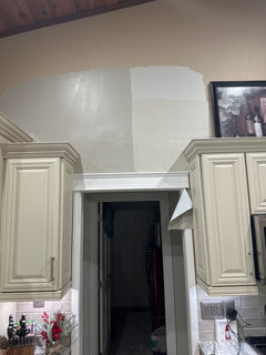
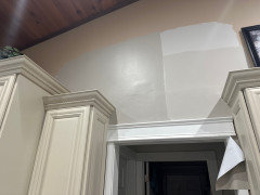
    How about anew gray… here is the sample

  • 2 years ago

    Stop! Please rethink those colors and whatever you end up choosing — definitely not satin.

  • 2 years ago

    What are you trying to accomplish? Are you just tired of the current color? I think you're going to run into the same issue with the anew gray. Your lighting seems to be enhancing the grey of the greiges.

    https://hextoral.com/side-by-side/anew-gray-sw-7030-vs-agreeable-gray-sw-7029/

  • PRO
    2 years ago

    EGGSHELL FINISH. Almost no sheen.


  • 2 years ago

    Deal… agree with eggshell

  • PRO
    2 years ago

    I agree with some of the comments definitely not satin. Eggshell is the best option I would also forget using gray the space is very warm toned some earthy colors would be good, the sage looks really good in my opinion the beige tones could be good but in that case I would go with something lighter than the kitchen color.

  • 2 years ago

    With your permanent finishes stay away from any paint color with gray in it or gray in its name.

  • 2 years ago

    How about accessible beige?

  • 2 years ago

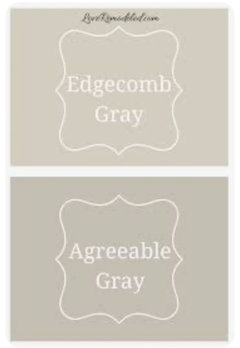
    I would suggest Edgecomb Gray


  • 2 years ago

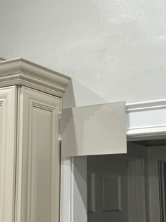
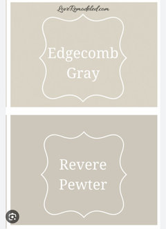
    Thank you…. Love Edgecomb but thought it may be too light… here is just now…

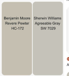
    Left is anew gray
    Right is revere pewter (one step darker than edgecomb)

    Thoughts?

  • 2 years ago


  • 2 years ago

    take down a cabinet door and put the swatches against them so you can see the colors in a vertical and a horizontal view. Revere pewter is more of a muddy tone.

  • 2 years ago

    You really need to know and inderstand the color of the cabinets first then pick the wall color.

  • 2 years ago


  • 2 years ago

    Edgecomb Gray and Accessible Beige are pretty close to each other. Both would probably be better than what you've tried so far, but they still have some gray, so they may not be warm enough. I agree with the other commenters that it looks like you need to stay away from anything that is really gray.

  • 2 years ago

    Accessible beige would probably be a better choice. It was throughout our house when we bought - varies from beige to soft greenish depending on the light, and would be warmer than what you have selected.

  • 2 years ago

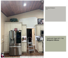
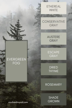
    Beverly’s example with Saybrook Sage makes me think Debbi’s suggestion of a sage green could be nice, like one of the lighter ones here.


  • 2 years ago

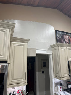
    So here is the latest. Anew Gray in left and revere pewter in right

  • 2 years ago

    Thoughts

  • 2 years ago

    Do you know what color the cabinets are? If not, I would take a door to the paint store to get it color matched and then have the store cut the saturation by 50%. Greys are not going to work here, I’m sorry.

  • 2 years ago

    Out of all the colors so far, I would pick the revere pewter. The others are just not jiving with your cabinets. I;ll echo Sammie J's opinion and try the Accessible Beige. Our home also was painted in that color and it reads neutral in most of the rooms, depending on the lighting.

  • 2 years ago

    “Do you know what color the cabinets are?”

    Was wondering the same thing.

  • 2 years ago

    They are called Victoria ivory… they are slightly cream color. Some pics make them look more yellow tones than they are

  • PRO
    2 years ago

    Based on everything you have posted, the revere pewter is the best of that bunch. However, it looks very close to the cabinets so the whole space may seem blah.

    What about just doing white like your trim? Not my taste at all but it looks good against the cabinets.

  • 2 years ago

    I think any "gray" paint will make them look even more yellow. You also have to factor in the backsplash and counters. Many of the colors above I like separately, but they are almost/too close to the color of the cabinets that it appears you're trying to match them, but it doesn't. Seems that something either lighter or darker in some color that contrasts a bit with the cabinets might work best.

  • 2 years ago
    last modified: 2 years ago

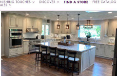
    Here are your cabinets with lighter wall paint on the Cabinets (not Kitchen) to Go website. Do you like this look?


  • 2 years ago

    Not too bad…. Just can’t find the color

  • 2 years ago
    last modified: 2 years ago

    ^Nice from deegw.

  • 2 years ago

    ?

  • 2 years ago

    deegw, is that Kitchen to Go or Cabinets to Go?

  • 2 years ago

    Yes they are

  • 2 years ago
    last modified: 2 years ago

    bwhirish - If you like the look in the picture above, you need to start picking much lighter sample colors. The cabinets-to-go site has chat help, perhaps you can ask if they know the wall color?

    https://cabinetstogo.com/pages/tom-gray-kitchen

  • 2 years ago
    last modified: 2 years ago

    @chloebud, I searched "victoria ivory" cabinets and it took me to the cabinets to go website. I made a mistake in my comment, I will fix it.

  • 2 years ago

    Yes that is what they are

  • 2 years ago

    deegw, I did the same search and found Cabinets to Go. The wall color in the pic you posted looks like a good one, whatever it is. Maybe Cabinets to Go will know.

  • 2 years ago

    You need to know where you are currently to know where to go! Found out the color of the cabinets by mayching to a paint color chip then go from there to find a color that

    will compliment them. Until then noone here can really help you as the pictures dont represent the exact color!

  • 2 years ago

    Ok, so they color matched the cabinets, but it’s not a normal paint color. I have the formula for color match… does that help?

  • 2 years ago

    That helps but you'll get a more accurate match to your version of the cabinet finish if you take one of your drawers to a paint store, not a big box store (if possible). Ask them to color-match the drawer front.

  • 2 years ago

    I did at Sherwin Williams… or are you saying that Sherwin Williams can say here is coordinating colors based off of this color match?

  • 2 years ago
    last modified: 2 years ago

    They'll use their computer to scan the drawer front and the computer will read the paint color combo on the drawer and configure a custom paint formula for a match. Paint stores seem to do a better job at it than big box stores.

  • 2 years ago
    last modified: 2 years ago

    Tell the person at Sherwin Williams what you are trying to do and show them the pictures you posted here as well. Most are pretty knowledgeable and helpful.

  • 2 years ago

    It don't look real bad the ceiling looks a little darker on my phone and the wall is lighter it's not the color of the cabinets and it's not the color of your countertop but the ceiling looks like it matches your countertop I had walls painted the same color as my cabinets in my old house it made my room look bigger

  • 2 years ago

    You just need to find the color family that the cabinets are in. I woukd go to BM and get them to color match to a paint chip of theirs.

  • 2 years ago

    Here is the update… shitakke from Sherwin williams

  • 2 years ago

    .

  • 2 years ago

    It looks great! I'm impressed with your perseverance, I hope you are happy with it. I suspect your kitchen will look more spacious as well.

  • 2 years ago

    That looks like a match!

  • 2 years ago

    Nice!👍🏻

  • 2 years ago

    That looks better & lighten when it dried.

  • 2 years ago

    Beiges and grays are so hard, as you know lol. It is so great you hung in there because it looks great. Congrats!