

Main living area advice
2 years ago
last modified: 2 years ago
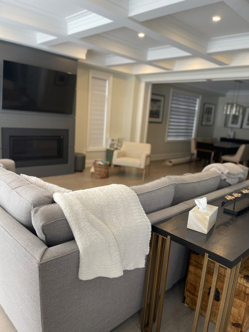
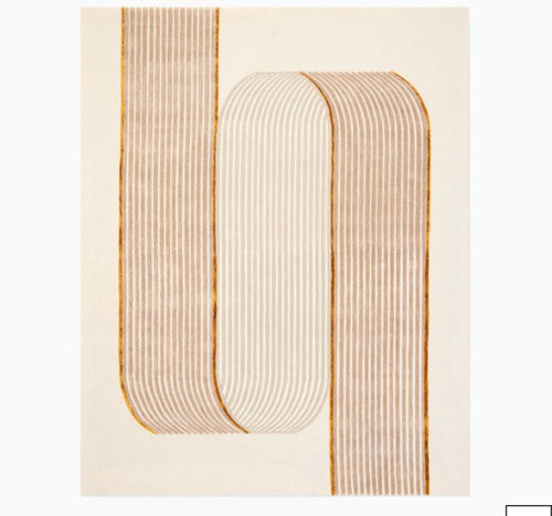
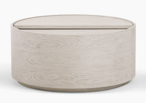
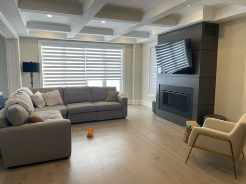
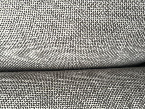
Featured Answer
Sort by:Oldest
Comments (11)
 2 years ago
Related Professionals
Los Angeles Interior Designers & Decorators · West Plains Architects & Building Designers · Queens Architects & Building Designers · Tampa Kitchen & Bathroom Designers · Chico Kitchen & Bathroom Designers · Bainbridge Design-Build Firms · Newburyport General Contractors · Lake Havasu City General Contractors · Tampa Flooring Contractors · Brainerd Flooring Contractors · Lufkin Interior Designers & Decorators · Enfield Interior Designers & Decorators · Rochester Interior Designers & Decorators · Kissimmee Furniture & Accessories · Winona Furniture & Accessories- 2 years ago
 2 years ago
 PRO2 years ago
- 2 years ago
 2 years ago
 PRO2 years ago
- 2 years ago


Related Stories
LIVING ROOMSAbracadabra! 9 Ways to Create a Kid-Friendly Living Area
A family room can be both functional and stylish with a few key design considerations
Full Story
LIVING ROOMSRoom of the Day: Dividing a Living Area to Conquer a Space Challenge
A new layout and scaled-down furnishings fill the ground floor of a compact Dublin house with light and personality
Full Story
MORE ROOMSIdeas for Awkward Living Room Areas
This year, think beyond the couch to add interest and utility to the living room
Full Story
DECORATING GUIDESRoom of the Day: Nautical Living Area Inspired by Green
A Northeast coastal guesthouse conjures up the sea with an unexpected mix of color and pattern
Full Story
LANDSCAPE DESIGNExpand Your Outdoor Living Space With a Satellite Patio
Invite guests to explore and enjoy the garden with a secondary seating area set apart from the main house
Full Story
LIGHTINGPro Tips for Lighting 10 Rooms and Outdoor Areas
Get professional advice for lighting your kitchen, bathroom, living room, office, patio and more
Full Story
SOUTHWEST GARDENINGUnderstanding the American Southwest's Three Main Climate Zones
If you live in one of the arid or semiarid regions of the U.S. Southwest, this gardening zone guide is for you
Full Story
DECORATING GUIDESSize Up the Right Area Rug for Your Room
The size of a rug can make an important difference to the feel of a room. Here are some tips to help you make the right choice
Full Story
HOUZZ TOURSMy Houzz: Dancing, Painting and Family Living in Seattle
With a backyard studio and a colorful, lively main home, these Washington state homeowners have all of their creative bases covered
Full Story
GARDENING AND LANDSCAPINGSunken and Raised Areas Take Gardens Up a Notch
Altering a landscape's grade can create energy and excitement, offering different vantage points and moods depending on the level
Full Story




ffpalms