Software
Houzz Logo Print
karla_cressman

Advice on Master Bedroom Decor

2 years ago
Hi all!

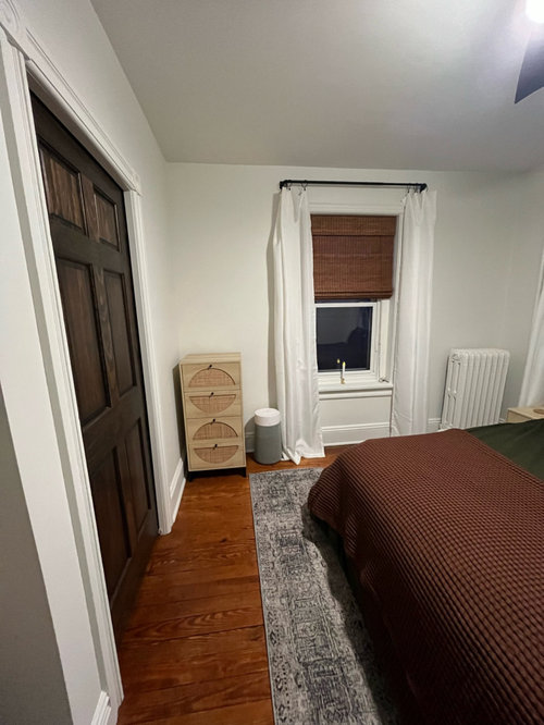
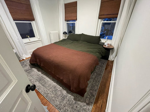
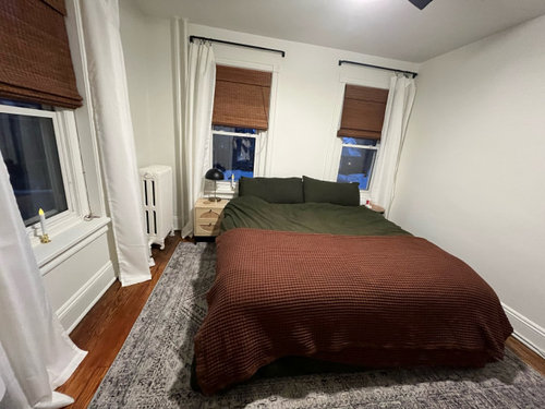
I need some recommendations on pulling our master bedroom together. Specifically the following:

  1. Wall decor recommendations above the bed, and on side walls

  2. Curtains. Do these curtains blend in with the wall too much?

  3. Bedding. I feel like I need something to make the bedding pop/being out the green. (We do have two shedding dogs)

  4. Headboard or no headboard due to window placement. If headboard, recommendations.

Thank you!!

Comments (10)

  • 2 years ago

    Just wondering…could the bed fit on the full wall? With nightstands beside it?

  • 2 years ago

    It’s a king sized bed, so the one side would have to go almost right up to the window.

  • 2 years ago

    I know it will be tight, but I would measure the room and furnishings and draw it to scale to see how the bed would fit on the full wall. As long as the person sleeping on the side closest to the windows can walk safely around that side of the bed, I’d move the bed. Small profile plug-in sconces hung beside the bed and a big sunburst over the bed. Art, photographs, or shallow woven bowls on walls opposite the bed. If not, I’d check to see if the rug fits if it’s turned the other way and pulled closer to the brown stained door. If so, it will make the room feel larger and give you a wider carpeted walkway around the bed. A grey comforter will also help the room to feel bigger because it will blend with the carpet. Then one of the same decor, as mentioned previously, above bed.

  • 2 years ago

    Remove the rust blanket or fold it smaller. Add some colorful pillows and art. I find the green very dark against the lighter walls and rug but some pillows may help.


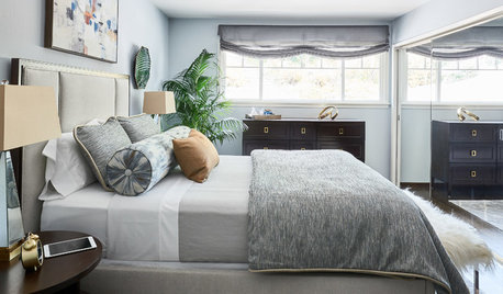
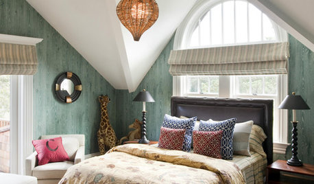
    This one has the rust color


    THis one combines the green and gray


  • 2 years ago

    @Susan- I just measured that wall and it’s 100. The bed itself is ~77. Definitely won’t be enough room near the window to get out of bed, and if the bed goes any further the opposite direction, it will be in the entry way :/

  • 2 years ago

    I also find the large uninterrupted amounts of dark green and rust very stark with the light walls. Especially in the small room. Also the dark blinds, but less so.
    Would you be up for different bedding that is lighter but, if the dark green and deep rust are favorite colors, would let you use them is smaller amounts, or mixed in print or stripe , or in art?

    I don’t think every room needs to be a sea of pale neutrals, and I like wood, earth tones, nature/ forest colors, but this room needs to work those colors with a bit of levity and different balance, somehow, and still complement the wood floors.

    For some dilemmas like this, a deeper, moody wall color would help, but I don’t think that’s the answer here.

  • 2 years ago

    Is there any way to keep the dark green bedding but lighten it with pillows or a different colored/patterned blanket? If so, what kind/color combo?

    I definitely agree with this feedback; I just don’t have a good eye with the colors.

  • 2 years ago

    Something like this?

  • 2 years ago

    Something like this?

  • 2 years ago

    I would avoid going all tan & beige , murky, but instead pick up the white woodwork color and introduce some kind of pattern that is “ fresher” but with forest green, brown, white ( or bright ivory) & even a bit of another color, though not required. You can go light background with small amounts of darker colors , or dark background with bits of light/ bright.

    For me, I love florals, botanicals, but also checks, plaids, stripes. I’d search for fabrics that maybe have a leaf print, flower with stems, etc. I’m pretty traditional & your room colors make me think of “ British colonial, “ or tropical retreat , where white walls are often mixed with dark woods, bamboo, rattan, & and prints with greens & browns. white, hot pink. Or art prints that are similar. Or maybe a kind of riff on Ralph Lauren cabin plaids, but introduce that bit of white.

    But you could find same color palette in modern or funky prints. So, you may already know, you hate florals or plaids or whatever. I would spend some time searching online using color combinations for search. Maybe search artwork as well to see if something grabs you as a goal.

    You can also find pillow cases that are a solid color but trimmed in ribbon of another color—helpful for the print- averse. Like, white with dark green trim. This is also something simpler to consider if you use wall artwork, instead of bedding , to add the interest/ link the colors & contrasts better.

    I wouldn’t focus on “ throw pillows” for the bed. You’ll just have to toss them off every night, and where, in that room? I think they’re very Insta and very impractical. Except maybe ONE , if you find something that really perks up the look , and for a king bed, not too tiny. Instead I’d work toward substantial, firm/ plump king pillows as kind of the back bolster, and maybe large standard pillows in front.

    Actual shams ( not ruffle-y) that are zip or envelope give a neater look. But somewhat fewer options. I only use cotton for my “ face pillow “ cases but am ok with microfiber for a “ bolster “ pillow for propping up.

    Pillowcases and shams can get expensive when you go outside standard solid colors, but you might get lucky, or, if you find something you just love that “ makes “ the room, invest in a pair; your sheets can be simple white.

    Also would consider that layered puffy throw or blanket at foot of bed , but being brighter, whiter or print. That is also kinda Instagram- y and not practical if you get too hot at night. Look at a lot of photos and see different ways they’re folded—I like about 1/4 - 1/3 of bed, try to avoid something droopy and wrinkly and a pain to keep arranged, or it’d be better to have a smooth neat bed cover alone.

    The reason to think in multiple options is, you might find the perfect throw/ quilt but less in pillow cases, or vice versa, or make choices based on what combination works best together.