

Let’s Play “Style the Credenza”
2 years ago

Boxes and sea shells

Boxes alone

Grouped boxes

Grouped boxes with a terrarium or vase in the center (terrarium pasted in for looks)

Grouped boxes with a Chinese jade calligraphy brush
Featured Answer
Sort by:Oldest
Comments (22)
Related Professionals
Fayetteville Furniture & Accessories · Galveston Furniture & Accessories · Mount Vernon Interior Designers & Decorators · Dayton Interior Designers & Decorators · Kearney Interior Designers & Decorators · Charlottesville Architects & Building Designers · Edmonton Architects & Building Designers · Southaven Design-Build Firms · Greensboro Design-Build Firms · Alexandria Design-Build Firms · Yuma Design-Build Firms · Oneonta General Contractors · Hays Flooring Contractors · Plainfield Flooring Contractors · Cody Flooring Contractors 2 years ago







Related Stories
KITCHEN ISLANDSLet’s Go Island Hopping Again
Check out these 92 kitchens with binge-worthy islands in a variety of shapes, materials and styles
Full Story
ROOM OF THE DAYRoom of the Day: A Playful Palm Springs Style in L.A.
The great room in Kelly Oxford’s 1960s Los Angeles home combines a monochromatic palette with bursts of color — and quirky touches
Full Story
HOUZZ TOURSMy Houzz: Playful Retro Style Perks Up a Dutch Home
Jewel tones, vintage finds and quirky accessories give a 1930s home a colorful, energetic spirit
Full Story
MIDCENTURY STYLEWalnut Cabinets and Geometric Tile Play Up Midcentury Style
In a Seattle condo’s kitchen and living area, a new layout, custom cabinets and hex tile complement vintage furnishings
Full Story
MY HOUZZMy Houzz: Playful Style in a Renovated Tel Aviv Apartment
Geometric patterns and eye-catching DIY touches come together in this designer couple’s 970-square-foot space
Full Story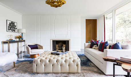
CONTEMPORARY HOMESHouzz Tour: Where ’60s London and Texas Style Meet
A midcentury ranch house’s architecture and a couple’s English and Lone Star State backgrounds come into play in a spirited renovation
Full Story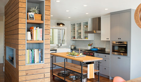
CONTEMPORARY HOMESHouzz Tour: Industrial Flavor and Playful Touches in a 1980s Home
A designer helps a San Francisco couple create a home with modern, eclectic style
Full Story
LOFTSMy Houzz: Letting Eclectic Style Roll in New Orleans
Behind the graffiti-art exterior of a onetime rice mill, art and antiques playfully mix against a backdrop of brick
Full Story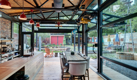
HOUZZ TOURSHouzz Tour: A Playful New Home With Restaurant Style
A rotating pizza oven, an industrial-style bar, a beer garden and a karaoke stage make for an entertainer’s paradise
Full Story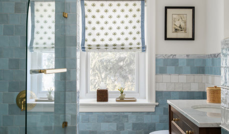
BATHROOM MAKEOVERSBathroom of the Week: Playful Style That Nods to Tradition
A designer honors a 100-year-old home’s history while creating a whimsical space for two young children
Full StorySponsored

Columbus Design-Build, Kitchen & Bath Remodeling, Historic Renovations



Maureen