

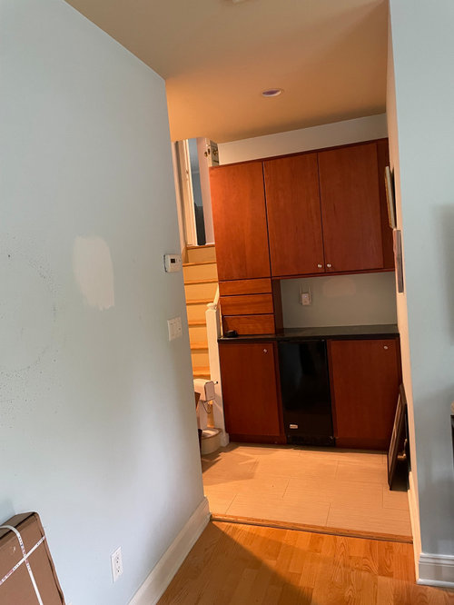
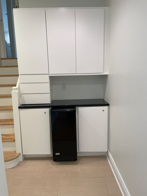
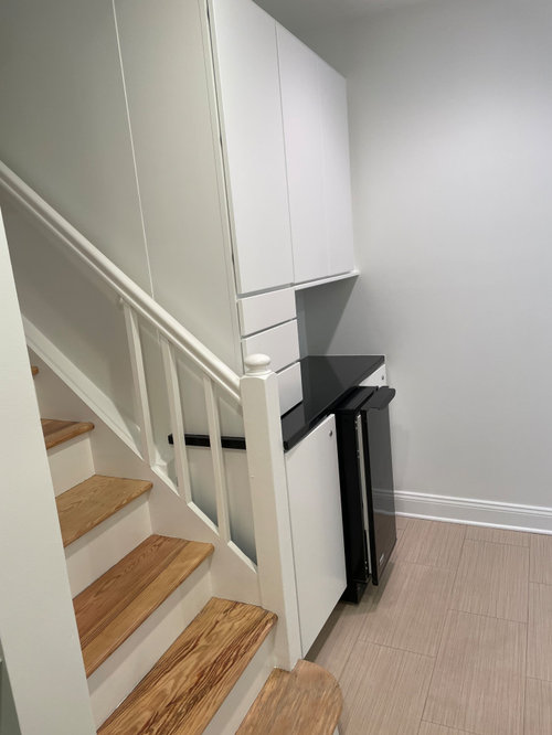
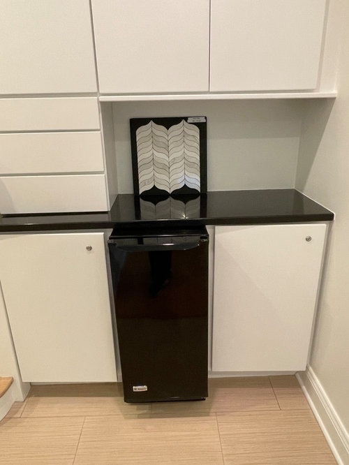
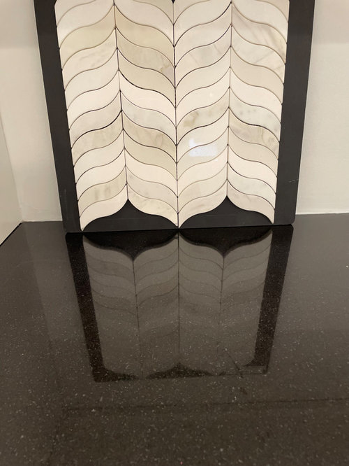
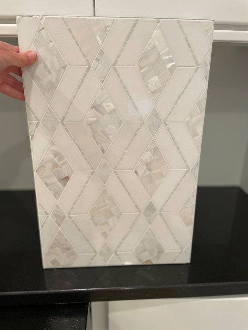
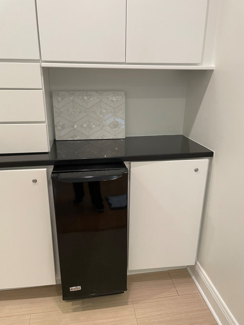
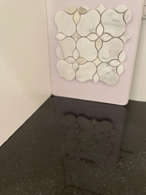
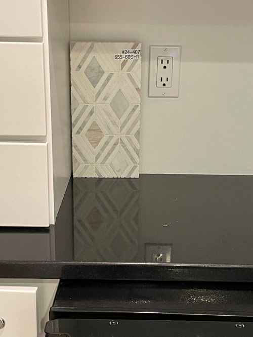
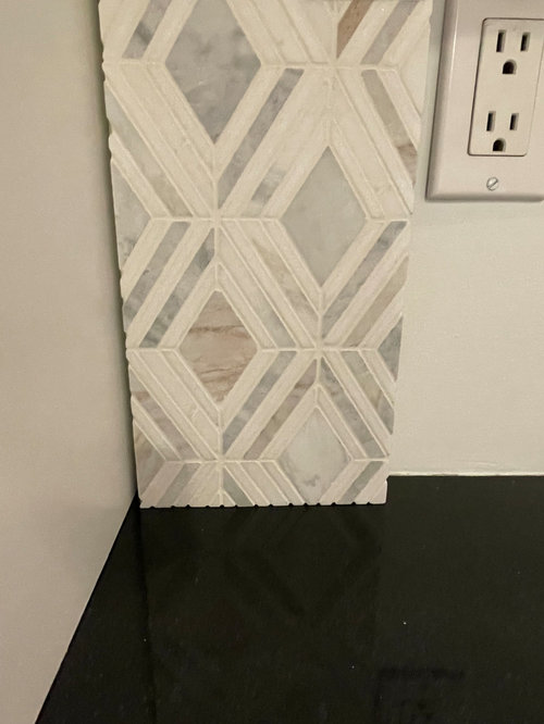
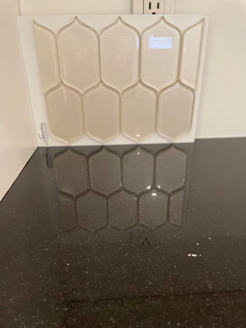
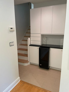
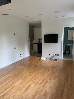
Before/ after need to choose backsplash
2 years ago
Featured Answer
Sort by:Oldest
Comments (10)
 2 years ago
- 2 years agolast modified: 2 years ago
Related Professionals
Elizabeth City Interior Designers & Decorators · Austin Kitchen & Bathroom Designers · Frederick Furniture & Accessories · Cincinnati Furniture & Accessories · Charleston Furniture & Accessories · Coeur d'Alene Furniture & Accessories · Beckley Home Remodeling · Worcester Bathroom Remodelers · Napa Bathroom Remodelers · Victoria Bathroom Remodelers · Clarksburg Interior Designers & Decorators · Mason City Interior Designers & Decorators · Petersburg Architects & Building Designers · Lafayette Kitchen & Bathroom Designers · Stockton Kitchen & Bathroom Designers- 2 years ago
- 2 years agolast modified: 2 years ago
 2 years ago
- 2 years agolast modified: 2 years ago
 PRO2 years ago


Related Stories
BEFORE AND AFTERSBefore and After: 19 Dramatic Bathroom Makeovers
See what's possible with these examples of bathroom remodels that wow
Full Story
TRADITIONAL HOMESBefore and After: Beauty and Functionality in an American Foursquare
Period-specific details and a modern layout mark the renovation of this turn-of-the-20th-century home near Boston
Full Story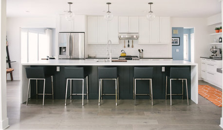
WHITE KITCHENSBefore and After: Modern Update Blasts a '70s Kitchen Out of the Past
A massive island and a neutral color palette turn a retro kitchen into a modern space full of function and storage
Full Story
BEDROOMSBefore and After: French Country Master Suite Renovation
Sheila Rich helps couple reconfigure dark, dated rooms to welcome elegance, efficiency and relaxation
Full Story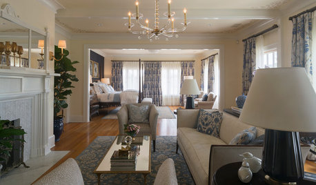
DESIGNER SHOWCASESBefore and After: See How Rooms Came to Life at the Pasadena Show House
Read the design details behind transformations at the 2016 Southern California showcase house
Full Story
FRONT YARD IDEASBefore and After: Front Lawn to Prairie Garden
How they did it: Homeowners create a plan, stick to it and keep the neighbors (and wildlife) in mind
Full Story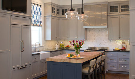
HOUZZ TOURSHouzz Tour: After a Fire, Reimagining a Home
A freak accident destroyed this family’s home on the night before Christmas, but they rebuild and make it a better fit
Full Story
MY HOUZZMy Houzz: A Seattle Bungalow Goes From Flip to Happily-Ever-After Home
Once intended for a quick sale, this 1930s house now bears witness to its remodelers’ love and marriage
Full Story
BEFORE AND AFTERSReinvent It: Street Signs Become a Lively Kitchen Backsplash
City surplus as unique decor? A Seattle family said sure, and now it's the star of their remodeled kitchen
Full Story
KITCHEN OF THE WEEKKitchen of the Week: The Calm After the Storm
Ravaged by Hurricane Sandy, a suburban New York kitchen is reborn as a light-filled space with a serene, soothing palette
Full StorySponsored

Columbus Design-Build, Kitchen & Bath Remodeling, Historic Renovations




gtdj519Original Author